
6 posts tagged with "conversion optimization"

View All Tags

How to Increase Website Conversions: An Actionable Playbook for SDR Leaders

· 27 min read

Getting more people to convert on your website is all about one thing: methodically finding and removing friction for your ideal buyers. For a Sales Development Representative (SDR) leader, this isn't about vanity metrics; it's about turning your website into the team's best qualifier. It’s a blend of digging into buyer-intent data, smoothing out the path to a demo, and writing copy that guides high-value visitors to take the next step. The goal is to make their journey so smooth and obviously valuable that booking a meeting with your SDR feels like the most natural thing to do.

Why Your Website Funnel Is Failing Your SDRs

Sales funnel showing many leads entering, filtering with uncertainty, resulting in a small pipeline, and a stressed SDR.

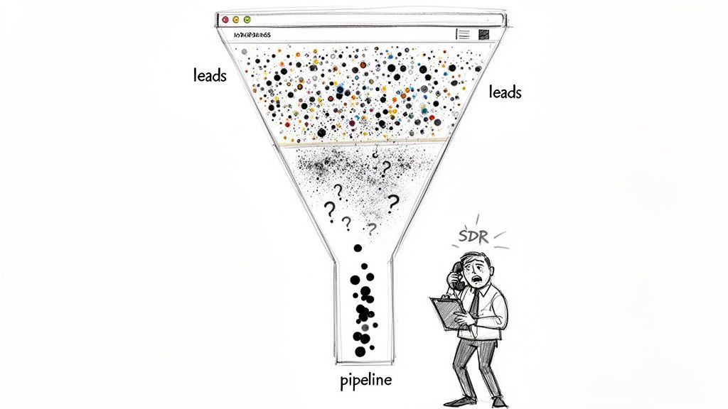
Let's be real for a second. Your sales development reps (SDRs) are probably drowning in a sea of low-quality "leads." While the marketing team pops champagne over a spike in form fills, your sales floor is telling a completely different story. It’s a story of dead-end calls, ignored emails, and prospects who have no idea who you are and no intention of buying.

This is the classic marketing-sales disconnect that grinds pipeline growth to a halt, leaving your SDRs to do the dirty work of sifting through garbage.

The problem starts with a flawed definition of "conversion." A traditional website funnel treats every action the same. A student downloading a top-of-funnel eBook gets logged with the same initial weight as a direct demo request from a VP at a target account. For an SDR, these two "leads" couldn't be more different, yet they often land in the queue with the same priority.

The result is painful and expensive. SDRs burn their most precious resource—time—chasing ghosts. They spend their days slogging through lists of contacts with zero buying intent, leading to frustration, burnout, and a lot of missed quotas. Your funnel isn't filtering for quality; it’s just collecting names in a spreadsheet and passing the qualification burden to your sales team.

The Volume Game vs. The Quality Signal

The old playbook was all about quantity. The thinking was, if you pour enough "leads" into the top, a predictable number of deals will magically pop out the bottom. For an SDR team, this "spray and pray" model is a recipe for inefficiency.

Think about the difference between these two leads from an SDR's perspective:

  • The Volume Lead: Someone downloads a whitepaper. They could be a competitor, a student doing research, or someone just kicking tires. The lead lands in the SDR's queue with zero context, kicking off a generic, and likely ignored, outreach sequence. This is a cold call with a flimsy excuse.
  • The Quality Signal: Someone from your ideal customer profile (ICP) hits your pricing page twice this week, then watches a 15-minute product demo. That’s not just a lead; it’s a flare going up, signaling real buying intent. For an SDR, this is a hot, contextualized lead that they can engage with a highly relevant message, dramatically increasing the chance of booking a meeting.

Your website needs to be an intelligent filter, not just a digital fishnet. It must learn to tell the difference between passive curiosity and active evaluation, so it can hand-deliver qualified opportunities to your SDRs.

The goal is to turn your website from a generator of noise into a source of clear, actionable signals. That's how you empower your SDRs to spend their time only on the accounts that are actually ready to talk.

From Vague Leads to Actionable Intelligence

When your website conversions aren't aligned with what SDRs actually need, you get a broken system. Marketing hits its MQL number, but the sales team misses its revenue target. Everyone loses.

This is exactly why a quality-first approach to conversion rate optimization (CRO) is so critical for SDR teams. By zeroing in on high-intent actions, you arm your SDRs with the context they need to start conversations that matter. Instead of asking "Are you the right person to talk to?", they can open with "I saw you were looking at our integration with Salesforce; I can show you exactly how that works."

This shift takes more than just tweaking a form field, though that's a good place to start. For some great ideas, check out these actionable conversion rate optimization tips for forms, which are often the last hurdle between you and a great lead.

Ultimately, tying marketing activities to real sales outcomes is the cornerstone of a modern go-to-market motion. This playbook will walk you through turning your site from a lead graveyard into a true pipeline-generating machine for your SDRs.

Build a Conversion Funnel on Trust and Social Proof

A sketch-style image showing a 'Demo Request' button, a testimonial bubble, and crossed-out Google logos.

Let's be blunt. Vague promises of "unparalleled ROI" and generic marketing slogans just don't land with savvy B2B buyers anymore. A VP of RevOps has heard it all before, and their default setting is skepticism. This skepticism is what your SDRs have to overcome on every single call.

To cut through that noise, you have to stop making claims and start proving value. This is where trust and social proof become your SDR team's most valuable assets. Instead of you telling prospects your solution is great, you let their peers do the talking. It’s a fundamental shift that directly fuels your pipeline with warmer, more qualified leads for your SDRs, making their outreach more of a welcome follow-up than a cold interruption.

Moving Beyond the Logo Wall

The old way of showing social proof? The static "logo wall." It's a grid of impressive company logos sitting on a page, and while it's better than nothing, it's a passive approach. It says, "these companies trust us," but it completely misses the prospect's most important question: "So what? What's in it for me?"

A modern, high-conversion strategy embeds social proof right where decisions are actually being made. This isn't about a passive display; it's about making it an active, persuasive part of the user's journey. This approach pre-handles objections and builds credibility before your SDR even says hello.

Just look at the difference in these two scenarios from an SDR's point of view:

The Old Way (Static Logo Wall)The New Way (Contextual Proof)
A prospect browses your "Customers" page and sees a familiar logo.A prospect is on your pricing page, and a testimonial from a peer in their industry appears right next to the "Request a Demo" button.
The SDR gets a generic "website inquiry" lead with zero context and has to start the conversation from scratch, building trust from the ground up.The SDR gets a lead alert showing the prospect engaged with the pricing page and a specific case study, giving them an instant, powerful opening line: "I saw you were checking out how [Similar Company] solved [Problem]..."

The difference is night and day. The first lead is cold. The second is pre-warmed with validation from a source they already trust, making your SDR's job infinitely easier and their conversation far more relevant.

Leveraging Real Stories and User Content

Authentic stories from real customers are your best sales tool, period. These narratives aren't just fluff—they are concrete evidence that your solution solves real-world problems. When you gather them and place them strategically, you build a powerful case for your product before an SDR even sends the first email.

The data absolutely backs this up. An analysis of over 1,200 websites showed that pages featuring User-Generated Content (UGC) have a 3.2% conversion rate. That rate jumps by another 3.8% when visitors simply scroll through it. But the real magic happens when users actually engage with that content—their likelihood of converting doubles, boosting rates by an incredible 102%.

Your goal is to make it impossible for a high-intent prospect to miss relevant social proof at their moment of decision. This isn't bragging; it's reassurance that helps your SDRs close for the meeting.

Here’s how you can put this into action right now to help your team:

  • Case Studies: Turn customer wins into detailed stories. Highlight the specific pain points, the solution you provided, and—most importantly—the quantifiable results. Then, make them easy to find on your relevant feature pages. Your SDRs can use these as powerful follow-up assets.
  • Testimonials and Quotes: Pull the most powerful one-liners from happy customers. Place them next to key CTAs, on landing pages, and even inside your demo request forms. This builds confidence at the exact moment a prospect might hesitate.
  • Reviews and Ratings: Integrate reviews from third-party sites like G2 or Capterra. This adds a layer of unbiased credibility that you just can't create on your own, giving your SDRs third-party validation to reference in their outreach.

When you collect and deploy these assets, you're not just decorating your website. You're building a smarter funnel that filters for intent and validates interest on the fly. To get a better handle on gathering this kind of feedback, check out these powerful voice of customer examples.

This entire approach ensures that when a prospect finally raises their hand, they've already been convinced by people they trust. That’s how you give your SDRs the ultimate advantage: a warmer, more receptive audience.

Focus Your Efforts On High-Converting Channels

Every lead is not created equal.

That’s a truth every SDR leader learns the hard way. Pouring resources into channels that pump up your traffic numbers but deliver low-intent prospects is a fast track to a burnt-out SDR team and a pipeline full of noise. The real key to increasing website conversions that actually close is a surgical focus on the channels that bring you people ready to talk business.

Think about it. Not all traffic is a signal of buying intent. Someone who clicks a paid ad for "sales dialer pricing" is in a completely different headspace than someone who lands on a blog post about "cold calling tips" from a Google search. One is actively shopping for a solution; the other is still in the early research phase. Arming your SDRs means knowing this difference and aligning your entire strategy around it.

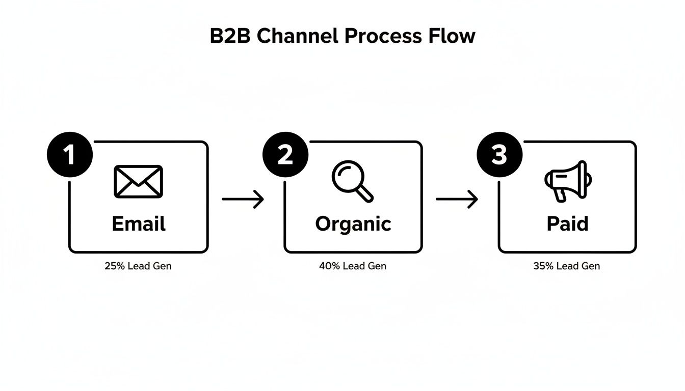
Comparing High-Intent B2B Channels

For most B2B tech companies I've worked with, three channels consistently rise to the top for generating real, valuable conversions that SDRs love: paid search, organic search, and targeted email campaigns. Each one requires a completely different playbook because the user's context and expectations are poles apart. Get this wrong, and you're just lighting your ad budget on fire and flooding your SDRs with unqualified leads.

A visitor from a paid ad expects an immediate, relevant answer. They clicked on a promise, and your landing page better deliver on it—instantly. Contrast that with a visitor from organic search, who is often looking for an expert to solve their problem. Your job there is to educate and build trust before you even think about asking for a conversion.

And to really dial in your strategy across these platforms, you'll eventually need to look at advanced marketing platforms that can unify the customer journey.

The single biggest mistake is treating all website visitors the same. A channel-specific strategy acknowledges the visitor's mindset and tailors the experience to match their intent, dramatically increasing the odds of a meaningful conversion that your SDR team can actually close.

This understanding is also crucial for setting realistic benchmarks and knowing where to double down.

B2B Conversion Rate Benchmarks by Channel

This table compares the average conversion rates for key B2B marketing channels, helping you prioritize efforts and set realistic performance goals. More importantly, it shows what each signal means for your SDRs.

ChannelAverage Conversion RateBest ForSDR Action Signal
Paid Search3.2%Capturing immediate, bottom-of-funnel demand.🔥 Hot: High-intent keywords signal an active buying cycle. Follow up immediately.
Organic Search2.7%Building trust and capturing mid-funnel research intent.🌡️ Warm: Solved a problem; now ready for the next step. Nurture with relevant content.
Email Marketing2.6%Nurturing known contacts and driving specific actions.🌡️ Warm: Engaged with targeted content; shows continued interest. Perfect for personalized outreach.
Social Media1.9%Brand awareness and top-of-funnel engagement.🧊 Cold: Typically lower intent unless from a direct offer ad. Route to automated nurture sequences.

While the numbers might seem close on the surface, the quality and intent behind them are vastly different. A 3.2% conversion rate from a "get a demo" paid campaign is infinitely more valuable to an SDR than a 2.7% rate from a "download our guide" organic post. This context is everything.

Paid search is the ultimate high-intent channel. Period. When someone types a specific solution into a search bar, they are waving a flag that says "I am looking to buy." The key to converting this traffic is message matching. The promise you make in your ad copy has to perfectly align with the headline, content, and call-to-action on the landing page. No exceptions.

  • The Landing Page: This isn’t a page on your main website; it’s a direct response to the ad, stripped of all distractions. Kill the main navigation, ditch the footer links—anything that could pull the visitor away from the one thing you want them to do.
  • The Offer: It must be compelling and directly tied to the search query. If your ad says "custom demo," the page is built around booking that demo, not downloading a generic whitepaper.
  • SDR Action Signal: A conversion from a high-intent paid search campaign is a five-alarm fire. This lead should be routed to an SDR immediately, with the full context of the search term and ad they engaged with. This is the definition of a hot lead.

Organic Search: The Trust-Building Engine

Organic search traffic is a different beast. It often has a much broader range of intent, from top-of-funnel research ("what is sales enablement") to bottom-of-funnel evaluation ("marketbetter.ai vs competitor"). Your goal here is to answer the user's question so damn well that you become their trusted authority, naturally guiding them toward a conversion that an SDR can act on.

Unlike a paid landing page, organic content needs to provide deep value upfront. This is where you solve their problem with comprehensive blog posts, tactical guides, or free tools. The conversion point should feel like a logical next step, not a hard sell. For example, a post on "How to Improve SDR Productivity" could lead to a CTA for a free trial of a tool like marketbetter.ai that automates those exact tasks. It just makes sense, and it gives the SDR a perfect, relevant conversation starter.

Targeted Email Campaigns: The Nurturing Path

Email gives you a direct line to a known audience, making it an incredibly powerful channel for nurturing leads and driving specific actions. Here, context is everything. An email to a list of webinar attendees should have a wildly different CTA than one sent to prospects who abandoned your pricing page.

The secret to high-converting emails is segmentation and personalization. Generic email blasts get generic results. By tailoring your message and offer to a specific segment's past behavior, you create a relevant, compelling reason for them to click through and convert—handing your SDRs a pre-warmed lead who has already shown they're paying attention.

Translate Website Signals into SDR Actions

This is where the rubber meets the road. All that hard work on your channels, messaging, and building trust culminates here, turning website traffic into actual pipeline for your SDR team.

Think about it. A prospect downloading a whitepaper is a decent signal. But what about a prospect from one of your target accounts hitting your pricing page three times in a week? That’s not a signal; it's a buying flare, screaming for your team’s immediate attention.

The next critical move is to build a seamless, automated workflow that takes these high-intent moments and turns them directly into prioritized tasks inside your SDR's CRM. This is the bridge that connects marketing insight to sales action, ensuring no hot lead ever goes cold.

No matter how prospects find you—email, organic search, or paid ads—they all land in the same funnel. Your job is to make sure their behavior gets interpreted and acted on, fast.

B2B channel process flow diagram for lead generation via email, organic, and paid channels.

The Old Way vs. The Intent-Driven Workflow

For decades, the SDR workflow was just plain broken. It was all manual lists, guesswork, and brute force. Reps got a spreadsheet from a webinar and started dialing for dollars, completely blind to who was actually interested right now. They spent more time figuring out who to call than having valuable conversations.

Contrast that with a modern, intent-driven approach. Instead of a static list, SDRs get a dynamic queue of tasks prioritized by real-time buyer behavior. The system does the heavy lifting, serving up the next best action with all the context they need to have a meaningful conversation.

The goal is to eliminate the question, "What should I do next?" from your SDR's vocabulary. Their inbox should tell them exactly who to contact, why to contact them, and what to say.

This shift moves your team from a reactive, volume-based model to a proactive, precision-based one. The result? Fewer wasted calls, more meaningful conversations, and a huge boost in both productivity and morale.

Configuring Your System for Actionable Signals

So, how do you make this happen? You set up your system to listen for specific website signals and automatically trigger tasks in your CRM. This isn't about tracking every single page view. It’s about zeroing in on the handful of digital behaviors that scream "buying intent."

Here are a few high-impact triggers you should set up immediately to empower your SDR team:

  • Pricing Page Visits: This is one of the strongest buying signals you can get. Set a trigger to create a high-priority task if a known contact from an ICP account visits this page more than once in a 7-day period.
  • Key Content Downloads: Not all content is created equal. A "Beginner's Guide" download is top-of-funnel noise. An "Implementation Guide" or a "Competitor Comparison" PDF, on the other hand, signals someone much further down the rabbit hole. Flag these for immediate SDR follow-up.
  • Demo or 'How It Works' Video Views: Someone watching a detailed product video is doing serious research. If a prospect watches more than 75% of a key product video, it’s a clear sign they’re actively evaluating you. This is a perfect reason for an SDR to reach out.

Once you configure these triggers, the magic happens. A prospect’s action on your site instantly creates a task in Salesforce or HubSpot. That task needs to include the prospect's name, company, the specific action they took (e.g., "Visited pricing page 3 times"), and a direct link to their record.

From Task Creation to Flawless Execution

Creating the task is only half the battle. To really empower your SDRs, that task needs to be a launchpad for immediate action, not just another notification. This is where tools like marketbetter.ai change the game.

The task doesn’t just report what happened; it tees up the next step. An integrated AI can analyze the signal (like a pricing page visit from a VP of Sales) and instantly generate a context-rich email draft. The SDR opens the task, reviews a sharp, relevant email, and hits send—all within seconds, and without ever leaving their CRM.

Let’s be honest about the two different worlds SDRs can live in. One is a frustrating grind; the other is a high-performance engine.

Manual vs Automated SDR Workflow Comparison

The table below breaks down the day-to-day reality of a traditional, manual process versus a modern, signal-driven workflow. The difference isn't just about efficiency; it's about effectiveness and SDR happiness.

SDR TaskTraditional Manual Process (The Old Way)Automated Workflow (The MarketBetter Way)
PrioritizationSDR sorts through a messy list of 100+ "leads," guessing who is most important based on title alone. Wastes hours on low-intent contacts.System auto-prioritizes the top 5 tasks based on intent signals and account fit. SDRs only work on hot leads.
ResearchRep opens 10 browser tabs to research the prospect and their company from scratch, looking for any hook.The CRM task includes key context like job title, recent company news, and the specific website engagement that triggered the alert.
OutreachSDR copies and pastes a generic template, trying to customize it on the fly. Sounds robotic and gets ignored.AI generates a personalized email draft based on the specific intent signal and persona. Outreach is hyper-relevant and effective.
LoggingRep forgets to log the call or email, creating a data gap for management and losing valuable context.Every email and call is logged automatically to the correct Salesforce or HubSpot record. Nothing falls through the cracks.

Moving to an automated, signal-driven workflow means you’re stripping away the low-value administrative work that can eat up to two-thirds of an SDR's day.

It frees them up to focus exclusively on what they were hired to do: have high-impact conversations with prospects who are actually ready to talk. This is how you stop hoping for pipeline and start building it.

How to Measure Your Conversion Strategy's Impact

Boosting website conversions isn't a project you check off a list. It’s a constant feedback loop, and that loop is powered by cold, hard data.

If you can't measure the impact of your changes, you’re just guessing. For SDR leaders, this is the whole game—proving that your efforts are building real pipeline, not just collecting clicks.

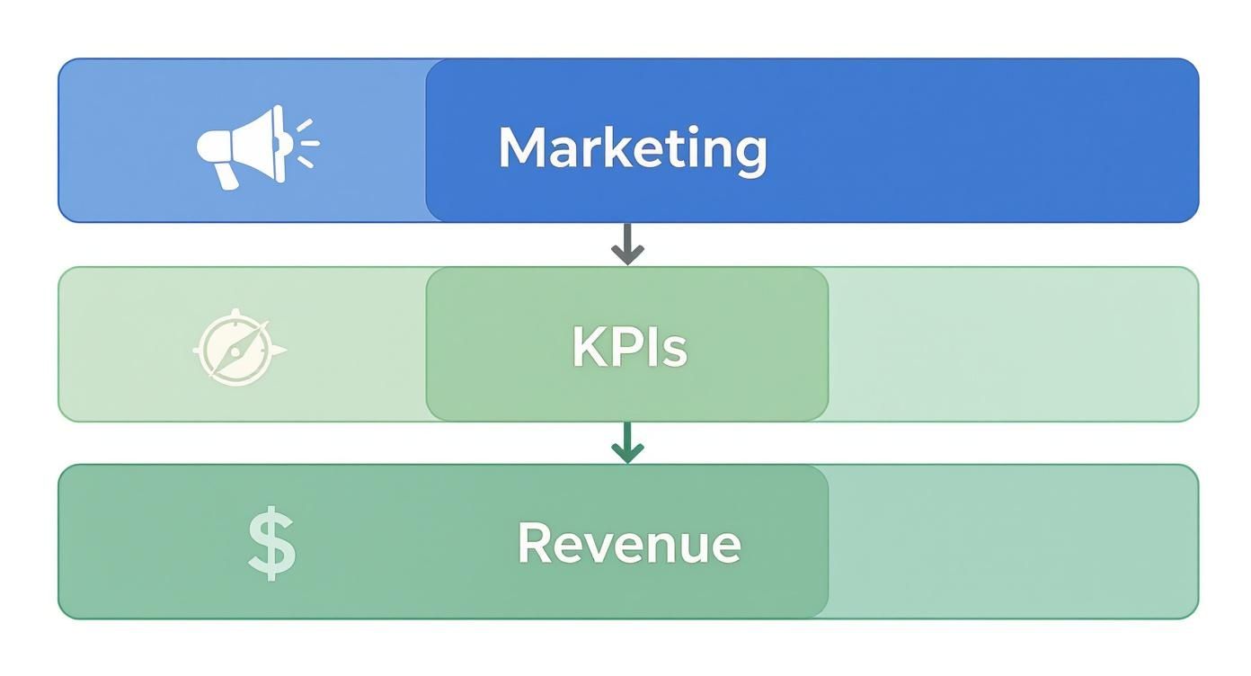
This is about getting brutally honest with your metrics. A jump in form fills is great, but it’s worthless if your SDRs are still complaining about lead quality. The real win is connecting every website action directly to a revenue outcome, so everyone sees exactly what's working and your SDRs trust the leads they receive.

Moving From Vanity Metrics to Revenue KPIs

The old way of measuring success was painfully simple: did the number of "leads" go up? This is exactly how you create a massive disconnect between marketing and sales.

Marketing hits its MQL number, celebrates, and moves on. Meanwhile, the sales team misses quota because those "leads" were just low-intent contacts with no budget and no real interest. Sound familiar?

To fix this, you have to shift the entire conversation from top-of-funnel activity to bottom-of-funnel results. It means tracking the KPIs that your CFO and VP of Sales actually care about—the ones that directly reflect your SDR team's performance.

Stop tracking raw form fills and start tracking metrics that tell a story about pipeline and efficiency. A proper measurement framework gives your sales team confidence that the leads hitting their inbox are actually worth their time.

Here’s how to reframe the conversation from marketing metrics to sales outcomes:

Old Metric (Vanity)New Metric (Revenue-Focused)Why It Matters for SDRs
Form FillsMQL-to-SQL Conversion RateThis is the ultimate test. It shows if marketing is sending leads that your sales team actually accepts and works, proving lead quality.
Website TrafficPipeline Generated from WebsiteDirectly attributes closed-won and open opportunities to specific conversion points, showing which pages generate real money.
Clicks on CTAsCost per Qualified MeetingMeasures the true efficiency of your spend in generating real sales conversations for your reps. This is what your budget should be based on.
Time on PageSales Cycle Length by SourceReveals if certain channels or offers bring in faster-closing deals, helping you prioritize the most efficient sources.

This shift changes everything. You’re no longer debating button colors in a meeting. You're discussing how a single landing page tweak generated $250,000 in new pipeline last quarter for your SDR team.

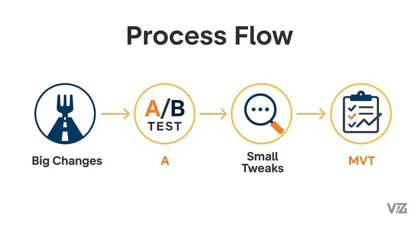
Running Simple, Hypothesis-Driven A/B Tests

Once you’re tracking the right things, you can start making improvements with real confidence. This is where A/B testing comes in, but not the kind you read about in abstract marketing blogs.

It’s not about guessing. It’s about forming a clear, testable hypothesis and letting the data tell you what your audience actually wants.

A good hypothesis isn't a random idea. It’s a sharp, focused statement: "We believe changing X into Y will result in Z." For an SDR leader, the most powerful tests are often the simplest ones that target high-intent actions.

The best A/B tests aren't about flashy redesigns. They focus on reducing friction and clarifying the value of taking the next step. A tiny change in language can have a massive impact on the quality of leads your SDRs receive.

Here’s a real-world scenario any SDR team can run:

  • Hypothesis: We believe changing our primary landing page CTA from "Learn More" to "Get a Custom Demo" will increase qualified meetings booked. The new language is more specific and signals higher intent.
  • The Test: Use a tool like VWO or the now-retired Google Optimize to show 50% of your traffic the original page and 50% the new version.
  • The Measurement: After a few weeks, you don't just count clicks. You track how many qualified meetings each version produced. This is the only metric that matters to your SDRs.

If Version B ("Get a Custom Demo") generates 30% more qualified meetings, you have an undeniable winner. You’ve just made a data-driven decision that directly helps your SDRs hit their number. It’s a world away from arguing about aesthetics in a conference room.

Attributing Pipeline with Clean CRM Data

Here's the catch: none of this works if your CRM data is a mess. Your Salesforce or HubSpot instance has to be the single source of truth for connecting a website conversion to a sales opportunity. This is the final, critical link in the chain.

It requires setting up proper campaign tracking and attribution models from the start. When a prospect fills out a form, that conversion event needs to be stamped onto their contact record in the CRM. From there, you can trace their entire journey—from the very first touchpoint all the way to a closed-won deal.

With this setup, you can finally answer the questions that change the business:

  • Which blog post generated the most enterprise-level demos last year?
  • Do our LinkedIn Ads convert into higher-value deals than our Google Ads?
  • What is the true ROI of our webinar program in terms of actual revenue, not just registrants?

This level of insight is incredibly empowering. It allows you to confidently scale what works and kill what doesn't. You're no longer spreading your budget thin across a dozen initiatives; you're doubling down on the proven winners that feed your sales team high-quality opportunities.

To truly master this, you need to understand the different frameworks available. You can dive deeper into this topic by reading our complete guide on how to measure marketing effectiveness, which breaks down various attribution models. This is how you stop guessing and start building a predictable, scalable revenue engine.

Got Questions? We've Got Answers.

When you're trying to dial in a website that actually fuels your sales team, a few common questions always pop up. Let's tackle them head-on, from the perspective of RevOps pros and SDR leaders who need pipeline, not just clicks.

How Is Website Conversion Different for an SDR Team?

This is the big one. For an SDR team, a "conversion" is a totally different beast than what a traditional marketer might track. A marketer might get excited about 1,000 new newsletter sign-ups. For an SDR, that’s mostly noise that clogs up their workflow.

The real difference comes down to two words: intent and quality. An SDR-focused strategy ignores low-commitment actions. Instead, it zeros in on high-intent signals that tell you a prospect is actively kicking the tires—things like repeatedly visiting your pricing page or watching a full product demo.

  • Standard Conversion: Someone downloads a top-of-funnel eBook. This is a low-priority lead that might get a nurture email. An SDR should not be touching this.
  • SDR-Focused Conversion: A visitor from a target account requests a custom demo right after binging a case study. This triggers an immediate, high-priority alert for an SDR to jump on within minutes.

Getting this right is the key to increasing website conversions that actually build a healthy pipeline and make your SDR team more efficient and successful.

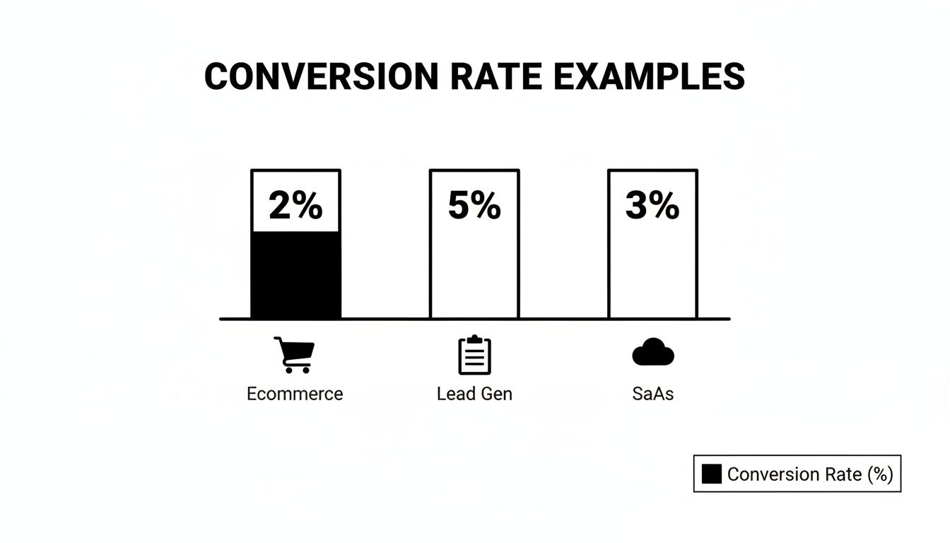
What Is a Good B2B Website Conversion Rate?

You'll see benchmarks floating around the 2% to 5% range, but honestly, that number can be a huge distraction for an SDR leader. A "good" conversion rate is all about context. A 10% conversion rate on a whitepaper download means a lot less than a 1% conversion rate on your "Request a Demo" page.

Instead of chasing some generic industry average, get obsessed with improving the conversion rates on your bottom-of-funnel pages. The goal isn’t just more conversions; it's more qualified sales conversations for your reps.

A much better metric to watch is your MQL-to-SQL conversion rate. If that number is going up, your website is doing its job: finding high-quality leads that your SDRs can actually turn into opportunities.

How Can We Get More High-Intent Conversions?

This feels counterintuitive, but the answer is to add a little bit of strategic friction. You want to make it incredibly easy for serious buyers to raise their hands while making it just a little harder for tire-kickers. It's not about being difficult; it's about qualifying in real-time so your SDRs don't have to.

Think about the difference in these two approaches:

ActionLow-Intent Approach (More Noise for SDRs)High-Intent Approach (More Signal for SDRs)
Gated ContentA generic "Download Now" button for an intro guide, open to anyone.A specific "Get the ROI Calculator" CTA that requires a business email, filtering out students and unserious prospects.
Demo RequestA simple form asking only for "Name" and "Email," creating work for your SDRs to qualify.A multi-step form that asks about team size and current challenges to pre-qualify them before they ever hit the SDR's queue.
Homepage CTAA vague "Learn More" button that drops them on a features page.A direct "See How It Works" button that links to an interactive product tour, letting prospects self-educate.

Each of the high-intent plays acts as a filter. Sure, you might get slightly fewer total form fills, but the quality of each lead you hand over to your SDRs will be exponentially higher, giving them a real shot at starting a meaningful conversation.


Ready to stop generating noise and start creating real pipeline? marketbetter.ai turns buyer signals into prioritized SDR tasks and helps your team execute flawlessly with AI-powered emails and a dialer that lives inside your CRM. See how it works.

What Is a Good Conversion Rate? Benchmarks, Comparisons, and Actionable Optimization Tips

· 15 min read

At its heart, conversion rate is your e-commerce batting average. Globally, most stores settle around 1.9%, while seasoned Shopify sellers often push into the 2.5–3.0% range. Compared to a new site converting at 1.2%, hitting 2.5% puts you in the top quartile. Use these numbers as your starting line—and then outpace them with targeted optimizations.

Quick Answer And Conversion Benchmarks

Conversion rates aren’t one-size-fits-all. They shift depending on your visitor’s device, how you acquire traffic, and the niche you’re in. Think of it as adjusting your swing for a fastball versus a curveball.

  • Device Type influences click patterns and checkout friction. Compare desktop at 5.06% vs mobile at 2.49%.
  • Acquisition Channel drives cost per sale and ROI. Paid search often rates 3.2%, while referral sits near 1.8%.
  • Vertical Niche shapes visitor intent and buying behavior. Finance sites average 3.1%, apparel under 1.9%.

A solid rule of thumb: about 2 out of every 100 visitors convert when you hit the 1.9%–2.0% global mark. In contrast, veteran Shopify shops often break the 2.5% threshold, sometimes nearing 3.0%. Learn more about these findings on Blend Commerce.

Key Insight: The global e-commerce conversion rate hovers near 2%, but mature platforms can exceed 3%.

Overview Of Good Conversion Rate Benchmarks

Use this summary of global, platform, and industry figures to guide your goal setting—and see where you compare:

ScopeTypical Conversion RateHow You Compare
Global Average1.9%–2.0%Baseline for sites of all sizes
Shopify Stores2.5%–3.0%Top 25% of Shopify merchants
Early-Stage Sites1.0%–1.5%New brands finding their footing
Subscription3.0%–5.0%Recurring-revenue champions

Use this table as your compass when defining realistic targets.

Screenshot from https://blendcommerce.com/blogs/shopify/ecommerce-conversion-rate-benchmarks-2025

How To Use Benchmarks

  1. Benchmark your current rate against the table above.
  2. Highlight areas where you lag by 0.5% or more.
  3. Prioritize tests: start with your biggest gaps (e.g., mobile checkout if you’re 1.8% vs 2.49% device average).
  4. Set monthly and quarterly targets that nudge you 0.2–0.5% above each milestone.

Treat this as an ongoing cycle—measure, compare, optimize, and watch your conversion average climb.

Understanding Conversion Rate Impact

Conversion rate is more than just a percentage on your dashboard. It’s the real story of how well your site turns casual visitors into customers. A site at 1.9% is converting half as many people as a site at 3.8%, doubling revenue potential on equal traffic.

Imagine a bustling retail shop. All that foot traffic doesn’t pay off until people reach the cash register. In the online world, that cash register is your signup or checkout page. Even a 0.5-point uptick can translate into meaningful revenue gains.

Key Takeaway: Small conversion uplifts drive noticeable ROI shifts—benchmarked against your peers, a 0.5% boost could leapfrog you into the top quartile.

Why Small Changes Matter

It may feel trivial to move from 2.0% to 2.5%, but the math tells a different tale. On 10,000 monthly visits, that half-point boost delivers 50 additional actions. Compared to your competitor at 1.8%, you unlock an extra 70 conversions.

  • Refine your calls-to-action so there’s no doubt about the next step. Compare “Buy Now” vs “Shop Now” button performance.
  • Experiment with headlines that mirror visitor search intent. Test “Free 30-Day Trial” against “Start Your Free Trial”.
  • Cut down form fields—every extra box is another reason someone might bail. Test 3-field vs 5-field checkouts.

Linking Budget To Results

Conversion rate is the bridge between your marketing spend and the dollars hitting your bank account. When more visitors convert, your cost per acquisition (CPA) drops—letting you stretch each advertising dollar further.

Pair your cost-per-click figures with conversion data for crystal-clear ROI insights. Then follow this simple process:

  1. Gather traffic and conversion data over a 30-day window.
  2. Calculate CPA by dividing total spend by total conversions.
  3. Spot campaigns with below-average conversion rates and sketch out A/B test plans.
  4. Shift budget toward your top performers and iterate.

Learn more about tying conversion metrics back to spend in our guide on measuring marketing effectiveness.

Action Steps To Elevate Impact

  1. Map out every conversion touchpoint from ad click to purchase confirmation—compare drop-off rates at each step.
  2. Pinpoint high-leverage spots where drop-offs exceed 30%, then apply targeted optimizations.
  3. Layer in behavioral tools like heatmaps or session recordings to catch any friction before it costs you.
  4. Run rapid A/B tests—aim for a new test every 2 weeks, swapping headlines, CTAs, or page layouts.

Remember: Small optimizations compound over time into major performance gains. Compare each test variant’s lift side-by-side to choose winners.

Real World Comparison

When Company A rolled out a redesigned checkout path, their conversion rate jumped from 1.8% to 2.4% in just two weeks. Meanwhile, Company B tweaked their email signup flow with personalized triggers and saw an increase from 2.1% to 3.0%.

CompanyBefore CVRAfter CVRRelative Lift
Company A1.8%2.4%33%
Company B2.1%3.0%43%

Use these real-world lifts as benchmarks for your own A/B and multivariate tests—and set goals that push you well beyond the industry averages.

Calculating Conversion Rate With Examples

Conversion rate is (total conversions ÷ total visits) × 100. If 2,000 people drop by and 50 complete a purchase, you’ve nailed a 2.5% rate—compared to the 2.0% global average, you’re outperforming many peers.

  • Total Conversions: Number of completed goals (sales, signups).
  • Total Visits: Unique visitors or sessions in a chosen timeframe.
  • Time Window: Always match your conversion and visit dates.

Even a one-day mismatch or aggressive rounding can send your numbers off track. Sync your Google Analytics goals and date ranges for rock-solid accuracy.

Step By Step Calculation

  1. Define your goal in Google Analytics (or your analytics platform).
  2. Choose a consistent time window (last 30 days vs last quarter).
  3. Pull your total sessions or unique visitors.
  4. Pull your total goal completions.
  5. Calculate conversions ÷ visits × 100—and compare against your benchmarks.

Examples:

  • E-Commerce Store: 1,500 visitors and 30 orders → 2%, matching the 1.9% global average.
  • Lead Generation Funnel: 5,000 clicks and 250 form fills → 5%, outperforming many e-commerce sites.
  • SaaS Trials: 2,000 signups and 400 activations → 20%, a benchmark for strong onboarding.

A well-tracked funnel reveals where visitors drop off and how small tweaks can lift your conversion by up to 20% in weeks.

Avoid Common Calculation Pitfalls

  • Mixing sessions with user counts can skew your rate—pick one and document it.
  • Ignoring multi-step funnels hides where people bail—break your funnel into stages and compare stage-by-stage.
  • Over-rounding prematurely drifts your results—round only once at the end.

Follow this repeatable routine and your conversion calculations will stay accurate and actionable. Ready to streamline your conversion tracking? See how marketbetter.ai automates goal setup and reporting so you can focus on campaign optimization tasks.

Industry Conversion Rate Benchmarks

No two markets play by the same rules. Industries with urgent needs—like legal services—outperform those where decisions take longer. Compare your sector to these averages:

IndustryTypical CVRHow You Compare
Food & Beverage2–3%Seasonal spikes may push higher
Beauty/Skincare2–3%Loyal followers boost repeat
Apparel<1.9%Compare your seasonal peaks
B2B E-Commerce1.6–1.9%Long cycles, high deal value
Finance3.1%Trust and service justify purchase
Legal3.4%High urgency drives action

For device-level insights, see the Statista global conversion rate report.

Vertical Medians And Quartiles

Benchmarking goes beyond averages. Think of percentiles as race positions on a track:

  • 25th Percentile: Below-average performance
  • 50th Percentile: Industry median
  • 75th Percentile: Top performers

Plot your current rate on these percentiles and set incremental uplifts of 0.5% to move up one bracket each quarter.

Setting Sector Targets

  1. Pinpoint your current rate and find your percentile.
  2. Define incremental uplifts—start with 0.3–0.5% steps.
  3. Compare test outcomes: e.g., a 0.5% lift in finance equals moving from 3.1% to 3.6%, closing in on top-tier firms.
  4. Calibrate your roadmap: allocate more budget to strategies that outperform your sector by at least 10%.

Factors Influencing Industry Conversion Rates

Benchmarks don’t tell the full story. Three forces can shift your numbers:

  • Order Value: Higher-ticket items often convert at 1–1.5%, but pay off with larger AOV.
  • Purchase Frequency: Consumables (food & beverage) may convert at 2–3% regularly.
  • Consumer Behavior: Holidays or economic shifts can temporarily boost or depress rates.

Comparing Different Approaches

Each funnel type has its norms:

  • E-commerce: ~2%
  • Lead Gen: ~5%
  • SaaS Trials: ~3% after onboarding

Compare your funnel’s performance to these norms and allocate resources to the highest-yielding ones.

Reducing Cart Abandonment

Even small hiccups cost. Compare your checkout abandonment (often 70%+) to a lean flow—aim for under 60%. Then:

  • Minimize form fields to 3–4.
  • Offer guest checkout vs forced sign-up.
  • Provide multiple payment methods.
  • Display trust badges prominently.

Infographic about what is a good conversion rate

For automated testing and reporting, explore Marketing Performance Metrics.

Even minor checkout changes can translate into major conversion wins.

Channel And Device Conversion Benchmarks

Not every visitor behaves the same. Breaking down conversion by channel and device shows where to pour budget and effort. For instance, paid search often lands at 3.2%, topping the global average, while organic search sits near 2.7%. Desktop users convert at 5.06%, more than double mobile at 2.49%. Dive into the full Ruler Analytics research to see raw numbers.

Segmenting Reports For Action

Once you slice by channel and device, gaps jump off the page:

ChannelConversion RateCompared To Global Avg
Paid Search3.2%+1.3%
Organic Search2.7%+0.8%
Email2.5%+0.6%
Referral1.8%-0.1%

Assign distinct conversion targets to each of these. For example, if your paid search is at 2.5%, plan tests to push it to 3.2% in 60 days.

Optimizing Based On Device Insights

Mobile often lags—improve yours from 2.49% to 3.5% by:

  • Reducing checkout fields from 5 to 3.
  • Implementing one-click payment options.
  • Leveraging mobile-specific UI patterns (sticky CTA buttons).

Tablet sits between desktop and mobile at around 3.8%—capitalize on its larger screen with richer visuals.

Comparing Mixed Segments

Dig into combined segments for deeper insights:

  • Mobile Email: ~1.5%, test mobile-optimized email templates.
  • Desktop Referral: ~4.5%, amplify partner programs here.

Action Steps To Improve Conversion

  1. Segment reporting by channel-device pairs.
  2. Set 0.5%–1.0% lift goals for underperformers.
  3. Run A/B tests on top segments monthly.
  4. Shift budget toward overachieving segments biweekly.

Applying Benchmarks And Tactics

By applying these benchmarks, you can:

  • Track ROI and CPA by segment.
  • Measure LTV per channel-device combo.
  • Spot emerging high-performers in real time.

Automate these reports to catch trends fast and refine strategy on the fly.

Diagnosing Conversion Rate Challenges

When your conversion rate plateaus, finding the root cause becomes non-negotiable. Below is a step-by-step framework—from A/B experiments to AI-powered enhancements—complete with comparisons and actionable next steps.

A/B Testing Framework

A rigorous A/B test cuts guesswork and surfaces true win-loss outcomes. Compare variant A vs B head-to-head:

  • Define Clear Goals so every test targets a measurable outcome (e.g., button color vs placement).
  • Segment Traffic to avoid cross-contamination.
  • Use Control Groups to isolate external factors.
  • Log Variations for a transparent audit trail.

Aim for 95% confidence and a consistent test window. Compare your test lifts: a 0.3% increase in CTA color changes is on par with industry averages.

Tracking And Reporting

Clean, organized data is the bedrock of optimization:

  • Centralized logging for full visibility.
  • Side-by-side segmented comparisons.
  • Anomaly alerts to catch unexpected shifts.

Compare period-over-period results and share findings in weekly reports.

Personalization Tactics

When your site feels like it “knows” the visitor, engagement follows. Compare generic vs personalized pages:

  • Pre-populate user names for returning visitors.
  • Tailor offers by geography or past behavior.
  • Trigger contextual pop-ups for high-value segments.

Personalization tests can reveal which audience slices react best—compare uplift by segment.

Post Test Diagnostics

After each test, audit results before declaring a winner:

  • Verify sample size met thresholds.
  • Confirm traffic sources remained consistent.
  • Ensure variants stayed in their assigned segments.

Archive findings and compare success rates over multiple tests to spot patterns.

Comparative Method Analysis

No single method rules all scenarios—compare yields:

  • A/B Tests: single change focus, quick insights.
  • Multivariate Tests: complex combos, need more traffic.
  • Surveys: uncover qualitative roadblocks.
  • Session Recordings: highlight real-time UX friction.

Use the method that best fits your traffic volume and urgency.

Friction Reduction Audit

Map every step in your funnel and compare before/after fixes:

Audit ItemBefore FixAfter Fix
Checkout Fields5 fields2 fields
Page Load Time3s1.5s
Form Error Rates8%3%

Removing just two fields often adds 0.5% to your CVR. Compare metrics weekly to track impact.

AI Driven Test Ideas

AI can accelerate your test pipeline. Compare manual vs AI-driven ideation:

  1. Predictive Text for subject lines and CTAs.
  2. Dynamic Content Blocks that adjust in real time.
  3. Automated Scheduling to hit traffic peaks.
  4. Real-Time Alerts for out-of-bounds metrics.

Each feature can boost conversions—compare lifts side-by-side.

Case Studies In UX Tweaks

CompanyChangeBefore CVRAfter CVRRelative Lift
Company X6→3 checkout fields1.8%2.2%22%
Company YDynamic banners for intent2.0%3.1%55%

Combine A/B testing with personalization for compounding gains. Learn segmentation tactics in Customer Segmentation Strategies.

Channel Comparison

ChannelBaseline CVRLifted CVRRelative Lift
Paid Search3.0%3.6%20%
Email2.5%3.0%20%
Organic2.7%3.2%19%

Set similar lift goals—compare test outcomes to your baselines.

Optimization Checklist

  • Hypothesis drafted and documented.
  • Audience segments defined and tagged.
  • Traffic channels tracked separately.
  • UI changes logged and versioned.
  • Impact metrics selected and monitored.
  • Statistical significance verified.
  • Learnings shared with the team.

Compare your checklist completion rate to past sprints to speed up cycles.

Scaling Your Improvements

When you’ve identified winners, rollout quickly and compare adoption:

  • Update style guides with proven microcopy.
  • Sync development sprints around optimization wins.
  • Automate rollout for stable variants.
  • Schedule recurring audit cycles and compare performance across time.

Next Steps With AI Powered Platform

With marketbetter.ai, you can automate tests, track outcomes instantly, and optimize across channels at scale. Compare manual vs AI-augmented workflows for speed:

  • AI-driven hypothesis generation.
  • Automated segmentation-based testing.
  • Live performance alerts.
  • Unified reporting suite.

By systematically diagnosing conversion challenges, you build a data-driven roadmap for continuous lifts.

Diagnostic Tools Comparison

Pick the tool that fits your stack and test volume:

  • Google Optimize for free A/B testing.
  • Optimizely for enterprise-grade flexibility.
  • VWO for intuitive visual editing.
  • marketbetter.ai for AI-augmented diagnostics.

Key Insight: Consistent diagnostics and data-driven testing are the foundation of conversion rate mastery.

FAQ About Conversion Rates

Visitors often ask, “What counts as a good conversion rate?” Answers shift by industry and channel, but real benchmarks clear the fog and help you set targets that actually make sense.

  • What is a good conversion rate for e-commerce versus B2B? Compare 2% e-commerce to 1.6–1.9% B2B.
  • How often should I measure and update my CVR? High-traffic sites: daily; mid-traffic: weekly; low-traffic: monthly.
  • Can I line up rates from email, search, and social side by side? Yes—segment before comparing to avoid blending highs (5% email) with lows (1.8% referral).

Knowing your baseline turns guesswork into action. For instance, if your email converts at 2% vs the 2.5–5% norm, that gap shows you where to focus next.

Tip From Experts: Always break your traffic into segments before you draw comparisons. A blended average can hide big wins (or losses).

Common Questions Answered

  1. Gather data from your last 30 days.
  2. Compare each channel’s rate against industry norms.
  3. Highlight gaps larger than 0.5% and prioritize A/B tests or tweaks.

Consistent tracking shines a light on trends and keeps surprises at bay. With these insights, you can sharpen landing pages, refine bids, and rally your team around clear, data-driven goals.


Boost conversions effortlessly with marketbetter.ai. Start optimizing and grow today at marketbetter.ai

What Is Multivariate Testing A Practical Guide

· 23 min read

Multivariate testing (or MVT for short) is a powerful way to optimize a webpage by testing multiple changes across different elements all at the same time. Instead of running separate tests for each tiny change, you test them in combination to find the exact mix that delivers the best results.

Understanding Multivariate Testing in Plain English

A person points at a white wall next to a laptop displaying images, with 'MULTIVARIATE TESTING' text.

Think of it like tuning a high-performance engine. An A/B test is like swapping out the spark plugs to see if you get more power. It’s a simple, direct comparison: Part A vs. Part B. Good, but limited.

Multivariate testing is like having a full pit crew. You’re not just swapping one part; you’re simultaneously testing different fuel mixtures, tire pressures, and spoiler angles to find the absolute perfect combination for the fastest lap time.

MVT goes way beyond a simple "this vs. that" showdown. Its real magic is in showing you how different elements interact. You might discover your punchy new headline only works when it’s paired with a specific hero image—an insight a standard A/B test would never uncover.

The Core Idea and Historical Roots

While it feels like a modern marketing tactic, the fundamental concept is centuries old. The idea of testing multiple factors at once has been around for ages. One of the earliest examples comes from 1747, when Royal Navy surgeon James Lind tested different combinations of remedies to find a cure for scurvy. You can read more about MVT's history on AB Tasty's blog.

Today, MVT is the go-to tool for refining high-traffic pages without needing a total redesign. By making small, simultaneous tweaks to key elements, you can pinpoint the exact recipe that gets you the biggest wins.

Actionable Tip: Don't use MVT for a total page redesign. Use it to fine-tune an existing, high-performing page by testing the headline, CTA button, and hero image simultaneously to find the most powerful combination.

Testing Methods at a Glance

To really get what MVT is all about, it helps to see how it stacks up against other common testing methods. Each one has its place, and knowing when to use which is half the battle.

Here’s a quick rundown to help you choose the right tool for the job.

Testing MethodWhat It TestsBest ForTraffic Needs
A/B TestingA single element with one or more variations (e.g., Headline A vs. Headline B).Radical redesigns or testing one big, bold change to see which performs better.Low to Moderate
Multivariate TestingMultiple elements and their variations simultaneously to find the best combination.Fine-tuning high-traffic pages by optimizing the interaction between several elements.High
Split URL TestingTwo or more entirely different web pages hosted on separate URLs.Major overhauls, such as comparing a completely new landing page design against the original.Low to Moderate

Ultimately, your goal dictates the test. If you’re making a big, directional change and need a clear winner, A/B testing is your best bet. But if you want to scientifically squeeze every last drop of performance out of an already successful page, multivariate testing is the only way to go.

So, Which Test Should You Run? A/B or Multivariate?

Deciding between an A/B test and a multivariate test isn't just a technical detail—it's a strategic call. The right move depends entirely on what you're trying to achieve. Are you swinging for the fences with a bold new design, hoping for a massive win? Or are you meticulously polishing an already solid page, trying to squeeze out every last drop of performance?

Getting this choice right is the foundation of any good testing program.

Think of it this way: A/B testing is a duel. You pit your champion (the original page) against a single challenger (the new version) to see who comes out on top. It’s fast, the winner is obvious, and it's perfect for testing big, radical ideas.

Multivariate testing, on the other hand, is a team tournament. You're not just finding the best player; you're figuring out the dream team lineup. It analyzes how every player (headline, image, CTA) performs with every other teammate to find the single most powerful combination. It’s a slower, more data-hungry process, but the insights are incredibly deep.

When to Use A/B Testing: Go for Big Swings and Clear Answers

A/B testing really shines when you're testing significant, high-impact changes. It’s the tool you pull out when your hypothesis boils down to a single, pivotal question.

You should absolutely opt for an A/B test for things like:

  • Complete Redesigns: You’ve built a brand-new landing page from scratch and want to know if it crushes the old one.
  • Validating a New Offer: You're testing a fundamental shift in your value proposition or core messaging.
  • Major User Flow Changes: You want to pit two completely different checkout processes or signup funnels against each other.

Because A/B tests are just comparing a couple of distinct versions, they don't need a ton of traffic to get a clear, statistically significant result. That means you get answers fast. If you're new to this, it's worth understanding how to conduct A/B testing before diving into more complex experiments.

When to Use Multivariate Testing: For Incremental Gains and Deep Insights

Multivariate testing (MVT) is your go-to for optimization, not revolution. You use it on pages that are already performing pretty well but you know have more potential. MVT is all about fine-tuning the experience by finding the perfect recipe of smaller elements.

Consider firing up a multivariate test when you want to:

  • Refine a High-Traffic Page: Like your homepage, where you want to test the headline, hero image, and CTA button text all at once.
  • Improve a Key Landing Page: Testing different form field labels, button colors, and social proof elements to nudge lead generation higher.
  • Optimize Product Pages: Experimenting with product descriptions, image styles, and trust badges to get more people hitting "add to cart."

The real magic of MVT is its ability to uncover interaction effects—how changing your headline might suddenly make a different CTA button more effective. This is an insight A/B testing simply can’t give you, helping you build a much deeper, almost intuitive, understanding of what your audience really wants.

A/B Testing vs Multivariate Testing: Choosing Your Approach

To make this crystal clear, let's break down the strategic differences. Choosing the right method is about matching the tool to your goals, traffic, and the specific questions you need answered. Getting it wrong just leads to muddy results and wasted clicks.

This table should help you decide which approach fits your immediate needs.

AttributeA/B TestingMultivariate Testing (MVT)
Primary GoalFind a clear "winner" between two or more completely different versions.Identify the best combination of elements and see how they influence each other.
Best Use CaseRadical redesigns, testing a single big change, validating a bold new concept.Fine-tuning high-performing pages by testing multiple small changes simultaneously.
ComplexityLow. Simple to set up and the results are easy to read.High. Requires more careful planning, a more complex setup, and deeper analysis.
Traffic NeedsLow to moderate. You can get a statistically significant winner with less traffic.High. You need a lot of traffic to properly test every possible combination.
Speed to ResultsFast. You can often get a clear answer in a much shorter timeframe.Slow. Tests have to run longer to gather enough data across all the variations.

Ultimately, A/B and multivariate tests aren't rivals. They're complementary tools in your optimization arsenal.

Think of it this way: Use A/B testing to find the right forest. Then, use multivariate testing to find the perfect path through it.

How to Design a Powerful Multivariate Test

Alright, let's get our hands dirty. Moving from knowing what a multivariate test is to actually building one is where the real work begins. Designing a powerful test isn't about throwing spaghetti at the wall to see what sticks; it’s a disciplined process that starts way before you hit "launch."

The whole thing lives or dies by one single element: your hypothesis. A weak, fuzzy hypothesis gives you muddy, useless results. A sharp one is your North Star, guiding every single decision from here on out.

Start with a Strong, Measurable Hypothesis

Before you touch a single pixel on the page, you have to be crystal clear about what you think will happen and, more importantly, why. A real hypothesis isn't a vague question like, "Will a new headline work better?" That's not a plan; that's a wish.

Instead, your hypothesis needs to be a predictive statement connecting a specific change to a measurable outcome. It needs teeth.

Actionable Example: "By changing the CTA button text from 'Sign Up' to 'Get Started Free' and replacing the stock hero image with a customer testimonial video, we will increase trial sign-ups by 15% because the new combination will build more trust and create a lower-commitment entry point."

See the difference? It's specific. It's measurable (a 15% lift). And it gives you the "why." This structure forces you to think through the user psychology you're trying to influence. Even if the test fails to lift conversions, you still learn something valuable about your audience's motivations.

This visual gives you a simple gut-check on which testing path makes the most sense.

Process flow illustrating different testing methodologies: Big Changes, A/B Test, Small Tweaks, and MVT.

As you can see, if you're making a big, bold change to a page, an A/B test is your best friend. But when you’re ready to fine-tune the winning formula by testing smaller, interacting elements, MVT is the tool for the job.

Select High-Impact Variables and Variations

Hypothesis locked in? Good. Now you need to pick which page elements—the variables—you're actually going to test. The trick here is to resist the temptation to test everything. Focus your firepower on the components that are most likely to move the needle on your primary goal.

Common variables with real leverage include:

  • Headline and Subheadings: This is your value proposition in a nutshell. Get it wrong, and nothing else matters.
  • Hero Image or Video: It’s the first thing people see. It sets the emotional tone instantly.
  • Call-to-Action (CTA) Button: The words, the color, the placement—it can all dramatically change click-through rates.
  • Social Proof Elements: Things like testimonials, customer logos, or review scores are all about building trust and credibility.

For each variable you pick, you'll create different versions, or variations. For your headline, maybe you test a benefit-focused variation against a question-based one. For a CTA button, it could be "Get Started" vs. "Request a Demo." You're looking for meaningful differences that truly test your assumptions.

This is also a great place to bring in what you know about your audience. By understanding customer segmentation strategies, you can craft variations designed to resonate with the specific needs or mindsets of different user groups.

Understand Traffic and Time Commitments

Finally, a reality check. MVT is a powerful tool, but it's a hungry one. Because it has to test every single combination of your variations, it chews through a lot of traffic to get a clean result.

Think about it: a test with two variables that each have two variations creates four unique combinations. Now add a third variable with two variations of its own, and you've suddenly jumped to eight combinations. The math gets big, fast.

Before you go live, use a sample size calculator. Get a realistic estimate of the traffic you'll need and how long the test will have to run to reach statistical significance. If your page isn't getting thousands of conversions a month, MVT might not be the right move. A series of clean, focused A/B tests would likely serve you better. Setting these expectations upfront keeps you from pulling the plug too early and making bad decisions on shaky data.

Running and Analyzing Your Test for Actionable Insights

Launching your multivariate test is a great feeling, but it’s just the starting line. The real money is made in what comes next: carefully watching the experiment unfold and, more importantly, making sense of the data it spits out. This is where you turn raw numbers into powerful, lasting lessons about what actually gets your audience to act.

Success here isn’t about finding one “perfect” combination and calling it a day. It’s about understanding the specific influence of each headline, button, and image you tested. That’s the kind of granular insight that pays dividends across all your marketing, turning a single test into a wellspring of strategic intelligence.

Monitoring Your Campaign and Key Metrics

Once your test is live, the first rule is to have some patience. It’s so tempting to check the results every five minutes, but early data is a notorious liar. One variation might shoot out to an early lead purely by chance, only to fizzle out as more traffic comes in. You have to let the test run long enough to get a reliable signal from the noise.

And don't just stare at your main conversion goal, like sales or sign-ups. You need to track secondary metrics to get the full story of what users are really doing. These often reveal subtle but critical interaction effects.

  • Bounce Rate: Did that killer new headline grab attention but fail to deliver, causing people to hit the back button immediately?
  • Time on Page: Are users sticking around longer with a certain image and description pairing, even if they aren't converting right away? That's a sign of engagement.
  • Click-Through Rate on Secondary CTAs: Is one version of your main button so effective that it’s stealing clicks from other important links on the page?

Tracking these data points helps you build a much richer story. It’s the difference between knowing what worked and truly understanding why it worked.

Demystifying Statistical Significance

As the numbers roll in, you’re looking for one thing above all else: statistical significance. Put simply, this is a measure of confidence. When a result is statistically significant—usually at a 95% confidence level or higher—it means you can be pretty sure the outcome wasn't just a random fluke.

Think of it like a clinical trial. You wouldn't trust a new drug if only three out of five patients got better. You'd want to see consistent results across a huge group to be confident it actually works. Statistical significance is the mathematical proof for your marketing experiments.

Getting to that level of confidence takes time and traffic. In fact, many analytics providers find that to run a successful MVT campaign, you often need at least 10,000 visitors a month, with tests running for several weeks. It requires patience, but the payoff can be a 20-30% lift in conversions—far beyond what simpler tests typically achieve. You can dig into more multivariate testing benchmarks at AB Tasty.

Interpreting Data and Finding Actionable Insights

Once your test hits statistical significance, it’s analysis time. Your testing tool will show you which combinations won, but the real gold is in isolating the impact of individual elements. You might discover that one headline consistently crushed it, no matter which image it was paired with. That’s a huge win! It’s a portable insight you can now apply to other landing pages, email subject lines, and ad copy.

This is also where more advanced tools can help you spot patterns that aren't immediately obvious. Using predictive analytics in marketing, for instance, can help forecast the long-term impact of a winning combination across different customer segments.

Ultimately, the goal is to find concrete actions on how to improve website conversion rates across the board. Don't just anoint the winner and move on. Force yourself to answer these questions:

  1. What did we learn about our customers? Did they respond better to emotional language or to hard data?
  2. Which single element had the biggest impact? This tells you exactly where to focus your optimization efforts next.
  3. Were there any results that completely surprised us? Often, the tests that demolish our assumptions are the most valuable ones.

By asking these questions, you build a powerful feedback loop. Every test—whether it’s a runaway success or a total flop—becomes a valuable step toward mastering your marketing.

Real-World Examples of MVT Driving Growth

A desk with business documents, charts, a laptop, a pen, and a coffee cup, featuring 'MVT Case Studies'.

This is where the rubber meets the road. All the theory in the world doesn't mean much until you see how companies are actually using MVT to make smarter decisions and, frankly, make more money.

Multivariate testing isn't some abstract academic exercise. It’s a battle-tested tool that top teams use to uncover surprising truths about their customers. Let's look at a few examples of MVT in the wild.

How a SaaS Company Fixed Its Pricing Page

A B2B SaaS company had a classic "good problem" that was driving them crazy. Their pricing page was pulling in solid traffic, but the demo request form at the end felt like a brick wall. Conversions were totally flat.

Instead of throwing the whole page out and starting over—a classic A/B test move—they decided to get surgical with an MVT approach. They had a hunch that the problem wasn't one big thing, but a few small things working against each other.

Here’s what they decided to test simultaneously:

  • Variable 1 (The Plan Names):
    • Variation A: Standard stuff like "Basic," "Pro," and "Enterprise."
    • Variation B: More aspirational names like "Starter," "Growth," and "Scale."
  • Variable 2 (The Feature Bullets):
    • Variation A: A dry list of technical features.
    • Variation B: Benefit-focused bullets (e.g., "Save 10 hours per week").
  • Variable 3 (The CTA Button):
    • Variation A: The old standby, "Request a Demo."
    • Variation B: A lower-pressure option, "See it in Action."

The winning combo was a genuine surprise. "Growth" as the plan name, paired with the benefit-focused feature list and the "See it in Action" CTA, delivered a 22% lift in qualified demo requests.

The real gold was in the why. The "Growth" plan name subconsciously primed visitors to think about outcomes, which made the benefit-oriented descriptions hit that much harder. It was a masterclass in how aligning every little element around a single psychological message can create a huge impact.

Cracking the "Add to Cart" Code for an E-commerce Brand

An online apparel store was struggling with a key funnel metric: the add-to-cart rate. Shoppers were looking, but they weren't committing. The team suspected a combination of weak visuals, unclear urgency, and shipping anxiety was causing the hesitation. MVT was the perfect tool to untangle it all.

Their hypothesis was that showing the product in a real-world context, making the discount obvious, and removing shipping cost fears would be the one-two-three punch they needed.

They set up a test with these moving parts:

  • Variable 1 (Product Photos):
    • Variation A: Clean, product-on-white-background shots.
    • Variation B: Lifestyle photos showing models wearing the apparel.
  • Variable 2 (The Discount):
    • Variation A: Simple "25% Off" text.
    • Variation B: A "slash-through" price showing both the original and sale price.
  • Variable 3 (Shipping Info):
    • Variation A: Tucked away in fine print below the button.
    • Variation B: A big, can't-miss-it banner: "Free Shipping On Orders Over $50."

The results were immediate and massive. The combination of lifestyle photos, the slash-through price, and the prominent shipping banner boosted add-to-cart actions by a whopping 31%.

This is the kind of insight that goes way beyond a single page. These findings can inform all sorts of marketing personalization strategies, because now they know exactly which visual and value cues their audience responds to.

The big takeaway? While each change had a small positive effect on its own, their combined power was explosive. The lifestyle shots created desire, the price comparison proved the value, and the shipping banner erased the last bit of friction. It was a perfect storm of persuasion, discovered only through MVT.

Common MVT Mistakes and How to Avoid Them

Even the sharpest marketers can see a multivariate test go completely sideways. You end up with junk data that points you in the wrong direction, and that's worse than having no data at all. Think of this as your pre-flight checklist—the stuff you absolutely have to get right before launching.

The single most common mistake? Testing too many elements with too little traffic. It’s tempting, I get it. You want to test five headlines, four images, and three CTAs all at once. But that creates a ridiculous number of combinations, and your traffic gets spread so thin that no single version can prove its worth in a reasonable timeframe. You'll be waiting forever for a statistically significant result.

The fix is to be ruthless. Prioritize. Focus on just 2-3 high-impact elements at a time. This keeps the number of combinations under control and gives each one a fighting chance to get enough data to be reliable.

Letting Impatience Drive Decisions

Here's another classic blunder: calling a test too early. You see one combination shoot out to an early lead after a couple of days and the urge to declare a winner is almost overwhelming. Don't do it. Early results are often just statistical noise, not a true reflection of user preference.

You absolutely have to let the test run its course until you hit a statistical significance level of at least 95%. Just as important, let it run for a full business cycle—at least one full week, ideally two. This smooths out the weird fluctuations you see between weekday and weekend user behavior.

A test stopped prematurely is worse than no test at all. It gives you false confidence in a conclusion that is likely based on random chance, not genuine user insight.

The Right Way vs. The Wrong Way

Let's make this concrete. Seeing the difference between a sloppy test and a disciplined one is the key to getting answers you can actually trust.

The Common MistakeThe Actionable Solution
Spreading Traffic Too Thin: Testing 5 variables with 3 variations each (243 combinations).Focusing on Impact: Testing 3 high-impact variables with 2 variations each (8 combinations).
"Peeking" and Ending Early: Stopping the test after 3 days because one variation is ahead by 10%.Exercising Patience: Running the test for 2 full weeks until it reaches a 95% confidence level.
Ignoring External Factors: Not considering a concurrent social media campaign driving unusual traffic.Maintaining a Clean Environment: Pausing other major campaigns or segmenting traffic to isolate the test's impact.

Finally, a critical error people overlook is failing to account for outside noise. Did a massive email blast or a viral social post go live in the middle of your test? Events like that can flood your page with a totally different kind of visitor, polluting your data and making the results meaningless.

The best practice here is to create a controlled environment. If you can, avoid launching other big marketing initiatives that might contaminate your test traffic. If that's not possible, you'll need to use advanced segmentation to isolate and exclude that traffic from your results. This discipline is what makes sure the insights you get from understanding what is multivariate testing are clean, reliable, and genuinely actionable.

Your Multivariate Testing Questions, Answered

Alright, you've got the theory down. But when the rubber meets the road, real-world questions always pop up. Let's tackle the most common ones marketers ask right before they hit "launch."

Seriously, How Much Traffic Do I Need?

There’s no magic number, but the honest answer is: a lot more than you'd need for a simple A/B test. The traffic requirement is tied directly to your current conversion rate and, crucially, the number of combinations you’re testing.

Every new element you add to the mix multiplies the number of variations, slicing your audience into smaller and smaller groups. Each one needs enough data to be statistically sound.

Actionable Takeaway: Pages that see thousands of conversions per month are prime candidates for MVT. If your page gets less traffic, stick to a series of focused A/B tests. You'll get clearer answers much faster without spreading your traffic too thin.

Before you even think about building the test, plug your numbers into a sample size calculator. It's the best way to avoid running a test that was doomed from the start.

How Long Should a Test Run?

Patience is key here. Your test needs to run long enough to hit statistical significance (the industry standard is a 95% confidence level) and to cover a full business cycle. A bare minimum is one to two full weeks.

Why? Because this duration smooths out the weird dips and spikes you see on weekends versus weekdays. It also accounts for traffic from a weekly newsletter or a short-lived promotion that could throw off your results. Never, ever stop a test early just because one version is rocketing ahead. Early leads are often just random noise.

Can I Test More Than Three or Four Elements at Once?

You can, but it's rarely a good idea. Modern tools can handle the complexity, but your traffic probably can't. Every element you add exponentially increases the number of combinations, spreading your traffic dangerously thin.

Just look at the math:

  • 3 Elements, 2 Variations Each: 2 x 2 x 2 = 8 combinations
  • 4 Elements, 2 Variations Each: 2 x 2 x 2 x 2 = 16 combinations
  • 5 Elements, 2 Variations Each: 2 x 2 x 2 x 2 x 2 = 32 combinations

For most businesses, the sweet spot is testing 2-4 high-impact elements. This gives you rich, actionable data on how your most important page components work together, without demanding an impossible amount of traffic to get a reliable answer.


Ready to stop guessing and start winning? The marketbetter.ai platform uses AI to automate this entire process, analyzing countless combinations to find the precise formula that drives real growth. See how our AI-powered marketing platform can transform your campaigns at https://www.marketbetter.ai.

Your Guide to Actionable Lead Generation KPIs

· 21 min read

Lead generation KPIs (Key Performance Indicators) are the specific, measurable numbers that tell you if your marketing and sales efforts are actually working. They go way beyond simple counts. Instead of just tracking activity, they focus on the outcomes that directly grow your business—things like lead quality and how many of those leads turn into actual customers.

Why Lead Generation KPIs Are Your Growth Compass

Trying to run a marketing campaign without tracking KPIs is like driving cross-country without a map. Sure, you're moving, but you have no idea if you're getting any closer to your destination.

It’s easy to get caught up in vanity metrics like just collecting contacts, but the real goal is to generate qualified opportunities that drive revenue. Measuring the right things is what turns marketing from a cost center into a predictable growth engine.

This is more important than ever. The global lead generation industry is on track to hit $295 billion by 2027, growing at a blistering pace of 17% each year. That kind of growth means data-driven strategies are no longer optional—they're essential for staying in the game.

This infographic paints a clear picture of how KPIs form the critical bridge between your day-to-day marketing activities and the revenue you’re trying to generate.

Infographic about lead generation kpis

As you can see, great marketing isn't just about making noise. It’s about using the right KPIs to translate that effort into results you can take to the bank.

Moving Beyond Metrics to Meaningful Action

It’s crucial to understand the difference between a simple metric and a true KPI. For instance, website traffic is a metric. The traffic-to-lead conversion rate? That's a KPI. The first one tells you how many people showed up; the second tells you how effective your site is at getting them to raise their hand. Making this distinction is the cornerstone of any solid demand generation strategy.

Actionable Tip: A metric counts activity, but a KPI measures effectiveness. To make a metric actionable, compare it to a business goal. Don't just report "10,000 website visits." Instead, analyze "Our website converted 2% of its 10,000 visitors into leads, hitting our 2% goal."

To really use KPIs as a compass for growth, you need to connect them to proven lead generation best practices. This alignment makes sure your measurement framework is built on strategies that are already known to work.

When you focus on the right indicators, you can:

  • Pinpoint Inefficiencies: Immediately see which channels or campaigns are wasting your time and money.
  • Optimize Spending: Confidently shift your budget to the activities that deliver the highest impact.
  • Improve Sales Alignment: Hand over higher-quality, conversion-ready leads that your sales team will actually love.

Measuring Awareness with Top-of-Funnel KPIs

Your lead generation engine starts at the top of the funnel (ToFu). This is where you cast your net, trying to attract a broad but still relevant audience. Think of these top-of-funnel KPIs as your sonar—they tell you if you're fishing in the right spots and if your bait is actually interesting.

Getting this stage wrong causes huge problems later. If you attract the wrong crowd here, you'll be dealing with unqualified leads all the way down the pipeline. Let's dig into the core metrics that show you how well your initial outreach is working.

Click-Through Rate (CTR)

Click-Through Rate is the first real test of your messaging. It tells you what percentage of people who saw your ad, social post, or email subject line actually bothered to click it. It’s a direct gut-check on how compelling your creative and copy are.

Formula: (Total Clicks / Total Impressions) x 100 = CTR (%)

A high CTR means your message is hitting the mark. A low one means you've got a disconnect. For example, a CTR of 2% is often considered good for search ads, while a 0.5% CTR on a social media ad might signal poor targeting or uninspired creative.

Actionable Tip: If your CTR is low, don't just scrap the campaign. Test different headlines or images. A simple A/B test comparing "Save 20% Today" vs. "Stop Wasting Time on Admin Tasks" can quickly reveal which message resonates with your audience and double your CTR.

Cost Per Lead (CPL)

This one is simple but powerful: Cost Per Lead is the final price tag for acquiring one new contact. It’s the metric that keeps your budget honest, tying your marketing spend directly to a tangible result.

Formula: Total Campaign Cost / Total New Leads = CPL

Actionable Tip: Don't just track your overall CPL. Segment it by channel to find your most efficient sources. If LinkedIn ads generate leads at a CPL of $75 but your organic blog generates them for $20, you have a clear directive: invest more in content creation and SEO to scale your most profitable channel.

The real magic happens when you compare CPL across channels. Let's say your LinkedIn ads bring in leads for $75 a pop, but your organic blog content generates them for just $20. That tells you exactly where to double down. Mastering your CPL is the foundation of a healthy inbound marketing lead generation strategy.

Traffic-to-Lead Ratio

While CTR shows initial interest, the Traffic-to-Lead Ratio tells you what happens after the click. Of all the people who landed on your page, how many actually filled out the form and became a lead? This metric puts your landing page experience under the microscope.

Formula: (Total New Leads / Total Website Visitors) x 100 = Traffic-to-Lead Ratio (%)

Here's where looking at these KPIs together paints the full picture.

  • Scenario A (High CTR, Low Conversion): You have a killer CTR (5%) but a terrible Traffic-to-Lead Ratio (1%). Your ad is fantastic at getting people to click, but your landing page is dropping the ball. The problem isn't the ad; it's what happens next. Action: A/B test your landing page headline, form length, or call-to-action button.
  • Scenario B (Low CTR, High Conversion): Your CTR is dismal (0.5%), but your Traffic-to-Lead Ratio is amazing (10%). Your ad is clearly missing the mark. But the few people who do click are so motivated they convert instantly. Your landing page is great, but your ad targeting or copy is broken. Action: Refine your ad audience or rewrite your ad copy to better match your high-converting landing page.

By analyzing these metrics together, you stop guessing and start diagnosing. You can see exactly where the leaks are in your funnel and plug them, making sure a steady stream of good prospects keeps flowing in.

Gauging Interest with Middle-of-Funnel KPIs

So you’ve grabbed a lead's attention. Great. Now the real work begins. The middle of the funnel (MoFu) is where that initial curiosity has to become real intent. The KPIs at this stage are your heat map, showing you exactly who’s warming up and who’s going cold.

This is the make-or-break handoff between marketing and sales. Nail it, and your sales team gets a steady stream of promising conversations. Get it wrong, and they’ll burn hours chasing dead ends, leading to wasted money and a seriously frustrated team.

A person at a desk analyzing charts and graphs on multiple screens, representing the tracking of middle-of-funnel KPIs.

Differentiating MQLs from SQLs

First things first: you need to draw a clear line between a Marketing Qualified Lead (MQL) and a Sales Qualified Lead (SQL). This isn't just fluffy jargon—it's the fundamental agreement that gets your marketing and sales teams rowing in the same direction.

  • MQL (Marketing Qualified Lead): This is someone who's definitely interested but not quite ready to talk to a salesperson. They’ve downloaded your ebook, joined a webinar, or maybe they keep coming back to your pricing page. They fit your ideal customer profile and are engaging with your content.

  • SQL (Sales Qualified Lead): This lead is the real deal. They've been vetted, either by automation or a sales development rep, and they check the important boxes: a clear need, a budget, and the authority to pull the trigger. They've taken a high-intent action, like requesting a demo or a quote.

Think of it like fishing. An MQL is a fish that’s nibbling at your bait. An SQL is the one you've hooked and are ready to reel in. The whole point of MoFu KPIs is to figure out which nibblers are about to bite down hard.

The Power of Lead Scoring

How do you tell the difference between a window shopper and a serious buyer automatically? The answer is Lead Scoring. It's a system that assigns points to leads based on who they are (demographics, company size) and what they do (website visits, email opens, content downloads).

A VP of Marketing at a 500-person tech firm? They’ll get more points than an intern from a tiny agency. Someone who requests a demo gets a massive score bump compared to someone who just reads a blog post.

This isn’t just a nice-to-have; it's a powerful lever for growth. Companies that implement Lead Score Tracking can see conversion rates jump by up to 28%. It’s a data-driven way to automatically surface your hottest prospects, so your sales team always knows who to call first.

Actionable Lead Scoring Model Comparison

You don't need a data science degree to build a lead scoring model. It’s really about comparing different signals of intent and assigning a logical value to each one.

Action Taken by LeadPoint ValueRationale
Visited Pricing Page+15Shows strong buying intent and consideration.
Attended a Webinar+10Demonstrates a commitment of time and interest in a solution.
Downloaded Ebook+5Indicates interest in a topic but is lower-intent.
Opened an Email+1A basic engagement signal, shows the lead is still active.

Actionable Tip: Set a threshold—let's say 50 points. Once a lead hits that number, automate two actions: flag them as an MQL in your CRM and immediately send a notification to the assigned sales rep. This simple automation bridges the gap between marketing interest and timely sales follow-up, ensuring hot leads never go cold.

Connecting Marketing to Revenue with Bottom-of-Funnel KPIs

This is where the rubber meets the road. If top-of-funnel metrics are about starting conversations, bottom-of-funnel (BoFu) KPIs are about cashing the checks.

These are the numbers your CFO and CEO actually care about. Why? Because they draw a straight line from your marketing campaigns to the company's bank account, proving your work isn't just a cost center—it's a revenue engine. We're moving past clicks and downloads to focus purely on efficiency and profit.

Getting this right lets you confidently answer the most important question: "Which of our marketing activities are making us the most money?"

A person pointing at a financial chart on a large screen, symbolizing the direct connection between marketing efforts and revenue.

Customer Acquisition Cost (CAC)

While Cost Per Lead (CPL) tells you what you paid for a handshake, Customer Acquisition Cost (CAC) tells you the total cost of winning a paying customer. It's the real deal.

CAC rolls up all your sales and marketing expenses—salaries, ad spend, software licenses, the whole shebang—and divides it by the number of new customers you closed in a set period.

Formula: Total Sales & Marketing Costs / Number of New Customers = CAC

Think of CAC as the ultimate stress test for your go-to-market strategy. A high CAC can bleed your company dry, even if you’re closing deals left and right. The goal isn't just to lower it, but to lower it without sacrificing the quality of the customers you bring in.

Comparing CAC Across Different Channels

To make CAC truly useful, you have to slice it up by channel. An overall CAC is a good health metric, but channel-specific CAC is where the strategic magic happens.

Imagine your paid search campaigns have a CAC of $1,500, but the customers coming from your organic blog content cost only $400 to acquire. That data isn't just a report card; it's a roadmap. It tells you exactly where to pour your next dollar for the biggest impact.

Actionable Tip: Create a simple table comparing the CAC of each marketing channel against the average deal size from that channel. If Channel A has a $500 CAC but brings in $5,000 deals, while Channel B has a $250 CAC but only brings in $1,000 deals, you can make a strategic decision to invest more in Channel A for higher ROI, despite its higher initial cost.

SQL-to-Customer Conversion Rate

This KPI is all about the handoff between marketing and sales. It measures how many of the leads your sales team accepted as qualified (SQLs) actually signed on the dotted line and became customers.

Formula: (New Customers / Total SQLs) x 100 = SQL-to-Customer Rate (%)

A low number here screams that there's a disconnect. Either marketing is sending over-hyped leads that aren't truly ready to buy, or the sales process has a leak that needs plugging. A common benchmark for B2B is around 20-30%. If yours is at 5%, it’s time for a joint meeting between marketing and sales to review lead qualification criteria.

Customer Lifetime Value (CLV)

Finally, we have Customer Lifetime Value (CLV). This isn't about the first sale; it's about the entire relationship. CLV predicts the total amount of revenue you can expect from a single customer over the entire time they do business with you. It’s the long game.

Formula: (Average Purchase Value x Average Purchase Frequency) x Average Customer Lifespan = CLV

Comparing your CLV to your CAC is the moment of truth for your business model. A healthy, scalable business needs its CLV to be much higher than its CAC. The classic benchmark is a 3:1 ratio.

Actionable Tip: If your CLV:CAC ratio is a dangerous 1:1, you have two levers to pull. You can work to decrease CAC by optimizing your marketing channels, or you can work to increase CLV by launching customer retention programs, upsell campaigns, or loyalty initiatives. Analyzing this ratio tells you whether to focus on acquisition efficiency or customer satisfaction.

Tying all these numbers together requires a solid grasp of where the revenue is actually coming from. To get a clearer picture, it’s worth exploring different multi-touch attribution models to see which touchpoints are doing the heavy lifting. This kind of analysis is what allows you to invest with confidence, knowing every decision is backed by hard financial data.

Building Your Lead Generation KPI Dashboard

Knowing your lead generation KPIs is one thing. Actually tracking them is how you win. A good dashboard turns a mountain of raw data into a handful of smart decisions, giving you a live look at the health of your marketing engine. It gets you out of the spreadsheet weeds and helps you see the story the numbers are telling.

The right tool really just depends on your scale. If you're a startup, a well-organized spreadsheet can be a surprisingly powerful (and free) command center. But once you're scaling, automated platforms like HubSpot or Marketo become non-negotiable for taming the complexity and seeing the entire funnel in one place.

Choosing Your Dashboard Tools

When you're comparing tools, the big differentiators are automation and integration. A simple spreadsheet means someone has to manually punch in the numbers. That's fine for a weekly review, but it’s not going to cut it for daily monitoring.

A dedicated marketing platform, on the other hand, does the heavy lifting for you. It pulls data automatically from all your sources—your website, your CRM, your ad accounts—and gives you a single source of truth.

  • Spreadsheets (Google Sheets, Excel): You get total flexibility at zero cost. Best for: Early-stage companies focusing on a few core metrics like CPL and conversion rate. Actionable Use: Create a weekly scorecard where you manually input leads, cost, and customers by channel.
  • Marketing Platforms (HubSpot, Marketo): These give you automated, real-time dashboards that connect the dots from first touch to final sale. Best for: Scaling businesses that need to track the full customer journey and complex attribution. Actionable Use: Build a "Funnel Health" dashboard showing MQLs generated this month, SQL-to-Customer rate, and channel-specific CAC.

The screenshot below from a HubSpot dashboard is a perfect example of this. It turns performance data into something you can actually understand at a glance.

This visual approach makes it dead simple to spot trends, like which channels are bringing in the best leads, without having to become a spreadsheet wizard.

Making KPI Reviews Actionable

A dashboard is just a pretty picture if you don't act on what it's showing you. You need a rhythm for reviewing it. I recommend weekly check-ins for small tactical tweaks and monthly meetings for bigger strategic shifts.

During these reviews, don't just read the numbers off the screen. Ask why. Why did CPL suddenly spike? Was it that new ad campaign we launched? Did that blog post go viral and flood the top of our funnel?

This focus on turning insights into action has never been more critical. In 2025, lead generation is still the top priority for 34% of companies. Yet a mind-boggling 80% of those leads never become sales. That’s a huge disconnect. As you can find in these lead generation statistics on DesignRush.com, it highlights a massive need to focus on lead quality, not just quantity—a shift you can only make with consistent KPI analysis.

Your dashboard's job is to flag problems and opportunities. Treat it like a diagnostic tool for your growth engine. It helps you find the bottlenecks, celebrate the wins, and constantly refine your game plan.

Common KPI Mistakes and How to Avoid Them

Tracking your lead generation KPIs is non-negotiable, but let’s be honest—tracking the wrong things is even worse than tracking nothing at all. It’s like sending your team on a wild goose chase for ghosts while real, paying customers walk right out the door.

The biggest trap? Vanity metrics. We all know them. Social media likes, page views, email open rates. They feel good, they look great in a report, but they don't pay the bills. A blog post with 10,000 likes that brings in zero leads is a distraction. The targeted article with only 100 views that lands two high-quality MQLs? That's the real winner.

A signpost with confusing arrows pointing in different directions, representing common KPI mistakes.

Mistake 1: Ignoring Context and Segmentation

Another classic pitfall is staring at numbers in a vacuum. Let’s say your overall Cost Per Lead (CPL) is a tidy $50. Sounds great, right? But what happens when you start slicing up that data?

You might find your LinkedIn ads are actually costing you $200 per lead, while your organic search CPL is a lean $15. Without digging into the segments, you'd keep pouring money down the drain, completely clueless that one channel is bleeding you dry while another is a goldmine.

Your top-level numbers tell you what happened. Segmented data tells you why. Always slice your KPIs by channel, campaign, and audience to get the real story behind the numbers.

This tunnel vision often leads to another problem: celebrating top-of-funnel wins without looking at the whole picture. A huge spike in new leads is great, but if none of them ever become Sales-Qualified Leads (SQLs), you've just created a lot of noise. You have to connect the dots from the first click all the way to the final sale.

Actionable Solutions to Common Pitfalls

Building a smart measurement system isn't complicated—it just requires discipline. Here’s how you can steer clear of these common traps:

  • Tie Everything to Revenue: For every single KPI you track, ask yourself: "How does this number get us closer to a sale?" If you can't draw a straight line, it’s probably a vanity metric. Action: Replace a "Page Views" goal with a "Traffic-to-Lead Ratio" goal.
  • Compare Apples to Apples: Don't just look at your overall CPL. Track the CPL for your Google Ads campaign versus your content marketing efforts. Compare the SQL-to-Customer rate from webinar leads against ebook downloads. Action: Create a monthly "Channel Performance" report that ranks your channels by CPL and CAC to force a data-driven budget conversation.
  • Build a Full-Funnel View: Your dashboard should tell a story. Put your Traffic-to-Lead Ratio right next to your MQL-to-SQL Rate and your Customer Acquisition Cost (CAC). Action: Structure your marketing meetings around the funnel stages (ToFu, MoFu, BoFu) to ensure no single stage is analyzed in isolation.

A Few Final Questions About Lead Generation KPIs

You've got the list, the formulas, and the strategy. But a few common questions always pop up when teams start getting serious about measurement. Let's tackle them head-on.

What’s the Real Difference Between a Metric and a KPI?

Think of it like driving. A metric is your speedometer—it tells you how fast you're going right now. It's just a number, a piece of data. Your website traffic is a metric. It just tells you how many people showed up.

A KPI, on the other hand, is your GPS. It tells you if you're actually getting closer to your destination. Your traffic-to-lead ratio is a KPI because it measures how good your website is at turning those visitors into actual leads, directly tying your speed (traffic) to your goal (more business).

The difference is all about focus. Chasing metrics like social media likes can keep you busy but not productive. Focusing on KPIs like SQL-to-customer conversion rate ensures every move you make is aimed squarely at driving revenue.

How Often Should I Actually Look at These Numbers?

This isn't a one-size-fits-all answer. Your review schedule should match the speed of the channel you're managing. A clear comparison helps:

  • Fast-Paced Channels (e.g., Paid Ads): Review these weekly. Bids, creative, and CPC can fluctuate rapidly. A weekly check-in lets you shift budget from an underperforming ad set to a winning one before you waste money.
  • Long-Term Channels (e.g., SEO, Content): Review these monthly. It takes time for content to rank and for organic trends to become clear. A monthly review helps you spot overarching trends, like which content clusters are driving the most organic leads, without overreacting to daily traffic dips.

Actionable Tip: Schedule two recurring meetings: a 30-minute "Weekly Tactical Huddle" to review ad performance and a 60-minute "Monthly Strategic Review" to analyze full-funnel trends and make bigger decisions on budget and channel focus.

We’re a B2B SaaS Company. Which KPIs Matter Most?

For B2B SaaS, the game is all about long-term value, not just a quick win. While top-of-funnel KPIs are important, the ones that truly define success are at the bottom of the funnel. Here's a comparison of what to prioritize:

  • Good to Track: Cost Per Lead (CPL) and number of MQLs. These are early health indicators.
  • Critical to Track: Customer Acquisition Cost (CAC), Customer Lifetime Value (CLV), and the CAC to CLV Ratio. These are the bottom-line truths of your business model.

A healthy, sustainable SaaS business should be aiming for a CLV that's at least 3x its CAC. Anything less, and you're likely spending too much to acquire customers who don't stick around long enough to pay you back. If your ratio is 1:1, you have a financial emergency. If it's 5:1, you are likely underinvesting in growth and should spend more aggressively.


Ready to turn your data into decisions? marketbetter.ai uses AI to optimize your campaigns and prove your marketing impact. Stop guessing and start growing by exploring our AI-powered marketing platform.

How to Conduct AB Testing: An Actionable Growth Guide

· 19 min read

A/B testing isn't just a buzzword; it's a fundamental shift in how you make decisions. Forget guesswork. This is about comparing two versions of a single variable—Version A (the control) versus Version B (the variation)—to see which one actually gets you more clicks, sign-ups, or sales.

The process is straightforward and highly actionable: you start with a data-backed hypothesis, create a new version to test against the original, and then show each version to a random slice of your audience. The results provide concrete proof of what works, allowing you to implement changes with confidence.

Why A/B Testing Is Essential for Growth

A person pointing at a whiteboard with two different designs, A and B, illustrating the concept of A/B testing.

Let’s be real. At its heart, A/B testing is your best defense against making choices based on ego or opinion. It single-handedly kills the "I think this blue button looks better" conversation.

Instead of debating preferences, you can compare the data. Imagine a scenario: one team member prefers a blue "Sign Up" button, another prefers green. An A/B test settles it. You run both versions and find that the green button drives 15% more sign-ups. That's not a small shift—it's the bedrock of sustainable growth and true data-driven decision making. Without it, you're just flying blind.

The Power of Incremental Improvements

Never underestimate the small wins. A minor tweak to a headline on a high-traffic landing page can have a massive ripple effect. Consider the comparison: a complete page redesign might take months and yield a 5% lift, while a simple headline test could take an hour and deliver a 2% lift in conversions. When applied to thousands of visitors, that small, fast win can easily translate into thousands of dollars in new revenue.

This is exactly why so many companies have woven testing into their DNA. Today, roughly 77% of companies are running A/B tests on their websites. Their primary targets? Landing pages (60%) and email campaigns (59%). The industry has clearly moved on from opinion-based marketing to data-backed optimization.

When you start treating every design change and marketing message as a testable hypothesis, you build a culture of continuous improvement. The learnings—from both wins and losses—become a powerful asset that fuels smarter decisions down the road.

A Roadmap for Successful Testing

To get real value from your tests, you need a repeatable system. Every successful experiment follows a structured path that ensures your results are reliable and your insights are actually useful. This guide is your map, designed to walk you through each critical phase and help you turn good ideas into measurable wins.

Before we dive in, here’s a high-level look at the key stages involved in any successful A/B test. Think of this as your cheat sheet for the entire process.

Key Stages of a Successful AB Test

PhaseObjectiveKey Action
1. Identify OpportunitiesPinpoint high-impact areas for testing.Use analytics and user behavior data to find leaks.
2. Formulate a HypothesisCraft a clear, testable statement.Define the change, the expected outcome, and why.
3. Design & ExecuteBuild your variation and launch the test.Use the right tools to create and run the experiment.
4. Analyze & ActInterpret the results and turn them into growth.Determine the winner and implement the changes.

This table lays out the fundamental workflow we're about to unpack. Getting these four stages right is the difference between random testing and strategic optimization that actually moves the needle.

Finding High-Impact Testing Opportunities

A magnifying glass hovering over a digital analytics dashboard, highlighting areas for improvement in a user journey.

The best A/B tests aren’t born from brainstorming sessions about button colors. They start long before you even think about building a variation. The real wins come from finding a genuine, measurable problem to solve.

Your goal is to become a detective—to pinpoint the exact moments of friction in your user journey that are costing you money.

This diagnostic phase is non-negotiable. Throwing spaghetti at the wall to see what sticks is a slow, expensive way to learn. Compare these two approaches: randomly testing your homepage CTA versus finding a pricing page with an 80% exit rate and testing its layout. The latter is a targeted, data-informed approach that ensures every test you run has a real shot at moving the needle.

Digging for Data-Driven Clues

The first place to look is your analytics. User behavior leaves a trail of digital breadcrumbs, telling you exactly where your funnel is leaking.

Start by hunting for pages with unusually high drop-off rates. These are flashing red lights, signaling that something on the page is frustrating visitors or failing to meet their expectations. Once you have a problem page, you need to figure out why people are leaving.

  • Heatmaps: These show you where users are clicking—and, more importantly, where they aren't. A heatmap might reveal that your primary call-to-action is practically invisible compared to a non-clickable graphic that gets all the attention.
  • Session Recordings: Watching recordings of real users is like looking over their shoulders. You can see them rage-clicking a broken button or scrolling endlessly because they can’t find what they need.

Analytics tells you what is happening. Heatmaps and recordings help you understand why.

Prioritizing Your Test Ideas

You’ll probably end up with a long list of potential problems. Don't just start at the top. You have to prioritize. Not all opportunities are created equal.

Focus your energy on changes that will have the biggest potential impact on your bottom line.

A small copy change on your high-traffic checkout page will almost always deliver more value than a complete redesign of a low-traffic "About Us" page. Compare the potential: a 2% conversion lift on a page with 10,000 monthly visitors is far more valuable than a 10% lift on a page with 500 visitors. It’s also critical to look at your data through different lenses; what frustrates new visitors might not bother returning customers. Digging into various customer segmentation strategies will give you a much clearer picture.

A great test idea isn't about what you think will work; it's about what the data suggests is broken. Let your users' behavior guide your experimentation roadmap.

Crafting a Powerful Hypothesis

With a problem identified and prioritized, it’s time to build your hypothesis. This isn't just a guess. It’s a structured, testable statement that connects a change to an outcome, with a clear reason why. This is your test’s North Star.

Use this simple but powerful framework:

By changing [Independent Variable], we can improve [Desired Metric] because [Rationale].

Let's compare a weak hypothesis to a strong, actionable one.

  • Bad Hypothesis: "Testing a new CTA will improve clicks." (This is too vague and doesn't explain anything.)
  • Good Hypothesis: "By changing the CTA button text from 'Submit' to 'Get Your Free Quote,' we can improve form submissions because the new copy is more specific and value-oriented."

This structure forces you to link a specific action to a measurable result, all backed by clear logic. That clarity is what helps you learn from every single test—win or lose.

Choosing the Right AB Testing Tools

Picking the right software is one of those decisions that can quietly make or break your entire testing program. Seriously. The right tool becomes your command center for spinning up variations, launching tests, and digging into the results. Without it, you’re left wrestling with clunky manual processes that are slow, error-prone, and just plain frustrating.

The decision usually comes down to a trade-off: power, simplicity, and cost. If you’re a solo founder testing a headline on a landing page, your needs are worlds apart from an enterprise team optimizing a complex, multi-step user journey. The good news? There’s a tool for just about every scenario.

Let’s break down the main categories to help you find the perfect fit for your budget, team, and technical comfort level.

Integrated Platforms vs. Dedicated Tools

One of the first forks in the road is deciding between an all-in-one marketing platform and a specialized testing tool.

Integrated platforms, like HubSpot, bake A/B testing right into their larger suite of tools. This is a huge win for convenience. You can test an email campaign or a landing page in the exact same environment you used to build it. The learning curve is usually flatter, and you aren’t juggling yet another piece of software. The trade-off is that their testing features can be less robust, offering limited control over advanced targeting compared to dedicated solutions.

Dedicated tools, on the other hand, live and breathe experimentation. Think platforms like VWO or Optimizely. They are built from the ground up for one thing: running tests. This means you get immense power and flexibility—complex multi-page tests, sophisticated audience segmentation, and hardcore statistical analysis. Of course, all that specialization often comes with a higher price tag and a steeper learning curve.

You can see the difference just by looking at the dashboard. A dedicated tool like VWO gives you a much richer view of what’s happening.

This kind of dashboard gives you an immediate, at-a-glance view of how your variations are stacking up against the control, complete with conversion rates and confidence levels.

The Rise of AI-Powered Testing

There’s a new player on the field: AI-driven testing platforms. These tools go way beyond just comparing Version A to Version B. They use machine learning to suggest test ideas, automatically generate copy and design variations, and even predict which user segments will respond best to certain changes. This can slash your experimentation cycle time.

This isn't just a gimmick; it's a major trend. It’s predicted that by 2025, AI-driven testing will dramatically speed up experimentation by helping ideate variables and generate content. But let’s be real—the initial cost and the need for skilled analysts can be a hurdle, especially for smaller businesses.

If you're curious about how AI is reshaping the entire marketing toolkit, our guide on AI marketing automation tools is a great place to start.

The best tool for you is the one your team will actually use. A super-powerful platform that gathers digital dust is far less valuable than a simpler tool that’s wired into your daily workflow.

Your choice really hinges on where you are in your journey. Just starting out? An integrated solution might be the perfect entry point. As your testing program matures and your questions get more complex, a dedicated or AI-powered tool will likely become a smart investment.

Comparison of AB Testing Tool Types

To make the decision a bit clearer, I've put together a table that breaks down the different types of tools. Think of it as a cheat sheet for matching your needs to the right software category.

Tool TypeBest ForProsConsExample Tools
Integrated PlatformsBeginners & teams wanting simplicity and an all-in-one solution.Lower learning curve; convenient workflow; cost-effective if you already use the platform.Limited testing features; less control over targeting; basic analytics.HubSpot, Mailchimp, Unbounce
Dedicated ToolsMature testing programs & teams needing advanced features.Powerful analytics; advanced segmentation; flexible test types (MVT, server-side).Higher cost; steeper learning curve; can require developer support.VWO, Optimizely, AB Tasty
AI-Powered ToolsHigh-volume testing & teams looking to accelerate the ideation process.Automated variation generation; predictive analytics; faster experimentation cycles.Can be expensive; may feel like a "black box"; requires skilled analysts to interpret.Evolv AI, Mutiny

Ultimately, the goal is to find a tool that removes friction, not adds it. Whether you're a team of one or one hundred, the right platform will feel less like a taskmaster and more like a trusted lab partner, helping you find the answers you need to grow.

How to Run Your Test and Avoid Common Mistakes

Alright, you've pinpointed a high-impact opportunity and picked your tools. Now it's time to move from theory to practice. Actually launching your A/B test is where the rubber meets the road, but this stage is also littered with common pitfalls that can easily invalidate all your hard work.

Getting this right means setting up a clean, reliable experiment from the get-go.

One of the first big decisions is your sample size. This isn't a number you can just guess. It needs to be large enough to give you statistically significant results, meaning the outcome is genuinely due to your changes, not just random chance. Most testing tools have built-in calculators to help, but the principle is simple: higher-traffic sites can run tests faster, while lower-traffic sites need more time to gather enough data.

The obsession with data-driven marketing has made this process more critical than ever. The global A/B testing software market was valued at around $517.9 million in 2021 and is on track to blow past $3.8 billion by 2032. That explosive growth isn't just hype; it reflects a universal need for reliable, data-backed optimization.

Setting Your Test Duration

A classic mistake is running a test until it hits a certain number of conversions or a set number of days. Don't do it. Instead, you should aim to run your test for at least one full business cycle—typically one or two full weeks. This helps smooth out the natural peaks and valleys of user behavior.

Why is this so important? Compare these scenarios:

  • Scenario A (Bad): Run a test for 3 days. It captures high-intent traffic from a weekday email blast, making the variation look like a huge winner.
  • Scenario B (Good): Run a test for 7 days. It captures both the high-intent weekday traffic and the more casual weekend browsing traffic, giving you a truer, more balanced picture of performance.

Stopping a test the moment it hits 95% statistical significance is another tempting but dangerous shortcut. Early results can be incredibly misleading. Let the test run its planned course to ensure your data is stable and trustworthy.

Think of statistical significance as your confidence score. A 95% level means you can be 95% sure that the difference between your control and variation is real and not just a fluke. But this number needs time to stabilize.

Avoiding Cross-Contamination and Bias

Once your test is live, the single most important rule is this: don't peek at the results every day. Seriously. Constantly checking the numbers creates confirmation bias and a powerful temptation to end the test early if you see a result you like. This is one of the fastest ways to get a false positive.

The infographic below shows the different paths you can take when selecting tools, which is a foundational step you should have already sorted before running your test.

Infographic comparing Integrated, Dedicated, and AI-Driven AB testing tools in a process flow format.

As you can see, your choice of tool—from a simple integrated solution to a complex AI-driven platform—directly impacts how you execute and monitor your experiment.

Finally, make sure your test is technically sound. Double-check that your variations render correctly across different browsers and devices. A broken element in your "B" version will obviously perform poorly, but it won't teach you anything useful about your hypothesis.

And once you master the basics, you can get more advanced. For instance, you might consider multivariate testing for video creatives to simultaneously optimize multiple elements and scale your results. But no matter the complexity, a clean setup is the foundation of a reliable conclusion.

Turning Test Results Into Actionable Insights

An A/B test is only as good as what you do after it’s over. Once the experiment wraps up and the data is in, the real work starts. This is where raw numbers become a strategic edge—the moment of truth for your hypothesis.

Sometimes, you get a clean win. The variation beats the control with statistical significance, and the path forward is clear: roll out the winner. When this happens, document the lift, share it with the team, and build momentum for the next round of testing.

But what happens when the results aren't so black and white?

Analyzing the 'Why' Behind the Numbers

Even with a clear winner, don't stop at the primary conversion metric. A test that bumps up sign-ups but also sends your bounce rate through the roof isn't a victory—it's a warning sign. To get the full story, you have to dig into the secondary metrics.

Look at the data that adds context and color to the main result.

  • Time on Page: Did the winning version actually get people to stick around and engage more? Compare the average time on page for Version A and Version B.
  • Bounce Rate: Did your brilliant change accidentally make more people hit the back button? If the bounce rate for Version B is significantly higher, you may have a problem.
  • Average Order Value (AOV): For an e-commerce site, did the new design lead to bigger carts, even if the conversion rate stayed flat?

Looking at these secondary data points helps you understand the qualitative ripples your changes created. For a deeper dive on this, check out our guide on how to measure marketing effectiveness. This is what separates a basic testing process from a mature, high-impact optimization program.

When a Test Fails or Is Inconclusive

It's easy to write off a "failed" or flat test as a waste of time. That’s a huge mistake. A losing variation or an inconclusive result is one of the most valuable things you can get. It proves your hypothesis was wrong, which is just as important as proving it was right.

A failed test isn't a failure to optimize; it's a success in learning. It stops you from rolling out a change that would have hurt performance and gives you rock-solid intel on what your audience doesn't want.

Instead of just tossing the result, ask what it taught you. Compare the losing variation against your original hypothesis. Did the new headline completely miss the user's intent? Was that "simplified" design actually harder to navigate? Document these learnings like they're gold.

This creates an invaluable knowledge base that makes your next hypothesis smarter and more targeted. Every single experiment, win or lose, deepens your understanding of what makes your audience tick. This cycle—test, learn, refine—is the engine that drives real, sustainable growth.

Common A/B Testing Questions, Answered

Even with the slickest testing plan, you’re going to hit a few bumps. It happens to everyone. Let’s walk through some of the most common questions that pop up once you actually start running experiments.

Getting these right is what separates the teams that get real results from those who just spin their wheels.

So, What Should I Actually Be Testing?

It’s tempting to go for the big, flashy redesign right out of the gate. Resist that urge. The most powerful tests are often the most focused ones. Start small, learn fast, and build momentum.

  • Calls-to-Action (CTAs): This is the classic for a reason. Compare specific, value-driven copy like "Get Your Free Quote" against a generic "Submit." Also test high-contrast colors (e.g., orange vs. blue) to see what stands out.
  • Headlines: Your headline is your five-second pitch. Test different angles. Pit a benefit-driven headline ("Save 2 Hours Every Week") against one that pokes at a specific pain point ("Tired of Wasting Time?"). You’ll quickly learn what language actually grabs your audience.
  • Images and Media: The visuals create the vibe. Compare an image of your product in action against a photo showing a happy customer. Or, test a static image against a short, punchy video to see if it boosts engagement metrics like time on page.

Can I Test More Than One Thing at Once?

This is a big one, and it’s where you hear people throw around terms like A/B testing and multivariate testing (MVT). It’s crucial to know the difference and when to use each.

A/B testing is your workhorse. It’s clean, simple, and direct. You’re testing one variable at a time—one headline against another, one button color against another. This simplicity is its strength; when you get a winner, you know exactly what caused the lift.

Multivariate testing (MVT) is the more complex cousin. It lets you test multiple variables and all their combinations at the same time. For instance, you could test two headlines and two hero images in a single experiment, which creates four unique variations for your audience to see.

The catch with MVT? It’s a traffic hog. To get statistically significant results for every single combination, you need a massive amount of volume. For most teams just starting out, sticking with classic A/B tests is the smarter, more practical path to getting actionable insights.

How Do I Know When a Test Is Really Done?

This is where discipline comes in. The golden rule is to run your test long enough to capture a full cycle of user behavior. For most businesses, that means at least one full business week. This smooths out the data, accounting for the natural peaks and valleys between a busy Monday morning and a quiet Saturday afternoon.

Whatever you do, don't stop a test just because it hits 95% statistical significance on day three. Early results are notoriously fickle. A variation that looks like a world-beater on Tuesday can easily regress to the mean by Friday.

Let the test run its planned course. This is what separates professional testers from amateurs. It’s how you ensure your data is solid and the decisions you make actually lead to growth.


Ready to stop guessing and start growing? marketbetter.ai uses predictive analytics and automated A/B testing to help you find winning variations faster. See how our AI-powered platform can improve your campaign conversions by 15% and give you back hours for strategic work. Get your demo today at marketbetter.ai.

Mastering Lead Generation Key performance Indicators

· 24 min read

Let's be honest. For a long time, the name of the game in marketing was just "more leads." We'd chase a big number, slap it on a slide, and call it a win.

But here’s the problem with that approach: more leads doesn't always mean more business. In fact, it often means more noise, more wasted time for your sales team, and a flatlining revenue chart that makes everyone scratch their head.

This is where we need to get smarter. We have to move past simply counting leads and start measuring what actually matters. That's what Lead Generation Key Performance Indicators (KPIs) are all about. They are the measurable values that tell you how effective you really are at generating new business.

Tracking these metrics is the difference between guessing and knowing. It’s how you make data-driven decisions that build a predictable growth engine for your company.

Why Tracking Leads Alone Is a Trap

Imagine a marketing team proudly announcing they doubled their lead count in a single quarter. High fives all around, right? But then the finance team runs the numbers and discovers revenue hasn’t budged an inch.

Sound familiar? This is the classic pitfall of focusing on quantity over quality.

An avalanche of leads is worthless if they're a bad fit, aren't ready to buy, or cost more to acquire than you'll ever see back in profit. Relying on that single, vanity metric—the raw number of leads—is dangerously misleading. It can make you feel successful while your business is actually standing still.

Moving Beyond the Vanity Metric

To avoid this trap, you need a more sophisticated toolkit. Think of your lead gen KPIs as the dashboard of your car. Just looking at the odometer (your lead count) tells you you're moving, but it's the other gauges that give you the critical context you need to actually get somewhere.

  • Your Speedometer: How fast are you bringing in qualified leads?
  • Your Fuel Gauge: Is your cost to acquire a customer sustainable, or are you about to run out of gas?
  • Your Engine Temp: Is your sales process efficient, or is it overheating with bad-fit prospects?

Without these other data points, you’re basically driving blind. You're burning fuel and hoping you end up at the right destination.

Relying solely on lead volume is like judging a restaurant's success by the number of people who walk through the door, not by how many actually sit down and order a meal. True performance is measured by conversion and profitability, not just foot traffic.

This guide will give you a practical framework to identify, track, and optimize the KPIs that truly matter. We're going to turn your lead generation from a guessing game into a predictable revenue driver. By the end, you'll know exactly how to connect your marketing efforts to bottom-line results, ensuring every dollar you spend is a smart investment in real, sustainable growth.

Understanding Your Foundational KPIs

If you want to get good at lead generation, you have to start with the basics: your foundational, top-of-funnel metrics. These are the core numbers that give you a quick pulse check on your marketing health. Think of them less as a final report card and more as the first few clues in solving your growth puzzle.

It's easy to get lost tracking dozens of different numbers, creating complex reports that hide more than they reveal. The real key is to focus on the vital few that tell the clearest story about how well you're grabbing your audience's initial attention.

This infographic breaks down the hierarchy of the most essential KPIs every marketer should be watching.

Infographic about lead generation key performance indicators

You can see how each metric builds on the last, moving from broad awareness to specific, measurable actions. Let's dig into what each one really tells you.

Number of Leads

This is the most basic KPI you can track: the raw Number of Leads. It’s your starting line.

Imagine you own a retail store. This number is simply counting every single person who walks through the front door. It's a non-negotiable metric because, without any foot traffic, you have zero chance of making a sale. But on its own, it’s just a raw count that tells you nothing about why they came in or if they actually want to buy something.

Actionable Insight: If your lead volume is too low, your immediate action is to broaden your reach. This could mean increasing your ad spend, expanding your keyword targeting, or testing new content formats to attract a larger audience. A sudden spike in leads might look great, but it could just mean you're attracting a crowd of window shoppers with no real intent.

Click-Through Rate (CTR)

Next up is your Click-Through Rate (CTR). If the number of leads is your total foot traffic, then CTR measures the effectiveness of your window display.

It tells you what percentage of people who saw your ad, email, or social media post were intrigued enough to actually click on it. The formula is simple:

(Total Clicks / Total Impressions) x 100 = CTR

Actionable Insight: A low CTR is a clear signal to rework your creative and messaging. Action Step: A/B test your headlines, images, and calls-to-action. For example, compare a benefit-driven headline ("Save 10 Hours a Week") against a curiosity-driven one ("The Secret to Effortless Project Management"). This direct comparison will show you what resonates with your audience. A high CTR, on the other hand, means your "window display" is successfully pulling people inside.

Conversion Rate

Once they're inside your "store," the Conversion Rate tells you what percentage of those visitors took the specific action you wanted them to. This doesn't have to be a final sale. For top-of-funnel marketing, a conversion is often something like:

  • Filling out a contact form
  • Downloading an ebook
  • Subscribing to your newsletter

The calculation is just as straightforward:

(Number of Conversions / Total Visitors) x 100 = Conversion Rate

Actionable Insight: A low conversion rate points to friction on your landing page. Action Step: Analyze your page for issues. Is your form too long? Is the call-to-action button hard to find? Compare a page with a 5-field form against one with a 3-field form. The shorter form will almost always convert better, showing you precisely how much friction your audience will tolerate. A high conversion rate means your page is doing its job.

By looking at these three KPIs together, you get the full story. High CTR but a low conversion rate? Your ad is great, but your landing page needs work. Low CTR but a high conversion rate? Your offer is a winner, but not enough of the right people are seeing it.

These foundational metrics work together to paint a clear picture of your campaign's performance from the very start. Nail these, and you're on your way to building a predictable and profitable marketing engine. For a deeper look at tracking and analyzing your core data, check out these crucial sales performance metrics.

Measuring the Cost and Efficiency of Your Leads

While it's great to know how many leads you're generating, those numbers don't tell the full story. To really understand your marketing's impact, you have to connect your efforts back to the budget. This is where cost-efficiency metrics come in, revealing the actual price tag on your lead gen machine.

These aren't just nice-to-have numbers; they're non-negotiable for proving marketing's value. They change the conversation from "how many leads did we get?" to "how much did we pay for them, and was it worth it?" This financial clarity is what lets you make smart budget decisions and justify every dollar spent.

Cost Per Lead (CPL): The Price of a Prospect

Cost Per Lead (CPL) is one of the most fundamental financial KPIs you can track. It tells you exactly what you paid, on average, to get a single person to raise their hand and show interest. Think of it as the cover charge for getting a potential customer into your club.

The math is simple:

Total Marketing Spend / Total New Leads = CPL

So, if you drop $5,000 on a Google Ads campaign and it brings in 100 new leads, your CPL is a clean $50. That number immediately gives you a baseline for that campaign's performance.

Actionable Insight: Tracking CPL by channel is critical. If your CPL from SEO is $25 but your CPL from paid ads is $75, you have a clear action item: analyze why your paid campaigns are so expensive. Are you targeting the wrong keywords? Is your ad quality score low? This comparison forces you to optimize your spend or shift budget to the more efficient channel. You can learn more about these important lead generation metrics from Abstrakt Marketing Group.

Before diving deep into channel-specific CPL, it helps to see a high-level comparison of what you might expect from different marketing avenues. Each channel has its own economic realities, with unique pros and cons that affect what you'll ultimately pay for a lead.

Comparing CPL Across Different Marketing Channels

Marketing ChannelAverage CPL (B2B)ProsCons
SEO/Content Marketing$20 - $75High-quality, long-term asset, builds authorityTakes time to see results, requires consistent effort
Email Marketing$40 - $60Nurtures existing database, cost-effective at scaleList fatigue is real, requires strong content
Social Media Ads$50 - $100Precise targeting, great for brand awarenessCan attract lower-intent leads, platform-dependent
PPC (e.g., Google Ads)$50 - $150+Captures active intent, highly measurable, fast resultsCan be very expensive, requires constant optimization
Webinars/Events$60 - $120Highly engaged leads, positions you as an expertHigh effort to produce, attendance can be unpredictable
LinkedIn Ads$75 - $200+Excellent for B2B targeting, professional contextOften the most expensive channel, ad fatigue is high

This table makes it clear that there's no single "best" channel. The right choice depends entirely on your budget, your audience, and whether you're playing the long game or need results right now.

Cost Per Acquisition (CPA): The Cost of a Customer

CPL measures the cost of a potential customer, but Cost Per Acquisition (CPA) goes one crucial step further. It measures the average cost to land an actual paying customer. This is the bottom-line metric because it ties your marketing spend directly to closed deals and revenue.

The formula is just as straightforward, but it focuses on the finish line:

Total Marketing Spend / Total New Customers = CPA

If that same $5,000 campaign ultimately produced 10 paying customers, your CPA would be $500. This is the number that answers the most important question of all: how much does it really cost us to win?

CPL vs. CPA: An Actionable Comparison

Knowing the difference between CPL and CPA is what separates tactical marketers from strategic ones. A cheap CPL is a vanity metric if those leads never, ever convert. The real magic happens when you look at both numbers side-by-side to judge your channels.

Let's walk through a real-world scenario:

  • Channel A (Google Ads): You spend $2,000 and get 100 leads ($20 CPL). Of those, 2 become customers ($1,000 CPA).
  • Channel B (LinkedIn Ads): You spend $2,000 and get 40 leads ($50 CPL). Of those, 5 become customers ($400 CPA).

At first glance, Google Ads looks like the clear winner with a $20 CPL—it's less than half of what LinkedIn costs! But the CPA tells the real story. The leads from LinkedIn, while more expensive up front, were far higher quality and converted at a much better clip. The result? A dramatically lower CPA.

This comparison reveals a powerful truth: Obsessing over a low CPL can trick you into pouring money into channels that generate cheap, junk leads, which ultimately costs you more to land a real customer.

To make this data actionable, your team would shift more budget toward Channel B. By focusing on the channel with the better CPA, you’re putting your resources where they generate the most profitable growth. This is the kind of data-driven decision that turns a marketing team from a cost center into a predictable revenue engine.

How to Measure Lead Quality and Sales Readiness

A team of marketers reviewing sales readiness charts and data on a large screen in a modern office.

So far, we’ve been talking about getting attention and figuring out what it costs. But a cheap lead that goes nowhere is just a waste of time and money. A low Cost Per Lead (CPL) is a vanity metric if those leads have zero shot at becoming customers.

This is where we pivot from a numbers game to a quality game. We’re moving into the lead generation key performance indicators that build the bridge between your marketing efforts and your sales team’s success. It’s time to stop asking "how many?" and start asking "how good?"

Let’s be honest: not all leads are created equal. Some are just kicking the tires, while others are pulling out their wallets. Telling the difference between the two is the secret sauce to an efficient sales process and a pipeline that actually delivers.

MQL vs. SQL: What Is the Difference?

To figure out lead quality, you first have to agree on what a "good" lead actually looks like. This brings us to two of the most critical acronyms in the business: Marketing Qualified Lead (MQL) and Sales Qualified Lead (SQL). Getting this right is everything.

A simple comparison helps clarify the distinction:

  • An MQL is someone who downloaded a top-of-funnel ebook. They are problem-aware.
  • An SQL is someone who requested a personalized demo. They are solution-aware and showing purchase intent.

The MQL is curious; the SQL is serious. Your marketing team's job is to nurture the curious MQLs, while your sales team's job is to close the serious SQLs.

The core difference isn't just their level of interest; it's their readiness for a sales conversation. MQLs are nurtured by marketing, while SQLs are actively pursued by sales.

Nailing this definition demands a tight alignment between marketing and sales. Both teams have to agree on the exact criteria that graduate a lead from MQL to SQL. This shared rulebook stops marketing from just "throwing leads over the wall" that sales will inevitably ignore.

MQL-to-SQL Conversion Rate

Once your definitions are locked in, you can track the single most important handoff metric between your teams: the MQL-to-SQL Conversion Rate. This KPI tells you how well your marketing is setting up real, valuable opportunities for sales.

The math is simple:

(Total SQLs / Total MQLs) x 100 = MQL-to-SQL Conversion Rate

Actionable Insight: A low MQL-to-SQL rate is a red flag signaling a disconnect. Action Step: Hold a joint marketing and sales meeting to review the last 20 leads that sales rejected. Was the lead's company too small? Were they in the wrong industry? This direct feedback loop is the fastest way to refine your MQL criteria and improve lead quality immediately.

For instance, if your marketing team generates 200 MQLs in a month and sales accepts 20 of them as SQLs, your conversion rate is 10%. Watching this number over time is how you find and fix the leaks in your funnel.

Implementing a Simple Lead Scoring System

So, how do you decide which MQLs are ready for prime time in a way that isn't just guesswork? The answer is lead scoring. It’s a system where you assign points to leads based on who they are and what they do, creating a score that signals their sales readiness.

Instead of relying on gut feelings, you build an objective, data-backed process. A higher score means a hotter lead, telling your sales team exactly where to focus their energy.

Here’s a basic framework you can put to work today.

1. Identify Key Behavioral Triggers

These are the actions a person takes that show they're interested.

  • Requesting a demo: +25 points (This is a big one)
  • Visiting the pricing page: +15 points
  • Downloading a case study: +10 points
  • Attending a webinar: +10 points
  • Opening a marketing email: +2 points

2. Define Important Demographic or Firmographic Data

This is all about who they are and where they work.

  • Job title (e.g., Director or VP): +15 points
  • Company size (matches your Ideal Customer Profile): +10 points
  • Industry (your target vertical): +10 points

By adding up these scores, you can set a clear threshold. For example, any lead who hits 50 points is automatically flagged as an SQL and routed to a salesperson. This ensures your team spends their precious time on the opportunities most likely to close.

If you want to go deeper, you can find a more advanced look at building these systems in our guide to AI lead scoring.

Connecting Your KPIs to Revenue and Growth

At the end of the day, marketing is here for one reason: to grow the business. While metrics like CTR and CPL are great for taking the temperature of a campaign, they don’t speak the language of the C-suite. To prove marketing’s real value, you have to draw a straight, undeniable line from your lead generation key performance indicators to actual revenue.

This is the jump from measuring activities to measuring impact. It's about showing how a click on a social media ad turned into a signed contract in your CRM. When you can do that, you stop being a cost center and become a predictable, powerful growth engine.

Customer Lifetime Value (CLV): The Ultimate Context

The single most powerful metric in this conversation is Customer Lifetime Value (CLV). In simple terms, CLV is the total revenue you can expect to earn from a single customer over the entire time they do business with you. It’s the long-term view that puts all your short-term spending into perspective.

Actionable Insight: Compare your Customer Acquisition Cost (CPA) to your CLV. A healthy business model typically aims for a CLV:CPA ratio of at least 3:1. If your ratio is 1:1, you're losing money with every new customer. Action Step: If your ratio is too low, you have two levers to pull: either find ways to decrease your CPA (by optimizing ad spend) or increase your CLV (by improving customer retention and upselling).

CLV is the KPI that gives you permission to spend more to acquire the right customers. It shifts the focus from finding the cheapest leads to finding the most profitable ones.

This one number reframes your entire strategy. Instead of hunting for the lowest CPL, you start hunting for the highest CLV—a fundamentally smarter, more profitable way to grow.

Lead-to-Close Ratio: Your Sales Efficiency Score

While CLV is your long-term lens, the Lead-to-Close Ratio (sometimes called Lead Conversion Rate) is your snapshot of how efficiently your sales process is working right now. It tells you exactly what percentage of the leads you generate actually become paying customers.

The math is simple:

(Total New Customers / Total Leads) x 100 = Lead-to-Close Ratio

If you generated 200 leads last month and 10 of them signed on the dotted line, your Lead-to-Close Ratio is 5%. This is a crucial health check on your sales effectiveness. A consistently low ratio is a red flag—it might mean you're chasing low-quality leads, or there’s a serious bottleneck somewhere in your sales funnel.

A Tale of Two Channels: A Case Study in Profitability

Let's put this all together with a real-world example. Imagine a B2B SaaS company running lead gen campaigns on two different channels.

  • Channel A (Social Media Ads): This channel was a CPL machine, generating leads at a ridiculously low $40 CPL. The marketing team loved it. The problem? These leads had a dismal Lead-to-Close Ratio of just 1% and a CLV of $1,500.
  • Channel B (Industry Webinars): The leads from here were way more expensive, costing $150 CPL. This looked inefficient at first glance. But these were high-intent, engaged leads with a Lead-to-Close Ratio of 8% and a massive CLV of $12,000.

If you only looked at CPL, Channel A would win every time. But when you connect the dots to revenue, the story completely flips.

To land one customer from Channel A, they needed 100 leads. That cost them $4,000 (100 leads x $40 CPL) for a $1,500 return. Ouch.

Meanwhile, Channel B only required about 13 leads to get one customer (100 / 8). The acquisition cost was just $1,950 (13 leads x $150 CPL) for a whopping $12,000 return.

By shifting their budget away from the "cheap" CPL channel and toward the high-CLV one, the company supercharged its profitability. This is why it's so important to look past surface-level metrics and understand how to measure marketing ROI to prove your team's true impact on the business.

Building Your Actionable KPI Dashboard

A marketing team collaborating around a large screen displaying an actionable KPI dashboard.

Tracking individual lead generation key performance indicators is a great start, but looking at them one by one is like trying to navigate a city by only looking at a single street sign. You get a piece of the picture, but you have no context. A real KPI dashboard pulls all that data together, transforming scattered metrics into a clear story that actually guides your strategy.

Think about your car's dashboard. You don't get separate, random alerts for low fuel, engine temperature, and tire pressure. You get one central display that gives you the full picture at a glance. That's what a good marketing dashboard does. It lets you make faster, smarter decisions instead of getting lost in a dozen different spreadsheets.

The goal is to create a single source of truth. It kills data silos and gets everyone, from marketing ops to the C-suite, working from the same playbook. It’s about clarity, not clutter.

Choosing the Right KPIs for Your Audience

This is where most teams go wrong. They build a single, monstrous dashboard that tries to show everything to everyone. The result? It's overwhelming, and nobody uses it. The secret is tailoring the view to the person looking at it, because different teams need to see wildly different things.

  • For the Marketing Team (The Operational View): This is your tactical command center, updated daily or weekly. It needs the nitty-gritty details: Cost Per Lead (CPL) by channel, landing page conversion rates, and MQL volume. Action Step: If CPL on one channel spikes, the team's immediate action is to pause that ad set and investigate.
  • For Leadership (The Strategic View): This is the big-picture view, reviewed monthly or quarterly. Forget the tactical weeds. This dashboard needs to focus on the metrics that tie directly to the bottom line: Customer Acquisition Cost (CPA), Customer Lifetime Value (CLV), and total marketing ROI. Action Step: If the CLV:CPA ratio dips below 3:1, leadership's action is to question the profitability of a channel and decide on budget reallocation for the next quarter.

By creating these distinct views, you give each person exactly what they need to make decisions. The data starts driving real conversations instead of just being numbers on a screen. And as your data game gets more sophisticated, you can layer in advanced tactics like those in our guide to person-level identification to make your dashboards even sharper.

An effective dashboard doesn't just report what happened. It gives you the context to understand why it happened and what to do next. It turns reactive data-checking into proactive strategy.

Checklist for Your First Dashboard

You don't need a data science degree to build your first dashboard. Start simple. Tools like Google Data Studio or even your CRM’s built-in reporting can get you surprisingly far.

Here’s a quick checklist to get you started:

  1. Define the Goal: What’s the single most important question this dashboard must answer? (e.g., "How efficiently are we acquiring new customers?")
  2. Identify the Audience: Who is this for? The marketing team? Sales? The CEO?
  3. Select 5-7 Core KPIs: Pick only the essential metrics that directly answer the main question for that audience. No vanity metrics allowed.
  4. Connect Your Data Sources: Hook up your analytics, CRM, and ad platforms.
  5. Visualize the Data: Use clear charts and graphs. A timeline for trends, a pie chart for channel mix—make it tell a story.
  6. Set a Review Cadence: Put it on the calendar. Schedule regular check-ins to actually discuss the data and decide on next steps.

A Few Common Questions About Lead Gen KPIs

Alright, we've covered the what and the why. But when the rubber meets the road, practical questions always pop up. How many of these things should you actually stare at? And how often? Let's get into the real-world answers.

How Many KPIs Should I Actually Track?

It’s incredibly tempting to measure everything. More data feels safer, right? But this almost always leads to "analysis paralysis," where you're drowning in numbers but have no idea what to do next.

Instead of tracking a dozen-plus metrics, zero in on a core set of 5-7 KPIs that truly connect to your main business goals.

A solid way to start is by picking one or two from each part of your funnel:

  • Top-of-Funnel: Click-Through Rate (CTR) or Cost Per Lead (CPL)
  • Mid-Funnel: MQL-to-SQL Conversion Rate
  • Bottom-of-Funnel: Customer Acquisition Cost (CPA) and Lead-to-Close Ratio
  • Big Picture: Customer Lifetime Value (CLV)

This gives you a complete, high-level view of what's happening without bogging your team down in noise.

Don't mistake motion for progress. A cluttered dashboard with 20 metrics is less useful than a focused one with five that actually drive action. The real goal is clarity, not complexity.

How Often Should I Review My KPIs?

The right cadence isn't one-size-fits-all. It completely depends on the metric itself and who's looking at it. Trying to review everything on the same schedule is a recipe for bad decisions.

A practical comparison for review frequency:

  • Weekly Review (Marketing Team): Focus on fast-moving, tactical KPIs like CPL, CTR, and Conversion Rates. These are the levers you can pull immediately to optimize live campaigns.
  • Monthly Review (Sales & Marketing Leadership): Focus on pipeline velocity KPIs like MQL-to-SQL Conversion Rate and Lead-to-Close Ratio. This cadence allows enough time for leads to move through the funnel and reveals trends.
  • Quarterly Review (Executive Team): Focus on strategic, slow-moving KPIs like CPA and CLV. These metrics reflect the overall health and profitability of the business and inform major budget decisions for the next quarter.

Matching the review frequency to the metric’s purpose is key. It stops you from overreacting to daily blips in big-picture numbers while keeping you agile enough to fix the small things that are happening right now.


Ready to stop guessing and start growing? marketbetter.ai uses AI to help you optimize every stage of your funnel, from the first click to the final close. See how our platform can help you turn your KPIs into predictable revenue. Learn more about what marketbetter.ai can do for you.