
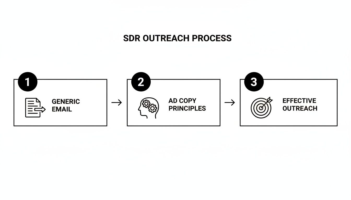
12 Actionable Small Business Growth Strategies for SDR Teams in 2026

· 30 min read

Every small business leader is chasing sustainable growth, but a critical bottleneck often goes unnoticed: the Sales Development Representative (SDR) team. Your SDRs are the engine of your pipeline, yet they spend an astonishing amount of their day on non-selling activities. Hours are lost to manual prospect research, logging calls and emails, and simply trying to figure out which account to prioritize next. This isn't just a minor inefficiency; it's a direct cap on your revenue potential and a primary driver of SDR burnout. When your team is buried in administrative tasks, they have less time for the high-value conversations that actually close deals.

This article provides a playbook to reclaim that lost time and transform your outbound process into a predictable growth machine. We will break down twelve high-impact small business growth strategies specifically designed to eliminate this friction and empower your SDRs. Instead of generic advice, we offer a direct comparison between outdated manual methods and modern, technology-driven workflows that enable reps to execute with precision and speed.

You will learn actionable tactics to automate low-value tasks, prioritize high-intent leads, and scale personalized outreach without overwhelming your team. We'll cover everything from AI-powered personalization and multichannel orchestration to data-driven coaching and intelligent territory design. By implementing these strategies, you can shift your SDRs' focus from busywork to building pipeline, turning your sales development function from a costly operational drag into a powerful and scalable revenue driver. Let's dive in.

1. Strategy #1: Intent-Based Lead Prioritization & Task Automation

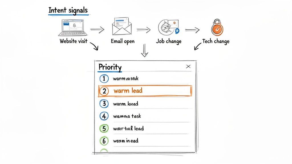
Intent-based lead prioritization is a game-changing small business growth strategy that moves your SDRs away from inefficient "dial-down-the-list" cold calling. Instead of treating all leads as equal, this data-driven approach uses real-time buyer intent signals to automatically prioritize prospects who are actively showing interest, ensuring SDRs spend their time on the warmest, most conversion-ready leads.

The Comparison: A traditional SDR workflow involves working through a static list, where every prospect receives the same effort, regardless of their current buying stage. In contrast, an intent-driven SDR's workflow is dynamic; their task list is automatically re-prioritized daily based on which accounts are actively researching solutions. This shifts the focus from sheer volume of activity to the quality and timeliness of each interaction.

A diagram illustrating intent signals like website visits, email opens, and job changes, which inform lead prioritization.

Why It's a High-Impact Growth Strategy for SDRs

For SDRs, this strategy is revolutionary. It transforms their daily workflow from a high-volume, low-success grind into a strategic, high-impact activity. By automatically surfacing accounts that are actively researching solutions like yours, it increases connect rates, boosts morale, and shortens the sales cycle. Platforms like 6sense and Demandbase pioneered this for large-scale Account-Based Marketing (ABM), while tools like Outreach and Salesloft have integrated intent data directly into sales engagement workflows, making it accessible for teams of all sizes.

Actionable Steps for Implementation:

  • Start Small: Instruct your SDRs to track 2-3 high-value intent signals. A powerful combination is a recent website visit to a pricing page, a job change for a key contact, and engagement with a recent email campaign.
  • Weight Your Signals: Analyze historical conversion data to determine which actions most often lead to a sale. Work with RevOps to weight these signals more heavily in your prioritization model so SDRs see the most valuable leads first.
  • Automate Task Creation: Use your sales engagement platform to automatically create tasks for SDRs when an account hits a specific intent score. For example, a contact from a target account visiting your pricing page could trigger a "High Priority Call" task in the SDR's queue.
  • Review and Recalibrate: This is not a set-it-and-forget-it system. Meet with your SDR team monthly to review which signals are leading to the best conversations and adjust your model's weights accordingly.

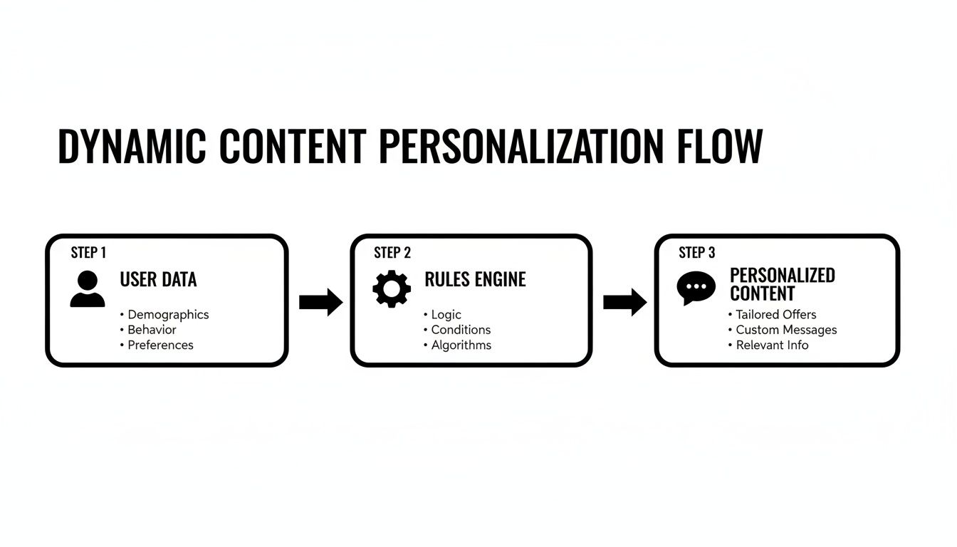
2. AI-Powered Personalized Outreach (Email & Call Prep)

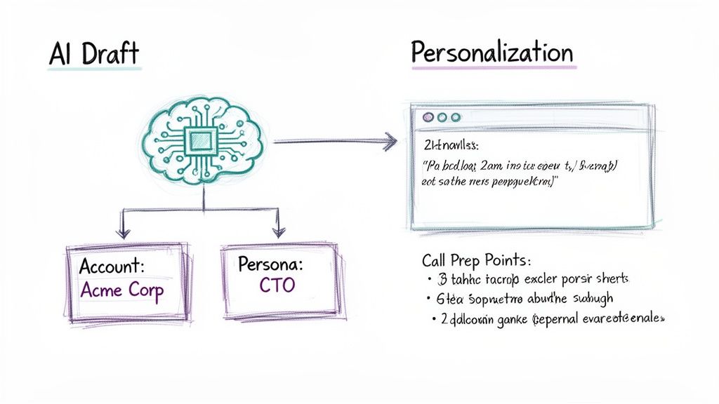
AI-powered personalized outreach is a critical small business growth strategy that dramatically reduces the manual research and writing time for SDRs. This approach uses artificial intelligence to instantly analyze prospect data, company news, and social profiles to generate highly relevant cold emails and call prep notes. It moves SDRs beyond generic templates and enables personalization at a scale previously impossible.

The Comparison: A traditional SDR spends over 30% of their day manually researching each prospect on LinkedIn, company websites, and news articles to find one or two personalization snippets. An AI-equipped SDR, however, can generate a personalized opening line and relevant talking points in seconds. This automation frees up hours each week, allowing SDRs to focus on high-value activities like having conversations and building relationships, rather than being bogged down by research.

AI draft diagram showing a brain generating personalized content based on account and persona data.

Why It's a High-Impact Growth Strategy for SDRs

For SDRs, AI-powered outreach is a force multiplier. It directly addresses their biggest bottleneck: the time-consuming and often unscalable task of personalization. By automating the most tedious parts of their workflow, it empowers them to send more high-quality, personalized messages, leading to significantly higher reply rates and more booked meetings. Platforms like Amplemarket and Persado leverage AI for email copy, while tools like Gong and Outreach use AI to analyze calls and coach reps on what messaging resonates, turning every interaction into a learning opportunity.

Actionable Steps for Implementation:

  • Integrate Fresh Data Sources: Connect your AI tool with reliable, real-time data sources like LinkedIn Sales Navigator, news APIs, and your company CRM. The quality of the AI's output is directly dependent on the quality of its input.
  • Start with AI-Assisted Templates: Instruct your SDRs to start by using AI to enhance existing, proven email templates. Use it to generate personalized opening lines or to suggest relevant P.S. notes based on prospect activity, rather than starting from scratch.
  • Enable Human Review and A/B Testing: Always have an SDR review and approve AI-generated copy before sending. Coach them to continuously A/B test AI-written emails against their own versions to identify what language, tone, and personalization angles perform best.
  • Build a Dynamic Objection Library: Use an AI call recording tool (like Gong) to analyze thousands of sales calls. Automatically identify common objections and transcribe the most effective, real-world responses from your top performers to build a powerful coaching resource for the entire SDR team.

3. Native CRM-Embedded Execution Workflows

Native CRM-embedded execution workflows are a powerful small business growth strategy designed to boost SDR productivity by eliminating context switching. Instead of juggling multiple applications, critical outreach tools like dialers, email clients, and task managers are built directly inside the CRM (like Salesforce or HubSpot). This approach ensures the CRM remains the single source of truth, allowing SDRs to execute their entire workflow without ever leaving a single screen.

The Comparison: The average SDR toggles between 5-8 different applications (CRM, email, dialer, LinkedIn, etc.), wasting time and leading to inaccurate data logging. An SDR using an embedded workflow stays in one system. This centralization means all activity data is captured automatically and accurately within the CRM, creating a clean, reliable dataset for reporting and coaching, which is often compromised when reps have to manually sync data between platforms.

Why It's a High-Impact Growth Strategy for SDRs

For SDRs, this strategy radically simplifies their daily grind and maximizes their "golden hours" of selling. Staying within one system means less friction, faster execution, and more time for meaningful conversations. It transforms the CRM from a passive data repository into an active workspace. Platforms like Outreach and Salesloft have pioneered deep integrations that embed their sales engagement features directly into Salesforce, while HubSpot and Salesforce offer their own native dialer and email tools, creating a seamless, unified environment that accelerates ramp time and drives efficiency.

Actionable Steps for Implementation:

  • Audit Current Workflows: Before implementing, shadow your SDRs for a day. Identify every instance they switch windows and note the associated friction and time lost. This audit will highlight the most impactful workflows to centralize first.
  • Start with a Core Workflow: Begin by integrating one critical function, such as a dialer that automatically logs calls and outcomes in the CRM. Coach SDRs on this new process until it's seamless before expanding to email sequencing or task management.
  • Standardize Disposition Codes: Work with your RevOps team to create a clean, mandatory set of call disposition codes (e.g., "Connected - Meeting Booked," "Left Voicemail"). This ensures all data captured is structured and reportable, making coaching more effective.
  • Train on the "Why": When rolling out the new workflow, focus training on the benefits for the SDR: less administrative work, more accurate data for performance reviews, and faster progression through their task list.

4. Sales Development Team Scaling & Hire-to-Productivity Acceleration

Scaling an SDR team is a pivotal small business growth strategy, but its success hinges on speed-to-productivity. This strategy focuses on building a repeatable system to hire, onboard, and ramp new SDRs to full quota attainment within 30-60 days.

The Comparison: Many businesses use slow, informal "shadowing" for training, where a new hire's success depends on the quality of the senior rep they follow. This leads to inconsistent performance and long ramp times (90+ days). A structured approach, however, uses documented playbooks, clear metrics, and robust coaching frameworks. This systematizes the knowledge transfer from your top performers, ensuring every new SDR gets the same high-quality foundation from day one.

Why It's a High-Impact Growth Strategy for SDRs

For a growing business, a well-oiled SDR machine is the engine of new revenue. This strategy directly impacts pipeline velocity by ensuring new hires contribute to targets faster. It creates a predictable and forecastable model for growth, allowing leadership to confidently invest in sales headcount. For scaling your Sales Development team, consider the advantages of expanding your talent pool; it can be a truly smart business move to hire remote workers from Latam to access a wider range of talent.

Actionable Steps for Implementation:

  • Create a 'First 30 Days' Playbook: Document a week-by-week plan for new SDRs, covering everything from CRM setup to call scripts. Include specific goals, like completing certifications by Day 5 and making the first live calls by Day 10.
  • Build a Call Recording Library: Tag and save call recordings from your top-performing SDRs that demonstrate effective objection handling and value proposition delivery. Make listening to 2-3 of these recordings a daily task for new hires in their first two weeks.
  • Implement Metric-Driven 1:1s: Track leading indicators of success for new SDRs, such as dials, conversations, and meetings booked. Review these metrics weekly to identify coaching opportunities and ensure they are on track to hit their ramp quota.
  • Launch a Peer Mentor Program: Pair every new SDR with a seasoned rep for their first 30 days. This gives them a go-to resource for tactical questions and helps integrate them into the team culture, accelerating their learning curve significantly.

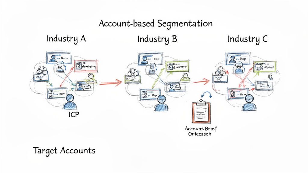
5. Account-Based Outreach & Segmentation Strategy

Account-based outreach is a focused small business growth strategy that flips the traditional sales funnel on its head. Instead of casting a wide net with generic cold outreach, SDRs concentrate their efforts on a curated list of high-value, "best-fit" accounts.

The Comparison: The traditional lead-centric model has SDRs calling individual contacts with little regard for the overall account strategy. In an account-based model, SDRs work to map out the entire buying committee within a target company, tailoring messaging to different roles and pain points. This alignment ensures that every touchpoint, from an SDR's email to a marketing ad, is consistent and relevant, dramatically improving the odds of securing a meeting with the right people.

Diagram illustrating account-based segmentation across three industries (A, B, C) with Ideal Customer Profiles.

Why It's a High-Impact Growth Strategy for SDRs

For SDRs, this strategy replaces high-volume, low-yield activity with strategic, high-impact engagement. It empowers them to become true experts on a smaller set of accounts, leading to more meaningful conversations and higher conversion rates. By focusing on accounts that are pre-qualified as ideal fits, SDRs waste less time on prospects who will never buy. This transforms the SDR role from a simple dialer to a strategic business developer.

Actionable Steps for Implementation:

  • Define Your Ideal Customer Profile (ICP): Work with sales and marketing leadership to create a detailed ICP based on your best current customers. Use firmographic, technographic, and intent data to build this profile.
  • Build Your Target Account List: Start small. Instruct your SDR team to identify their top 25 target accounts that perfectly match the ICP. Assign these accounts exclusively to foster ownership and deep knowledge.
  • Coordinate Multi-Channel Outreach: Align with marketing to ensure your SDRs' target accounts are seeing ads, receiving relevant content, and being engaged on social media while direct outreach is conducted. For more details on this, explore these advanced customer segmentation strategies.
  • Measure Account-Level Metrics: Shift your SDRs' focus from individual activity metrics (like calls made) to account-level engagement metrics (like meetings booked per account or account penetration). Review and refresh the target list quarterly.

6. Sales Enablement & Coaching Leverage at Scale

Sales enablement and coaching leverage is a powerful small business growth strategy that moves managers from inconsistent, one-off feedback to a scalable system for improving SDR performance. It uses tools like call recording and AI-powered transcription to analyze real sales conversations, identify what top performers are doing differently, and systematically transfer those winning playbooks to the entire team.

The Comparison: Traditional coaching relies on random call listening or subjective ride-alongs, which are not scalable and often miss key moments. A modern, data-driven approach provides a complete, searchable library of every prospect interaction. This allows managers to pinpoint specific moments for praise or improvement, making coaching objective, consistent, and highly targeted.

Why It's a High-Impact Growth Strategy for SDRs

For SDRs, this strategy transforms coaching from a subjective review into an objective, data-backed development plan. By analyzing call recordings, managers can identify specific areas for improvement, such as objection handling, talk-to-listen ratios, or value proposition delivery. This creates a continuous feedback loop that accelerates ramp time for new hires and elevates the performance of the entire team. For further insights into empowering your sales team, explore these actionable sales enablement best practices for building a high-performing culture.

Actionable Steps for Implementation:

  • Start with Trust: Position call recording as a performance improvement tool for SDRs, not a surveillance tactic. Begin with opt-in participation from a few reps to build trust and demonstrate value.
  • Build a Playbook Library: Use AI tagging to identify and save call snippets where SDRs successfully handle objections or book meetings. Organize these into a "greatest hits" library for training new hires.
  • Create a 'Lost Call' Library: Similarly, tag and analyze calls where meetings were not booked. Use these examples to build countermeasures and practice new talk tracks as a team, turning losses into learning opportunities.
  • Host Weekly Coaching Sessions: Dedicate time each week to review anonymized call snippets with the SDR team. Focus on one specific skill per session (e.g., handling the "we're not interested" objection) to provide focused, actionable feedback.

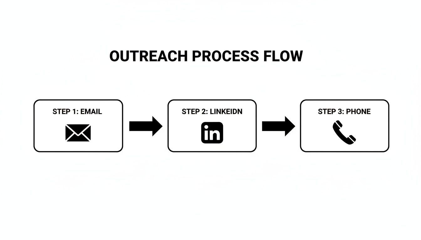
7. Multichannel Outreach Orchestration (Email + Call + LinkedIn + SMS)

Multichannel outreach orchestration is a systematic growth strategy that coordinates communication across multiple platforms like email, phone, LinkedIn, and SMS. Instead of relying on a single channel, SDRs engage prospects through a pre-defined sequence of touches, meeting buyers on the channels they frequent most.

The Comparison: Traditional, siloed outreach has an SDR send five emails and then give up, never trying another channel. A modern, orchestrated approach uses a sequence like an initial email, a LinkedIn connection request the next day, and a follow-up call two days later. This creates a cohesive brand presence and acknowledges that a prospect might ignore an email but respond to a LinkedIn message, making outreach more resilient and effective.

Why It's a High-Impact Growth Strategy for SDRs

For SDRs, multichannel orchestration is a force multiplier. It dramatically increases connect and response rates by breaking through the noise of any single channel. Instead of being one of 200 emails in an inbox, an SDR's name becomes familiar through a LinkedIn view, a thoughtful comment, and a relevant voicemail. This boosts the likelihood of a positive response and helps build rapport before the first live conversation. Platforms like Outreach, Salesloft, and Apollo.io have built their businesses on this principle, enabling SDRs to execute complex, personalized sequences at scale.

Actionable Steps for Implementation:

  • Design a 3-Channel Cadence: Instruct your SDRs to start with a simple sequence involving email, phone calls, and LinkedIn. For example: Day 1 (Email), Day 2 (LinkedIn Connection Request), Day 4 (Call + Voicemail), Day 6 (Follow-up Email).
  • Space Your Touches: Coach your team to avoid overwhelming prospects. Leave 2-3 business days between touches on different channels to appear persistent, not pushy.
  • Personalize Your "Steps": For high-value accounts, require SDRs to customize steps within the sequence. Instead of a generic LinkedIn connection, they should reference a recent post or shared connection to increase acceptance rates.
  • Track Channel Effectiveness: Work with your team to monitor which channels generate the most responses. If you notice your target audience is highly active on LinkedIn, re-weight your cadences to include more steps on that platform.

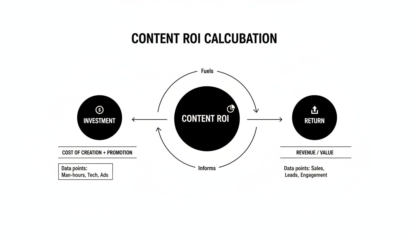
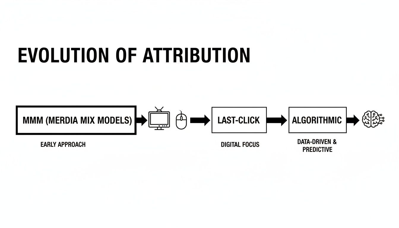
8. Data-Driven Activity Metrics & Pipeline Attribution

Data-driven activity metrics and pipeline attribution is a critical small business growth strategy that moves sales development beyond simple volume tracking (like calls made) to understanding true performance and ROI. It involves systematically tracking SDR activities and then connecting that effort directly to pipeline created and deals closed.

The Comparison: Traditional SDR management often focuses on top-of-funnel metrics in isolation (e.g., "make 50 calls a day"). This can lead to reps optimizing for the wrong behavior. A data-driven approach links activity to revenue outcomes, answering the crucial question: "What specific activities from our SDR team are generating the most valuable opportunities?" A rep making 30 highly targeted calls might be more valuable than one making 60 generic ones.

Why It's a High-Impact Growth Strategy for SDRs

For SDRs, this strategy transforms performance management from a subjective process into an objective, data-backed one. It empowers them with real-time visual dashboards showing exactly how their efforts contribute to sales, fostering a sense of ownership and motivation. Instead of being judged on raw call volume, they are measured on impact. Platforms like Outreach and Gong have revolutionized this by providing built-in dashboards that correlate call data with successful outcomes.

Actionable Steps for Implementation:

  • Enforce Logging Discipline: Before you can trust the data, you must capture it. Mandate that all SDR activities are logged consistently in your CRM or sales engagement platform.
  • Track Leading and Lagging Indicators: Coach your SDRs to monitor their own leading indicators (daily activities like calls and emails) to manage effort, and lagging indicators (meetings booked, pipeline generated) to measure results.
  • Give Reps Real-Time Dashboards: Provide each SDR with a personal dashboard showing their key metrics against team goals. This promotes self-management and healthy competition.
  • Connect Activity to Revenue: Use your CRM's reporting tools to build attribution reports. For a deeper understanding of how multiple touchpoints contribute to a sale, explore advanced techniques discussed in our guide to multi-touch attribution models.
  • Use Data for Coaching: In 1:1s, review SDR metrics to identify specific areas for improvement. A high call volume with a low connect rate might indicate a need for coaching on call times or list quality, not just a need to "make more calls."

9. Inbound + Outbound Alignment (SDR/Marketing/Sales Coordination)

Inbound and outbound alignment is a powerful small business growth strategy that breaks down the silos between Marketing, SDRs, and Account Executives. Instead of operating as separate engines, this unified approach ensures that marketing campaigns directly fuel outbound efforts, inbound leads are routed to SDRs instantly, and all teams share intelligence to create a consistent buyer experience.

The Comparison: In a siloed organization, Marketing "throws leads over the wall" to the SDR team, with little context or coordination. An aligned team operates with a feedback loop: SDR insights from outbound calls inform marketing messaging, and marketing's campaigns warm up cold accounts for SDR outreach. The result is a highly efficient revenue engine where no lead is wasted and no prospect receives mixed signals.

Why It's a High-Impact Growth Strategy for SDRs

For SDRs, this alignment is transformative. It means they no longer waste time on ice-cold outreach to accounts that have never heard of their company. Instead, their outbound prospecting is amplified by marketing's efforts, leading to higher connect rates and more meaningful conversations. Simultaneously, it guarantees that valuable, time-sensitive inbound leads are acted upon immediately, maximizing the chances of conversion for the SDR.

Actionable Steps for Implementation:

  • Create a Lead Quality Agreement: Marketing and SDR leaders must formally agree on the definition of a Marketing Qualified Lead (MQL). This document should outline the specific criteria that make a lead ready for SDR follow-up.
  • Implement Speed-to-Lead Rules: Use your CRM to create automation rules that route new inbound leads to the appropriate SDR in under 15 minutes. This is a critical KPI for SDRs working inbound leads.
  • Maintain a Shared Campaign Calendar: Give your SDR team access to a shared calendar where marketing logs all upcoming webinars, content launches, and ad campaigns. SDRs can use this to time their outbound sequences for maximum relevance.
  • Hold a Weekly 10-Minute Sync: Host a brief, standing meeting between Marketing and SDR leads. The only agenda items should be: "What's working?", "What's not working?", and "What are we doing next week?".

10. Territory Design & Account Assignment Strategy

A well-defined territory design is a foundational small business growth strategy that moves SDRs from a chaotic free-for-all to a focused, efficient go-to-market motion. Instead of letting reps chase the same high-profile accounts or neglect entire market segments, this approach systematically carves up the total addressable market (TAM) into equitable territories.

The Comparison: Without territories, SDRs often operate in a "Wild West" environment, leading to duplicate outreach, internal conflict, and missed opportunities. A strategic territory plan provides each SDR with a clear, manageable "book of business" to own and develop. It’s the operational backbone that supports scalable growth, enabling SDRs to build deep expertise within their assigned patch. It’s the difference between targeted prospecting and simply hoping for the best.

Why It's a High-Impact Growth Strategy for SDRs

For SDRs, clear territory rules are a game-changer. It provides them with ownership and focus, allowing them to become true experts in their assigned segment. This specialization leads to more relevant messaging, deeper industry knowledge, and stronger relationships. It also creates a fair and balanced system for lead distribution, which directly impacts morale and motivation. This clarity removes friction and allows SDRs to concentrate fully on execution.

Actionable Steps for Implementation:

  • Segment Your Market: Use firmographic and technographic data to divide your TAM. A common starting point is segmenting by company size (SMB, Mid-Market, Enterprise) and then by geography or industry within those segments.
  • Balance Workload Equitably: Don't just divide the number of accounts evenly. Model potential revenue and account complexity to create territories with similar quota attainment potential. Ensure each SDR has a fair shot at success.
  • Automate Assignment Rules: Use your CRM to create lead routing rules that automatically assign new accounts to the correct SDR territory owner. This eliminates manual work and ensures rapid follow-up.
  • Establish Clear Rules of Engagement: Define what happens when an account moves between segments or when a rep leaves. Create a transparent policy for account ownership to prevent disputes and keep your SDRs focused on selling.

11. Compliance, Privacy & Data Quality Considerations

While not a direct outreach tactic, establishing a robust framework for compliance, privacy, and data quality is a foundational growth strategy. It protects your business from legal risks and ensures that your SDRs are working with accurate, reliable data, which directly impacts the effectiveness of every other strategy.

The Comparison: A reactive approach to data waits for problems to arise—bounced emails, stale contacts, or legal complaints. A proactive approach integrates data governance directly into sales operations. It prevents the accumulation of duplicate or inaccurate contact information that wastes SDR time and ruins personalization efforts, ensuring the foundation of all outreach is solid.

Why It's a High-Impact Growth Strategy for SDRs

For SDRs, high-quality, compliant data is the fuel for their engine. It means fewer bounced emails, fewer wrong numbers, and more confidence that the person they are contacting has a legitimate interest. This eliminates wasted cycles on dead-end leads and protects the SDR from personal liability in certain jurisdictions. It empowers reps to engage prospects effectively and ethically, leading to better conversations and higher conversion rates.

Actionable Steps for Implementation:

  • Centralize Suppression Lists: Create a master suppression or "do not contact" list that is automatically respected by all outreach channels. This is a critical safeguard for every SDR.
  • Automate Data Hygiene: Implement automated CRM rules or use a data enrichment service to periodically deduplicate contacts and verify email addresses. This saves SDRs countless hours of manual data cleaning.
  • Build Consent into Workflows: Ensure that lead capture forms and data import processes include clear consent mechanisms. Train SDRs to tag these contacts appropriately in your CRM.
  • Consult Legal Early: Before launching a new outreach channel, especially SMS or automated dialing, partner with legal counsel to review your proposed cadence and ensure it complies with all relevant regulations like TCPA.

12. Strategy #12: Solidify Technology & Integration Requirements

A powerful growth engine requires a well-oiled technical foundation. For SDRs, this means ensuring the systems that feed them leads and insights are seamlessly integrated and reliable. This strategic focus involves defining technical prerequisites for your entire GTM tech stack, including CRM integrations, bidirectional data syncs, and the ingestion of buyer intent signals.

The Comparison: Many teams simply buy software and hope it works, leading to data lags, sync errors, and system downtime that frustrates SDRs. A strategic approach architects a resilient ecosystem where data flows freely and accurately between platforms. This backend work is one of the most crucial yet overlooked small business growth strategies.

Why It's a High-Impact Growth Strategy for SDRs

For SDRs, solid technical integration is the difference between a high-performance workflow and a day spent fighting bad data. When systems are integrated correctly, SDRs can trust the information in front of them. High-priority lead alerts are delivered in near-real-time, and they don't have to waste time manually correcting data or switching between ten different browser tabs. This reliability allows them to focus 100% of their energy on high-value outreach activities, directly boosting productivity.

Actionable Steps for Implementation:

  • Define Integration SLAs: Before implementing any new tool, establish a Service Level Agreement (SLA) with the vendor. This should define acceptable data lag, error rates, and uptime, ensuring the tool reliably supports your SDRs.
  • Normalize Your Data: Implement a middleware or data normalization layer to standardize data from various sources before it enters your CRM. This ensures the data SDRs see is consistent and trustworthy.
  • Involve RevOps Early: Keep your Revenue Operations (RevOps) team closely involved in any new tool rollout. They are essential for testing at scale and ensuring data integrity for the SDR team.
  • Document and Version Mappings: Create clear documentation for all data mappings between systems. This "source of truth" helps SDRs understand where their data comes from and helps IT troubleshoot issues faster.

12-Point Small Business Growth Strategy Comparison

ItemImplementation Complexity 🔄Resource Requirements 💡Expected Outcomes ⭐📊Ideal Use Cases 💡Key Advantages ⚡
Intent-Based Lead Prioritization & Task AutomationMedium–High: integrations + signal weighting; revops involvementIntent feeds, scoring engine, CRM sync, ongoing tuning⭐⭐⭐⭐⭐ · ↑Connects 20–40%; faster time-to-first-touch; prioritized pipelineSDR inbox prioritization; ABM day-to-day execution; high-volume outbound⚡ Work warm leads first; scalable outbound; manager visibility
AI-Powered Personalized Outreach (Email & Call Prep)Medium: prompt engineering + data freshness controlsClean account data, AI models/APIs, review workflows⭐⭐⭐⭐ · ↓Prep time 60–75%; higher open/reply rates; faster rampScalable personalization; fast SDR ramp; high-volume email/call programs⚡ Rapid personalized content; consistent messaging; improved call quality
Native CRM-Embedded Execution WorkflowsHigh: deep Salesforce/HubSpot API work; RevOps coordinationEngineering for native integrations; maintenance; change control⭐⭐⭐⭐ · ↑CRM data quality 40–60%; reduced context switching; faster adoptionTeams wanting single-source workflow; dual-CRM environments⚡ Stay-in-CRM execution; automatic logging; better coaching data
Sales Development Team Scaling & Hire-to-Productivity AccelerationMedium: playbooks + enablement systems; change mgmtTraining content, coaching library, AI tooling, manager time⭐⭐⭐⭐ · 50% productivity in 4–6 weeks; consistent onboarding outcomesRapid SDR hiring; startups scaling SDR headcount⚡ Faster ramp; repeatable onboarding; improved retention
Account-Based Outreach & Segmentation StrategyMedium: ICP definition + coordination overheadICP modeling, account lists, marketing alignment, intent data⭐⭐⭐⭐ · Higher conversion and deal sizes; clearer account metricsEnterprise/strategic accounts; cross-functional campaigns⚡ Focus on high-fit accounts; deeper personalization; sales/marketing alignment
Sales Enablement & Coaching Leverage at ScaleMedium: tooling + culture change; privacy considerationsCall recording, AI transcription/tagging, coaching workflows⭐⭐⭐⭐ · Faster rep improvement; scalable best-practice rolloutTeams focused on quality improvement and manager-driven coaching⚡ Data-driven coaching; scalable knowledge transfer; objective QA
Multichannel Outreach Orchestration (Email + Call + LinkedIn + SMS)Medium–High: cadence logic + compliance rulesIntegrations (LinkedIn, SMS, email, dialer), compliance tooling⭐⭐⭐⭐ · Higher connect/conversion; better channel match; multi-touch liftComplex sequences for varied personas; high-engagement segments⚡ Improved reach and response; channel optimization; reduced no-shows
Data-Driven Activity Metrics & Pipeline AttributionMedium: requires reliable logging and dashboardsCRM logging discipline, BI/reporting, attribution models⭐⭐⭐⭐ · Predictable forecasting; targeted coaching; clear ROI by activityOperations-driven teams needing measurable SDR impact⚡ Objective performance insights; data-backed hiring and coaching
Inbound + Outbound Alignment (SDR/Marketing/Sales Coordination)Medium: process + routing rules; frequent syncsShared lists, routing automation, campaign calendar⭐⭐⭐⭐ · Faster inbound response; fewer duplicate touches; consistent messagingOrganizations combining inbound leads with outbound motions⚡ Better lead handling; consistent cross-team messaging; clear attribution
Territory Design & Account Assignment StrategyMedium: segmentation + quota modeling; political sensitivityICP/intent data, quota models, RevOps support⭐⭐⭐ · Focused ownership; predictable hiring plans; fairer quotasCompanies scaling coverage and specialization (vertical/geography)⚡ Clear ownership; reduced internal conflict; predictable capacity planning
Compliance, Privacy & Data Quality ConsiderationsMedium–High: ongoing legal & engineering effortConsent management, audit logs, suppression lists, data ops⭐⭐⭐ · Reduced legal risk; better deliverability; cleaner dataAny multichannel outreach; regulated markets (EU/US/phone/SMS)⚡ Risk mitigation; higher deliverability; auditability
Technology & Integration RequirementsHigh: middleware, bidirectional syncs, monitoringEngineering, RevOps, middleware, real-time ingestion pipelines⭐⭐⭐ · Enables real-time prioritization; reliable data flows when done wellOrganizations integrating many vendors and dual-CRM setups⚡ Centralized signals; resilient integrations; reduced manual work
Free Tool

Try our Marketing Plan Generator — generate a complete AI-powered marketing plan in minutes. No signup required.

Turn Your SDR Team Into a Growth Engine, Not a Cost Center

We've explored twelve high-impact small business growth strategies, each designed to transform your SDR team from a high-effort cost center into a predictable, highly efficient growth engine. The common thread weaving through every strategy is the shift away from manual, repetitive tasks and toward intelligent, data-driven execution. Sustainable growth is not born from simply demanding longer hours; it's the result of empowering your SDRs with the right focus, tools, and insights at the exact moment they need them.

This journey from manual chaos to strategic execution is the single most important transition a scaling sales team can make. It's the difference between reps spending their days buried in CRM admin and reps spending their time building relationships and generating qualified pipeline. By embracing these principles, you are not just optimizing a process; you are fundamentally changing the DNA of your sales organization.

From Strategy to Execution: Your Actionable Roadmap

The strategies outlined in this article are a practical blueprint for building a high-performance sales development function. Your immediate next steps should be to assess where the most significant friction exists in your current SDR workflow.

Is it in lead prioritization? If your SDRs waste hours sifting through low-quality leads, the problem can be directly solved by Intent-Based Lead Prioritization (Strategy #1) and intelligent Territory Design (Strategy #10).

Is it in outreach quality and efficiency? If your SDRs struggle to personalize at scale, this challenge is addressed by leveraging AI-Powered Personalized Outreach (Strategy #2) and orchestrating follow-ups with a Multichannel Strategy (Strategy #7).

Or is the problem rooted in your tech stack? If SDRs are constantly switching between tabs and manually logging activities, it's time to implement Native CRM-Embedded Execution Workflows (Strategy #3) to keep them focused and productive in their primary workspace.

The True Measure of an Elite SDR Program

Ultimately, an elite SDR program is defined by its predictability and scalability. It’s about more than hitting quota this month; it’s about building a system that can consistently generate pipeline and onboard new reps efficiently. This is where Data-Driven Activity Metrics (Strategy #8) and streamlined Sales Development Team Scaling (Strategy #4) become critical. You need clear visibility into what’s working and a repeatable process to turn new hires into productive team members quickly.

Mastering these small business growth strategies means you stop guessing and start engineering your success. It means every action an SDR takes is purposeful, every piece of technology serves to accelerate their workflow, and every conversation they start is more likely to convert into real revenue. This strategic alignment across your people, processes, and technology is the foundation upon which lasting business growth is built, turning your sales development team into the powerful, consistent engine it was always meant to be.


Ready to stop managing tasks and start driving revenue? See how marketbetter.ai embeds these powerful small business growth strategies directly into your CRM, helping your SDRs execute faster and smarter. Discover the all-in-one execution platform at marketbetter.ai and turn your sales team into an unstoppable growth engine.

How to Write Ad Copy That Closes Deals for SDRs

· 23 min read

Think ad copy is just for the marketing team? Think again.

For a modern Sales Development Representative (SDR), knowing how to write like an expert copywriter is no longer a soft skill—it's a critical tool for hitting quota. It directly translates to more replies, better conversations, and, most importantly, more meetings booked. The same principles that make a LinkedIn ad stop a CEO mid-scroll are the exact same ones that will make your cold email cut through an executive's inbox noise.

In a world of overflowing inboxes, your prospect makes a snap judgment in seconds. Generic, self-centered outreach gets deleted instantly. This is where an SDR who thinks like a copywriter has a massive, unfair advantage over the rep still using templates from 2018.

From Generic Outreach to Compelling Copy

Let's compare two real-world approaches. A standard SDR message is almost always about the sender's company and its product features. It’s lazy, and it doesn't work.

  • Standard SDR Approach (Generic & Ineffective): "Hi [Prospect], I'm with MarketBetter. We have an AI-powered dialer that integrates with Salesforce. I'd love to schedule a demo to show you how it works."

This message is all "we, we, we." It forces the prospect to do the hard work of connecting your features to their problems—and they won't. This is why you get ghosted.

Now, let's rewrite it using a copywriter's mindset, focusing on the prospect's world.

  • Copy-Infused SDR Approach (Actionable & Relevant): "Hi [Prospect], saw your team is hiring three new SDRs. Getting them ramped while hitting quota is tough. Our clients use our AI-assisted workflow inside Salesforce to cut new hire ramp time by 40%. Interested in how?"

See the difference? The second version is a targeted solution. It starts with an observation about their situation (hiring), identifies a specific pain point (slow ramp time), and offers a clear, quantifiable outcome (40% faster ramp time). It grabs attention by making it about them. This is the heart of effective sales enablement best practices that actually connect with buyers.

The Commercial Value of Great Copy

This skill isn't just a "nice-to-have"; it's a high-value discipline with real economic weight behind it. The global copywriting market was valued at a staggering $25.29 billion in 2023 and is only projected to grow.

North America completely dominates this market. That means the performance-driven best practices we're talking about—concise benefit statements, clear calls to action, and a relentless focus on the customer—are forged in the most competitive attention economy on the planet.

Actionable Takeaway for SDRs: By mastering these techniques, you’re not just sending better emails; you’re adopting a proven, multi-billion dollar framework for persuasion. You learn to speak your prospect's language, making your message resonate on a level that generic templates simply can't touch. This shift in mindset is what separates top-performing SDRs from the rest of the pack.

Mastering Your Audience Before You Write

The best SDRs know a secret: killer copy isn't born from a blank page. It’s forged in the prep work you do before a single word gets written. If you want your outreach to actually connect, you have to start with deep customer insight, not just a list of your product’s features.

This is where you stop thinking in terms of generic job titles and start building a hyper-specific Ideal Customer Profile (ICP) for each campaign. Forget "VPs of Sales." Get granular. What are their daily headaches? What exact metric are they on the hook for this quarter? What’s the specific jargon they use with their own team?

This single shift transforms your outreach from a shot in the dark into a precision-guided solution.

Building Your Hyper-Specific ICP

Generic ICPs lead to generic, ignorable outreach. Simple as that. To cut through the inbox noise, you need to think less like a marketer and more like a novelist creating a character. Give your ICP a name, a role, and a set of real-world problems.

What does this actually look like? Let’s compare two ways an SDR might target a sales leader.

  • The Generic Way (Leads to Ignored Emails): VP of Sales at a mid-market SaaS company.
  • The Hyper-Specific Way (Leads to Meetings): "Dana," a newly promoted VP of Sales at a 200-person B2B SaaS firm. Dana is under immense pressure to boost outbound pipeline by 30% this quarter. The problem? Inconsistent CRM hygiene from her junior SDRs is killing her forecasting. She’s constantly complaining about "garbage in, garbage out" reporting.

See the difference? The second profile is a goldmine. You know Dana's core pain point (messy CRM data), her primary goal (30% pipeline growth), and the exact language she uses ("garbage in, garbage out"). This is the raw material for copy that feels like it was written just for her. Before you can write for your audience, you first need to learn how to create impactful B2B buyer personas that feel this real.

Connecting Your ICP to a Single, Compelling Offer

Once you’ve nailed your hyper-specific ICP, your next move is to connect their biggest problem to one irresistible offer. Most SDRs mess this up by leading with their product. Newsflash: your prospect doesn’t care about your tool; they care about their problems.

Your offer isn’t "a demo of our software." It’s the solution to their most urgent issue.

Actionable Takeaway for SDRs: Your offer is the tangible outcome you promise in exchange for their time. Frame it as the direct antidote to their pain. This shifts the conversation from what you're selling to what they're gaining.

Instead of just listing features, you need to frame your offer as a direct solution. Digging into different customer segmentation strategies can help you master aligning the perfect offer with the right audience segment.

Here's a quick look at how this changes the game for your outreach.

SDR Outreach Before vs After Ad Copy Principles

This table breaks down how a typical, feature-first SDR email compares to one infused with the ad copy principles we're talking about. The difference is night and day.

ElementGeneric SDR Outreach (Before)Ad Copy-Infused Outreach (After)
Offer Focus"Want to see a demo of our AI dialer?""Interested in how VPs like you are cutting new hire ramp time by 40%?"
Resource Hook"Check out our new whitepaper.""I have a one-page report on fixing messy CRM data. Mind if I send it over?"
Meeting CTA"Are you free for a call next week?""Got 15 minutes to map out a plan for hitting your Q3 pipeline goal?"

The "After" column works because every offer is a direct response to a specific pain point discovered during your ICP research. This isn't just better messaging—it's a fundamentally different approach.

When you nail this foundation, every headline, bullet point, and call to action you write will be perfectly tuned to resonate, making a reply feel like the only logical next step.

The diagram below shows exactly how this strategic thinking transforms generic emails into outreach that actually starts conversations.

Diagram illustrating the SDR outreach process, moving from generic email to effective outreach using ad copy principles.

This is the bridge between just sending messages and actually booking qualified meetings. It all starts with knowing your audience inside and out.

Crafting Hooks That Earn the Next Sentence

Let's be honest: your prospect's inbox is a warzone. Everyone wants their attention, and your opening line is the only weapon you have to win that first, critical skirmish. For an SDR, that hook isn't just a sentence—it's the gatekeeper that decides whether your message gets read or instantly trashed.

Think about it. The average professional gets slammed with over 120 emails per day. Your hook has to do more than just introduce a topic. It needs to land with enough urgency, curiosity, or value to stop them dead in their tracks. It has to earn you their next 30 seconds.

A hand-drawn sketch of an email inbox, highlighting a subject line 'Cut your reporting time in half next week' with a star and a 'Hook' label.

This is where great SDRs steal directly from the playbooks of top advertisers. A killer ad headline and a killer email subject line are cut from the same cloth. They both make an irresistible promise to the right person at exactly the right time.

Proven Hook Formulas for SDR Outreach

You don't need to reinvent the wheel every time you kick off a new cadence. The best copywriters lean on proven formulas that tap into basic human psychology. Here are a few you can adapt for your outreach right now.

  • The Benefit + Timeframe Hook: This one is a workhorse. It’s powerful because it combines a result they want with a specific, tangible timeline. It feels real and immediately valuable.

    • Email Subject Line: "Cut your reporting time in half by next week?"
    • LinkedIn Opener: "Hey [Name], your post on forecasting sparked a thought. What if your team could get cleaner CRM data in just one sprint?"
  • The Intrigue Hook: This approach weaponizes curiosity. You hint at valuable intel that their competitors might have, creating an urgent need to close that information gap.

    • Email Subject Line: "The one mistake your competitors are making with [Their Industry Challenge]"
    • LinkedIn Opener: "Saw you’re scaling the sales team. There’s a common hiring pitfall I’m seeing at other [Industry] companies—mind if I share?"

Actionable Takeaway for SDRs: The goal of the hook isn't to sell your product. It's to sell the next sentence. Your only job is to create enough momentum to get them to open the message and read past that first line.

Comparing Standard vs Hook-Driven Openers

Let's compare a standard SDR opener—usually polite but completely forgettable—with a hook-driven opener that is sharp, personalized, and almost impossible to ignore.

Outreach TypeStandard Opener (Gets Deleted)Hook-Driven Opener (Gets a Reply)
Email SubjectQuick Question[Prospect's Competitor] mentioned your name
LinkedIn InMailHope you're having a great week!Your recent post on pipeline goals is exactly why I'm reaching out.
Cold Call Intro"Hi, this is [Name] from [Company]...""Hi [Name], I saw your company just raised a Series B—congrats. Scaling the SDR team is likely top of mind."

The hook-driven examples just hit different. Why? Because they’re rooted in the prospect's world—their competitors, their recent activity, their company's big wins. This immediately signals that you've done your homework and your message isn't just another automated blast. If you really want to see these principles in action, studying viral ad copy examples is a masterclass in itself.

At the end of the day, learning how to write ad copy as an SDR is all about becoming an expert in crafting these powerful opening moments. Get the hook right, and you've already won the most important part of the battle.

Building Your Case with Proven Copywriting Formulas

A great hook earns you their attention for a few seconds. A solid structure is what guides them all the way to a "yes."

Once you've hooked them, you can't just throw a list of features at them and hope something sticks. This is the moment to build a logical, persuasive case using the same proven copywriting formulas that drive millions in ad spend.

These aren't abstract marketing theories; they're battle-tested blueprints for structuring a message. They turn a jumble of benefits and pain points into a compelling narrative that makes your solution feel like the only logical next step.

For SDRs in the trenches, two formulas stand out for their raw effectiveness: PAS (Problem-Agitate-Solve) and AIDA (Attention-Interest-Desire-Action).

PAS: The Direct Hit on Pain Points

The PAS formula is arguably the most powerful framework for cold outreach. It’s direct, empathetic, and perfectly suited for the short, punchy nature of a cold email or LinkedIn message. It works because it zeroes in on a problem you know your prospect is wrestling with.

Here’s the breakdown:

  1. Problem: State their problem clearly. Show you get their world.
  2. Agitate: Pour a little salt in the wound. Describe why that problem is so frustrating, costly, or time-consuming. This is the crucial step—it connects the problem to a real, emotional consequence.
  3. Solve: Introduce your solution as the direct, obvious fix for that agitated pain.

Let’s apply this to a 100-word cold email targeting a sales leader who can't get their team to use the CRM properly.

  • (Problem) Getting new SDRs to consistently log activity in Salesforce is a constant battle.
  • (Agitate) This leads to messy pipelines and forecasts you can't trust, forcing you to chase reps for updates right before every leadership meeting.
  • (Solve) Our tool, marketbetter.ai, automates call and email logging directly within Salesforce. Reps stay in their workflow, and you get clean data, instantly. Interested in seeing how?

This email just works. It follows a logical path from a known frustration to a clear resolution. That "Agitate" step is what makes it hit home—it’s not just about a problem, it’s about the headache that problem causes.

AIDA: Building Momentum Toward Action

While PAS is a surgical strike on pain, AIDA is more of a guided journey. It’s fantastic for building on an initial spark of curiosity and turning it into a genuine motivation to act. This formula is your go-to for slightly warmer outreach or when your solution's value needs a little more storytelling.

The AIDA model unfolds like this:

  1. Attention: Grab them with that killer hook we talked about.
  2. Interest: Hold their focus by sharing a fascinating fact or highlighting a highly relevant challenge.
  3. Desire: Now, you paint a picture. Help them visualize a better future where their problem is gone and they're hitting their goals.
  4. Action: Give them a clear, low-friction next step.

Here’s how AIDA could frame a message about slashing SDR ramp time.

  • (Attention) Subject: The 40% faster ramp time question
  • (Interest) Getting a new SDR team to full productivity in under six months is a huge challenge for most sales leaders.
  • (Desire) Imagine if your next hiring class was pipeline-positive in their first quarter, fully equipped with the right messaging and workflows from day one, giving you predictable growth.
  • (Action) Do you have 15 minutes next week to see how VPs at companies like [Competitor] are making that happen?

AIDA works by building emotional momentum. It shifts the prospect's mindset from "What is this?" to "What if I could have that?" This is pure persuasion.

Comparing PAS and AIDA for Real-World Scenarios

So, which one do you use? It completely depends on your audience and the context. One isn't "better," but one will almost always be a better fit for the job at hand. This is how top SDRs choose their weapon.

ScenarioBest FormulaWhy It Works for an SDR
Hyper-Targeted Cold OutreachPAS (Problem-Agitate-Solve)When you've found a specific, high-priority pain point, PAS lets you hit it directly and immediately. It’s efficient and proves you’ve done your homework.
Follow-Up After an Event/WebinarAIDA (Attention-Interest-Desire-Action)You already have their attention. AIDA builds on that initial interest, creates desire for an outcome tied to the event's topic, and drives a relevant action.
When the Pain is ObviousPAS (Problem-Agitate-Solve)Selling a solution to a universal, frustrating problem (like bad data quality)? PAS is the most direct route to showing you have the cure.
Introducing a New ConceptAIDA (Attention-Interest-Desire-Action)If your solution is novel or requires a slight shift in thinking, AIDA gives you the runway to build interest and desire before asking for anything.

Mastering both of these classic structures gives you a versatile toolkit. You'll stop writing random collections of sentences and start crafting carefully constructed arguments designed to get one thing: a response.

Writing Calls to Action That Actually Get a Reply

You've nailed the hook and built a solid case, but it all means nothing if your last sentence is a weak, passive call to action (CTA). For any SDR, the CTA isn't just the end of the message; it's the entire point. A brilliant message that fizzles out with a vague "Let me know if you want to chat" is dead on arrival.

The goal here is to stop making passive suggestions and start writing clear, low-friction CTAs that make responding an easy decision. When a prospect reads your ask, they're doing a quick mental calculation: is the value I'm getting worth the effort it'll take?

Your job is to make that a no-brainer.

Two demo options comparing high versus low friction: 'Book 30-min demo' (high) versus 'See 2-min demo?' (low).

High Friction vs. Low Friction Asks

The single biggest mistake SDRs make is asking for way too much, way too soon. A high-friction CTA demands a serious commitment of time and energy, whereas a low-friction CTA makes saying "yes" almost effortless. The difference in reply rates is staggering.

Let's compare them side-by-side.

CTA TypeExampleProspect's Mental Burden
High Friction"Book a 30-minute demo on my calendar.""I have to find a time, commit half an hour, and sit through a sales pitch."
Low Friction"Interested in seeing how we solve X?""All I have to do is reply 'yes' to show interest."

The low-friction CTA wins every time in cold outreach because it demands next to nothing. It's a simple question that opens the door for a conversation without forcing them to open their calendar. Your first mission is just to get a reply, and a tiny ask is the surest way to get one.

Actionable Takeaway for SDRs: A great CTA matches the size of the request to the level of trust you've earned. For a cold prospect, that trust level is zero. Start small to build momentum.

Matching Your CTA to the Outreach Stage

Not all CTAs are created equal. The right one depends entirely on your goal and where that person is in their journey. Instead of relying on one generic closing line, you need a toolkit of options ready for different scenarios.

Here are two essential types every SDR should master.

  • Interest-Based CTAs: These are your go-to for that first cold touchpoint. The goal isn't to book a meeting; it's simply to confirm they have a problem you can solve or validate their interest. They're low-pressure and keep the focus on providing value upfront.

    • "Mind if I send over a one-pager on how we helped [Competitor] solve this?"
    • "Worth a look, or is this not a priority right now?"
    • "Is fixing messy CRM data something on your radar this quarter?"
  • Time-Based CTAs: Pull these out only after you've established some level of interest. They propose a specific, small time commitment to take the next logical step—and I mean small.

    • "Do you have 15 minutes to review this on Tuesday?"
    • "Happy to walk you through it for 5 minutes if that's easier."

When you align your ask with the prospect’s mindset, you radically increase the odds of getting that reply. But remember, the CTA is just one piece of the puzzle. For more tips on getting that initial engagement, check out our guide on how to improve email open rates. When you apply ad copy principles to your entire message—from subject line to signature—you create a cohesive and compelling reason for them to act.

How to Measure and Optimize Your Ad Copy

Great copy isn't written on gut feelings alone. It's forged in data.

Think of every cold email sequence you send as a mini-experiment. Every open, click, and reply—or lack thereof—is pure, unfiltered feedback from your market. Adopting a performance marketer's mindset means you stop throwing spaghetti at the wall and start building a repeatable process for what actually works to book meetings.

The good news? You don't need a complex analytics suite to get started. The most important metrics are already sitting right there in your outreach tool or CRM. This is how you turn your outreach from a game of chance into a predictable system for hitting your number.

The Only Metrics That Really Matter for SDRs

As an SDR, your goal isn't just to get clicks; it's to start conversations that lead to revenue. It's easy to get lost in vanity metrics, so let's cut through the noise and focus on what directly impacts your pipeline.

These four metrics tell the complete story of your copy's performance:

  • Open Rate: This is your subject line's report card. Plain and simple. If people aren't opening, your hook isn't sharp enough to cut through their crowded inbox.
  • Click-Through Rate (CTR): Are you including a link to a case study or a short video? The CTR tells you how compelling your body copy was.
  • Reply Rate: This is a huge indicator of engagement. It tells you how many people felt compelled enough by your message to actually hit the "reply" button.
  • Positive Reply Rate: This is the money metric for SDRs. It filters out all the "no thanks" and "unsubscribe" responses, showing you how effectively your copy is resonating with genuinely interested prospects and generating pipeline.

Even small wins here are massive. For context, the global average CTR for social media ads often sits around a humble 1.2%–1.4%. Professional copywriters pop the champagne when they achieve a 10–20% lift on metrics like these. Why? Because at scale, those tiny, incremental improvements compound into serious pipeline and revenue.

Want to go deeper? Check out this report on foundational copywriting metrics for more industry benchmarks.

An Actionable A/B Testing Plan for SDRs

"A/B testing" might sound intimidating, but it's really just a disciplined way of answering the question, "Does this work better than that?" The golden rule is to change only one thing at a time. Otherwise, you'll never know what actually caused the change in results.

Here’s an actionable test you can run tomorrow on your email subject line.

  1. Pick One Variable to Test: For this experiment, it's the subject line. Everything else—the body copy, the CTA, the signature—must stay exactly the same for both versions.
  2. Write Two Different Versions:
    • Version A (Benefit-Driven): "Cut new hire ramp time by 40%?"
    • Version B (Intrigue-Driven): "A question about your SDR team"
  3. Split Your Audience: Take your prospect list for the week and divide it right down the middle. Group 1 gets Version A. Group 2 gets Version B.
  4. Check the Results: At the end of the week, look at the open rates. Did Version A get a 35% open rate while Version B only hit 22%? Boom. You have a statistically significant winner and a new control to beat next week.

This simple, data-backed approach is an absolute game-changer. A small 10% lift in your positive reply rate doesn't just feel good on a spreadsheet; it leads to a real, measurable increase in meetings booked over a quarter. You're no longer guessing. You're building a playbook based on what your market is telling you works.

Free Tool

Try our Marketing Plan Generator — generate a complete AI-powered marketing plan in minutes. No signup required.

Your Burning Questions Answered

Stepping into the world of ad copy can feel a little strange, especially if you spend your days living and breathing your CRM. Here are a few no-fluff answers to the questions I hear most often from SDRs just getting started.

I'm Not a Creative Writer. Can I Still Write Good Copy?

Absolutely. Here's a little secret: killer ad copy is 90% strategy and 10% creative flair. It’s not about writing the next great novel; it’s about empathy and precision.

Your real job is to pinpoint your prospect’s biggest professional headache and then articulate your solution in the simplest way possible. That’s it.

Frameworks like PAS (Problem-Agitate-Solve) give you a reliable, logical structure to lean on. You don't need to invent cleverness from thin air. Just focus on what’s in it for them—the benefits, not the features. An actionable first step is to analyze the sales messages you’ve received that actually made you stop and think. Consistency and testing will beat raw creativity every single time.

How Long Should My Outreach Message Actually Be?

When in doubt, go shorter. Always.

For a cold email, think of 100-150 words as a hard ceiling. It’s not a law, but it’s a guardrail that forces you to get straight to the point.

Picture your prospect scrolling through their inbox on their phone between meetings. You have their attention for maybe 30 seconds, max. Your message needs to land its punch fast. Stick to one core idea, one clear benefit, and one specific call-to-action. If you have more to say, let the CTA do the heavy lifting. Something like, "Curious to see how it works? I made a 2-min video for you," is perfect.

What's the Single Biggest Copy Mistake SDRs Make?

Easy. Making the message all about your company.

I see it constantly. "We are a leading provider of..." or "Our features include..." It's an instant trip to the trash folder. Your prospect doesn't care about you or your product—they care about their own problems and their own career.

Your Actionable Check: Your copy has to be ruthlessly customer-centric. Before you hit send, do a quick "us vs. you" check. If the message is full of "we" and "our," it’s a red flag. Rewrite it using "you" and "your." If the benefit to them isn't painfully obvious in the first sentence, start over.


Ready to stop the busywork and start booking more meetings? marketbetter.ai turns buyer signals into prioritized tasks and helps your SDRs execute flawlessly with AI-written emails and a dialer that lives inside Salesforce and HubSpot. See how it works.

How to Create a Landing Page That Converts at 8%+ (Not the Usual 2.3%)

· 24 min read

For a Sales Development Representative, a dedicated landing page isn't just a marketing asset; it's a closing tool. It’s what you use to turn a warm conversation into a booked demo, cutting through the noise and friction of a generic company homepage. This isn't just theory—it's a tactical advantage that top-performing SDRs use to crush their quotas by making the prospect's decision to meet a no-brainer.

Why Your SDRs Need a Dedicated Landing Page

The standard SDR playbook is packed with email cadences and call scripts. But what happens after you nail the call or send that perfect, witty email? You send them a link. All too often, that link points to your company's homepage, and that's a momentum-killer.

Sending a prospect to your homepage after a great conversation is like giving them a map of the entire city when all they need is the address of one building. They're suddenly forced to navigate menus, case studies, and blog posts that have nothing to do with the specific problem you just discussed.

It’s a jarring experience. The journey goes from a personalized, one-on-one discussion straight into a one-size-fits-all digital maze. More often than not, this leads to confusion, drop-off, and a lost opportunity. The prospect who was moments away from booking a demo is now gone, and all that hard work just evaporated.

The Homepage vs. Landing Page Showdown for SDRs

A homepage is built for exploration. It has to serve everyone—potential investors, job seekers, existing customers, you name it. A landing page, on the other hand, is built for one specific action. For an SDR, that action is almost always booking a meeting. The difference in results is stark.

FeatureHomepageSDR Landing PageSDR Benefit
GoalExploration & brand awarenessA single action (book demo)Higher conversion, less friction
AudienceEveryoneOne specific prospect/accountHyper-relevant, personal message
NavigationMany links (menu, footer, etc.)Zero links, one buttonKeeps prospect focused, no distractions
OutcomeBrand education, potential confusionBooked meeting, clear next stepMore qualified meetings in the pipeline

Let’s walk through the two paths a prospect can take:

  • The Homepage Detour: An SDR sends a follow-up email linking to the company homepage. The prospect clicks, gets overwhelmed by navigation options, and tries to find info relevant to their pain point. They get distracted by a blog post, their phone buzzes, and they leave without booking a meeting. The conversation dies right there.
  • The Landing Page Expressway: An SDR sends an email linking to a custom landing page. The page’s headline mirrors the exact pain point they discussed. The content speaks directly to their industry, a relevant testimonial builds trust, and a single, unmissable "Book a Demo" button is the only path forward. The prospect feels understood. They book the meeting.

This direct approach isn't just about making things easy; it’s a crucial part of modern sales enablement. By creating a frictionless path, you respect the prospect's time and keep control of the narrative. If you're looking to sharpen your team's process, understanding broader sales enablement best practices can show you how to weave this tactic into your larger strategy.

Real-World Scenarios Where SDR Landing Pages Win

This isn't a one-trick pony. A dedicated landing page is a versatile tool that can be deployed at different stages of the sales cycle to make an SDR dramatically more effective and help them crush their quota.

Think about these common situations:

  • Account-Based Marketing (ABM): For a high-value target account, an SDR can spin up a landing page personalized with the company's name, logo, and colors. The copy can reference specific industry challenges or even mention the prospect's role, showing you’ve done your homework.
  • Post-Demo Follow-Up: After a great discovery call, the landing page can summarize the key discussion points and give the prospect a direct link to book the next meeting with the Account Executive. No more email tag to get something on the calendar.
  • Event or Webinar Follow-Up: Instead of a generic "thanks for attending" email, send attendees to a page with the event recording, key takeaways, and a clear CTA to discuss how those ideas apply directly to their business.

By creating a hyper-relevant, frictionless experience, a dedicated landing page transforms from a simple marketing tool into a strategic sales asset. It’s the difference between saying "go find what you need" and "here is exactly what we discussed."

The Blueprint for a High-Converting SDR Landing Page

Before you even think about copy or design, you need a blueprint. For an SDR, that blueprint has one job and one job only: book a demo. Anything that doesn't directly serve that goal is just noise—and noise kills conversion rates. Your prospects are busy. They don't have time to solve a puzzle. They need a straight line from their problem to your solution.

This isn't about throwing information on a page; it's about building a rock-solid argument that convinces a prospect a meeting is worth their time, and doing it in under a minute.

This flowchart shows exactly why that direct path matters. Sending a prospect to your homepage from a targeted email is a recipe for a dead end. A dedicated landing page, on the other hand, creates a frictionless journey straight to a booked demo.

Flowchart showing two prospect journey flows: email to homepage, and email to landing page then demo.

Without this focused structure, you’re just hoping for the best. With it, you're engineering a specific outcome.

The Five Pillars of an SDR Landing Page

Think of your landing page as a short, sharp conversation. You need to grab their attention, show them the value, earn their trust, make it ridiculously easy to say yes, and then ask for the meeting. Each of these five pillars handles one part of that conversation.

  • The Problem-Centric Headline: This is your hook. It has to hit home instantly. Stop talking about your product and start talking about their pain. "The Future of Sales Software" is generic and gets skipped. But "Tired of Reps Wasting Hours on Admin Work?" That speaks directly to a Sales VP's daily headache.

  • The Solution-Oriented Value Proposition: Right below the headline, you need to answer the silent question: "What's in it for me?" This isn't a feature list. It’s a promise of results. Instead of saying, "We have an AI dialer," say, "Help your team make 2x more calls without ever leaving Salesforce." See the difference?

A great landing page answers a prospect's unasked questions before they even think of them. It anticipates their needs and guides them to the logical conclusion that a demo is the next best step.

  • Targeted Social Proof: Prospects are naturally skeptical. You have to build credibility, and you have to do it fast. The key is relevance. If you're targeting a tech company, a testimonial from a manufacturing firm won't land with the same impact. Use logos of companies they recognize, a quote from someone in their role, or a hard-hitting stat like, "Trusted by 500+ sales teams."

  • The Frictionless Form: This is where so many landing pages fall apart. Your goal is to book a meeting, not to pre-qualify the entire lead. Every single field you add is another reason for them to leave. The best "form" isn't a form at all—it's an embedded calendar from Calendly or Chili Piper. If you absolutely must use a form, ask for their work email. That's it. You already know who they are.

  • A Singular, Compelling Call-to-Action (CTA): Your page has one goal, so it gets one CTA. Period. Strip out everything else. No navigation menu, no links to your blog, no "About Us" page. Nothing. The button text needs to be clear and action-oriented. "Submit" is weak. "Book Your 15-Minute Demo" is strong, direct, and sets clear expectations.

To help tie this all together, here’s a quick cheat sheet for the core components every SDR page needs.

Core Components of a High-Conversion SDR Landing Page

ComponentSDR-Specific PurposeConversion Goal
Problem HeadlineInstantly mirror the prospect's biggest pain point.Grab attention and establish relevance.
Value PropositionClearly state the specific outcome or benefit.Answer "What's in it for me?" quickly.
Relevant Social ProofBuild immediate trust with logos or testimonials.Overcome skepticism and add credibility.
Frictionless Form/SchedulerRemove every possible barrier to booking a meeting.Maximize form completions/booked demos.
Single, Clear CTAFocus the prospect's attention on the one desired action.Drive a click to the scheduler or form.

Getting these five elements right is the foundation. They work together to guide the prospect’s eye and their decision-making process straight toward that final, all-important click.

For a deeper dive into the fundamental principles, it's worth reviewing a complete guide on how to create high-converting landing pages that boost sales. Mastering these basics is what separates SDRs who consistently hit their numbers from those who don't.

Writing Compelling Copy That Books More Meetings

Your landing page is your best sales pitch, working 24/7. But for an SDR, it's more than that—it's a direct continuation of a real conversation. Generic marketing fluff just won't cut it. The copy has to feel personal, solve the exact problem you just discussed, and drive one specific action: booking that next meeting.

The difference between copy that gets ignored and copy that converts often boils down to empathy. Does your headline mirror the pain point they mentioned on your call? Or does it sound like a generic brochure? Prospects are tired of being treated like a number. Your landing page is your chance to prove you were actually listening.

Two handwritten notes comparing bad and good landing page copy with a weak versus a strong call to action.

From Generic to Specific: A Framework for SDRs

Stop talking about features and start talking about your prospect's reality. A simple but powerful way to structure your landing page message is the 'You, We, Proof' model. It creates a conversational flow that builds a rock-solid case for taking the next step.

  • You: Start with them. Hit their specific challenge or goal right out of the gate. This proves you get their world.
  • We: Position your solution as the bridge from their current problem to their desired outcome. This is where you connect their pain to your value.
  • Proof: Back it up. Slap a relevant customer logo, a targeted testimonial, or a hard-hitting statistic on the page to build instant credibility.

This structure forces you to write from the customer's perspective, which is the whole game. It's a subtle shift that makes your copy feel helpful, not pushy.

Writing Headlines That Hit Home

The headline is 80% of the battle. If it doesn't grab them, nothing else you've written matters. As an SDR, you have a massive advantage here: you've already spoken to the prospect. Use that intel.

Let's say you're talking to a prospect whose team is buried in manual CRM data entry.

  • Weak Headline: "The #1 CRM Automation Platform" (This is all about you.)
  • Strong Headline: "Cut Your Team's Salesforce Admin Time in Half" (This speaks directly to their problem and offers a tangible outcome.)

The second headline isn't just better; it’s a direct echo of a real conversation. That personal touch immediately signals that this page is for them, not for everyone.

Your best headlines are probably sitting in your call notes right now. Pull direct quotes or summarized pain points from your conversations to create headlines that are impossible to ignore.

Crafting a Call to Action That Creates Urgency

Your call-to-action (CTA) is the final shove. It needs to be clear, compelling, and feel immediate. Vague, lazy buttons like "Submit" or "Learn More" are absolute conversion killers because they offer zero value and create uncertainty.

A great CTA tells the user exactly what happens next and reinforces the benefit they're about to receive. Think of it as a value exchange, not just a command.

Weak CTAStrong CTAWhy It Works Better
SubmitBook Your 15-Min DemoIt sets clear expectations for time and action. No surprises.
DownloadGet My Free Sales Playbook"My" feels personal, and "Playbook" is more valuable than a generic "download."
Contact UsSee How Much You Can SaveIt focuses on the outcome (saving money), not the task (contacting you).

Notice how the strong examples are all benefit-driven? They answer the "what's in it for me?" question one last time before the click. This is especially crucial for SDRs who need to keep the momentum going. Digging into the motivations behind why prospects act can make your copy even sharper. For a deeper dive, check out these powerful customer segmentation strategies that can help you tailor your message.

Ultimately, great landing page copy isn't about clever wordplay. It's about clarity, relevance, and a genuine understanding of the person on the other side of the screen. By using insights from your sales calls and structuring your message around the prospect's world, you can turn a simple webpage into your most effective tool for booking more meetings.

Designing for Trust, Action, and Credibility

Great design isn’t about flashy animations or artistic flair; it’s about psychology. For a Sales Development Representative (SDR), your landing page has one job: build instant trust and guide your prospect’s eye straight to the "Book a Demo" button. Think of it as a silent partner in your sales pitch, reinforcing the credibility you’ve already started building.

Many SDRs think design is a marketer’s job, but you don't need to be a designer to understand the basics. A cluttered, confusing page screams disorganization and makes a prospect second-guess your professionalism. In contrast, a clean, focused design communicates competence and respect for their time.

This isn't just about looking good; it's about making it ridiculously easy for the prospect to say yes. Smart design choices directly impact meeting booking rates by removing friction and building confidence with every scroll.

Two hand-drawn web page layouts illustrating a generic long-form versus a concise, to-the-point form.

Guiding the Prospect's Eye with Visual Hierarchy

Visual hierarchy is just a fancy way of saying you’re arranging elements to show their order of importance. It’s what tells the visitor what to look at first, second, and third. For an SDR’s page, the hierarchy should be dead simple: headline, value prop, social proof, and finally, the call-to-action (CTA).

You create this hierarchy with a few simple tools:

  • Size: Your headline should be the biggest text on the page. Your CTA button should be large and impossible to miss.
  • Color: Use a bold, contrasting color for your CTA button so it pops. If your brand color is blue, an orange button will naturally draw the eye.
  • Whitespace: Don’t cram everything together. Whitespace (or negative space) is the empty area around your text and images. It kills clutter and makes your most important elements stand out.

A cluttered page is like a loud, crowded room where you can’t hear what one person is saying. A clean page with plenty of whitespace is like a quiet, one-on-one conversation—clear, focused, and persuasive.

Choosing Images That Build Credibility

Generic stock photos of smiling business people in a boardroom are a credibility killer. Your prospects have seen them a thousand times, and they instantly signal "corporate brochure." To build genuine trust, your images have to feel authentic.

Ditch the stock photos and use visuals that actually support your message.

  • Product Screenshots: Show, don't just tell. A clean screenshot of your platform in action is way more convincing than a paragraph of text.
  • Team Photos: A simple, professional photo of your team (or even just you) adds a human touch. It reminds the prospect there are real people behind the software.
  • Customer Logos: This is powerful visual social proof. A row of recognizable logos builds immediate trust before they’ve read a single word.

The rule is simple: if the image doesn't add value or build credibility, get rid of it. Every single element on the page should serve your one goal of booking that meeting.

Optimizing the Lead Form for SDRs

This is where the rubber meets the road. The goal is to make saying "yes" as frictionless as possible. Every single field you add increases the odds of abandonment. A prospect might be willing to give you their email, but asking for their phone number, company size, and annual revenue will make them hit the back button faster than you can blink.

Look at the difference between these two approaches:

Ineffective Form (High Friction)SDR-Optimized Form (Low Friction)
First NameName
Last NameWork Email
Work Email(That's it. Seriously.)
Phone Number
Company Name
Company Size
Job Title

Remember, your landing page isn't for qualifying the lead; it's for securing the meeting. You can gather all that extra information on the discovery call. The only data you need right now is what's required to book the demo.

For a deeper dive into visual guidance, these 10 Landing Page Design Best Practices are a great resource for making sure your page is both appealing and effective.

How to Measure and Optimize Your Landing Page Performance

Launching your landing page isn’t the finish line. Honestly, it’s just the starting block. For a Sales Development Representative (SDR), the real magic happens next: turning that live page into a repeatable, predictable source of booked demos. This is where you shift from building to optimizing, using data to systematically improve your results.

Without tracking, you’re just guessing. You might think a headline is brilliant, but if prospects aren't clicking, it's not doing its job. Measuring performance lets you move beyond opinions and make data-driven decisions that directly impact your quota.

This process transforms your landing page from a static brochure into a dynamic sales asset that gets smarter over time. You don't need a dedicated marketing team to do it, either. You just need to know what to look for and how to test your assumptions.

Key Metrics Every SDR Should Track

You don't need to get lost in a sea of analytics. For an SDR, only a handful of metrics truly matter. They tell you exactly what's working and where prospects are dropping off.

  • Conversion Rate: This is your North Star. It’s the percentage of visitors who actually book a demo. A low conversion rate is a blaring alarm that something in your message or design isn't connecting.
  • Bounce Rate: This one tracks the percentage of visitors who land on your page and leave without doing anything. A high bounce rate usually means your headline and initial value prop aren't strong enough to hold their attention for more than a few seconds.
  • Time on Page: This shows how long visitors are sticking around. If your conversion rate is low but the time on page is high, it could mean your copy is engaging but your call-to-action (CTA) isn't strong enough to close the deal.

Getting a handle on these numbers is non-negotiable; they're the vital signs of your landing page's health. For a deeper dive, check out our guide on essential lead generation key performance indicators.

The Power of A/B Testing for SDRs

A/B testing is your secret weapon for continuous improvement. The concept is simple: you create two versions of your page (Version A and Version B), change just one single element, and see which one performs better. By isolating one variable at a time, you can scientifically figure out what resonates most with your prospects.

The core principle of A/B testing is simple: Don't guess. Test. A small change, like rephrasing a CTA button from "Book a Demo" to "Get a 15-Min Demo," can have a surprisingly large impact on your booking rate.

This approach is incredibly effective. Landing pages have become powerful tools, with the average conversion rate across all industries sitting around 6.6%. They outperform other signup methods by a staggering 160%. What's more, companies that use between 31 and 40 landing pages generate seven times more leads than those with just a handful. You can discover more about these landing page statistics and how to apply them.

What Should You Test on Your Landing Page

To keep from getting overwhelmed, focus your A/B tests on the elements that have the biggest impact on a prospect's decision to act.

Elements to A/B Test for Higher Conversion

Element to TestWhy It Matters for SDRsExample Test (A vs. B)
HeadlineIt's the first thing a prospect reads. It determines if they stay or leave.A: "The Future of Sales Automation" vs. B: "Cut Your Team's Admin Work by 5 Hours a Week"
Call-to-Action (CTA)The button's text, color, and placement directly influence clicks.A: "Submit" (button color: blue) vs. B: "Book My Demo" (button color: orange)
Hero Image/VideoA visual can build trust or cause confusion. It needs to be relevant and credible.A: Generic stock photo of an office vs. B: A short video of you explaining the value proposition.
Social ProofThe type of proof you use—testimonials, logos, case studies—can make or break your credibility.A: Testimonials from SMBs vs. B: Logos of enterprise customers.

The key is to run each test long enough to get a statistically significant result—usually a few hundred visitors, depending on your traffic. Once you have a clear winner, you implement that change and move on to testing the next element. This iterative process is how you build a landing page that doesn't just look good, but consistently books more meetings and helps you crush your sales goals.

Free Tool

Try our Marketing Plan Generator — generate a complete AI-powered marketing plan in minutes. No signup required.

Your Top SDR Landing Page Questions, Answered

Even with a solid game plan, you're going to hit a few snags building your first landing page. That's just part of the process. As an SDR, your time is your most valuable asset, and getting bogged down by a technical hiccup or a design debate is a total momentum killer.

This section is your quick-reference guide for those moments. I’ve compiled the most common questions sales reps ask and provided straight, actionable answers to get you unstuck and back to booking meetings.

What’s the Easiest Way to Build a Landing Page Without Knowing How to Code?

Good news: you absolutely don't need to be a developer. The market is packed with user-friendly builders made for people who care more about the message than the code behind it.

The single most important thing to look for is a tool that plays nice with your CRM or sales software. You need lead data and booked meetings to flow right into your workflow, no manual copy-pasting required.

Here are a few popular choices I’ve seen teams use successfully:

  • Unbounce & Instapage: These are the industry heavyweights. They come with powerful templates, serious A/B testing features, and deep integrations. They're perfect for teams that want total control and are obsessed with optimization.
  • Leadpages: Known for being incredibly easy to use and more affordable. Leadpages is a fantastic starting point if you just need to get a solid page live fast without a massive learning curve.
  • Carrd: If you need a dead-simple, one-page site, Carrd is brilliant. It's the go-to for a super-focused page with a single call-to-action, maybe for a specific account or a niche campaign.

How Do I Actually Personalize a Page for One Specific Account?

This is your secret weapon. Personalization is the biggest advantage you have over generic, one-size-fits-all marketing pages. It instantly shows the prospect you’ve done your homework and makes them feel like you get them. This is the heart of any real account-based marketing (ABM) play.

Start with the simple stuff:

  • Slap their company name right in the headline. Something like "A Better Workflow for [Company Name]" works every time.
  • Drop their logo next to yours. It creates an immediate visual cue of a potential partnership.

For a high-value account, you need to go deeper. Reference a specific challenge you uncovered during your research. Use images that reflect their industry—don't show a picture of a software dashboard to a manufacturing plant manager. Tailor your entire value prop to solve a problem you know they have.

For an SDR, a personalized landing page is the digital equivalent of a firm handshake and direct eye contact. It proves you're not just another automated email—you're a focused problem-solver.

Seriously, How Many Form Fields Should I Use?

The answer is brutally simple: as few as humanly possible.

Your goal is to book a meeting, not pre-qualify their entire business. Every single field you add is another reason for them to click away. Think of each box as a little bit of friction.

For most SDR pages, you only need a Name and Work Email. And honestly, you probably already have their name from your outreach, so you might get away with just asking for an email confirmation.

The best-case scenario? No form at all. Embed a scheduler like Calendly or Chili Piper directly on the page. This completely removes the barrier and lets a prospect book a time in just a couple of clicks. Fight the urge to ask for their phone number, company size, or job title. Save that for the discovery call.

Where Can I Get Social Proof That Actually Works?

Social proof is what makes your pitch believable. Without it, you're just making claims. Your first stop should always be your marketing team—they usually have a goldmine of approved customer logos, quotes, and case studies ready to go.

Here are the types of social proof that hit hardest on an SDR's landing page:

  • Customer Logos: Don't just throw any logo up there. Use logos from companies in your prospect's industry. Seeing a familiar competitor or partner builds instant trust.
  • Short Testimonials: A quote from someone with the same job title as your prospect is incredibly effective. It's someone they can relate to.
  • Hard Data: Concrete numbers are persuasive. Something like "Trusted by 5,000+ sales teams" shows scale and proves you're not a risky bet.
  • Third-Party Badges: If your company has great reviews on sites like G2 or Capterra, use their badges. It's unbiased validation you can't fake.

At marketbetter.ai, we turn this entire process into a seamless workflow. Our platform helps you identify the right accounts, generates the tasks, and provides the AI-powered tools to create compelling outreach—all inside your CRM. See how you can build a consistent outbound motion without the busywork at https://www.marketbetter.ai.

7 Actionable Marketing Report Example Templates for SDRs in 2026

· 25 min read

As a Sales Development Representative (SDR), your entire day revolves around one thing: booking qualified meetings. Every dial, email, and LinkedIn message is a step toward that goal. But what if you could make every outreach significantly more effective by understanding what truly motivates your prospects before you even start a conversation? This is where a well-structured marketing report becomes your most powerful, yet often overlooked, tool. It’s not just a document for marketers; it’s your roadmap to smarter prospecting and higher conversion rates.

Imagine knowing which blog post a lead read right before they downloaded a whitepaper, or seeing that a specific ad campaign is driving high-intent leads from a particular industry. This data, found within a marketing report example, transforms your cold outreach into a warm, relevant conversation. Instead of guessing a prospect's pain points, you can reference the exact content they engaged with, allowing you to tailor your pitch with precision. This deep level of personalization is what separates top-performing SDRs from the rest of the pack.

This guide is built specifically for SDRs, BDRs, and sales teams who want to leverage marketing intelligence to crush their quotas. We will break down different types of marketing reports, showing you exactly what to look for and how to translate marketing metrics into actionable sales insights. You'll find a curated list of the best resources for templates and examples, complete with screenshots and direct links, so you can stop guessing and start having more strategic, effective conversations. We'll explore everything from campaign performance dashboards to ROI analysis, giving you the knowledge to collaborate more effectively with your marketing team and, ultimately, close more deals.

1. HubSpot Resources Library — Marketing Reporting Templates

For sales development representatives (SDRs) and their managers, speed and clarity are everything. HubSpot’s Resources Library offers a no-frills, highly practical collection of free marketing reporting templates that cut directly to the metrics that matter for pipeline generation. In contrast to more design-focused platforms, HubSpot prioritizes function. Teams can download ready-to-use templates in Excel and Google Sheets, making it a go-to resource for structured, data-driven reporting without the fuss.

HubSpot Resources Library — Marketing Reporting Templates

The primary advantage for an SDR is the business-centric structure. These templates are built around core KPIs and dashboards, allowing a manager to quickly adapt them to track metrics like lead-to-MQL conversion rates and SQLs generated by campaign. This focus on raw data over aesthetics is what makes it a powerful marketing report example for SDR teams who need actionable intelligence, not just a pretty chart.

Strategic Analysis for SDRs and Sales Teams

HubSpot's templates provide a solid foundation for aligning marketing efforts with sales outcomes. An SDR can use these reports to see which campaigns are generating the most qualified leads, enabling them to tailor their outreach messaging. For example, if a report shows a specific webinar generated high-quality MQLs, the SDR team knows to immediately prioritize follow-ups with those attendees, referencing the webinar content to create a warm, relevant opening. This is far more effective than a generic cold call.

Strategic Takeaway: Use the monthly marketing report template to create a shared "source of truth" between SDRs and marketing. By tracking lead sources and conversion rates, SDRs can provide direct feedback to marketing on which channels produce leads that actually convert to meetings, helping optimize ad spend and content strategy.

Actionable Tips for Implementation

To get the most out of these templates, SDRs and their managers should customize them to reflect their specific sales funnel and activities.

  • Adapt KPI Sections: Modify the default KPI sections to include SDR-specific metrics like "Meetings Booked," "Opportunities Created," or "Positive Reply Rate." This transforms a general marketing report into a powerful sales development dashboard.
  • Integrate Activity Data: Add columns to the spreadsheet templates to track outreach activities (calls, emails) against leads from specific campaigns. This directly correlates marketing efforts with the sales actions that lead to revenue.
  • Focus on ROI: The data from these reports is crucial for demonstrating the value of marketing activities. To take your analysis further, you can explore how to connect these metrics to revenue by learning more about calculating your marketing ROI.

Access: The templates are completely free. You can download them instantly from the HubSpot website after providing your email address. While they may require some minor brand customization, their immediate accessibility and practical format make them an invaluable resource for any data-driven sales team.

Website: HubSpot Resources Library

2. Envato Elements — Marketing Report Templates

For marketing teams and their sales counterparts, presenting data in a compelling, visually polished way is crucial for stakeholder buy-in. Envato Elements offers a vast library of professionally designed marketing report templates that elevate data from simple spreadsheets into impactful presentations. Where a tool like HubSpot provides the raw data structure, Envato delivers the polished final product. Teams can access a subscription-based collection of templates for PowerPoint, Google Slides, and Canva, ensuring every report looks clean and professional.

Envato Elements — Marketing Report Templates

The key benefit for SDRs and their managers is the ability to communicate performance effectively up the chain of command. A well-designed report commands more attention and makes the SDR team's contribution clearer. This makes it an ideal marketing report example resource for when SDR managers need to present performance metrics to leadership, showcasing the direct impact of marketing campaigns on the sales pipeline in a format that builds confidence.

Strategic Analysis for SDRs and Sales Teams

Envato's templates serve as a powerful communication tool to bridge the gap between marketing execution and sales results. SDR managers can use these visually engaging formats to tell a story with their data, highlighting how marketing activities translate into tangible sales opportunities. For instance, a visually rich slide deck can clearly illustrate the journey from a marketing qualified lead (MQL) generated by a specific campaign to a sales qualified lead (SQL) and, ultimately, a booked meeting. This visual proof helps secure more budget for the campaigns that make an SDR's job easier.

Strategic Takeaway: Use a visually compelling template from Envato for quarterly business reviews (QBRs) to showcase the marketing-to-sales handoff. A well-designed report makes it easier for SDR leadership to argue for more resources by clearly visualizing the ROI of marketing-generated leads.

Actionable Tips for Implementation

To maximize the value of Envato’s templates, focus on adapting their visual structure to your specific sales metrics.

  • Create a Funnel Visualization: Use the infographic templates to build a custom visual of your marketing-to-sales funnel. Mapping out key stages like "MQLs," "Meetings Booked," and "Opportunities Created" gives executives an at-a-glance performance overview.
  • Develop Campaign-Specific Slides: Download a presentation template and create a standardized one-slide summary for each major marketing campaign. Include top-level metrics like leads generated, cost per lead, and the number of SDR follow-ups, making it easy to compare performance across initiatives.
  • Define Your Core Metrics: A beautiful report is only as good as the data it contains. Ensure your templates are populated with the right KPIs by exploring the fundamentals of lead generation key performance indicators.

Access: Envato Elements requires an ongoing subscription for unlimited downloads. This is less ideal for a one-off need but highly valuable for teams that regularly produce client-facing or executive-level reports. While you must input your own data, the quality of the visual designs saves significant time and design costs.

Website: Envato Elements

3. SlideModel — Marketing Plan/Report Presentation Templates

For sales and marketing leaders who need to present performance data to executives, the visual narrative is just as important as the numbers themselves. SlideModel offers a vast library of premium, business-grade templates for PowerPoint and Google Slides. In contrast to Envato's broad creative library, SlideModel specializes in corporate and strategic visuals, designed specifically for crafting polished marketing plans and KPI reports that resonate with a C-suite audience.

SlideModel — Marketing Plan/Report Presentation Templates

The key advantage for an SDR manager is its focus on high-stakes communication. The templates are storytelling tools. A manager can use these slide decks to frame marketing performance in the context of business goals, such as pipeline growth or revenue attribution. This makes it an essential marketing report example for transforming raw SDR metrics into a compelling argument for strategic investment or headcount.

Strategic Analysis for SDRs and Sales Teams

While individual SDRs might not build these decks, the reports generated are critical for their success. When a manager presents a clear, data-backed story on which channels deliver the highest-quality leads, that insight directly informs SDR priorities. For instance, a slide visualizing a high lead-to-opportunity rate from a specific industry event validates allocating more SDR resources to follow up with those contacts. The professional design ensures the data is taken seriously, securing buy-in for sales-focused initiatives.

Strategic Takeaway: Use SlideModel’s funnel and journey map templates to visually connect marketing activities to SDR outcomes. Presenting a clear diagram that shows how a blog post led to an MQL, then to an SDR-booked meeting, and finally to a sales opportunity makes the value of top-of-funnel marketing tangible and justifies the SDR team's existence.

Actionable Tips for Implementation

To maximize the value of SlideModel, managers should use it to bridge the gap between marketing metrics and sales results.

  • Create a KPI Storyboard: Before filling in the numbers, use a template to map out the narrative. Start with high-level business goals, show the marketing KPIs that support them, and conclude with the direct impact on SDR metrics like "Meetings Booked" or "Opportunities Created."
  • Customize Diagrams for Your Funnel: Adapt the pre-built funnel diagrams to match your company’s specific stages (e.g., MQL, TAL, SQL, SQO). This ensures the report speaks the same language as your sales and marketing teams.
  • Highlight Channel-Specific Wins: Use dedicated slide templates to showcase the performance of individual campaigns. For an SDR team, this provides clear guidance on which lead sources are most valuable and deserve immediate, personalized follow-up.

Access: SlideModel is a subscription-based service, offering various plans for individuals and teams to gain access to its entire catalog of editable templates. While it requires an investment, the time saved and the professional quality of the output provide a strong return for teams that regularly present performance data to leadership.

Website: SlideModel

4. Template.net — Marketing Report Templates

For marketing and sales teams who need a specific report format now, Template.net is a massive library offering a huge variety of ready-made documents. Unlike platforms focused on data dashboards or slide decks, Template.net specializes in professionally formatted, text-led reports in familiar office formats like Word and Google Docs. This makes it an ideal resource for creating detailed, narrative-driven reports for monthly reviews or campaign post-mortems where context is just as important as the numbers.

Template.net — Marketing Report Templates

The key advantage for an SDR is the sheer breadth of niche templates available. Whether you need an ecommerce weekly sales report or an influencer marketing ROI summary, there's likely a pre-built structure waiting for you. This saves countless hours on formatting and ensures all necessary sections are included, making it a powerful marketing report example for teams who need to produce comprehensive documents quickly and without a steep learning curve.

Strategic Analysis for SDRs and Sales Teams

Template.net's documents excel at bridging the gap between raw data and strategic narrative. SDR managers can use these templates to create reports that not only show the numbers but also explain the why behind them. For instance, a monthly marketing report can be used to detail which specific messaging in an email campaign led to a spike in MQLs, providing qualitative insights that help SDRs refine their own outreach scripts and email templates. This direct feedback loop is invaluable for improving performance.

Strategic Takeaway: Leverage the "Campaign Report" templates to conduct post-mortems on specific SDR outreach sequences. By using a structured document, teams can analyze what worked (e.g., subject lines, call scripts, follow-up timing) and what didn't, creating a formal knowledge base that improves future performance.

Actionable Tips for Implementation

To maximize the value of Template.net's resources, SDR teams should adapt their structures to their specific needs.

  • Customize for Sales Narratives: Take a "Marketing Audit" template and reframe it as a "Quarterly SDR Outreach Audit." Use the predefined sections to analyze call-to-meeting rates, email response patterns, and SQL conversion by channel.
  • Merge with Data Sources: Download a template in Google Docs or Word and embed screenshots from your CRM or sales engagement platform. This combines the template's professional structure with live, dynamic data for a more impactful report.
  • Standardize Team Reporting: Use a single, customized template for all SDRs to complete for their weekly check-ins. This ensures consistency and makes it easier for managers to compare performance and spot trends across the team.

Access: Template.net operates on a freemium model. Many templates are available for free with a simple account sign-up, while premium, more detailed designs and features require a paid subscription. The files are downloadable in all common office formats, ensuring immediate usability.

Website: Template.net — Marketing Report Templates

5. Etsy — Marketplace for Marketing Report Templates (Canva/PowerPoint)

For freelancers, small agencies, and social media managers who need visually compelling reports without the time investment, Etsy offers a surprisingly rich marketplace. It hosts thousands of downloadable marketing and analytics report templates, often in Canva or PowerPoint formats. This is the ideal source for affordable, one-off, ready-to-present reports tailored for client-facing roles where aesthetics are just as important as the data itself.

The primary advantage of sourcing a marketing report example from Etsy is the sheer variety and specialization available. Unlike standardized corporate templates, you can find niche designs for everything from a monthly social media deep-dive to a high-level executive summary. This allows marketing consultants and agency reps to find a visual style that perfectly matches their client's brand, making the data feel more personal and impactful.

Strategic Analysis for Agencies and Freelancers

Etsy's templates are built for presentation. They excel at transforming raw data into a narrative that clients can easily understand and appreciate. For a social media manager, a well-designed Canva template can visually highlight key wins like engagement spikes or follower growth, reinforcing the value of their services. This is crucial for client retention, as the report itself becomes a deliverable that showcases professionalism and results.

Strategic Takeaway: Use Etsy templates to create a tiered reporting system for different client stakeholders. A visually rich, high-level summary template can be used for CEO or executive check-ins, while a more granular, data-heavy template can be used for the marketing director who wants to see the tactical details.

Actionable Tips for Implementation

To maximize the value of templates from Etsy, focus on selection and customization.

  • Vet Sellers Carefully: Before purchasing, thoroughly review the seller's portfolio, listing previews, and buyer reviews. Look for sellers who specialize in business or marketing templates and have a history of positive feedback.
  • Customize for Your Brand: While the designs are a great starting point, always adapt them. Change the color palette to match your client's brand guidelines, replace placeholder logos, and adjust the font to ensure brand consistency.
  • Create a Master Template: Once you find a template you love, customize it once and save it as your own "master" version. This allows you to quickly duplicate and populate it for each reporting period without redoing the branding work, saving significant time.

Access: Templates are available as instant digital downloads after a one-time purchase. Prices vary widely but are generally very affordable. Be aware that quality can differ between sellers, and some users report occasional issues with Canva template links, so using a desktop browser for the initial download is recommended.

Website: Etsy Marketplace for Canva Marketing Templates

6. Whatagraph — Automated Marketing Report Templates and Examples

For sales development teams that need to demonstrate the direct impact of marketing activities on their pipeline, Whatagraph offers a powerful solution that moves beyond static spreadsheets. It provides automated, live-updating marketing report templates that connect directly to data sources like Google Analytics, social media platforms, and ad networks. This automation is a game-changer for SDR managers who need real-time insights without manual data entry.

Whatagraph — Automated Marketing Report Templates and Examples

The primary advantage for SDR and sales teams is the platform's ability to create a "living" report that visualizes the entire funnel, from initial ad click to lead conversion. Instead of waiting for a monthly marketing deck, an sales manager can access a live dashboard showing which campaigns are generating the most qualified leads right now. This makes Whatagraph a premier marketing report example for teams focused on agility and immediate, data-backed action.

Strategic Analysis for SDRs and Sales Teams

Whatagraph's templates bridge the common gap between marketing metrics and sales outcomes. By connecting data sources, an SDR team can instantly see how a spike in website traffic from a LinkedIn campaign translates into new MQLs for them to pursue. This direct line of sight empowers SDRs to tailor their outreach with relevant, timely context. For instance, they can see which blog post a lead read just before converting, providing a perfect icebreaker for an initial call.

Strategic Takeaway: Use Whatagraph’s cross-channel reporting to build a "performance feedback loop" for marketing. When SDRs notice a high meeting-booked rate from leads generated by a specific Facebook ad set, they can share that live dashboard with the marketing team, providing immediate validation to reallocate budget and scale that successful creative.

Actionable Tips for Implementation

To maximize Whatagraph for a sales development workflow, focus on customizing the dashboards to reflect key sales activities and outcomes.

  • Create a "Lead to Opportunity" Funnel View: Use the report builder to combine marketing data (e.g., MQLs from GA4) with sales data from your CRM. Visualize the conversion rates at each stage, from initial lead to meeting booked and opportunity created.
  • Set Up Automated Alerts: Configure the platform to send automated notifications to the SDR team channel when a high-value campaign hits a specific lead threshold. This ensures immediate follow-up on the hottest prospects.
  • Build an SDR Performance Dashboard: Customize a template to track individual SDR metrics like outreach attempts, connection rates, and meetings booked against the marketing campaigns they are working on. This helps managers coach their team and identify top performers.

Access: Whatagraph is a subscription-based service with a free trial available. While it requires an investment compared to free templates, its value lies in saving countless hours on manual report creation and providing live, client-ready visuals. The learning curve involves connecting data sources, but the pre-built templates simplify the initial setup.

Website: Whatagraph Marketing Report Templates

7. Fiverr — Hire a Freelance Designer/Marketer to Create a Marketing Report Example

For sales development teams that need a report with a specific look, feel, and set of KPIs not found in standard templates, Fiverr offers a flexible and powerful alternative. Instead of downloading a generic file, you can hire a freelance designer or marketer to build a bespoke marketing report example from scratch. This approach is ideal for SDR managers who need to present performance data to leadership in a highly polished, brand-aligned format that directly ties marketing activities to sales outcomes.

Fiverr — Hire a Freelance Designer/Marketer to Create a Marketing Report Example

The primary advantage of using Fiverr is the ability to combine professional design with strategic data storytelling. You can find freelancers who specialize in creating PowerPoint, Google Slides, or PDF reports that not only look professional but are also structured to highlight the metrics most important to an SDR team. This includes lead source effectiveness, MQL-to-SQL conversion rates, and campaign impact on meetings booked, making it a unique solution for creating a truly custom marketing report example.

Strategic Analysis for SDRs and Sales Teams

Fiverr enables SDR managers to commission reports that are perfectly tailored to their team's workflow and executive audience. For example, a manager can hire a freelancer to design a template that visually separates top-of-funnel campaign metrics (like webinar sign-ups) from bottom-of-funnel sales activities (like demos scheduled from that webinar). This custom visualization helps clearly demonstrate the direct impact of marketing efforts on sales pipeline generation.

Strategic Takeaway: Commission a "Lead Source Performance" report template on Fiverr that specifically tracks the journey from marketing touchpoint to sales meeting. Have the freelancer create clear visual sections for each major marketing channel (e.g., Paid Social, Organic Search, Events) and include fields for SDR-specific outcomes like "Meetings Booked" and "Opportunities Created," providing a clear view of which channels deliver the most valuable leads.

Actionable Tips for Implementation

To maximize the value of hiring a freelancer on Fiverr, it's crucial to provide a clear and detailed brief.

  • Define Core Sales KPIs: Before hiring, list the exact sales development metrics you need to track, such as "Lead Response Time," "Positive Reply Rate," or "SQL Acceptance Rate." Provide this list to the freelancer to ensure the final template is built around your team's goals.
  • Provide Brand Guidelines: Share your company's logo, color palette, and font preferences to ensure the report looks like an official internal document. A polished, on-brand report carries more weight in executive meetings.
  • Vet Freelancers Carefully: Look for freelancers with portfolios that showcase data visualization and business report design. Pay close attention to reviews and ratings to find a reliable partner who understands how to connect marketing data to sales results. To better scope the project, you can learn more about how to measure marketing effectiveness.

Access: Pricing on Fiverr is based on individual freelancer "gigs," which typically have tiered packages (Basic, Standard, Premium). A simple template design might start around $25-$50, while a more complex report with data integration could cost several hundred dollars. The key is to carefully vet seller portfolios and communicate your needs clearly to avoid scope creep and unexpected costs.

Website: Fiverr

Top 7 Marketing Report Template Comparison

OptionImplementation complexity 🔄Resource requirements ⚡Expected outcomes 📊 ⭐Ideal use cases 💡Key advantages
HubSpot Resources Library — Marketing Reporting TemplatesLow — download and minor formattingMinimal cost (free + email); Excel/Sheets skills📊 Structured KPI dashboards; ⭐ Functional for internal reportingSDR teams needing a fast, free way to track core metricsFree, business-focused templates for immediate use
Envato Elements — Marketing Report TemplatesLow–Medium — select and customize polished designsSubscription (unlimited downloads); design-tool familiarity📊 High visual quality; ⭐ Strong brand-ready aestheticsPresenting SDR performance to leadership with visual impactLarge, professional library for high-quality presentations
SlideModel — Marketing Plan/Report Presentation TemplatesMedium — customize slide diagrams and vectorsSubscription; PowerPoint/Google Slides proficiency📊 Executive-ready slide decks; ⭐ Consistent corporate lookSDR managers presenting strategy and results to executivesProfessionally designed diagrams and editable vector graphics
Template.net — Marketing Report TemplatesLow — edit familiar office formatsMix of free/premium assets; Word/Sheets/PPT📊 Text-led, niche report coverage; ⭐ Practical and printableCreating detailed narrative reports on campaign performance for SDRsBroad category coverage in familiar, printable formats
Etsy — Marketplace for Marketing Report Templates (Canva/PowerPoint)Low — one-off download and minor editsOne-off purchase per asset; variable file types (Canva, PPT, PDF)📊 Varied visual styles; ⭐ Quality varies by sellerAffordable one-off templates for freelancers and small agenciesNo subscription, diverse styles, buyer reviews to vet sellers
Whatagraph — Automated Marketing Report Templates and ExamplesMedium–High — connect data sources and configure templatesSubscription platform; integrations (GA4, Ads, Social, Email)📊 Automated live-data dashboards; ⭐ High accuracy and repeatabilitySDR teams needing real-time data on lead sourcesLive connectors, automated reports, client-ready dashboards
Fiverr — Hire a Freelance Designer/Marketer to Create a Marketing Report ExampleMedium — brief, manage revisions and deliveryPay-per-gig; time for vetting and revisions📊 Bespoke, branded reports; ⭐ Quality depends on freelancerCreating a custom SDR dashboard or executive summaryFully customized output; combine design and analytics in one order
Free Tool

Try our Marketing Plan Generator — generate a complete AI-powered marketing plan in minutes. No signup required.

Beyond the Template: Building a Pipeline-Driving Reporting Culture

We've explored a diverse range of marketing report examples, from HubSpot’s functional spreadsheets to the bespoke creations available on Fiverr. Each serves a purpose, whether it's providing a high-level executive summary for the VP of Sales or a granular performance dashboard for an SDR. However, the true power of a marketing report isn't found in a perfectly designed template; it's discovered when reporting evolves from a static document into a dynamic, pipeline-driving cultural asset for the SDR team.

The goal isn't just to present data. It's to arm your sales development team with the intelligence they need to prioritize their efforts, refine their outreach, and ultimately, book more meetings. A great marketing report is a strategic weapon for the front lines.

Key Takeaways for SDRs and BDRs

For Sales Development Representatives (SDRs) and Business Development Representatives (BDRs), the insights buried in these reports are pure gold. Moving beyond a generic template means you can directly answer critical questions that impact your daily grind and your quota attainment.

  • Campaign Performance Insights: A detailed campaign report tells you which content, messaging, or offer is generating the most qualified leads. This allows you to tailor your outreach with relevant talking points ("I saw you downloaded our guide on X..."), significantly increasing your connection rates.
  • Channel-Level Data: Knowing that a specific webinar or whitepaper is driving high-intent leads from LinkedIn helps you focus your prospecting efforts. Instead of a scattergun approach, you can concentrate on the platforms where your ideal customers are actively engaged.
  • ROI and Attribution Clarity: Understanding which marketing touchpoints influenced a deal helps you engage in more strategic conversations. You can reference the prospect's journey, acknowledging the content they’ve consumed and positioning your call as the next logical step, not a cold interruption.

By advocating for and actively using this level of detailed reporting, SDRs transform from cold callers into informed consultants. You become a crucial feedback loop for marketing, helping them refine campaigns based on what’s actually resonating with prospects on the front lines.

From Static Reports to Actionable Intelligence

The fundamental shift is moving from rearview-mirror reporting to forward-looking, predictive intelligence. A static PowerPoint slide shows what happened last month. An automated, real-time dashboard shows you which leads are showing buying signals right now. This transition is essential for any sales team looking to gain a competitive edge.

To truly build a pipeline-driving reporting culture, it's essential to understand which metrics are most impactful and ensure they are being monitored. Many teams focus on vanity metrics, but what truly matters are the numbers that directly correlate to revenue. If you're unsure where to start, begin by evaluating the 5 crucial marketing metrics you need to track to ensure your reports are focused on what moves the needle.

Choosing the Right Path Forward

The tools and examples we've reviewed offer different paths to better reporting. A freelance designer on Fiverr can create a visually stunning, custom marketing report example that wows leadership. Whatagraph can automate the data pull, saving your demand gen team hours each week. The key is to match the solution to your team's specific pain point.

For SDR and BDR teams, the best solution is one that bridges the gap between marketing data and sales action. It’s not just about seeing the numbers; it’s about getting clear, actionable directives from them. Your report should tell you not just that you have 50 new MQLs, but who they are, why they are qualified, and what you should say to them.

Ultimately, the best marketing report example is one that doesn't just get filed away. It's one that gets used, debated, and acted upon daily, creating a powerful synergy between marketing's efforts and sales' execution that consistently fuels the pipeline and drives revenue growth.


Ready to transform your data from static reports into actionable sales intelligence? marketbetter.ai uses AI to analyze your marketing data, identify your highest-intent leads, and provide your SDRs with the exact talking points they need to book more meetings. Stop just reporting on the past and start building the future pipeline at marketbetter.ai.

Roi on content marketing: Proven Ways to Measure and Boost ROI

· 26 min read

Figuring out the ROI on content marketing isn't as simple as checking your bank account after a flash sale. If you’re looking for a quick benchmark, a 3:1 return is a decent starting point, but the real story is almost always hidden deeper. Too many marketers get this wrong, treating content like a one-off transaction, and their numbers end up being incomplete and flat-out misleading. The true power of content is in its compounding value—it’s an asset that should grow over time.

Why Most Content ROI Calculations Are Incomplete

Let's start with a hard truth: most marketers can't prove the value of their work because they’re measuring it the wrong way. They're laser-focused on the final sale, completely ignoring the long, winding journey that brought the customer to their door in the first place. That narrow view just doesn’t capture the full financial picture your content is painting.

A desk setup featuring a laptop with 'CONTENT PORTFOLIO' on screen, a plant, a notebook with coins, and a pen.

Think of your content less like an expense and more like a financial portfolio. Every article, video, and case study is an asset you own. Over time, these assets appreciate, kicking off dividends in the form of organic traffic, brand authority, and customer trust. This is a world away from paid ads, which are more like a one-time stock trade—the value vanishes the second you stop paying.

The Four Layers of Content Marketing ROI

To really get the full picture, you need to look at the different ways content creates value, from immediate cash to long-term strategic influence. This isn't a single metric, but a stack of returns. Here's an actionable way to compare the layers:

ROI LayerWhat It MeasuresExample MetricAction To Take
Direct RevenueThe most straightforward layer. How much money did a piece of content directly generate?Sales from a product-focused blog postTrack conversions from "Buy Now" links within content.
Lead GenerationThe value of new leads entering your pipeline.MQLs from a downloadable ebookImplement lead magnets (guides, templates) in high-traffic posts.
Brand EquityThe "soft" value of becoming a trusted authority in your space.Increase in branded search volumeCreate thought leadership content and promote it in industry forums.
Cost SavingsHow content reduces expenses in other departments.A support article deflecting customer service ticketsInterview your support team to identify common questions to answer with content.

Each layer builds on the one before it. Focusing only on the top layer, Direct Revenue, means you're ignoring the foundational value your content is creating across the business.

The Problem with a Transactional Viewpoint

When you only measure the direct revenue from a single blog post, you miss the forest for the trees. This transactional approach gives you a distorted view of what’s actually working and leads to terrible strategic decisions. It’s like judging the strength of a building’s foundation by looking at the first brick you laid. The real strength is how it supports the entire structure for years to come.

Your content isn't an expense; it's a balance sheet asset. Calculating its ROI requires you to measure not just the immediate sales but also its appreciating value as a long-term business driver.

A smarter analysis of content marketing ROI looks at leading indicators—the metrics that predict future revenue. These numbers show the compounding effect of your work long before a final purchase ever happens.

Here are a few key leading indicators to watch and act on:

  • Organic Traffic Growth: This shows the growing reach of your content assets without you having to pay for every click. Action: Perform a content audit to find articles on page 2 of Google and update them with fresh data to push them to page 1.
  • Lead Quality Improvement: Are your sales reps telling you the leads from content are better? This tracks if you're attracting more qualified prospects who are easier to convert. Action: Add a "How did you hear about us?" field to your forms to directly attribute lead quality.
  • Brand Authority and Trust: This measures how your content is positioning you as an industry leader, which makes the entire sales process smoother and faster. Action: Track mentions of your brand in industry publications and on social media after a major content launch.

Comparing Content to Paid Advertising

The difference in value snaps into focus when you compare the returns. Content marketing consistently delivers, with B2B companies hitting an average ROI of 3:1—that’s $3 back for every $1 invested.

Paid ads, on the other hand, average just $1.80 per dollar spent. And worse, that return evaporates the moment you turn off the campaign. You can learn more about how content marketing ROI stacks up against other channels, but the distinction is critical. It’s the key to securing budgets and justifying a strategy that builds sustainable growth, not just short-term wins.

Gathering the Right Data for Your ROI Calculation

Before you can run the numbers, you need the right ingredients. Any calculation for ROI on content marketing is only as good as the data you feed it. This isn't just about grabbing a few metrics from Google Analytics; it's about building a complete, defensible story about your spending and your returns.

To get this right, we need to split our data into two clean piles: the Investment (everything you spent) and the Return (all the value you created). Think of it as your pre-flight check before you even touch a spreadsheet.

Tallying Your Total Content Investment

The most common mistake I see marketers make is massively undercounting their investment. They’ll remember the freelancer's invoice but completely forget the dozen other things that made that content actually work. Getting a true picture of your investment means looking way beyond the obvious costs.

For a real-world number, you have to track every expense, direct and indirect. When you’re pulling this data together, it's also a good time to look at how efficient your processes are. For instance, a quick look at a CRM automation vs. manual data entry ROI comparison can shine a light on just how much team time costs and where you can tighten things up.

Here’s a quick-and-dirty checklist of costs you can't afford to miss:

  • Content Production Costs: This one’s the easiest. It’s what you paid your freelance writers, videographers, designers, or the prorated salaries of your in-house team who created the assets.
  • Software and Tool Subscriptions: What’s in your tech stack? List out your SEO tools (like Ahrefs or Semrush), content platforms, design software (Canva, Adobe), and any scheduling tools.
  • Promotional Spend: Did you boost that blog post on social or run a paid campaign to get it in front of more eyeballs? Every single dollar you spent promoting the content is part of the investment.
  • Team Time (Overhead): This is the silent killer of ROI calculations. Figure out the hourly rate for everyone involved—strategy, editing, project management, promotion—and multiply it by the hours they spent. This gives you the real cost of your internal effort.

Measuring Your Complete Content Return

Measuring the return is where things get really interesting. Sure, direct sales are the ultimate goal, but they're just one piece of the puzzle. A complete picture includes both the immediate cash (lagging indicators) and the signals that predict future gains (leading indicators).

The true return on your content is a blend of immediate revenue and the appreciating value of the assets you've created. Ignoring leading indicators like organic traffic value is like measuring a stock's worth by its last dividend payment alone—you miss the bigger picture of its growth potential.

To capture the full story, make sure you're tracking these metrics:

1. Direct Revenue and Attributed Leads

This is the money trail. Track every sale that came directly from a content link and every lead that filled out a form on a content asset. To make this data useful, you have to assign a dollar value to your leads.

Here’s a simple, actionable formula:

Lead Value = Customer Lifetime Value (LTV) x Lead-to-Customer Conversion Rate

So, if your average customer is worth $5,000 over their lifetime (LTV) and you convert 10% of your leads into customers, then every single qualified lead your content generates is worth $500. Easy.

2. Leading Performance Indicators

These metrics show that your content is building long-term value, even if it hasn't turned into cash yet.

  • Organic Traffic Value: Use an SEO tool to figure out what your organic traffic would cost if you had to buy it through PPC ads. As that number goes up, so does your return.
  • Improved Keyword Rankings: Climbing the ranks for high-value keywords means more visibility and more future traffic. This is a direct measure of your content’s value as an asset that appreciates over time.
  • Lower Customer Acquisition Cost (CAC): How much does it cost to acquire a customer through your content versus, say, paid ads? Content is almost always cheaper, and that difference is a real, tangible return.

A Step-by-Step Guide to Calculating Content ROI

Let's move from theory to reality. This is where the rubber meets the road in figuring out your ROI on content marketing. The industry is massive—on track to hit $107 billion by 2026—but a shocking number of companies are flying blind. While 82% of businesses are doing content marketing, only 38% are actually measuring its ROI. That’s a huge gap between effort and understanding.

So, how do you get it right? Let's break down the math with a framework you can use again and again. At its heart, the formula is refreshingly simple.

Content ROI % = ((Return - Investment) / Investment) x 100

This little equation is your North Star. The trick, of course, is knowing exactly what numbers to plug into it. Let’s walk through a real-world example for a B2B company to see how this plays out.

A Foundational ROI Calculation Example

Imagine your B2B software company just wrapped up a three-month content campaign designed to generate qualified leads for your sales team. Here’s how you’d break down the numbers to get a clean ROI calculation.

Step 1: Calculate Your Total Investment

First things first: add up every single dollar you spent. And I mean every dollar. Don’t just count the obvious stuff; getting this right means tracking both direct and indirect costs.

  • Content Production: You hired a freelance writer for four deep-dive blog posts and a whitepaper. Total cost: $6,000.
  • Design Assets: A graphic designer created custom visuals and laid out the whitepaper. That was another $1,500.
  • Promotional Spend: You put some budget behind targeted social media ads to get eyeballs on the content, spending $2,500.
  • Team Time: Your content manager spent about 40 hours on strategy, editing, and project management. At an internal rate of $50/hour, that’s $2,000 worth of time.

Your Total Investment adds up to $12,000. That’s the true, all-in cost to get this campaign out the door.

Step 2: Calculate Your Total Return

Next up, let's figure out the value you created. The campaign brought in 60 qualified leads. To translate that into a revenue figure, you need to pull in a couple of key sales metrics.

  • Lead-to-Customer Rate: Historically, your sales team converts 10% of qualified leads into paying customers.
  • Customer Lifetime Value (LTV): On average, a new customer is worth $6,000 to your business over their entire relationship with you.

Now we can do the math:

  1. Calculate New Customers: 60 Leads x 10% Close Rate = 6 New Customers
  2. Calculate Total Revenue: 6 Customers x $6,000 LTV = $36,000

Your Total Return from this campaign is $36,000.

Step 3: Calculate the Final ROI

With your investment and return figures ready, just plug them into our formula:

(( $36,000 - $12,000 ) / $12,000 ) x 100 = 200% ROI

That number tells a powerful story. For every $1 you put into this campaign, you got $2 back in profit. If you want to dig deeper into the mechanics, check out our complete guide on https://marketbetter.ai/blog/2025-10-11-how-to-calculate-marketing-roi.

An Advanced Model for Compounding Value

The basic model is perfect for campaigns with a clear start and end. But what about the long game? Mature content programs build assets that generate value over time, and a more sophisticated model should account for this.

This is where you factor in the growing value of your organic traffic. Think of it as an asset that appreciates.

You can use an SEO tool to estimate the "organic traffic value" of the articles you created. This metric tells you what you'd have to pay in Google Ads to get the same amount of traffic.

Let’s say your new content now brings in an extra $500 in organic traffic value each month. Over a year, that’s another $6,000 in value the content generated for free. Adding this to your return gives you a much fuller picture of your content's long-term financial clout. To get a broader perspective on measuring ROI across all your marketing efforts, it's worth reading up on how to measure marketing ROI the right way.

Choosing an Attribution Model That Tells the Truth

Figuring out the ROI on content marketing isn't as simple as plugging numbers into a formula. The whole calculation hinges on one critical choice: your attribution model. This is the rulebook you use to decide which piece of content gets credit for a sale, and if you get it wrong, your ROI numbers will be a complete fantasy.

Think about a real customer journey. Someone finds your brand by reading a killer blog post. A few weeks later, they see one of your ads on LinkedIn. Then, finally, a sharp email convinces them to buy. So, who gets the credit? The blog, the ad, or the email? The answer completely depends on the story your attribution model is set up to tell.

This is the basic flow—you put money in, you get a return out. But connecting those dots is where things get tricky.

A diagram illustrating content ROI calculation, showing investment, content ROI, and return with key data points.

Without the right model, you can't possibly understand the journey from investment to actual revenue.

The Dangers of Last-Touch Attribution

The most common model out there is also the most misleading: Last-Touch Attribution. It’s brutally simple. It gives 100% of the credit for a sale to the very last thing a customer clicked before they converted. In our example, the email gets all the glory.

That blog post that started the whole relationship? Worthless, according to this model. The social ad that kept your brand on their radar? Got you nothing. Last-Touch makes all your top- and mid-funnel content look like a total waste of money, even when it was doing the essential work of getting people in the door.

Last-Touch Attribution is the marketing equivalent of giving all the credit for a championship win to the player who scored the final point, ignoring the assists, defense, and teamwork that made the victory possible.

This simplistic view is dangerous because it systematically undervalues the very assets that build awareness and trust over time. It makes bottom-of-funnel tactics look like superstars and can trick you into cutting the budget for the content that’s actually fueling your entire pipeline.

A More Balanced View with Multi-Touch Models

To get a real, truthful picture of what's working, you need a model that sees the entire customer journey. Multi-touch attribution models are designed to do just that. They spread the credit across multiple touchpoints, giving you a far more accurate view of how each piece of content contributes to a sale.

For a deeper look at the mechanics, check out our complete guide on multi-touch attribution models.

But let's quickly break down a few of the most practical models using our example journey (Blog Post -> Social Ad -> Email).

A Practical Comparison of Attribution Models

This table shows how different models assign credit across a customer journey, directly impacting your content's perceived ROI.

Attribution ModelHow It Assigns CreditBest Suited ForCommon Pitfall
LinearSpreads credit evenly across all touchpoints (e.g., 33.3% each).B2B companies with long sales cycles where every touchpoint plays a role in nurturing the lead.Can undervalue the crucial first and last touches that start and close the journey.
Time-DecayGives more credit to touchpoints closer to the conversion. The email gets the most, the blog gets the least.Businesses with shorter, more impulsive sales cycles (like e-commerce) where recent interactions matter most.Systematically devalues top-of-funnel content that builds initial awareness but happened long ago.
U-ShapedGives 40% to the first touch, 40% to the last touch, and splits the remaining 20% among the middle touches.Sales cycles where capturing initial interest and closing the deal are considered most important.The "messy middle" of the journey gets very little credit, even if it's critical for education.

Choosing the right model really comes down to knowing your business. A company with a long, complex sales cycle might get the truest picture from a Linear or U-Shaped model. A direct-to-consumer brand, on the other hand, might find the Time-Decay model better reflects how its customers actually behave.

The goal isn't to find a perfect model—it's to pick one that honestly reflects how your customers interact with your brand. Only then will your ROI calculations start telling you the truth about what’s really driving growth.

Actionable Strategies to Increase Your Content ROI

Knowing your ROI is one thing. Actually making that number go up is where the real work begins. The good news? Boosting your ROI on content marketing doesn't mean you have to scrap everything and start over. It's about focusing on a few smart strategies to get more mileage out of what you've already built.

This isn't about working harder; it’s about making your content work smarter. By zeroing in on repurposing, distribution, and conversion, you can create a powerful flywheel that multiplies your returns without blowing up your budget.

A modern desk with an open book, two tablets, and a coffee mug, illustrating content strategy.

Content Repurposing and Optimization

The fastest way to crank up your ROI is to squeeze more value out of your existing content. Let’s be real, creating a new blog post from scratch is a heavy lift. It costs time and money. Updating an old post or spinning it into new formats? That delivers fresh value for a fraction of the cost.

Start with a content audit to find your "quick wins." Look for posts that are already ranking, but maybe on the second or third page of Google for keywords that matter. A simple update—fresh stats, new examples, better internal links—can often be enough to bump them onto page one and unlock a wave of new traffic.

Next, think about atomization. One big, comprehensive guide can be the seed for dozens of smaller assets. You're not creating new content, you're just changing its shape.

Content PieceRepurposing ActionNew Asset Comparison
A 2,000-word blog postTurn key statistics into an infographic.Design a completely new infographic from scratch.
A webinar recordingCreate 5-7 short video clips for social media.Film 5-7 new, standalone videos.
A customer case studyPull out a powerful quote for a testimonial graphic.Interview a different customer for a new quote.

This approach dramatically lowers your investment per piece of content, which directly pumps up your overall ROI. For a deeper look at this, check out our guide on how to scale content marketing without burning out.

Smarter Content Distribution

Hitting "publish" is only half the job. If nobody sees your brilliant content, its ROI is exactly zero. A smarter distribution strategy gets your work in front of way more people than search engines alone ever could, making sure your investment actually pays off.

Ditch the old "publish and pray" method. Instead, build a distribution checklist you run through for every single piece of content. This forces you to hit multiple channels, every time.

  • Email Sequences: Don't just send a one-off newsletter. Weave your new content into automated email sequences for leads who've already shown interest in that topic. It's about nurturing, not just announcing.
  • Niche Communities: Where does your audience actually hang out online? Find them. Share your content in relevant Slack channels, LinkedIn Groups, or Reddit communities—not as a spammy link drop, but as a helpful answer to a real question.
  • Video Formats: The data here is impossible to ignore. Video is delivering returns 49% faster than just text. Recent surveys put short-form video at the top of the heap, with the highest ROI at 31%, easily beating blogs (15%) and podcasts (14%). You can find more marketing ROI statistics to see how different formats stack up.

A great piece of content with poor distribution will always underperform an average piece of content with excellent distribution. Your amplification strategy is just as important as your creation strategy.

Improving Your Conversion Paths

Lots of traffic is nice, but it's a vanity metric if it doesn't lead to anything. Optimizing your conversion paths is the final lever for boosting ROI. This is how you turn readers into actual leads and customers.

A/B testing is your best friend here. You'd be amazed at how small tweaks to your calls-to-action (CTAs) and landing pages can have a massive impact on your conversion rates.

Actionable A/B Test Ideas:

  1. CTA Button Text: Test a benefit-driven CTA like "Get Your Free Template" against a direct one like "Download Now."
  2. CTA Placement: See what works better: a CTA at the very end of a post, or one that slides into view as the user scrolls down the page.
  3. Landing Page Forms: How many fields is too many? Test a form with five fields against one with only three. Less friction often means more sign-ups.

By systematically testing and improving these small but critical elements, you wring more value out of the traffic you already have. You don't need to spend another dime on content creation. That direct impact on lead generation makes it one of the most powerful ways to improve your ROI on content marketing.

What to Do When Your Content Isn't Performing

Even the best-laid content plans can go sideways. Your numbers aren't where they should be, and it's frustrating. But this isn't a dead end—it's a diagnostic opportunity. Instead of guessing, we can pinpoint exactly what’s broken and apply the right fix. This turns a low ROI on content marketing from a mystery into a solvable problem.

Think of it like a car that won't start. You don't just rip out the engine. You check the simple stuff first: the battery, the gas, the ignition. We'll use the same logic here, breaking down the most common performance issues into a simple "Problem/Fix" format to get your content engine firing on all cylinders again.

Problem One: High Traffic, Low Conversions

This is probably the most common (and maddening) issue. You look at Google Analytics, and traffic is climbing. Fantastic. But leads and sales? Flatlined. It means your content is great at attracting eyeballs but terrible at its real job: turning readers into customers.

Nine times out of ten, the culprit is a broken or invisible conversion path. The content is doing its part, but the bridge from reading to acting is missing a few planks.

The Fix: You need to rebuild that bridge with clear, compelling calls-to-action (CTAs) and lead magnets that people actually want.

  • Audit Your CTAs: Are they generic and boring ("Contact Us") or specific and valuable ("Get Your Free SEO Audit")? A/B test your button text, colors, and placement. See what gets the click.
  • Upgrade Your Lead Magnets: Does your ebook or checklist genuinely solve a problem for someone reading that specific article? The offer has to feel like the natural next step, not a random interruption.
  • Reduce Friction: Take a hard look at your landing page forms. Do you really need their company size and phone number right away? Shorter forms almost always convert better. Get the basics first, then qualify them later.

Problem Two: You've Mismatched Search Intent

Here's another classic. You create a piece of content that ranks for a keyword, but it doesn't actually answer the user's question. You get the click, but they bounce immediately. Why? Because your article on "best project management software" is a high-level think piece when they were just looking for a simple feature comparison table.

This happens when you obsess over the keyword itself and ignore the why behind the search.

When your content fails to align with search intent, you're essentially inviting guests to a dinner party and serving them breakfast. They might show up, but they won't stay long, and they definitely won't come back for more.

The Fix: Before you write another word, you have to become a student of the search engine results page (SERP). It holds all the clues.

  1. Analyze the Top-Ranking Content: What format are the top results? Are they "how-to" guides, listicles with big images, or technical product pages? This is Google telling you exactly what searchers want to see.
  2. Read the "People Also Ask" Box: This is a goldmine. These are the literal questions your audience is asking. Answer them directly and clearly in your content.
  3. Adjust Your Format: If the SERP is full of videos and you wrote a 5,000-word article, you've brought a knife to a gunfight. Match the format to the intent.

When you align your content with what people are actually looking for, you don't just improve your bounce rate. You send a powerful signal to Google that your page is a high-quality result, which is absolutely critical for long-term ROI on content marketing.

Free Tool

Try our Marketing Plan Generator — generate a complete AI-powered marketing plan in minutes. No signup required.

A Few Common Questions About Content ROI

Look, proving the value of your content can feel fuzzy. It's not as simple as tracking clicks on a PPC ad. You're going to run into some recurring questions from your team, your boss, and probably yourself. Getting straight answers is the first step to confidently measuring and defending your content marketing ROI. Let's clear up a few of the big ones.

What’s a "Good" ROI, Anyway?

You’ll hear people throw around a 3:1 ratio—$3 in for every $1 spent—as a decent benchmark. And it is. But honestly, a “good” ROI is completely dependent on your business model. It's not a one-size-fits-all number.

Think about it: a high-margin SaaS company might be ecstatic with a 3:1 return. Their cost of goods is basically zero, so that's almost pure profit. On the other hand, an e-commerce brand selling physical products with thin margins might need a 5:1 ratio or even higher just to break even. The only way to set a realistic goal is to stack your returns against your actual costs and unique sales cycle.

How Long Until I Actually See a Return?

This is where you have to play the long game. Content isn’t an ad you turn on for instant results. It’s an asset you build. While you might see early indicators like a nice bump in organic traffic or better keyword rankings within 3-6 months, the real, dollars-and-cents return takes more time to materialize.

Get this in your head: you can expect to see measurable, revenue-driven ROI build over 6-12 months. Content has a compounding effect. Its value grows as it earns more backlinks, builds authority, and pulls in more organic traffic over time.

This is the critical difference. A paid ad is dead the second you stop funding it. A great piece of content can keep delivering value for years, long after you paid for it.

My Content Doesn't Directly Sell Anything. How Do I Prove Its Value?

This is the classic top-of-funnel problem. That awesome blog post about industry trends? It’s probably not going to be the last thing someone reads before they click "buy." So how do you prove it’s working?

You have to look beyond that final click. This is where multi-touch attribution models in a tool like Google Analytics become your best friend. Instead of just looking at the last touchpoint, you can track assisted conversions. This shows you every single time a piece of content was a stop on a customer journey that eventually led to a sale. It proves your content didn't close the deal, but it was essential in starting the conversation. You can also point to non-financial wins like audience growth, email sign-ups, and improved brand sentiment.


Ready to stop guessing and start proving your content's financial impact? The marketbetter.ai platform gives you the tools to track every touchpoint, assign accurate attribution, and calculate a defensible ROI that executives will understand. Learn how to connect your content efforts directly to revenue with marketbetter.ai.

Outbound Lead Gen in 2026: The Playbook That Books 15+ Meetings/Week

· 26 min read

Let's be honest, waiting for leads to wander through your digital front door isn't a strategy—it's a hope. Outbound lead generation is the exact opposite. It's about proactively hunting for your ideal customers and starting the conversation yourself, using channels like cold email, LinkedIn, or a good old-fashioned phone call. This is how you target high-value accounts with surgical precision.

What Is Outbound Lead Gen and Why It Still Matters

A woman uses a laptop to research profiles for proactive prospecting, with a bulletin board in the background.

Think of it like this: your business is a professional sports team. You can hold open tryouts and just see who shows up. That's inbound marketing. It works, but you get what you get.

Or, you can send a talent scout to find the exact all-star player you need to win the championship. That focused, proactive search is the soul of outbound lead gen.

Instead of writing a blog post and hoping the right VP of Engineering stumbles upon it, outbound flips the script. You identify the specific companies and decision-makers who are a perfect fit for what you sell, and you reach out directly. For B2B companies with a crystal-clear Ideal Customer Profile (ICP), this approach is pure gold.

The Inbound vs Outbound Mindset

The difference here isn't just about tactics; it's a completely different way of thinking. Inbound is a magnet. You're creating valuable content to attract prospects who are already aware of their problem and actively looking for answers. It's a long game that builds authority and pulls people into your orbit over time.

Outbound, on the other hand, is a hunter's game. It’s all about precision and control. You don’t wait for your dream customers to find you; you go out and find them. This makes it an absolutely critical strategy when you're:

  • Targeting specific, high-value accounts: You can literally build a list of your top 100 dream clients and focus every ounce of your energy on landing them.
  • Breaking into new markets: When nobody knows who you are, outbound lets you introduce yourself directly to the key players who need to know you exist.
  • Selling to people who aren't searching: Let's face it, many C-level executives aren't Googling for solutions to their biggest problems. But they will absolutely respond to a compelling, relevant offer that lands in their inbox and solves a massive headache.

The Strategic Importance of Outbound

In a world drowning in content, simply being loud isn't enough. While inbound is fantastic for building a reliable, long-term flow of leads, it just doesn't have the speed or the focus of a well-run outbound campaign. A proactive strategy gives you control over your own destiny—and makes your sales pipeline far more predictable.

Outbound lead generation is about creating opportunities, not just waiting for them. It allows you to engage decision-makers who might never have discovered your brand through traditional inbound channels.

This direct approach is still a vital part of any modern growth plan. Sure, the raw conversion rates might be lower than for inbound leads, but the strategic value is off the charts. In fact, depending on the industry, outbound-sourced leads often make up 40-60% of all marketing-sourced leads. It's a powerful engine for building your brand and zeroing in on the accounts that matter most.

You can dig into more lead generation statistics to see just how big of an impact this can have on modern sales pipelines.

Inbound vs. Outbound: Let's Settle the Debate

When you're trying to build a predictable growth engine, the whole inbound vs. outbound argument misses the point. It’s not about which one is "better." It’s about knowing what tool to pull out of the toolbox for the job at hand. The real magic happens when you blend them together, creating a system that’s both aggressive and sustainable.

Think of it like fishing.

Inbound lead generation is like casting a massive net in a busy channel. You publish blog posts, dial in your SEO, and build a social media presence to attract prospects who are already out there looking for answers. It’s a fantastic way to catch a high volume of leads over time, but you're waiting for the fish to come to you.

Outbound lead gen is the complete opposite. It’s spear-fishing. You identify the exact high-value fish you want—that ideal customer profile—and you go right after it with a laser-focused approach. It’s all about precision, control, and getting results now.

Who’s in the Driver’s Seat?

The biggest difference comes down to one thing: control.

With inbound, the buyer is firmly in control. They decide when they want to search on Google, what content they want to read, and if or when they’ll ever fill out a form on your website. You're attracting people who are already problem-aware and hunting for a solution on their own time.

Outbound flips the script entirely. You are in the driver's seat. You get to proactively pick the market, the company, and even the specific person you want to talk to. This kind of surgical precision is just not possible with inbound alone, which is why outbound is non-negotiable when you’re targeting a list of dream accounts or trying to break into a new market where no one knows your name.

The core difference is simple: Inbound marketing earns a prospect's attention, while outbound lead gen goes out and captures it directly. One builds a magnetic brand over time; the other creates targeted opportunities right now.

Cost, Speed, and Getting to the Close

Now, let's talk about the practical stuff: your budget and your timeline. How you approach lead gen has a massive impact on your resources and when you can expect to see a return.

On paper, inbound often looks more efficient. The numbers don't lie: inbound channels typically produce leads at a lower cost and boast higher close rates. In fact, some reports show inbound leads can be ~62% cheaper to acquire than outbound ones. Conversion rates tell a similar story, with some studies putting inbound lead close rates as high as 14.6%, dwarfing the typical 1.5–1.8% seen from outbound. You can discover more insights about lead generation costs to dig deeper into the numbers.

But that’s not the full picture.

What outbound lacks in raw conversion stats, it makes up for with sheer speed and predictability. You can spin up an outbound campaign and start booking meetings in a matter of days. A solid inbound engine, on the other hand, can easily take 6-12 months to gain real traction with SEO and content.

The sales cycle is another piece of the puzzle. Inbound leads have usually done their homework, so once they engage, they tend to move through your pipeline faster. Outbound leads might need a bit more nurturing since you're often the one starting the conversation, sometimes before they were even actively looking.

Inbound vs Outbound Lead Gen At a Glance

To make this crystal clear, let's stack them up side-by-side. This table should help you figure out how to allocate your team's time and money based on what you need to achieve today versus what you’re building for tomorrow.

AttributeOutbound Lead GenInbound Lead Gen
Primary GoalProactively target and engage specific high-value accounts.Attract a broad audience of interested prospects over time.
ControlYou control who you target, when, and with what message.The buyer controls their journey, discovering you on their terms.
Speed to ResultsFast. You can see initial results and book meetings in days or weeks.Slow. It often takes months to build authority and organic traffic.
TargetingHighly precise. You can select individual companies and people.Broad. You target personas or keywords, attracting anyone who fits.
Cost Per LeadGenerally higher due to the direct resources required.Generally lower over the long term as content assets mature.
ScalabilityCan be scaled quickly by adding more reps or tools.Slower to scale, as it depends on content and domain authority.

At the end of the day, the smartest companies don't pick a side. They build a hybrid engine. They use outbound to light a fire under the pipeline right now while their inbound machine is warming up. That's how you create a powerful, resilient model for growth that delivers today and builds for the future.

Key Channels for a Modern Outreach Strategy

Picking the right channels for your outbound strategy is like packing a toolkit for a job. You wouldn't bring just a hammer if you needed to build a house. You need a variety of tools that work together. A modern strategy doesn't just rely on one channel; it blends several to create a presence that's impossible for your ideal customer to ignore.

The three pillars of any strong B2B outbound campaign are cold email, LinkedIn outreach, and the trusty cold call. They can each get results on their own, but their real power is unlocked when you weave them together into a single, cohesive sequence that surrounds your prospect with value.

Cold Email: The Digital Handshake

Cold email is still a cornerstone of outbound for one simple reason: it works. It's direct, you can scale it, and it lets you put a highly personalized message right in a decision-maker's inbox. But let's be clear—the days of "spray and pray" with generic templates are long gone. Success today is all about relevance and respect.

A great cold email isn't a sales pitch. It’s the start of a conversation. Your only job is to prove you’ve done your homework and have a legitimate reason for showing up in their inbox.

An actionable framework for emails that get replies:

  1. Subject Line: Compare a generic subject like "Quick Question" with a specific one like "Question about [Their Company]'s recent project". The specific version shows research and sparks relevant curiosity.
  2. Opening Line: Make it about them, not you. Reference a recent company announcement, a LinkedIn post they wrote, or something you both have in common. This proves you aren't just blasting a template.
  3. Value Prop: State a problem you solve that actually matters to their role. Use a quick data point for proof, like, "We helped a similar company in your industry cut X by 25%."
  4. Call-to-Action (CTA): Keep the ask small and easy. Compare a "hard CTA" like Book a 30-minute demo with a "soft CTA" like Open to learning more?. The soft CTA lowers the barrier to a reply.

LinkedIn Outreach: Building Social Capital

LinkedIn isn't just a digital Rolodex anymore; it’s where professional relationships are built. Smart LinkedIn outreach is less about the hard sell and more about "social selling"—engaging with people in a genuine way before you ever ask for their time.

This is the perfect channel to add a human touch to your outreach. A well-timed comment or a thoughtful connection request can dramatically warm up a cold lead before you send that first email or make a call. For a deeper look at how to systemize this, check out our playbook on LinkedIn prospecting automation.

An actionable multi-touch LinkedIn strategy:

  • Step 1: View their Profile. It’s a quiet, non-intrusive first touch that lets them know you've stopped by.
  • Step 2: Engage with their Content. Like or, even better, leave a thoughtful comment on a post they shared. This shows you're paying attention.
  • Step 3: Send a Connection Request. Add a short, personalized note that references your shared interest or that recent post you commented on.
  • Step 4: Follow-up Message. Once you're connected, send a message that continues the conversation, not one that immediately pitches your service.

Cold Calling: The Direct Connection

Despite what you may have heard, cold calling is far from dead—it has just grown up. A modern cold call isn't about brute-forcing your way through a script. It's about being a sharp problem-solver who can quickly identify a potential need and connect it to a relevant solution.

Preparation is everything. Before you even think about dialing, you should know the person's role, what their company has been up to, and have a solid guess about the challenges they’re likely facing.

The goal of a modern cold call isn't to sell something on the first touch. It's to earn the next conversation by showing you're credible and relevant in under 60 seconds.

An actionable framework to replace rigid scripts:

  • Opener: State your name and company, then immediately pivot to why you're calling. "Hi [Name], this is [Your Name] from [Your Company]. I saw your company just launched [New Initiative], and I had a quick question about it."
  • Problem Hypothesis: Ask a question that gets them thinking about a pain point. "A lot of leaders in your role tell me that [Common Challenge] is a real bottleneck. Is that something on your radar?"
  • Value Statement: If they agree, briefly explain how you help solve that exact problem.
  • CTA: Don't ask for a long demo. Just ask for a dedicated discovery call later in the week.

The Power of an Omnichannel Sequence

The real magic happens when you stop thinking about these channels in silos and start conducting them like an orchestra. Relying on a single channel just doesn't cut it anymore. In fact, sales teams that use three or more outreach channels see a massive spike in engagement. Many report up to a 50% increase in prospect interactions when using a multi-channel approach versus email alone.

Combining channels creates a series of professional touchpoints that reinforce your message without being annoying. It shows you’re persistent and serious, which dramatically increases the odds of getting a response.

Here’s a practical look at how you can blend email and LinkedIn into a simple but effective sequence.

Example 5-Step Omnichannel Outreach Sequence

DayChannelAction
1LinkedInView the prospect's profile. A subtle, non-intrusive first touch.
3EmailSend your personalized Email #1 with a strong, relevant opening line.
5LinkedInEngage with a recent post (like or comment).
8EmailSend Email #2, referencing a new angle or providing a short case study.
12LinkedInSend a personalized connection request with a brief, relevant note.

This kind of structured, multi-channel approach respects the buyer's time while ensuring your message is seen. It's about being thoughtfully persistent, not just loud.

How to Build Your Outbound Lead Gen Engine

Building a powerful outbound engine isn't about just sending a few campaigns and hoping for the best. It's about engineering a repeatable, measurable system. Think of it like assembling a high-performance car—every single part has to be chosen carefully and fitted perfectly to make the whole machine run smoothly.

The goal isn't just to "do outreach." It's to build a system that consistently finds the right people, says the right thing to them, and uses technology to do it all efficiently at scale. From finding that first prospect to booking the meeting, every step needs a process.

Define Your Ideal Customer Profile

Before you write a single line of a cold email, you have to know exactly who you're talking to. This is your Ideal Customer Profile (ICP). An ICP isn't some vague marketing persona; it's a razor-sharp, data-backed definition of the perfect company for what you sell.

If you try to sell to everyone, you’ll end up connecting with no one.

To nail down your ICP, look at your best customers right now. What do they all have in common? Get specific and focus on hard data points:

  • Firmographics: Company size, industry, annual revenue, and where they're located.
  • Technographics: What tech stack are they already using? Are they a Salesforce shop or a HubSpot user? This tells you a lot about their priorities.
  • Behavioral Data: Did they just get a round of funding? Are they hiring for a specific role? Did they just expand into a new market? These are massive buying signals.

A solid ICP is your North Star. It guides every single decision you make and ensures your team's energy is only spent on prospects who can actually become great customers.

Building Your Prospect List

With a crystal-clear ICP, you can now build your prospect list. This is where so many teams fail. A bad list will kill your campaign before it even starts, tanking your engagement rates and landing you in spam folders. Quality over quantity, every single time.

Your mission is to get accurate contact info for the key decision-makers inside your ICP accounts. This isn't just about scraping names from a website; it’s about verifying and enriching that data so you know it's reliable. This is where tech comes in. You’ll absolutely need the right tools—check out the best lead generation tools to see what’s out there.

A great outbound list isn't just a collection of contacts; it's a curated portfolio of future customers. Each name should be there for a specific, strategic reason.

Crafting Personalized Messaging

Generic, one-size-fits-all emails are dead. They were dead ten years ago. Today, your outreach has to feel like it was written for an audience of one. And personalization means a whole lot more than just dropping in a [First Name] tag.

It's about proving you understand their world. Your message has to connect a specific challenge they're facing with the solution you provide. Mention something real about their company—a recent press release, a product they just launched, or even a podcast their CEO was on.

This one simple step proves you've done your homework. It gives you a legitimate reason to be in their inbox. You're not just pitching; you're starting a conversation.

This diagram shows a common multi-channel flow that weaves together email, LinkedIn, and phone calls into one cohesive campaign.

Outreach process flow diagram showing three steps: Email, LinkedIn, and Phone contact.

By hitting them on different channels, you create multiple touchpoints that reinforce your message and keep you top-of-mind.

Choosing Your Tech Stack

To make this whole engine run without burning out your team, you need the right tools. A smart, integrated tech stack handles all the repetitive grunt work, gives you the data you need to make decisions, and frees up your reps to actually sell.

Don't look for a single unicorn tool that does everything. Instead, build a stack with a few best-in-class solutions that work together.

Here are the three core components you can't live without:

  1. List Building & Data Enrichment: Tools like ZoomInfo, Apollo.io, or Clearbit are your go-to for finding and verifying contact data for your target accounts.
  2. Sales Engagement Platform: This is your mission control. Platforms like Outreach, Salesloft, or Mixmax let you build and automate your multi-channel sequences of emails, calls, and social touches.
  3. CRM (Customer Relationship Management): Your CRM, like Salesforce or HubSpot, is the central source of truth. It tracks every interaction and manages your entire pipeline from the very first touch to a closed deal.

These three pieces form the operational backbone of your outbound machine, creating a seamless workflow from prospect discovery to a meeting on the calendar.

Using AI for Smarter Outbound Personalization

A laptop displaying 'AI Personalization' on its screen, surrounded by a smartphone, notebooks, and a plant on a wooden desk.

Personalization at scale used to be a fantasy. Sales teams had to make a tough choice: go wide with a generic message or go deep with a handful of accounts. You couldn't do both.

That trade-off is officially dead. AI is completely changing the outbound game, letting teams send thousands of hyper-relevant messages that feel like they were written one by one.

Think of AI less as a robot and more as the world's best research assistant for your sales team. It handles the tedious work of finding the right people, figuring out what to say, and even learning when to say it. This gives your reps a level of precision that used to take hours of manual digging for a single prospect.

Find the Right People with AI Prospecting

Every great outbound campaign starts with a killer prospect list. The old way involved endless hours of scrolling through LinkedIn and company databases—a slow process where it was easy to miss the mark.

AI-powered tools tackle this with surgical accuracy. They chew through thousands of data points—financials, hiring sprees, tech stacks, press releases—to pinpoint companies that are a perfect match for your ideal customer profile (ICP). This goes way beyond simple filters.

Manual vs. AI-Powered Prospecting:

  • Manual Prospecting: You filter by industry, employee count, and maybe location. It’s a good start, but you’re flying blind when it comes to timing. For example, you find a great company, but they just signed with a competitor last month.
  • AI-Powered Prospecting: The AI spots subtle buying signals in real-time. It flags a company that just announced a huge funding round, started hiring a dozen engineers, or whose executive just spoke about a problem you solve. These are the accounts with budget and a problem to solve right now.

This smarter targeting means your team stops wasting time on dead-end leads and focuses only on accounts ready to convert.

Write Better Messages with AI Content Generation

Once you know who you're talking to, you have to break through the inbox noise. This is where generative AI becomes your secret weapon.

Modern AI tools can scan a prospect’s LinkedIn profile, company news, and recent podcast appearances to draft a personalized opening line in seconds. Instead of the tired "Hope you're having a great week," AI can generate an intro that references a specific quote from an article they wrote.

That kind of detail immediately shows you've done your homework.

AI doesn't replace the human touch; it scales it. It does the grunt work of research and drafting, freeing up your reps to focus on strategy, building relationships, and actually closing deals.

For a deeper dive into this, plenty of great resources cover the nuts and bolts of AI for Lead Generation.

Optimize Your Campaigns with AI

Outbound is never "set it and forget it." It demands constant tweaking to get the best results. AI and machine learning can analyze your campaign data in real-time, pulling out insights that would take a human analyst days to find.

These systems can automatically A/B test subject lines, calls-to-action, or different value props to see what actually connects with your audience. AI can even figure out the best time of day to email a CFO versus a marketing manager, making sure your message hits their inbox at the perfect moment.

If you want to get into the weeds on this, our guide on AI for marketing automation is a great place to start.

When you bring AI into your workflow, your outbound engine becomes a learning machine. Every email sent and every reply received makes the entire system smarter, faster, and more effective over time.

Measuring Success and Optimizing Your Campaigns

Running an outbound campaign without tracking the right numbers is like driving blind. You're definitely moving, but you have no idea if you're getting closer to your destination or just burning gas. To build a reliable growth engine, you have to measure what matters and never stop tweaking.

Too many teams get hung up on what we call vanity metrics. These are the numbers that look impressive on a slide deck but don't actually tell you if you're on track to hit your revenue goals.

Actionable Metrics vs. Vanity Metrics

The real trick is to shift your focus from what feels good to what actually drives business. A high open rate is nice, but a booked meeting is what keeps the lights on.

It's about trading ego-boosting stats for metrics that have a direct line to your bottom line.

Vanity Metric (What to Deprioritize)Actionable KPI (What to Obsess Over)Why It Matters
Open RatesPositive Reply RateThis tells you if your message actually connects, not just if your subject line was clever enough to earn a click.
Email ClicksMeetings BookedThis is the clearest signal that you've created a real sales opportunity. It's the ultimate goal of B2B outreach.
ImpressionsCost Per Acquisition (CPA)This measures the actual financial efficiency of your efforts and helps you prove a positive return on investment (ROI).

These are the KPIs that give you an honest, unfiltered look at your campaign's health. For a more exhaustive list, check out our deep dive on lead generation key performance indicators.

Creating a Continuous Feedback Loop

Killer results don't happen by accident. They're born from a relentless cycle of testing, measuring, and iterating. The best outbound teams live in this loop. This is where strategic A/B testing becomes your best friend.

A/B testing is simple: run two slightly different versions of your outreach to see which one gets a better response. The golden rule? Don't test everything at once. Isolate one variable at a time so you know exactly what moved the needle.

Here are a few actionable A/B tests to run now:

  • Subject Lines: Test a question-based subject line ("Question about X?") against a benefit-driven one ("A new way to manage X").
  • Value Propositions: Compare a hard data point (e.g., "reduce overhead by 15%") against a pain point (e.g., "tired of inefficient workflows?").
  • Calls-to-Action (CTAs): Test a direct "hard" ask ("Book a 15-minute demo") against a softer, interest-based "soft" ask ("Open to learning more?"). Log the reply rates for each to find your winner.

A weekly review of your A/B test results should be non-negotiable. This simple habit is what turns raw data into smart decisions, making your outbound engine more efficient with every send.

When you zero in on revenue-driving KPIs and build a culture of constant testing, you stop throwing darts in the dark. Instead, you start building a fine-tuned, predictable machine for growth. This is what separates the good campaigns from the great ones.

Free Tool

Try our AI Lead Generator — find verified LinkedIn leads for any company instantly. No signup required.

Common Questions About Outbound Lead Gen

Even the best-laid plans run into questions on the ground. When you're in the trenches with outbound, a few common hurdles always seem to pop up, whether you're just starting or trying to hit the next level. Let's tackle them head-on.

How Much Outreach Is Too Much?

This is the classic balancing act. You have to be persistent to cut through the noise, but you can't be so aggressive you burn your list to the ground. There's no single magic number here. The real answer is to focus on the value of each touchpoint, not the sheer volume.

Think about it like a real-world conversation. You wouldn't walk up to someone and ask the same question ten times in a week. The same rules of professional courtesy apply here. A solid, well-paced sequence often involves 5-8 touches spread over 3-4 weeks, mixing channels like email and LinkedIn to stay on their radar without being a nuisance.

The key isn't the number of touchpoints, but the quality of each interaction. If every message provides a new piece of value or a different perspective, you earn the right to stay in their inbox.

How Long Until I See Results?

This is where outbound really shines compared to its inbound cousin. Inbound marketing is a long game; it can easily take six months or more to build momentum and see a real return. A sharp outbound campaign, on the other hand, can deliver results much, much faster.

You should start seeing initial signs of life—opens, clicks, and a few replies—within the first couple of days of launching. But the metric that really matters is meetings booked. It’s totally reasonable to expect your first qualified meetings to land on the calendar within 2-4 weeks. Of course, this all hinges on the quality of your list, how sharp your messaging is, and how consistently your team executes the plan.

Should My Sales Team Do Their Own Prospecting?

Ah, the age-old debate. Should your closers also be your prospectors? Let's break down the two models everyone talks about.

ModelDescriptionProsCons
Full-Cycle RepOne person handles it all, from finding the lead to closing the deal.Reps have total control and deep knowledge of their accounts.It's inefficient. Every hour spent prospecting is an hour not spent selling.
Specialized RolesSales Development Reps (SDRs) find and qualify leads, then pass them to Account Executives (AEs) to close.Hyper-efficient. Everyone focuses on what they do best.Requires a bulletproof handoff process so nothing gets lost in translation.

For most teams looking to scale, specialization is the only way to fly. It lets your AEs—your closers—focus their energy on the one thing that brings in revenue: closing deals. Meanwhile, your SDRs become absolute experts at starting valuable conversations. This division of labor creates a far more powerful and scalable outbound lead gen engine.


Ready to build a smarter, more efficient outbound engine? marketbetter.ai uses AI to help you find the right prospects, craft personalized outreach at scale, and optimize every campaign for maximum ROI. Discover how our AI-Powered Marketing Platform can transform your lead generation.

What Is Attribution Modeling and How Does It Actually Work

· 26 min read

So, what exactly is attribution modeling? Think of it as the rulebook marketers use to figure out which of their efforts actually deserve credit for a sale. It’s a framework for assigning value to the ads, emails, and content that guide a customer from "just browsing" to "take my money."

Done right, attribution modeling shows you which channels are your heavy hitters, letting you invest your marketing budget where it will make the biggest impact. It transforms marketing from a cost center into a predictable revenue engine.

Decoding the Customer Journey

Three colleagues discuss soccer strategy on a tablet with a stylus in a modern office.

Imagine your customer's path to purchase is a soccer game, and the conversion is the winning goal. If you only credit the player who kicked the ball into the net, you’re ignoring the entire team's effort—the defender who stole the ball, the midfielder who threaded the perfect pass, and the forward who set up the final shot.

That’s the exact problem attribution modeling solves.

Without it, marketers often default to what’s called last-click attribution—giving all the glory to that final kick. It’s simple, but it's dangerously misleading. This approach gives far too much credit to bottom-of-funnel tactics (like a final "Buy Now" ad) while completely ignoring what introduced the customer to you in the first place, like that blog post or social media ad they saw weeks ago.

Why Old Methods Fall Short

Relying on a simple, single-touch model is like trying to understand a great movie by only watching the last five minutes. You see the outcome, but you miss the character development and plot twists that made it meaningful. This tunnel vision leads to flawed budget decisions and wasted ad spend.

For example, a company might slash its budget for top-of-funnel content marketing because it doesn't look like it’s driving direct sales under a last-click model. What they miss is that this content is the very first touchpoint for 70% of their most valuable customers. This is where a smarter, more holistic approach to attribution becomes mission-critical.

Attribution modeling gives you a framework to move beyond guesswork. It’s a structured way to analyze and assign credit across all the touchpoints that lead to a conversion, finally giving you the complete picture of what’s truly driving results.

The Real-World Impact on Your Bottom Line

Getting attribution right isn't just an academic exercise; it’s a competitive necessity for justifying budgets and proving marketing’s value. It directly answers the tough questions every CMO and marketing director has to face:

  • Where should we invest our next dollar? By seeing which channels are actually performing, you can allocate your budget with confidence.
  • Which campaigns are dead weight? It shines a light on the weak spots in your strategy, letting you optimize or cut what isn't working.
  • What's the real ROI of our marketing? It delivers clear, evidence-based proof of how marketing contributes to revenue.

Ultimately, solid attribution modeling connects the dots between your team's actions and the company's bottom line. It gives you the clarity needed to scale growth efficiently and make smarter, data-driven decisions that benefit the entire organization.

The Evolution of Attribution: From Guesswork to Precision

To really get why modern attribution is such a big deal, you have to look at where we came from. It's a story that starts with broad, fuzzy guesses and ends with the kind of AI-powered precision we have today. This wasn't just a tech upgrade; it was a total mindset shift in how businesses understand their customers.

The journey started way before the internet. Back in the 1950s, the best marketers could do was use massive Marketing Mix Models (MMMs). Think of these as high-level statistical reports trying to connect a spike in sales to a big TV or print ad campaign. It gave you a bird's-eye view, but you couldn't see what was happening on the ground in real-time.

The Rise and Fall of the "Final Touch"

Then the digital age hit, and everything changed. Almost overnight, last-click attribution became the default. It's simple: whatever a customer clicked right before they bought something gets 100% of the credit. Easy to track, easy to explain. What's not to love?

Well, a lot, it turns out. Its simplicity was its biggest weakness. Last-click gave a dangerously narrow view of reality, heaping all the praise on bottom-of-the-funnel tactics (like a final Google Ad click) while completely ignoring the blog posts, social media ads, and email newsletters that got the customer interested in the first place.

Trying to See the Whole Story

Marketers knew this was broken. We could feel it. That gut feeling led to the first real attempts at Multi-Touch Attribution (MTA) in the mid-2000s. Suddenly, we had models like linear, time-decay, and position-based, all trying to spread the credit around more fairly.

The big idea behind multi-touch was a breakthrough: every single touchpoint has value. It was a conscious move away from just rewarding the finish line and finally starting to appreciate the entire race.

But the early excitement quickly ran into a wall. These rules-based models, while a step up, were still just educated guesses. They were rigid, a pain to set up, and relied on our assumptions, not actual performance data. To even begin, you need rock-solid data collection, which is why a practical guide to Google Analytics UTM parameters is non-negotiable for tracking campaign sources correctly.

By 2014, Gartner's Hype Cycle was already showing marketers were getting fed up with MTA's flaws. Then, the landscape shifted again. Machine learning got smarter, and privacy rules like GDPR forced everyone to rethink their data strategies. Today, sophisticated algorithmic models that analyze every possible path are boosting accuracy by 20-30% in major markets, setting a completely new bar for what "good" looks like.

This whole journey—from statistical guesswork to data-driven clarity—has brought us here. AI and machine learning aren't just trendy terms anymore; they're the essential tools that finally let us see what’s really working. They deliver on the original promise of attribution: to stop guessing and start knowing.

Comparing the Six Common Attribution Models

Picking an attribution model is a lot like choosing the right tool for a job. A hammer is perfect for nails but useless for screws. Each model gives you a different lens to look through when you're evaluating marketing performance, and the best one for you hinges entirely on your business goals, your sales cycle length, and the story you need to tell with your data.

Let's walk through the six models you'll run into most often, starting with the simple, rules-based classics and moving up to the smarter, data-informed approaches. We'll use a hypothetical $100 sale for each to make the differences crystal clear.

This flowchart shows how we got here—from broad, high-level guesses to the sharp, algorithmic models we rely on now.

Flowchart showing the evolution of attribution models, from early MMM to last-click and algorithmic, data-driven approaches.

You can see a clear path from old-school Marketing Mix Models (MMM) to the dangerously simple Last-Click model, and finally to the sophisticated algorithms that run modern attribution.

The Single-Touch Models: Last-Click and First-Click

Single-touch models are the most basic form of attribution. They give 100% of the credit for a conversion to just one event in the customer's journey. They're dead simple to set up and understand, which explains their long-standing popularity, but they provide a very narrow view.

1. Last-Click Attribution

This is the old default for a reason. It gives all the glory for a sale to the very last thing a customer did before they converted. Think of it like a soccer game where only the goal scorer gets any credit, ignoring the rest of the team's passing and setup.

  • How it works: A customer clicks a Google Ad and buys. The Google Ad gets 100% of the credit.
  • $100 Sale Example: That final retargeting ad a customer clicked? It gets the full $100.
  • Best For: Businesses with super short sales cycles and a heavy focus on direct-response campaigns, where that last touch really is the deal-maker.

2. First-Click Attribution

As you'd guess, this is the polar opposite of last-click. It hands all the credit to the very first touchpoint a customer ever had with your brand. The focus here is all about discovery—what brought someone into your world in the first place?

  • How it works: A customer finds your brand through a blog post. Months later, they buy. That original blog post gets 100% of the credit.
  • $100 Sale Example: An early-funnel social media ad made the customer aware of you. It gets the full $100 in credit.
  • Best For: Companies obsessed with top-of-funnel growth and brand awareness. If new leads are your north star, this model tells you what's working.

The Multi-Touch, Rules-Based Models

Multi-touch models get more realistic. They recognize that it takes more than one interaction to close a deal and try to spread the credit around based on a set of pre-defined rules. They’re a significant step up from single-touch, but they still operate on assumptions rather than performance data. To go even deeper on this, check out our guide on multi-touch attribution models.

3. Linear Attribution

The linear model is the diplomat of the group. It distributes credit perfectly evenly across every single touchpoint in the journey. No playing favorites.

  • How it works: If a buyer interacted with a blog post, an email, a social ad, and a direct visit, each one gets exactly 25% of the credit.
  • $100 Sale Example: With four touchpoints, each one would be credited with $25.
  • Best For: Marketers who want a simple, holistic view of every channel that played a part, without making any judgment calls on which one mattered more. It's a great baseline model.

4. Time-Decay Attribution

This model operates on the idea that the closer an interaction is to the sale, the more influential it was. Touchpoints that happen nearer to the conversion get a bigger piece of the pie.

  • How it works: Credit is handed out on a sliding scale. A click from yesterday gets more credit than a click from two weeks ago.
  • $100 Sale Example: The final direct visit might get $40, an email from three days prior gets $25, a social ad from last week gets $20, and the first blog post they read gets $15.
  • Best For: Businesses with longer consideration periods, like B2B or high-ticket e-commerce, where the late-stage nurturing really matters.

Comparison: Think of Linear vs. Time-Decay. A Linear model treats a blog post read two months ago as equal to the pricing page visit yesterday. A Time-Decay model correctly argues the pricing page visit was more influential in the final decision.

The Advanced Algorithmic Models

This is where things get really smart. Instead of relying on rigid, human-defined rules, these models use data and machine learning to figure out how much credit each touchpoint truly deserves based on its actual impact.

5. Position-Based (U-Shaped) Attribution

This is a hybrid model that champions the first and last touches as the most important moments. It gives them the lion's share of the credit and sprinkles the rest across the interactions in the middle. The standard split gives 40% to the first touch, 40% to the last touch, and the remaining 20% is divided among everything else.

  • How it works: It highlights the two bookend moments of the journey: the introduction and the close.
  • $100 Sale Example: The first touch gets $40, the last touch gets $40, and all the middle touches share the leftover $20.
  • Best For: Marketers who are convinced that generating the lead and closing the deal are the two most critical jobs of their marketing efforts.

6. Data-Driven Attribution

Welcome to the big leagues. This is the most sophisticated and accurate model available. It uses machine learning to analyze every converting and non-converting customer path to figure out the actual impact of each touchpoint. It doesn't guess; it learns from your data.

  • How it works: The algorithm calculates the probabilistic value of each interaction based on historical performance.
  • $100 Sale Example: The algorithm might decide the first ad gets $15, a social media view gets $5, attending a webinar gets $50, and the final email click gets $30—all based on what it's learned from thousands of other customer journeys.
  • Best For: Businesses with enough conversion data to feed the algorithm and a real commitment to letting the data guide their decisions.

A Practical Comparison of Attribution Models

To make this even clearer, here’s a side-by-side breakdown of the models we just covered. This table should help you quickly assess which approach might be the best fit for your team right now.

ModelHow It WorksProsConsBest For
Last-ClickGives 100% credit to the final touchpoint before conversion.Simple to implement and track. Identifies closing channels.Ignores the entire top and middle of the funnel. Highly misleading.Short sales cycles; direct-response campaigns.
First-ClickGives 100% credit to the very first touchpoint in the journey.Great for understanding which channels generate initial awareness.Ignores all nurturing and closing activities. Also misleading.Brands focused on top-of-funnel growth and lead generation.
LinearDistributes credit equally across all touchpoints.Provides a balanced view; ensures no channel is ignored.Falsely assumes all touchpoints are equally valuable.Getting a baseline understanding of all contributing channels.
Time-DecayGives more credit to touchpoints closer to the conversion.Reflects that later touches are often more influential.Can undervalue crucial awareness-building activities.Businesses with longer consideration periods (B2B, high-value B2C).
Position-BasedGives 40% to the first touch, 40% to the last, and 20% to the middle.Balances the importance of lead generation and closing.The 40/20/40 split is arbitrary and may not fit your journey.Teams that value the first and last touches most.
Data-DrivenUses machine learning to assign credit based on actual impact.The most accurate and unbiased model; adapts over time.Requires significant data; can be a "black box."Mature organizations ready for truly data-informed marketing.

Ultimately, moving from a simple model like last-click to something more nuanced is a sign of a maturing marketing organization. The goal isn't just to assign credit, but to understand the customer journey so you can make smarter investments.

How to Implement an Attribution Model: An Actionable Guide

Alright, let's move from the "what" to the "how." Knowing what attribution models are is one thing, but actually picking one and putting it to work is where you start seeing real results. This is the playbook for moving beyond last-click and turning your marketing data from a tangled mess into a clear roadmap for growth.

The Framework: Picking the Right Model for You

Choosing a model isn’t about grabbing the most complicated one you can find. It’s about finding the one that fits your business reality right now. Before you commit, you have to be honest about where you stand on four key pillars. This framework will point you to the perfect starting line.

  • Business Goals: What are you actually trying to achieve? If your main goal is raw brand awareness, a First-Click model might be your best friend, since it highlights what’s bringing people in the door. But if you’re laser-focused on closing deals and proving ROI, you’ll need a model like Position-Based or Data-Driven that gives more weight to the stuff that happens just before the sale.

  • Sales Cycle Length: How long does it take for a stranger to become a customer? For an e-commerce brand with a short, simple sales cycle, a Last-Click or Linear model can give you quick, actionable insights. But if you’re a B2B company with a sales cycle that spans several months, a Time-Decay model is a much better fit because it correctly values the touchpoints closer to the deal.

  • Channel Mix: Where are you spending your money? If you pour most of your budget into a couple of direct-response channels like paid search, a simple model might suffice. But if you're juggling a complex mix of social media, content marketing, email nurture sequences, and paid ads, a multi-touch model like Linear or Position-Based is non-negotiable. You have to see how they all play together.

  • Data Maturity: Let’s be real—how clean is your data? A Data-Driven model sounds amazing, but it requires a huge amount of clean conversion data for the algorithm to learn from. If your tracking is spotty or you're just getting started, don't jump into the deep end. Start with a solid rules-based model like Linear and make your first priority improving your data quality.

Your Step-by-Step Implementation Guide

Got a model in mind? Great. Now for the hard part. Implementation requires careful planning and a bit of grunt work upfront. Follow these steps to get it right and avoid the common traps that trip people up.

  1. Define Your Conversion Goals. Seriously, what counts as a win? A signed contract? A demo request? A completed purchase? Be crystal clear on this, because this single action is what your entire model will be measured against.

    • Actionable Tip: Create a primary conversion goal (e.g., "Purchase") and one or two secondary goals (e.g., "Newsletter Signup"). This gives you a more nuanced view of performance.
  2. Audit Your Data Tracking. This is the step everyone wants to skip, and it's the most critical one. You have to make sure your tracking is consistent everywhere. Standardize your UTM parameters, check your CRM integration, and verify your tracking codes are firing correctly on every single page. Data silos are the absolute enemy of good attribution.

    • Actionable Tip: Create a simple spreadsheet for your team that dictates the exact format for UTMs (utm_source, utm_medium, utm_campaign). Consistency is key.
  3. Select Your Starting Model. Based on your framework analysis, pick your first model. Don't chase perfection on day one. It's almost always better to start with a straightforward model like Linear to get a baseline. You can always get more sophisticated later.

  4. Configure It in Your Analytics Platform. This is the technical part. Go into your analytics tool of choice—whether it's HubSpot or Google Analytics—and actually set it up. Most platforms have a "Model Comparison Tool" that lets you view data through different lenses.

    • Actionable Tip: In Google Analytics, use the Model Comparison Tool to compare Last-Click against your chosen model (e.g., Linear or Data-Driven) side-by-side. This will immediately highlight which channels you’ve been undervaluing.
  5. Monitor, Analyze, and Act. Attribution isn't a "set it and forget it" project. Check in on your reports regularly.

    • Actionable Tip: Set aside time each month to review your attribution reports. Ask: "Which channels are over-performing or under-performing compared to last-click? Based on this, where can we test shifting 10% of our budget next month?"

A successful attribution strategy hinges on unified, clean data. Inconsistent tracking across channels will undermine even the most advanced model, leading to flawed insights and poor budget decisions.

That challenge of breaking down data silos is a big one, but you can't sidestep it. Getting all your marketing and sales tools talking to each other is foundational. If you're trying to get a handle on this, check out our guide on customer data platform integration—it breaks down exactly how to build that unified view of your customer's journey.

Understanding the Power of AI and Data-Driven Models

This is where marketing measurement gets really interesting. While rules-based models give you a structured, educated guess at what's working, data-driven attribution scraps the guesswork entirely. It uses machine learning to crunch the numbers on every single customer path—the ones that converted and, just as importantly, the ones that didn't—to figure out who gets the credit with mathematical confidence.

A man analyzing data visualization graphs on a desktop computer screen in an office.

Here's a comparison. A rules-based model is like following a pre-written recipe step-by-step. A data-driven model is like a master chef who tastes every single ingredient, understands how they all play together, and creates the perfect dish based on pure experience and evidence. It doesn't lean on a static formula; it actually learns from your unique data.

Beyond Rigid Rules to Probabilistic Credit

Think about a Position-Based model that blindly assigns 40% credit to the first touchpoint. A data-driven algorithm might look at your actual sales data and find that the initial blog post a customer read only contributed 5% of the influence for that specific conversion path.

On the flip side, it might discover that a mid-funnel webinar—something a Last-Click model would completely ignore—was massively influential and deserves 50% of the credit.

This is the entire ballgame. Data-driven attribution assigns credit based on probability, not a predetermined spot in the lineup. It calculates how much each touchpoint increased the likelihood of a sale, giving you a far more dynamic and honest picture of what's actually driving revenue.

Data-driven attribution isn't just another model. It's a fundamental shift from applying human assumptions to letting your own performance data tell you the truth. It's the most objective way to understand what's really working.

The Tangible Benefits of Algorithmic Analysis

Moving from gut-feel heuristics to AI-driven precision pays off in real, measurable ways. It's redefining how modern marketing teams prove their value and decide where to place their bets.

The results speak for themselves. Google’s own Data-Driven model in GA4 delivers 15-27% higher accuracy in ROI forecasts for advertisers compared to rules-based models. And a 2023 trends report found that 62% of Fortune 500 marketers using algorithmic attribution saw a 20% improvement in budget allocation. The trend is clear: smarter data leads to smarter spending. You can learn more about how algorithmic models are changing marketing on owox.com.

This kind of insight is invaluable. It gives marketers the power to:

  • Invest with Confidence: Stop arguing over which channels deserve more budget. The model points directly to where you can allocate funds for maximum impact.
  • Optimize the Full Funnel: Uncover the hidden gems in the middle of your customer journey that simpler models always undervalue.
  • Adapt to a Cookie-Less Future: As third-party cookies fade away, models that can analyze patterns across all your available data become absolutely essential for keeping your measurement accurate.

Making Advanced Insights Accessible

The good news? You don't need a team of data scientists locked in a room to get this done anymore. Platforms like Google Analytics 4 (GA4) now offer data-driven attribution as the default setting, making this powerful technology accessible to more teams.

It automates the heavy lifting, giving marketing teams sophisticated insights that once required a massive investment. By looking beyond simple conversion counts, these systems spot trends and can even make forward-looking recommendations.

This move from reporting on the past to actively shaping the future is a game-changer. For a deeper look into this shift, check out our article on predictive analytics in marketing. At the end of the day, AI-driven models give you the clarity to stop reacting and start building your future success with confidence.

How to Measure Success with Attribution KPIs

Picking an attribution model is just the starting line. The real win comes when you can translate all that new data into a clear story about what's working and what's not. To do that, you need to anchor your analysis in key performance indicators (KPIs) that connect your marketing spend directly to revenue.

Forget vanity metrics. The right model lets you zero in on the numbers that actually move the needle for the business.

Core Attribution KPIs to Track

To get a complete picture of your performance, you can boil it down to a few essential KPIs. These three give you a rock-solid foundation for measuring the impact of your marketing efforts.

  • Cost Per Acquisition (CPA): This is the bottom-line cost to land one new customer. With a multi-touch model, you get a far more honest CPA because you’re properly crediting all the touchpoints that contributed, not just the final click.
  • Customer Lifetime Value (CLV): By seeing the whole customer journey, you can finally identify which channels and campaigns are bringing in the best customers—the ones who stick around and spend more over time. This helps you optimize for long-term profitability, not just the first sale.
  • Return on Ad Spend (ROAS): This is the ultimate proof of campaign profitability. It’s a simple, powerful metric that tells you exactly how much revenue you’re generating for every single dollar you put into advertising.

How Different Models Tell Different Stories

Let’s walk through a quick example to see how your choice of model can completely change your perception of success.

Imagine you spend $1,000 on a campaign that brings in $4,000 in revenue. The customer’s journey involved seeing a social media ad, reading a blog post, and finally clicking a retargeting ad to make a purchase.

Under a Last-Click model, that retargeting ad gets 100% of the credit. Its ROAS looks phenomenal, while the social ad and blog post look like they did nothing. But a Data-Driven model might analyze the path and see the social ad was crucial for discovery, assigning it $1,500 in credit and proving its value.

This shift is everything. It stops you from making the classic mistake of cutting the budget for top-of-funnel channels that are quietly teeing up all your future customers.

For a deeper dive into how this plays out in a specific environment like Connected TV, this CTV Measurement Attribution Guide is a fantastic resource. It gives you the language and data you need to confidently explain each channel’s true value to your stakeholders.

Free Tool

Try our Marketing Plan Generator — generate a complete AI-powered marketing plan in minutes. No signup required.

Your Top Attribution Modeling Questions, Answered

Once you start digging into attribution, the real-world questions pop up fast. Let's tackle a few of the most common ones I hear from marketing teams trying to put these models into practice.

What’s the Best Model for a B2B Company with a Long Sales Cycle?

If your customer journey is a marathon, not a sprint—spanning months or even quarters—then simple models like First-Click or Last-Click just won't cut it. They’re blind to all the critical, relationship-building work that happens in the middle of the funnel.

For a more honest look, you need a model that respects the entire journey.

A Time-Decay model is a great place to start. It correctly assumes that the touchpoints closest to the deal closing carried more weight, reflecting that final push that gets a long-term contract signed. Even better is a Data-Driven model, assuming you have the data volume to support it. It algorithmically figures out which interactions—that key webinar six weeks ago or the product demo last week—were the real heavy hitters, no matter where they happened in the cycle.

Comparison: A rules-based model like Time-Decay gives you a logical framework for a long sales cycle. But a Data-Driven model delivers the most accurate, unbiased view by letting your actual performance data write the rules.

How Often Should I Change My Attribution Model?

Almost never. The whole point is to establish a consistent yardstick to measure performance over time. Changing your model frequently is like changing the rules of a game halfway through—you'll never know if you're actually getting better. Think of it as a strategic commitment, not a tactical tweak.

That said, there are a few specific times when you absolutely should revisit your model:

  • Annually: A yearly check-in ensures your model still reflects your business goals and marketing reality.
  • Major Strategy Shift: Launching a new flagship product? Entering a new global market? Your customer journey is about to change, and your model needs to change with it.
  • Significant Channel Mix Changes: If you suddenly invest heavily in a new channel (like Connected TV) or pull back from another, the dynamics of your touchpoints will shift, making a review a smart move.

The goal is stability, punctuated by deliberate, strategy-driven reviews.

Is It Useful to Compare Multiple Models at the Same Time?

Yes, one hundred percent. In fact, this is one of the most powerful things you can do to get a full, nuanced understanding of your marketing performance.

Running models side-by-side instantly reveals the inherent bias in each one. For example, when you compare your Last-Click report to a Linear or Data-Driven one in your analytics tool, you can suddenly see how much heavy lifting your top-of-funnel channels are really doing.

This is how you build an ironclad business case for the channels that are essential for building awareness and nurturing leads, even if they don't get the glory of landing the final click.


Ready to stop guessing and start knowing which marketing efforts are driving real revenue? The marketbetter.ai platform uses AI-powered, data-driven attribution to give you a clear, accurate picture of your performance. See how you can optimize your budget and prove your impact at https://www.marketbetter.ai.

What Is a Good Conversion Rate? Benchmarks, Comparisons, and Actionable Optimization Tips

· 15 min read

At its heart, conversion rate is your e-commerce batting average. Globally, most stores settle around 1.9%, while seasoned Shopify sellers often push into the 2.5–3.0% range. Compared to a new site converting at 1.2%, hitting 2.5% puts you in the top quartile. Use these numbers as your starting line—and then outpace them with targeted optimizations.

Quick Answer And Conversion Benchmarks

Conversion rates aren’t one-size-fits-all. They shift depending on your visitor’s device, how you acquire traffic, and the niche you’re in. Think of it as adjusting your swing for a fastball versus a curveball.

  • Device Type influences click patterns and checkout friction. Compare desktop at 5.06% vs mobile at 2.49%.
  • Acquisition Channel drives cost per sale and ROI. Paid search often rates 3.2%, while referral sits near 1.8%.
  • Vertical Niche shapes visitor intent and buying behavior. Finance sites average 3.1%, apparel under 1.9%.

A solid rule of thumb: about 2 out of every 100 visitors convert when you hit the 1.9%–2.0% global mark. In contrast, veteran Shopify shops often break the 2.5% threshold, sometimes nearing 3.0%. Learn more about these findings on Blend Commerce.

Key Insight: The global e-commerce conversion rate hovers near 2%, but mature platforms can exceed 3%.

Overview Of Good Conversion Rate Benchmarks

Use this summary of global, platform, and industry figures to guide your goal setting—and see where you compare:

ScopeTypical Conversion RateHow You Compare
Global Average1.9%–2.0%Baseline for sites of all sizes
Shopify Stores2.5%–3.0%Top 25% of Shopify merchants
Early-Stage Sites1.0%–1.5%New brands finding their footing
Subscription3.0%–5.0%Recurring-revenue champions

Use this table as your compass when defining realistic targets.

Screenshot from https://blendcommerce.com/blogs/shopify/ecommerce-conversion-rate-benchmarks-2025

How To Use Benchmarks

  1. Benchmark your current rate against the table above.
  2. Highlight areas where you lag by 0.5% or more.
  3. Prioritize tests: start with your biggest gaps (e.g., mobile checkout if you’re 1.8% vs 2.49% device average).
  4. Set monthly and quarterly targets that nudge you 0.2–0.5% above each milestone.

Treat this as an ongoing cycle—measure, compare, optimize, and watch your conversion average climb.

Understanding Conversion Rate Impact

Conversion rate is more than just a percentage on your dashboard. It’s the real story of how well your site turns casual visitors into customers. A site at 1.9% is converting half as many people as a site at 3.8%, doubling revenue potential on equal traffic.

Imagine a bustling retail shop. All that foot traffic doesn’t pay off until people reach the cash register. In the online world, that cash register is your signup or checkout page. Even a 0.5-point uptick can translate into meaningful revenue gains.

Key Takeaway: Small conversion uplifts drive noticeable ROI shifts—benchmarked against your peers, a 0.5% boost could leapfrog you into the top quartile.

Why Small Changes Matter

It may feel trivial to move from 2.0% to 2.5%, but the math tells a different tale. On 10,000 monthly visits, that half-point boost delivers 50 additional actions. Compared to your competitor at 1.8%, you unlock an extra 70 conversions.

  • Refine your calls-to-action so there’s no doubt about the next step. Compare “Buy Now” vs “Shop Now” button performance.
  • Experiment with headlines that mirror visitor search intent. Test “Free 30-Day Trial” against “Start Your Free Trial”.
  • Cut down form fields—every extra box is another reason someone might bail. Test 3-field vs 5-field checkouts.

Linking Budget To Results

Conversion rate is the bridge between your marketing spend and the dollars hitting your bank account. When more visitors convert, your cost per acquisition (CPA) drops—letting you stretch each advertising dollar further.

Pair your cost-per-click figures with conversion data for crystal-clear ROI insights. Then follow this simple process:

  1. Gather traffic and conversion data over a 30-day window.
  2. Calculate CPA by dividing total spend by total conversions.
  3. Spot campaigns with below-average conversion rates and sketch out A/B test plans.
  4. Shift budget toward your top performers and iterate.

Learn more about tying conversion metrics back to spend in our guide on measuring marketing effectiveness.

Action Steps To Elevate Impact

  1. Map out every conversion touchpoint from ad click to purchase confirmation—compare drop-off rates at each step.
  2. Pinpoint high-leverage spots where drop-offs exceed 30%, then apply targeted optimizations.
  3. Layer in behavioral tools like heatmaps or session recordings to catch any friction before it costs you.
  4. Run rapid A/B tests—aim for a new test every 2 weeks, swapping headlines, CTAs, or page layouts.

Remember: Small optimizations compound over time into major performance gains. Compare each test variant’s lift side-by-side to choose winners.

Real World Comparison

When Company A rolled out a redesigned checkout path, their conversion rate jumped from 1.8% to 2.4% in just two weeks. Meanwhile, Company B tweaked their email signup flow with personalized triggers and saw an increase from 2.1% to 3.0%.

CompanyBefore CVRAfter CVRRelative Lift
Company A1.8%2.4%33%
Company B2.1%3.0%43%

Use these real-world lifts as benchmarks for your own A/B and multivariate tests—and set goals that push you well beyond the industry averages.

Calculating Conversion Rate With Examples

Conversion rate is (total conversions ÷ total visits) × 100. If 2,000 people drop by and 50 complete a purchase, you’ve nailed a 2.5% rate—compared to the 2.0% global average, you’re outperforming many peers.

  • Total Conversions: Number of completed goals (sales, signups).
  • Total Visits: Unique visitors or sessions in a chosen timeframe.
  • Time Window: Always match your conversion and visit dates.

Even a one-day mismatch or aggressive rounding can send your numbers off track. Sync your Google Analytics goals and date ranges for rock-solid accuracy.

Step By Step Calculation

  1. Define your goal in Google Analytics (or your analytics platform).
  2. Choose a consistent time window (last 30 days vs last quarter).
  3. Pull your total sessions or unique visitors.
  4. Pull your total goal completions.
  5. Calculate conversions ÷ visits × 100—and compare against your benchmarks.

Examples:

  • E-Commerce Store: 1,500 visitors and 30 orders → 2%, matching the 1.9% global average.
  • Lead Generation Funnel: 5,000 clicks and 250 form fills → 5%, outperforming many e-commerce sites.
  • SaaS Trials: 2,000 signups and 400 activations → 20%, a benchmark for strong onboarding.

A well-tracked funnel reveals where visitors drop off and how small tweaks can lift your conversion by up to 20% in weeks.

Avoid Common Calculation Pitfalls

  • Mixing sessions with user counts can skew your rate—pick one and document it.
  • Ignoring multi-step funnels hides where people bail—break your funnel into stages and compare stage-by-stage.
  • Over-rounding prematurely drifts your results—round only once at the end.

Follow this repeatable routine and your conversion calculations will stay accurate and actionable. Ready to streamline your conversion tracking? See how marketbetter.ai automates goal setup and reporting so you can focus on campaign optimization tasks.

Industry Conversion Rate Benchmarks

No two markets play by the same rules. Industries with urgent needs—like legal services—outperform those where decisions take longer. Compare your sector to these averages:

IndustryTypical CVRHow You Compare
Food & Beverage2–3%Seasonal spikes may push higher
Beauty/Skincare2–3%Loyal followers boost repeat
Apparel<1.9%Compare your seasonal peaks
B2B E-Commerce1.6–1.9%Long cycles, high deal value
Finance3.1%Trust and service justify purchase
Legal3.4%High urgency drives action

For device-level insights, see the Statista global conversion rate report.

Vertical Medians And Quartiles

Benchmarking goes beyond averages. Think of percentiles as race positions on a track:

  • 25th Percentile: Below-average performance
  • 50th Percentile: Industry median
  • 75th Percentile: Top performers

Plot your current rate on these percentiles and set incremental uplifts of 0.5% to move up one bracket each quarter.

Setting Sector Targets

  1. Pinpoint your current rate and find your percentile.
  2. Define incremental uplifts—start with 0.3–0.5% steps.
  3. Compare test outcomes: e.g., a 0.5% lift in finance equals moving from 3.1% to 3.6%, closing in on top-tier firms.
  4. Calibrate your roadmap: allocate more budget to strategies that outperform your sector by at least 10%.

Factors Influencing Industry Conversion Rates

Benchmarks don’t tell the full story. Three forces can shift your numbers:

  • Order Value: Higher-ticket items often convert at 1–1.5%, but pay off with larger AOV.
  • Purchase Frequency: Consumables (food & beverage) may convert at 2–3% regularly.
  • Consumer Behavior: Holidays or economic shifts can temporarily boost or depress rates.

Comparing Different Approaches

Each funnel type has its norms:

  • E-commerce: ~2%
  • Lead Gen: ~5%
  • SaaS Trials: ~3% after onboarding

Compare your funnel’s performance to these norms and allocate resources to the highest-yielding ones.

Reducing Cart Abandonment

Even small hiccups cost. Compare your checkout abandonment (often 70%+) to a lean flow—aim for under 60%. Then:

  • Minimize form fields to 3–4.
  • Offer guest checkout vs forced sign-up.
  • Provide multiple payment methods.
  • Display trust badges prominently.

Infographic about what is a good conversion rate

For automated testing and reporting, explore Marketing Performance Metrics.

Even minor checkout changes can translate into major conversion wins.

Channel And Device Conversion Benchmarks

Not every visitor behaves the same. Breaking down conversion by channel and device shows where to pour budget and effort. For instance, paid search often lands at 3.2%, topping the global average, while organic search sits near 2.7%. Desktop users convert at 5.06%, more than double mobile at 2.49%. Dive into the full Ruler Analytics research to see raw numbers.

Segmenting Reports For Action

Once you slice by channel and device, gaps jump off the page:

ChannelConversion RateCompared To Global Avg
Paid Search3.2%+1.3%
Organic Search2.7%+0.8%
Email2.5%+0.6%
Referral1.8%-0.1%

Assign distinct conversion targets to each of these. For example, if your paid search is at 2.5%, plan tests to push it to 3.2% in 60 days.

Optimizing Based On Device Insights

Mobile often lags—improve yours from 2.49% to 3.5% by:

  • Reducing checkout fields from 5 to 3.
  • Implementing one-click payment options.
  • Leveraging mobile-specific UI patterns (sticky CTA buttons).

Tablet sits between desktop and mobile at around 3.8%—capitalize on its larger screen with richer visuals.

Comparing Mixed Segments

Dig into combined segments for deeper insights:

  • Mobile Email: ~1.5%, test mobile-optimized email templates.
  • Desktop Referral: ~4.5%, amplify partner programs here.

Action Steps To Improve Conversion

  1. Segment reporting by channel-device pairs.
  2. Set 0.5%–1.0% lift goals for underperformers.
  3. Run A/B tests on top segments monthly.
  4. Shift budget toward overachieving segments biweekly.

Applying Benchmarks And Tactics

By applying these benchmarks, you can:

  • Track ROI and CPA by segment.
  • Measure LTV per channel-device combo.
  • Spot emerging high-performers in real time.

Automate these reports to catch trends fast and refine strategy on the fly.

Diagnosing Conversion Rate Challenges

When your conversion rate plateaus, finding the root cause becomes non-negotiable. Below is a step-by-step framework—from A/B experiments to AI-powered enhancements—complete with comparisons and actionable next steps.

A/B Testing Framework

A rigorous A/B test cuts guesswork and surfaces true win-loss outcomes. Compare variant A vs B head-to-head:

  • Define Clear Goals so every test targets a measurable outcome (e.g., button color vs placement).
  • Segment Traffic to avoid cross-contamination.
  • Use Control Groups to isolate external factors.
  • Log Variations for a transparent audit trail.

Aim for 95% confidence and a consistent test window. Compare your test lifts: a 0.3% increase in CTA color changes is on par with industry averages.

Tracking And Reporting

Clean, organized data is the bedrock of optimization:

  • Centralized logging for full visibility.
  • Side-by-side segmented comparisons.
  • Anomaly alerts to catch unexpected shifts.

Compare period-over-period results and share findings in weekly reports.

Personalization Tactics

When your site feels like it “knows” the visitor, engagement follows. Compare generic vs personalized pages:

  • Pre-populate user names for returning visitors.
  • Tailor offers by geography or past behavior.
  • Trigger contextual pop-ups for high-value segments.

Personalization tests can reveal which audience slices react best—compare uplift by segment.

Post Test Diagnostics

After each test, audit results before declaring a winner:

  • Verify sample size met thresholds.
  • Confirm traffic sources remained consistent.
  • Ensure variants stayed in their assigned segments.

Archive findings and compare success rates over multiple tests to spot patterns.

Comparative Method Analysis

No single method rules all scenarios—compare yields:

  • A/B Tests: single change focus, quick insights.
  • Multivariate Tests: complex combos, need more traffic.
  • Surveys: uncover qualitative roadblocks.
  • Session Recordings: highlight real-time UX friction.

Use the method that best fits your traffic volume and urgency.

Friction Reduction Audit

Map every step in your funnel and compare before/after fixes:

Audit ItemBefore FixAfter Fix
Checkout Fields5 fields2 fields
Page Load Time3s1.5s
Form Error Rates8%3%

Removing just two fields often adds 0.5% to your CVR. Compare metrics weekly to track impact.

AI Driven Test Ideas

AI can accelerate your test pipeline. Compare manual vs AI-driven ideation:

  1. Predictive Text for subject lines and CTAs.
  2. Dynamic Content Blocks that adjust in real time.
  3. Automated Scheduling to hit traffic peaks.
  4. Real-Time Alerts for out-of-bounds metrics.

Each feature can boost conversions—compare lifts side-by-side.

Case Studies In UX Tweaks

CompanyChangeBefore CVRAfter CVRRelative Lift
Company X6→3 checkout fields1.8%2.2%22%
Company YDynamic banners for intent2.0%3.1%55%

Combine A/B testing with personalization for compounding gains. Learn segmentation tactics in Customer Segmentation Strategies.

Channel Comparison

ChannelBaseline CVRLifted CVRRelative Lift
Paid Search3.0%3.6%20%
Email2.5%3.0%20%
Organic2.7%3.2%19%

Set similar lift goals—compare test outcomes to your baselines.

Optimization Checklist

  • Hypothesis drafted and documented.
  • Audience segments defined and tagged.
  • Traffic channels tracked separately.
  • UI changes logged and versioned.
  • Impact metrics selected and monitored.
  • Statistical significance verified.
  • Learnings shared with the team.

Compare your checklist completion rate to past sprints to speed up cycles.

Scaling Your Improvements

When you’ve identified winners, rollout quickly and compare adoption:

  • Update style guides with proven microcopy.
  • Sync development sprints around optimization wins.
  • Automate rollout for stable variants.
  • Schedule recurring audit cycles and compare performance across time.

Next Steps With AI Powered Platform

With marketbetter.ai, you can automate tests, track outcomes instantly, and optimize across channels at scale. Compare manual vs AI-augmented workflows for speed:

  • AI-driven hypothesis generation.
  • Automated segmentation-based testing.
  • Live performance alerts.
  • Unified reporting suite.

By systematically diagnosing conversion challenges, you build a data-driven roadmap for continuous lifts.

Diagnostic Tools Comparison

Pick the tool that fits your stack and test volume:

  • Google Optimize for free A/B testing.
  • Optimizely for enterprise-grade flexibility.
  • VWO for intuitive visual editing.
  • marketbetter.ai for AI-augmented diagnostics.

Key Insight: Consistent diagnostics and data-driven testing are the foundation of conversion rate mastery.

Free Tool

Try our Marketing Plan Generator — generate a complete AI-powered marketing plan in minutes. No signup required.

FAQ About Conversion Rates

Visitors often ask, “What counts as a good conversion rate?” Answers shift by industry and channel, but real benchmarks clear the fog and help you set targets that actually make sense.

  • What is a good conversion rate for e-commerce versus B2B? Compare 2% e-commerce to 1.6–1.9% B2B.
  • How often should I measure and update my CVR? High-traffic sites: daily; mid-traffic: weekly; low-traffic: monthly.
  • Can I line up rates from email, search, and social side by side? Yes—segment before comparing to avoid blending highs (5% email) with lows (1.8% referral).

Knowing your baseline turns guesswork into action. For instance, if your email converts at 2% vs the 2.5–5% norm, that gap shows you where to focus next.

Tip From Experts: Always break your traffic into segments before you draw comparisons. A blended average can hide big wins (or losses).

Common Questions Answered

  1. Gather data from your last 30 days.
  2. Compare each channel’s rate against industry norms.
  3. Highlight gaps larger than 0.5% and prioritize A/B tests or tweaks.

Consistent tracking shines a light on trends and keeps surprises at bay. With these insights, you can sharpen landing pages, refine bids, and rally your team around clear, data-driven goals.


Boost conversions effortlessly with marketbetter.ai. Start optimizing and grow today at marketbetter.ai

7 Actionable Marketing Dashboard Examples for Enterprise Teams in 2026

· 26 min read

A marketing dashboard should be a strategic command center, not a graveyard for vanity metrics. Many teams struggle with dashboards that are either too complex to be useful or too simple to be insightful, failing to connect marketing activities directly to revenue. This disconnect leads to data overload, missed opportunities, and an inability to prove marketing's true value. The result is a reporting tool that generates more questions than answers, leaving stakeholders unclear on performance and strategy.

This article cuts through the noise. We will deconstruct seven powerful marketing dashboard examples, moving beyond surface-level visuals to provide a blueprint for creating actionable, ROI-focused reports. We will compare different approaches from platforms like Tableau, Power BI, and specialized tools like Marketbetter.ai, giving you a clear path to finding the right solution for your specific goals.

You'll get more than just a list of pretty charts. For each example, you will find:

  • Strategic Analysis: A breakdown of the core KPIs and why they matter for use cases like campaign performance, SEO, acquisition, and executive reporting.
  • Actionable Takeaways: Specific steps to interpret the data, make smarter decisions, and replicate these dashboards in your own environment.
  • Direct Links & Screenshots: Visual references and direct access to each template or gallery to help you get started immediately.

Our goal is to equip you with a framework for building dashboards that not only track performance but also drive strategic clarity, helping you prove and improve marketing's impact on the bottom line.

1. marketbetter.ai

As our featured choice, marketbetter.ai stands apart by fundamentally reimagining what a marketing dashboard can be. Instead of merely visualizing data from disparate tools, this AI-native platform integrates the entire marketing and revenue acceleration stack. It combines content generation, multi-channel campaign execution, and real-time attribution into a single, CRM-connected system, offering a holistic view that most dashboard-only solutions cannot match.

marketbetter.ai platform showing marketing dashboard examples with graphs and charts

This unified approach provides a powerful advantage for mid-market and enterprise B2B teams. Where a typical marketing operations team might use separate tools for prospecting, content creation, email sequencing, and analytics, marketbetter.ai consolidates these functions. Its dashboards are not just passive reports; they are actionable command centers that connect AI-driven insights directly to automated execution.

Strategic Analysis: Beyond Visualization to Execution

The core strength of marketbetter.ai lies in its ability to close the loop between insight and action. The platform is engineered to detect GTM signals like page-level intent and firmographic data, automatically enrich and score accounts, and trigger personalized multi-channel outreach without manual intervention.

Key Strategic Takeaway: The platform’s true value is its operational efficiency. By replacing multiple point solutions, it eliminates data silos and automates the top-of-funnel workflow, allowing teams to move from intent detection to a first meeting faster and with less overhead. Customer-reported metrics like a 2x increase in first meetings and a 24% faster follow-up time directly reflect this integrated power.

Unlike traditional analytics tools that require marketers to interpret data and then manually build campaigns in other systems, marketbetter.ai uses its dashboard insights to fuel its own AI engine. For instance, if the dashboard shows a specific segment is responding well to a campaign, the platform can automatically reallocate budget or adjust messaging in real-time.

Standout Features and Actionable Insights

Let's break down the key capabilities that make its dashboards so effective:

  • Unified Revenue Attribution: The dashboards directly link marketing activities (blog posts, ads, emails) to pipeline and revenue by writing every interaction back to Salesforce, HubSpot, or Dynamics. This provides clear, defensible ROI metrics that CMOs can present to the board.
  • Predictive Campaign Optimization: The platform doesn't just show you A/B test results. It uses AI to run tests automatically, identify winning variations, and dynamically adjust segmentation and budget allocation to maximize performance.
  • AI-Powered Content Intelligence: Dashboards are connected to an AI content generator that creates on-brand blogs, ads, and social posts. This allows teams to rapidly act on performance data by creating and deploying new assets informed by what’s already working.

Practical Implementation and Use Cases

For a Demand Generation Manager, this means launching a new product campaign becomes a streamlined process. Using marketbetter.ai, they can:

  1. Identify Intent: The platform detects a cluster of target accounts visiting specific product pages.
  2. Generate Assets: The AI creates tailored ad copy, emails, and social posts for this high-intent segment.
  3. Automate Outreach: The system triggers a multi-channel sequence across email and LinkedIn Ads.
  4. Measure and Attribute: The dashboard tracks every touchpoint, attributing new meetings and pipeline directly to the campaign.

The setup is designed for rapid deployment. With turnkey CRM integrations and a simple tracking code installation, the vendor claims teams can be operational in minutes. This speed, combined with dedicated implementation support, makes it an attractive option for organizations undergoing digital transformation or needing to hit aggressive growth targets.

Pros and Cons of marketbetter.ai

ProsCons
Unified AI-Native Platform: Replaces multiple point tools (prospecting, automation, enrichment), simplifying the martech stack and reducing data silos.No Public Pricing: Requires a demo or quote, which may be a barrier for smaller teams or those with rigid budget approval processes.
Proven Impact Metrics: Strong customer-reported results (e.g., 3x campaign ROI, 30% more qualified demos) backed by a 4.97 G2 rating.Potential Compliance Complexity: Automated IP-based identification may require careful configuration to align with privacy regulations like GDPR or CCPA.
Full-Funnel Automation: Connects intent detection directly to multi-channel outreach and CRM write-back for end-to-end attribution.Learning Curve: While powerful, an all-in-one platform may require more initial team training compared to a single-function point solution.
Fast Time-to-Value: Turnkey integrations with major CRMs and a straightforward setup process are supported by dedicated implementation teams.
Enterprise-Grade Security: Features encryption, audit logs, and configurable data policies to meet enterprise security and compliance standards.

Website: https://www.marketbetter.ai

The Google Looker Studio Report Gallery is an invaluable resource for marketers seeking ready-to-use, professional-grade dashboard templates. As Google's official repository, it provides a curated collection of reports designed for a wide range of marketing use cases, from Google Ads campaign analysis to GA4 traffic deep dives. Its primary strength lies in its seamless integration with the Google ecosystem, making it a go-to starting point for teams heavily invested in Google's marketing and analytics platforms.

Google Looker Studio Report Gallery (official)

Unlike many platforms that require extensive setup, Looker Studio's gallery allows marketers to find a relevant template, click "Use template," and connect their own data sources in minutes. This dramatically reduces the time to value. Compared to a tool like Tableau which requires a paid license and more technical setup, Looker Studio's free and intuitive interface makes it highly accessible for teams of any size.

Strategic Analysis and Tactical Insights

The gallery is more than just a collection of templates; it's a strategic playbook. By browsing the marketing section, you can see how Google and top marketing practitioners visualize data to answer critical business questions. This is one of the best free resources for finding proven marketing dashboard examples that are ready for immediate deployment.

Key Strategic Insight: Looker Studio templates are designed around specific data connectors (e.g., GA4, Google Ads, YouTube Analytics). This forces you to think about data integration from the start. A dashboard that combines Google Ads cost data with GA4 conversion data provides a much clearer picture of your Return on Ad Spend (ROAS) than looking at each platform in isolation.

Actionable Takeaway: Don't just copy a template. Analyze its structure. Action this by asking yourself why certain metrics are grouped together. For instance, a lead generation dashboard might pair impressions and clicks with form submissions and cost-per-acquisition. This structure helps you follow the customer journey from initial awareness to conversion. To get more ideas on what to track, explore these essential lead generation key performance indicators.

Access and Implementation

Looker Studio's core product is completely free, making it accessible to individuals, startups, and large enterprises alike.

  • Access: Simply visit the Looker Studio Report Gallery with a Google account.
  • Pricing: The gallery and core dashboarding tools are free. An optional upgrade to Looker Studio Pro is available for enterprises needing advanced team management, governance, and SLA support.
  • Data Connectors: While native Google connectors are free, connecting to non-Google platforms like HubSpot, Facebook Ads, or Salesforce often requires third-party connectors (e.g., from Supermetrics or Power My Analytics), which come with their own subscription costs.

3. Tableau Exchange – Accelerators (official)

For marketing teams operating within the Tableau or Salesforce ecosystem, the Tableau Exchange Accelerators are a powerful, enterprise-grade resource. These are not just templates; they are fully-formed, free-to-use dashboards built by certified partners. They are designed to plug directly into your data sources and provide immediate analytical value, covering specialized areas like Paid Media Performance, Social Media Analytics, and Google Ads campaign tracking.

Tableau Exchange – Accelerators (official)

Unlike more generalized galleries, Tableau Accelerators are pre-configured to answer specific, complex business questions right out of the box. This drastically reduces the development time typically associated with building sophisticated dashboards in a powerful BI tool like Tableau. The user experience is tailored for analysts and data-savvy marketers who need to move beyond basic reporting and into deeper data exploration.

Strategic Analysis and Tactical Insights

The true power of Tableau Accelerators is their focus on complex marketing analysis. They provide a solid foundation for building sophisticated visualizations that can uncover nuanced performance trends. Many of these pre-built dashboards serve as excellent marketing dashboard examples for teams aiming for a higher level of data maturity.

Key Strategic Insight: Accelerators often incorporate advanced analytical concepts from the start. For example, a Paid Media Performance accelerator might include blended data from multiple ad platforms (Google, Meta, LinkedIn) and tie it back to CRM data (like Salesforce). This encourages a holistic view of campaign effectiveness and ROI that isolated platform dashboards cannot provide.

Actionable Takeaway: Download an accelerator that aligns with your key channels, like the "Paid Media Performance" one. Instead of just connecting your data, dissect its logic. Pay attention to how it calculates metrics like blended Cost Per Lead (CPL) or visualizes customer journey paths. Use this as a blueprint to create a unified data model for your own reports, ensuring consistent calculations across all channels. For deeper insights, you can explore various multi-touch attribution models to see how each channel contributes to conversions.

Access and Implementation

While the accelerators themselves are free, they require a Tableau license to function, positioning them as a value-add for existing users rather than a standalone free tool.

  • Access: Available directly from the Tableau Exchange by searching for relevant marketing keywords.
  • Pricing: The accelerators are free to download and use. However, a paid license for Tableau Desktop, Tableau Creator, or Tableau Cloud is required to open, edit, and connect them to your data.
  • Data Connectors: Accelerators are built for common data sources (e.g., Google Ads, Salesforce, Snowflake). Each listing includes detailed instructions and notes on the required data schema, which you must match for the dashboard to populate correctly.

4. Microsoft AppSource – Power BI marketing templates

For organizations embedded within the Microsoft ecosystem, AppSource is the go-to marketplace for discovering pre-built Power BI template apps. These turnkey solutions are designed to dramatically accelerate the deployment of sophisticated marketing analytics. Instead of building reports from a blank canvas, AppSource provides complete, installable dashboards for specific use cases like Meta Ads performance, multichannel attribution, and lead funnel analysis, making it an excellent source for robust marketing dashboard examples.

Microsoft AppSource – Power BI marketing templates

Unlike Google's Looker Studio gallery, which primarily focuses on Google-centric data, AppSource offers a broader range of third-party templates from various publishers. The key comparison here is ecosystem alignment: Power BI templates are ideal for companies using Microsoft Dynamics 365 and Azure, whereas Looker Studio is the default for those centered on Google Analytics and Google Ads.

Strategic Analysis and Tactical Insights

The true value of AppSource templates lies in their enterprise-ready structure. They often include not just the dashboard but also the underlying data model and Power Query transformations. This provides a complete blueprint for how to structure marketing data for scalable analysis, a significant step up from basic template galleries.

Key Strategic Insight: Power BI templates on AppSource are built for integration and governance. They are designed to fit into a corporate BI strategy where data from marketing (e.g., Facebook Ads) needs to be securely blended with data from other departments (e.g., sales data from Dynamics 365). This encourages a holistic view of business performance, connecting marketing spend directly to revenue outcomes.

Actionable Takeaway: When evaluating an AppSource template, look beyond the visuals. Investigate the data model included with the template. How does it handle date tables? What relationships are pre-defined between campaign data and conversion data? Your action is to replicate these logical structures in your own BI environment—this is often more valuable than copying the charts themselves. To see these principles in action, you can explore various inspiring Power BI dashboard examples that demonstrate effective marketing performance visualization.

Access and Implementation

While the Power BI platform has a free tier, many of the advanced marketing templates on AppSource have associated costs, either for the template itself or for required data connectors.

  • Access: Browse marketing templates on the Microsoft AppSource website. A Microsoft work or school account is typically required to install apps into a Power BI workspace.
  • Pricing: Varies by publisher. Some templates are free, while others require a one-time purchase or an ongoing subscription.
  • Data Connectors: The biggest caveat is that many templates rely on third-party data pipelines or ETL services to pull data from platforms like Meta, LinkedIn, or HubSpot. These services carry their own subscription fees, so be sure to review the template's "Requirements" section before installation.

5. Databox – Marketing dashboard templates

Databox offers one of the most extensive and actively maintained libraries of marketing dashboard templates available. With over 200 pre-built options covering everything from GA4 and HubSpot to social media and paid advertising, it serves as a powerful no-code solution for teams that need to deploy comprehensive reports quickly. Its key differentiator is the one-click setup, which leverages over 130 native integrations to pull data and populate a dashboard in minutes, not hours.

Databox – Marketing dashboard templates

Compared to platforms like Looker Studio, which may require third-party connectors for non-Google data, Databox's value lies in its all-in-one, integrated environment. The user experience is designed for speed and simplicity, enabling marketers to select a template, connect their accounts, and immediately see their data visualized. This makes it an ideal choice for agencies managing multiple clients or in-house teams seeking standardized reporting across departments.

Strategic Analysis and Tactical Insights

The sheer volume of Databox's gallery provides a strategic advantage by offering specialized views for nearly every marketing function. You can find highly specific marketing dashboard examples, such as a "HubSpot Blog Performance" report or a "Google Ads Call & Lead Details" dashboard. This specialization allows teams to move beyond generic overviews and monitor the precise KPIs that drive their specific goals.

Key Strategic Insight: Databox excels at creating multi-source dashboards out of the box. For example, a "Paid Ads Overview" template can pull data from Google Ads, Facebook Ads, and LinkedIn Ads into a single, unified view. This immediately highlights cross-channel performance, enabling you to see which platform delivers the best cost-per-lead or ROAS without building complex data blends manually.

Actionable Takeaway: Use Databox templates to establish a performance baseline, then customize them to answer deeper questions. For instance, start with the "GA4 Website Traffic" template. After reviewing it, your action is to add a calculated metric that tracks the conversion rate of blog traffic versus paid traffic. This turns a standard report into a strategic tool for budget allocation. Understanding these metrics is crucial; for more detail, learn how to calculate marketing ROI effectively.

Access and Implementation

Databox is a subscription-based service with various tiers tailored to different business needs, from small teams to large agencies.

  • Access: Sign up for a free trial directly on the Databox website to explore the template gallery and connect your data sources.
  • Pricing: Databox operates on a paid subscription model after the initial trial period. Plans are typically based on the number of data connections and dashboards required. The platform's free plan was sunset, so a paid subscription is necessary for continued use.
  • Data Connectors: The platform boasts over 130 native one-click integrations, including HubSpot, Google Analytics 4, SEMrush, Salesforce, and all major social media and ad platforms. This extensive list is a core part of its value proposition.

6. Geckoboard – Marketing dashboard examples and templates

Geckoboard specializes in creating simple, high-impact dashboards designed for real-time team visibility and stakeholder communication. Its strength is not in complex data exploration but in distilling key marketing metrics into easily digestible visuals, perfect for displaying on office TVs or sharing with non-technical executives. With over 90 pre-built integrations, it allows marketers to quickly connect their tools and create focused dashboards for specific functions like lead generation, social media performance, or high-level CMO overviews.

Geckoboard – Marketing dashboard examples and templates

Unlike more analyst-focused tools like Tableau, which are built for deep dives, Geckoboard prioritizes speed-to-value and "glanceability". The user experience is exceptionally straightforward; marketers can select a pre-built template, connect data sources like Google Analytics or HubSpot with a few clicks, and have a live dashboard running in minutes. This makes it an ideal solution for teams that need to foster a data-aware culture without a steep learning curve.

Strategic Analysis and Tactical Insights

Geckoboard’s approach is centered on communication. The templates and examples provided on their site are excellent marketing dashboard examples that demonstrate how to communicate performance without overwhelming the audience. The focus is on clarity and real-time updates, making it a powerful tool for operational alignment.

Key Strategic Insight: Geckoboard’s design philosophy forces you to prioritize what truly matters. By limiting the number of widgets on a screen and focusing on clear, numerical KPIs, it encourages a "one primary metric per widget" approach. A dashboard built for a TV screen can't afford clutter, which pushes you to select metrics that drive immediate action, like "New MQLs Today" or "Live Website Visitors."

Actionable Takeaway: Use Geckoboard's simplicity as a strategic filter for your KPIs. To make this actionable, ask: "If my team could only see five metrics to know if we are winning today, what would they be?" Start with high-level outcomes (e.g., Leads Generated) and pair them with leading indicators (e.g., Ad Spend or Organic Sessions). This focus helps teams connect daily activities directly to business goals, turning the dashboard from a reporting tool into a motivational one.

Access and Implementation

Geckoboard is a premium SaaS product with a free plan for single users and one dashboard, making it accessible to try before committing to a paid tier for team use.

  • Access: Sign up for an account on the Geckoboard website. A 14-day free trial of paid features is available.
  • Pricing: Plans start with a free tier. Paid plans are based on the number of users and dashboards, starting at $49/month for the "Team" plan, which includes 3 dashboards and unlimited users. Higher tiers add features like Slack sharing and custom CSS.
  • Data Connectors: Geckoboard offers over 90 pre-built integrations with popular marketing platforms like Google Analytics, HubSpot, Salesforce, Mailchimp, and social media channels. These native connectors are included in the subscription cost.

The Supermetrics Template Gallery is a powerful hub for marketers looking to build sophisticated, multi-channel reports without starting from scratch. While Google's gallery excels within its own ecosystem, Supermetrics specializes in bridging the gap between dozens of non-Google platforms like Meta Ads, LinkedIn, TikTok, and HubSpot. It offers a vast collection of free and paid templates designed to work seamlessly with its data connectors across various BI tools, including Looker Studio, Power BI, Excel, and Google Sheets.

Supermetrics Template Gallery (for Looker Studio, Power BI, Sheets, Excel)

This platform's core advantage is saving immense time on data integration. Instead of manually exporting CSVs or wrestling with APIs, marketers can use a Supermetrics template, connect their ad accounts via the Supermetrics connector, and have a comprehensive dashboard populated in minutes. The templates are built by marketing data experts, ensuring the visualizations and KPI groupings are logical and designed for performance analysis.

Strategic Analysis and Tactical Insights

The Supermetrics gallery provides a clear blueprint for unified marketing reporting. Its templates are particularly strong for paid media, social media, and SEO, offering some of the most practical marketing dashboard examples for performance marketers who need to blend data from multiple sources. A single dashboard can compare Meta Ads CPA against Google Ads CPA, or track organic search rankings alongside paid search clicks, providing a holistic view of performance.

Key Strategic Insight: Supermetrics templates are designed to solve the data blending problem. A "Paid Channel Mix" dashboard, for instance, forces you to standardize metrics (like cost, impressions, and conversions) across platforms that report them differently. This enables a true apples-to-apples comparison of channel efficiency and helps you allocate budget more effectively.

Actionable Takeaway: When you select a Supermetrics template, pay close attention to the data sources it pulls from. Use the "Paid Channel Mix" report to not only monitor performance but to identify cross-channel trends. For example, if you see a spike in branded search traffic (from a GA4 dashboard) a week after launching a high-reach TikTok campaign, you can start to attribute indirect value and justify your social media spend. This is your action: connect insights from one channel to performance in another.

Access and Implementation

While the templates themselves are often free, they require a paid Supermetrics subscription to function, as they rely on Supermetrics' data connectors.

  • Access: Browse the full collection at the Supermetrics Template Gallery. Each template comes with detailed setup instructions.
  • Pricing: The templates are free to use, but you must have a corresponding paid Supermetrics subscription for the specific data connectors needed (e.g., a connector for Meta Ads, another for LinkedIn Ads). Pricing is tiered based on the number of data sources, users, and accounts.
  • Data Connectors: Supermetrics is the connector. Its primary business is providing reliable data pipelines from marketing platforms into BI tools and spreadsheets. The templates are a value-add that accelerates the time-to-insight for their customers.

Top 7 Marketing Dashboard Examples Comparison

SolutionImplementation complexity 🔄Resource requirements 💡Expected outcomes 📊Ideal use casesKey advantages ⭐⚡
marketbetter.ai🔄 Moderate — turnkey tracking + CRM connectors; enterprise config for compliance💡 Mid–high: CRM, implementation support, likely custom pricing📊 High-impact claims: 1.6x inbound SQLs, 2x meetings, 3x campaign ROI; improved attributionMid-market & enterprise B2B demand‑gen, consolidate martech, intent-driven outreach⭐ Integrated AI-native stack with CRM write‑back; ⚡ fast time‑to‑value; measurable ROI
Google Looker Studio Report Gallery (official)🔄 Low — copy templates and swap data; some connectors add steps💡 Low: free core product; Pro for governance; third‑party connectors may cost📊 Quick KPI dashboards and shareable reports; limited built-in attributionIndividuals/teams in Google ecosystem needing fast, low‑cost reporting⭐ Free templates, deep Google integration, strong community content
Tableau Exchange – Accelerators (official)🔄 Low–moderate — download + data mapping; requires Tableau environment💡 Mid: Tableau Desktop/Cloud license; possible partner setup📊 Enterprise‑grade, vetted dashboards that shorten time‑to‑valueTableau/Salesforce customers needing certified marketing dashboards⭐ High-quality partner-built accelerators with data mapping guidance
Microsoft AppSource – Power BI templates🔄 Low — one‑click install but may require data prep/mapping💡 Mid: Power BI license; some templates need ETL/subscriptions📊 Turnkey reports and standardized views within Microsoft stackOrganizations standardizing on Power BI for marketing reporting⚡ One‑click installs and guided setup; enterprise governance
Databox – Marketing dashboard templates🔄 Very low — one‑click setup from many integrations💡 Low–mid: paid plan after trial; no‑code platform📊 Fast deployment of multi‑source dashboards and goal trackingAgencies and in‑house teams needing rapid, consistent reporting⚡ Large template catalog (200+); 130+ integrations for quick setup
Geckoboard – Marketing dashboard examples🔄 Very low — ready‑to‑use KPI dashboards and TV mode💡 Low–mid: paid tiers scale with dashboards/editors📊 Real‑time visibility and stakeholder alignment; simple KPI focusNon‑technical teams wanting live TV dashboards and executive views⚡ Easy rollout; excellent real‑time displays and simple sharing
Supermetrics Template Gallery🔄 Low–moderate — templates for multiple platforms; connector setup required💡 Mid: Supermetrics subscription often required; connector costs📊 Consolidated multichannel paid‑media and blended reportsTeams reporting across Looker Studio, Power BI, Sheets, Excel for ads/SEO⭐ Strong multichannel support and detailed setup guides; good for paid media integration
Free Tool

Try our Marketing Plan Generator — generate a complete AI-powered marketing plan in minutes. No signup required.

Your Next Step: From Insight to Actionable Intelligence

We've explored a comprehensive gallery of marketing dashboard examples, moving from the granular details of SEO and campaign performance to the high-level strategic overview required in an executive summary. The journey through platforms like Looker Studio, Tableau, and Power BI reveals a crucial truth: a dashboard is not merely a collection of charts and numbers. It's a strategic command center designed to answer your most pressing business questions.

The most effective dashboards, as we've seen, share common traits. They are tailored to a specific audience, focused on a handful of critical KPIs, and designed to tell a clear, unambiguous story. They transform raw data from disparate sources into a cohesive narrative that links marketing activities directly to business outcomes like revenue, customer lifetime value, and market share.

Distilling Action from Analysis

The core takeaway from these examples is the shift from passive data monitoring to active, intelligent decision-making. A well-crafted dashboard doesn't just show you what happened; it illuminates why it happened and guides you on what to do next.

  • Focus on Causation, Not Just Correlation: Instead of just noting that website traffic and sales both increased, a strong dashboard helps you connect the dots. Did a specific PPC campaign (with its own detailed report) drive the high-converting traffic? Did a surge in organic rankings for bottom-of-funnel keywords lead to more demo requests?
  • Embrace Iteration: Your first dashboard won't be your last. As your marketing strategy evolves, so should your metrics. The acquisition dashboard you build today might need to incorporate product-led growth metrics next quarter. Treat your dashboards as living documents that adapt to your business goals.
  • Automate Where Possible: The time spent manually pulling data and compiling reports is time you could be spending on strategy and execution. Tools like Supermetrics and Databox excel at automating data integration, freeing up your team to focus on analysis rather than assembly.

Choosing Your Starting Point and Tools

Your ideal tool depends entirely on your team's technical skill, budget, and specific needs. The marketing dashboard examples we've reviewed offer a clear roadmap for selecting the right platform.

  • For Maximum Customization and Integration (High Technical Skill): Tableau and Microsoft Power BI are enterprise-grade solutions. They offer unparalleled power for data modeling and visualization but come with a steeper learning curve. They are best suited for organizations with dedicated data analysts or BI teams.
  • For Accessibility and Ease of Use (Low to Medium Technical Skill): Looker Studio, Databox, and Geckoboard provide a more user-friendly entry point. Their template galleries allow you to get up and running quickly, connecting to common marketing data sources with minimal friction. If you're focused on paid media, streamlining your reporting process is essential. To streamline your reporting process and ensure strategic clarity, consider leveraging top PPC reporting templates for Google Ads which can be easily adapted for these platforms.
  • For Automated Action and Optimization (All Skill Levels): This is where a platform like marketbetter.ai creates a new category. While traditional BI tools show you the data, marketbetter.ai closes the loop by using that data to automate and optimize marketing actions. It moves beyond visualization to execution, turning insights into tangible performance gains without manual intervention.

Ultimately, the goal is to create a data-driven culture. This begins by providing every stakeholder, from the demand generation manager to the CMO, with a clear, relevant, and actionable view of performance. Use these examples not as rigid blueprints, but as a source of inspiration to build the marketing intelligence engine your business needs to thrive.


Ready to move beyond static reports and turn your data into automated growth? marketbetter.ai connects to your data sources, analyzes performance, and automatically adjusts your campaigns to maximize ROI. Stop just viewing your data and start acting on it by visiting marketbetter.ai to see how our AI-powered platform can build and optimize your marketing engine for you.

What Is Dynamic Content? A Practical Guide to Personalization

· 23 min read

So, what exactly is dynamic content? At its core, it’s digital material that changes on the fly based on who's looking at it—their behavior, their preferences, their location. Instead of blasting everyone with the same generic message, it creates a personalized experience by adapting what someone sees on a website, in an email, or inside an app.

Understanding Dynamic Content in Simple Terms

Picture walking into your favorite coffee shop. The barista greets you by name and asks, "The usual today?" That small, personal touch feels good. It builds a connection and makes you want to come back.

Dynamic content brings that exact feeling to the digital world. It transforms a website from a static billboard into a living, responsive conversation.

It works by using data—like your location, browsing history, or past purchases—to show you things you'll actually care about. If you want to go a bit deeper on the mechanics, this is a great explainer on What Is Dynamic Content?. The goal is simple: make every interaction more relevant and ditch the one-size-fits-all approach for good.

Static vs Dynamic Content

The easiest way to really get what dynamic content is all about is to put it side-by-side with its opposite: static content. A static website is like a printed brochure. Every single person who picks it up sees the exact same information, images, and offers. It's fixed. Unchanging.

Dynamic content, on the other hand, is like a personal shopper. It quickly figures out who you are and what you might be looking for, then presents you with the perfect options. This isn't just a gimmick; it's a cornerstone of modern marketing.

The fundamental difference is simple: Static content speaks at an audience, while dynamic content speaks to an individual. It’s the shift from broadcasting a single message to having millions of personalized conversations at once.

Static Content vs Dynamic Content at a Glance

Let’s lay out the key differences in a table to make it crystal clear. Think of static content as that billboard on the highway everyone sees, while dynamic content is the personal shopper who knows your style.

FeatureStatic Content (The Billboard)Dynamic Content (The Personal Shopper)
User ExperienceUniform, one-size-fits-all. Everyone sees the same thing.Unique journey tailored to each visitor’s interests and needs.
PersonalizationImpossible. The message is fixed.Built around personalization, showing relevant offers or messages.
PerformanceCan load quickly but often has lower engagement.Drives higher engagement, conversions, and long-term loyalty.
Use CasesBasic info pages, blogs, company "About Us" sections.E-commerce recommendations, targeted ads, personalized emails.

This side-by-side view really highlights why the shift toward dynamic experiences is so critical for any brand that wants to connect with its customers, not just talk at them.

Here are the practical takeaways:

  • User Experience: Static is predictable and impersonal. Dynamic creates a unique journey for every single person based on their interests.

  • Personalization: With static content, you can't personalize anything. Dynamic content is built for it, using data to show relevant products or messages. To see how this plays out in the real world, check out our guide on effective marketing personalization strategies.

  • Performance: A static page might have a slight edge on initial load speed, but dynamic content absolutely crushes it in the metrics that matter—engagement, conversion rates, and customer loyalty.

This distinction isn't just academic. It directly shapes how customers see your brand and whether they decide you're worth their time and money.

The Engine Behind Personalized Experiences

Ever wonder how a retailer's website knows to show you a winter coat in January while a visitor in Florida sees swimsuits? It’s not magic. It’s a well-oiled machine humming just beneath the surface. To really get what dynamic content is, you need to peek under the hood at the three core parts that make it all happen.

Think of it like a simple conversation: listening, thinking, and then speaking. First, the system "listens" by gathering clues about the user. Next, it "thinks" by applying a set of rules to that information. Finally, it "speaks" by delivering the perfect piece of content.

This diagram breaks down that simple but powerful flow—from raw user data to a perfectly timed, personalized message.

Diagram illustrating the dynamic content personalization flow from user data through a rules engine to personalized content.

As you can see, the process is all about turning anonymous data points into a relevant, one-to-one experience by filtering them through a decision-making engine.

Step 1: Data Collection — The Listening Phase

Every dynamic interaction starts with data. This is the "listening" phase, where your website or app is quietly collecting clues about who the visitor is and what they're looking for. This information can stream in from all over the place.

Some of the most valuable data points include:

  • Behavioral Data: Which pages did they visit? What products did they click on? Did they ditch a full shopping cart?
  • Contextual Data: What’s their geographic location? Are they browsing on a phone or a desktop? What time of day is it?
  • Demographic Data: For known users, this could be their age, industry, or job title, often pulled straight from your CRM.

To get even sharper, marketers often look at external signals, like intent data, to understand what topics a user is actively researching across the wider web. It adds another layer of insight.

Step 2: Rules Engine — The Thinking Brain

Once the data is in, it’s fed into the "thinking" brain of the operation: the rules engine. This is where the logic lives. A rules engine runs on simple "if-then" statements that you get to define.

For example, a rule might be as basic as:

  • IF a visitor is from Canada, THEN show them the winter collection banner.
  • IF a visitor is a returning customer, THEN greet them with a "Welcome Back" message and personalized recommendations.

These rules can be straightforward or incredibly complex, layering multiple conditions to create hyper-targeted audience segments. The engine’s job is to instantly check a user’s data against these rules and decide which content variation to serve up.

The rules engine is the critical bridge between raw data and a relevant experience. It’s where abstract information like location or click history is translated into a concrete, actionable decision about what content to display.

This is where you can start getting sophisticated. A basic engine just follows the commands you set. But more advanced systems use AI and machine learning to analyze data and make predictive decisions on their own, without you having to write an "if-then" rule for every possible scenario.

Step 3: Content Delivery — The Speaking Part

The final piece is content delivery—the "speaking" part. After the rules engine makes its split-second decision, the system serves the right content to the user in real time. The generic homepage banner gets swapped for the personalized version, and the user is none the wiser.

This whole process happens in the blink of an eye. The visitor never sees the logic whirring in the background; they just get a webpage that feels like it was made just for them. It’s this seamless execution that makes dynamic content so powerful. To pull this off effectively, you need a solid handle on your data, which is where a strong customer data platform integration becomes essential.

Bringing Dynamic Content to Life in Your Marketing

Knowing the theory is great, but seeing dynamic content actually drive results? That's the real win. It's time to move from concepts to concrete plays and look at how these strategies transform generic marketing messages into powerful, personalized experiences that actually work.

Every single use of dynamic content should tie back to a real business goal—whether that's more conversions, better engagement, or just earning some long-term loyalty. The trick is to start with a clear "why" and then figure out the "how."

A person holding a smartphone next to a tablet displaying 'Personalized Marketing' on a wooden desk.

This isn't about one-off tricks. Effective personalization is a sequence of targeted touchpoints, each designed to guide a user through their own unique journey with your brand.

Dynamic Website Personalization

Your website is your digital storefront. It's often the first real impression someone gets. Instead of laying out a generic welcome mat for everyone, you can create a tailored experience from the moment they land. And this goes way beyond just plugging in their first name.

Think about these practical examples:

  • Smarter Hero Banners: A B2B software company could show a hero image that speaks directly to a visitor's industry. Someone from a healthcare company sees a hospital case study, while a visitor from the finance world sees a testimonial from a bank. Same page, completely different feel.
  • Location-Based Offers: A retail brand can instantly show a promotion for the nearest physical store or highlight products that are trending in the visitor's city. It makes the offer feel immediate and far more relevant.
  • Custom CTA Buttons: The call-to-action can change based on where someone is in their journey. A brand-new visitor might see a "Learn More" button, but a returning lead who has already downloaded a guide sees "Request a Demo." It’s a simple, smooth way to guide them down the funnel.

When you swap static elements for dynamic ones, your website stops being a passive brochure and becomes an active participant in the sales conversation. It starts anticipating what users need instead of just waiting for them to find it.

Hyper-Personalized Email Campaigns

Email is where dynamic content really flexes its muscles. It's the difference between a generic email blast that gets instantly archived and a one-to-one conversation that people actually open and click.

Here’s a quick breakdown of a static vs. dynamic email:

Email ElementStatic Approach (Everyone gets this)Dynamic Approach (Personalized for you)
Subject Line"Our Weekly Newsletter Is Here!""John, Here Are 3 Products You'll Love"
Product SectionShows the same 5 best-sellers to all subscribers.Displays products the user previously viewed but didn't buy.
OfferA generic 10% off coupon for everyone.A special offer on an item left in the user's abandoned cart.

The difference is night and day. The dynamic approach speaks directly to what you know about the user, making the content impossible to ignore. It’s not just a hunch; dynamic strategies can generate three times more leads per dollar than paid ads and boost email open rates by a whopping 26%.

Dynamic In-App and Ad Content

This thinking shouldn't be confined to your website or inbox. You can (and should) extend this personalized strategy to your in-app messages and digital ads to create a single, seamless experience everywhere your brand shows up.

Here’s how to put it into action:

  1. Custom In-App Notifications: If a user hasn't tried a key feature in your app, you can send a push notification with a quick tutorial. It’s a smart way to re-engage them based on their actual behavior inside the product.
  2. Smarter Retargeting Ads: Go beyond showing a generic ad to everyone who visited your site. Instead, serve up a dynamic ad that features the exact product someone looked at. It’s a powerful reminder that brings their interest right back to the forefront.
  3. Lifecycle-Aware Banners: Inside a SaaS app, a brand-new user might see a banner with links to onboarding guides. A seasoned power user, on the other hand, could see an invitation to a webinar on advanced features.

Many of these complex, data-driven campaigns are now managed through advanced platforms. If you're curious about the tech making this possible, you can learn more about how AI is used for marketing automation in our detailed guide.

When you start implementing these strategies, you stop broadcasting and start communicating. Every dynamic element you add works to build a stronger, more relevant connection with your audience—and that has a direct impact on engagement and your bottom line.

Measuring the Real-World Impact of Your Strategy

A great strategy is only as good as the results it delivers. Rolling out dynamic content just feels right, but to get budget and keep stakeholders happy, you need to back up that gut feeling with cold, hard data. It’s time to move past assumptions and connect your personalization efforts to actual business outcomes.

The goal here is simple: translate fuzzy benefits like "better engagement" into specific, measurable wins. Instead of just hoping for the best, you need a clear way to track the key performance indicators (KPIs) that prove your strategy is actually working.

Key Metrics That Prove Your Success

When you swap a static, one-size-fits-all experience for a dynamic one, you’re fundamentally changing how people interact with your brand. The right metrics will tell that story for you, showing exactly where personalization is paying off.

Focus on tracking these core performance indicators:

  • Engagement Metrics: Are people sticking around? Look for a lower bounce rate and a higher time on page. These are the clearest signs that your content is relevant enough to hold attention.
  • Conversion Metrics: This is where the money is. Keep a close eye on your click-through rate (CTR) for personalized calls-to-action and, most importantly, the overall conversion rate for your main goals, whether that's a sign-up or a sale.
  • Loyalty and Revenue Metrics: For the long game, track Customer Lifetime Value (CLV). A truly personalized journey encourages repeat business and builds loyalty, directly boosting how much each customer is worth to you over time.

Comparing Dynamic vs Static with A/B Testing

To build an undeniable business case, you have to put your new dynamic approach head-to-head with the old static version. This is where A/B testing becomes your secret weapon. It’s the cleanest way to isolate the impact of personalization and show a direct return on your investment.

Here’s a simple framework to get your tests running:

  1. Isolate One Variable: Don't try to boil the ocean. Start small by testing a single dynamic element, like a personalized hero banner or a targeted call-to-action.
  2. Define Your Audience Split: Serve the static version (Control Group A) to 50% of your audience and the new dynamic version (Test Group B) to the other 50%.
  3. Set a Clear Goal: Decide what success looks like before you start. Is it a higher CTR on the banner? More form submissions?
  4. Run the Test and Analyze: Let it run long enough to get statistically significant results, then compare the performance of Group A versus Group B. The numbers won't lie.

A well-structured A/B test kills all the guesswork. It gives you clear, quantitative proof that showing the right message to the right person drives a better outcome than a generic blast.

There’s a reason the content analytics market is projected to grow at an 18.9% CAGR. Companies that use these insights to deliver truly personalized experiences are seeing a 20% uplift in engagement. You can discover more insights about content analytics on Grand View Research. By measuring what matters, you can confidently prove the real-world impact of your dynamic content strategy.

Building Your First Dynamic Content Campaign

Alright, let's move from theory to action. Getting your first dynamic content campaign off the ground can feel like a huge lift, but it’s really about breaking the process down into manageable chunks. This is your roadmap for getting started.

Success here doesn’t start with cool tech. It starts with strategy—knowing exactly what you want to accomplish and who you're talking to.

Step 1: Define Your Goals and Audience Segments

Before you touch a line of code or design a single graphic, you have to nail two questions: What business result are we chasing? And who, specifically, are we trying to influence? Without sharp answers, you're just making noise.

Your goals need to be concrete. "Increase engagement" is a wish. "Reduce bounce rate by 15% on our pricing page for enterprise visitors" is a goal. It's specific, measurable, and gives you a clear target.

Once you have that goal, think about the distinct groups of people who will see different versions of your content. These are your segments.

For example, a B2B software company might slice its audience like this:

  • By Industry: Show a healthcare-focused case study to visitors clicking in from a hospital network.
  • By Company Size: Display an enterprise pricing plan to someone whose IP address traces back to a Fortune 500 company.
  • By Behavior: Offer a product demo popup to a user who has visited the pricing page three times this week.

Step 2: Organize Your Data and Pick Your Tools

With your goals and segments clear, it's time to check the fuel tank: your data. What information are you actually collecting on your customers, and is it organized in a way that’s usable? This data is what your system will use to decide which content to show to whom.

This is also the perfect time to look at your tech stack. It doesn’t need to be some complicated, multi-headed beast, but it must be able to execute the rules you plan on setting.

Here’s a quick way to think about your options:

Tool CategoryBest ForKey Function
Email Service Provider (ESP)Basic email personalization (e.g., first name, city).Segmenting lists and inserting simple dynamic fields.
All-in-One Marketing PlatformWebsite and email personalization based on known data (like a lead's lifecycle stage).Connecting website behavior to your CRM for a single view of the customer.
Dedicated Personalization EngineAdvanced, real-time personalization for anonymous and known visitors.Using AI and complex rule sets to deliver hyper-relevant experiences on the fly.

The right tool depends entirely on your ambition. A simple name-merge in an email? Your ESP is fine. Real-time website changes based on browsing behavior? You’ll need a dedicated engine.

Step 3: Create and Launch Your Content Variations

Now for the fun part. You get to create the different versions of content—the headlines, images, and calls-to-action—that each of your segments will see. The magic is in making each variation speak directly to that specific group's pain points or context.

Let’s say you’re personalizing the hero section of your homepage for different industries. You’d create:

  • A headline, image, and CTA for the Finance segment.
  • A different headline, image, and CTA for the Healthcare segment.
  • And a default version for anyone who doesn't fit a defined segment.

Always, always have a default version of your content. This is your safety net. It ensures any visitor who doesn't match a specific rule still gets a coherent, functional experience, preventing any weird gaps or broken pages.

Once your variations are built and the rules are plugged into your platform, you're ready to go live. But this isn't the end. It's the beginning.

Step 4: Test and Optimize Continuously

Launching the campaign isn't the finish line; it’s the starting gun. The best dynamic content strategies are built on a relentless cycle of testing and optimization. You have to measure everything.

Run A/B tests to get clean, data-backed answers. Is your personalized CTA actually getting more clicks than the generic one? Did that industry-specific banner really lower the bounce rate? Let the numbers guide your next move. This process of launching, measuring, and refining is how you turn a good campaign into a great one.

Inspiring Examples of Dynamic Content in Action

Theory is one thing, but seeing how the pros do it is where the real lightbulbs go off. Let's look at how some of the biggest brands use dynamic content to build real connections with their customers. These aren't just clever tricks; they're proven strategies that turn generic broadcasts into personal handshakes.

Think of this as a playbook you can borrow from for your own marketing.

Three large digital display screens on a tiled wall in a modern public space.

We'll break down how these companies use data to create experiences that feel like they were made just for you, stacking them up against the old-school static approach to really show the difference.

Amazon: The Recommendation Powerhouse

It's impossible to talk about this stuff without mentioning Amazon. Their product recommendation engine is the gold standard—it’s like having a personal shopper who knows what you want before you do.

  • The Old Way (Static): An e-commerce site shows every single visitor the same "Top Sellers" or "New Arrivals" list. It’s a one-size-fits-all approach that completely ignores individual tastes.
  • The Amazon Way (Dynamic): Amazon is always watching. It tracks your browsing history, past purchases, and even the items you hover over but don't buy. With that data, it populates your homepage with sections like "Inspired by your shopping trends" and "Frequently bought together," making the entire store feel like it was curated for you and you alone.

The Takeaway: Amazon’s strategy isn’t just about showing you more stuff; it’s about anticipating your needs. They use behavioral data to create a discovery loop that keeps you clicking, drives up the average order value, and makes you want to come back.

Netflix: The Art of the Personalized Thumbnail

Netflix has figured out that the image you see can be the deciding factor in whether you click "play." They’ve turned thumbnail selection into a data-driven art form, using dynamic content to grab your attention in a sea of options.

So how do they pick the perfect image for you? It all comes down to your viewing history.

If You Watch...You Might See a Thumbnail Featuring...
Lots of action moviesAn explosion or a high-speed car chase.
Dramas with strong female leadsA powerful close-up of the main actress.
Stand-up and sitcomsA shot of the cast in a laugh-out-loud moment.

This isn't just guesswork. Netflix runs thousands of A/B tests to see which thumbnail gets the most clicks from different audience segments. It's why you and a friend can look at the exact same movie title and see completely different artwork, each one optimized to match your viewing habits.

Skyscanner: The Localized Travel Companion

Travel sites like Skyscanner have perfected the art of using contextual data to make life easier for their users. Their whole game is about removing friction and getting you the right information, faster.

Here’s what that looks like in practice:

  • The Clunky Way (Static): You land on the homepage and have to manually type in your departure city every single time. It’s a small hassle, but it adds up and feels repetitive.
  • The Smart Way (Dynamic): Skyscanner uses your IP address to guess your location. It then automatically pre-fills the "From" field with your nearest major airport, saving you a step and making the whole process feel way more intuitive.

This simple use of location data shows a deep respect for the user's time. By anticipating a basic need, Skyscanner builds a little bit of trust and smooths the path to booking a flight. When people ask what is dynamic content at its best, it's this—a tool for creating smarter, more helpful, and ultimately more profitable customer experiences.

Free Tool

Try our Lookalike Company Finder — find companies similar to your best customers in seconds. No signup required.

Questions We Hear All the Time

So, you're sold on the idea, but the practical side of things is still a bit fuzzy. That’s perfectly normal. Let's tackle the most common questions marketers have when they're getting ready to make the switch from static to dynamic.

Do I Need a Ton of Data to Get Started?

Honestly, you can get going with a lot less than you'd think. Forget massive data warehouses for a minute. The best first steps use simple, powerful data points you probably already have.

  • User Location: Easy win. Show different store hours or offers based on a visitor's city or country.
  • Visitor Status: Is this their first visit? Greet them with an intro offer. Are they a returning customer? Welcome them back by name.
  • Device Type: Optimize the layout and buttons for someone tapping on a phone versus clicking on a desktop.

The trick is to start small and focused. Pick one audience segment, set a clear goal, and prove the concept works with the data you have. Once you see the lift, you’ll have the business case to scale up.

Is This Going to Wreck My SEO?

This is a big one, but the short answer is no—when done right, it actually helps. Modern personalization platforms are smart enough to show a stable, default version of your page to search engine crawlers like Googlebot. This means your core content always gets indexed without a hitch.

But here's the real magic: dynamic content sends positive signals that search engines absolutely love.

When you give people a more relevant experience, they stick around longer. Your bounce rates drop and time-on-page goes up. Those are powerful signals that tell Google your site is high-quality, which can give your rankings a nice boost over time.

Wait, Isn't This Just A/B Testing?

I get this question all the time. It's a common mix-up, but they serve two completely different—and complementary—purposes. Think of it like this: A/B testing is about finding the best message, while dynamic content is about delivering it to the right person.

A/B testing is a hunt for the single best "winner." You show random groups of people different versions of a page to see which one performs best overall. The goal is to find one universally superior option for everyone.

Dynamic content isn't looking for one winner. Its whole job is to serve up different, highly relevant experiences to different people at the same time. Visitor A sees one version, Visitor B sees another, and both are "correct" because they're personalized.

Simply put: A/B testing finds the best generic message. Dynamic content delivers the right message to the right individual.


Ready to stop broadcasting one message and start having millions of personalized conversations? marketbetter.ai is the integrated AI platform that makes creating, managing, and scaling dynamic content straightforward. Explore how marketbetter.ai can elevate your marketing strategy today.