
3 posts tagged with "marketing kpis"

View All Tags

7 Actionable Marketing Dashboard Examples for Enterprise Teams in 2025

· 26 min read

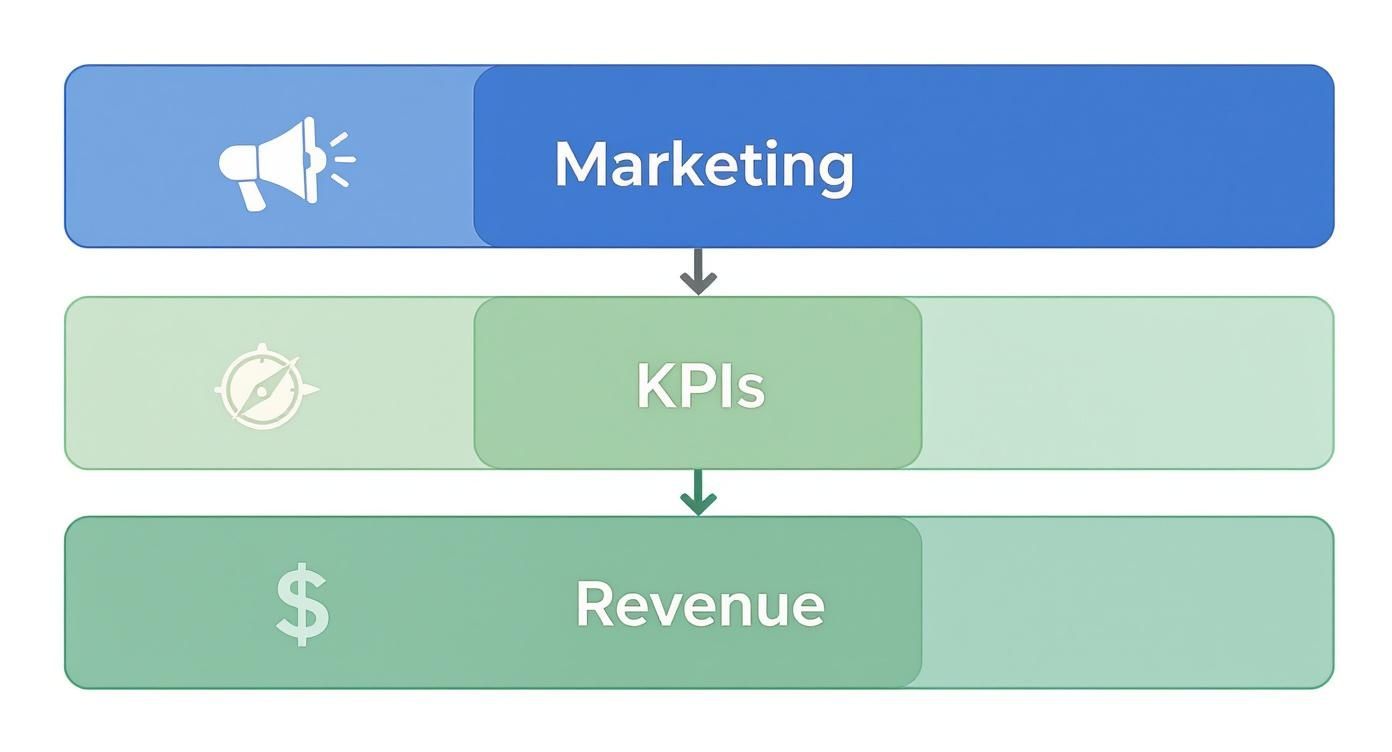
A marketing dashboard should be a strategic command center, not a graveyard for vanity metrics. Many teams struggle with dashboards that are either too complex to be useful or too simple to be insightful, failing to connect marketing activities directly to revenue. This disconnect leads to data overload, missed opportunities, and an inability to prove marketing's true value. The result is a reporting tool that generates more questions than answers, leaving stakeholders unclear on performance and strategy.

This article cuts through the noise. We will deconstruct seven powerful marketing dashboard examples, moving beyond surface-level visuals to provide a blueprint for creating actionable, ROI-focused reports. We will compare different approaches from platforms like Tableau, Power BI, and specialized tools like Marketbetter.ai, giving you a clear path to finding the right solution for your specific goals.

You'll get more than just a list of pretty charts. For each example, you will find:

  • Strategic Analysis: A breakdown of the core KPIs and why they matter for use cases like campaign performance, SEO, acquisition, and executive reporting.
  • Actionable Takeaways: Specific steps to interpret the data, make smarter decisions, and replicate these dashboards in your own environment.
  • Direct Links & Screenshots: Visual references and direct access to each template or gallery to help you get started immediately.

Our goal is to equip you with a framework for building dashboards that not only track performance but also drive strategic clarity, helping you prove and improve marketing's impact on the bottom line.

1. marketbetter.ai

As our featured choice, marketbetter.ai stands apart by fundamentally reimagining what a marketing dashboard can be. Instead of merely visualizing data from disparate tools, this AI-native platform integrates the entire marketing and revenue acceleration stack. It combines content generation, multi-channel campaign execution, and real-time attribution into a single, CRM-connected system, offering a holistic view that most dashboard-only solutions cannot match.

marketbetter.ai platform showing marketing dashboard examples with graphs and charts

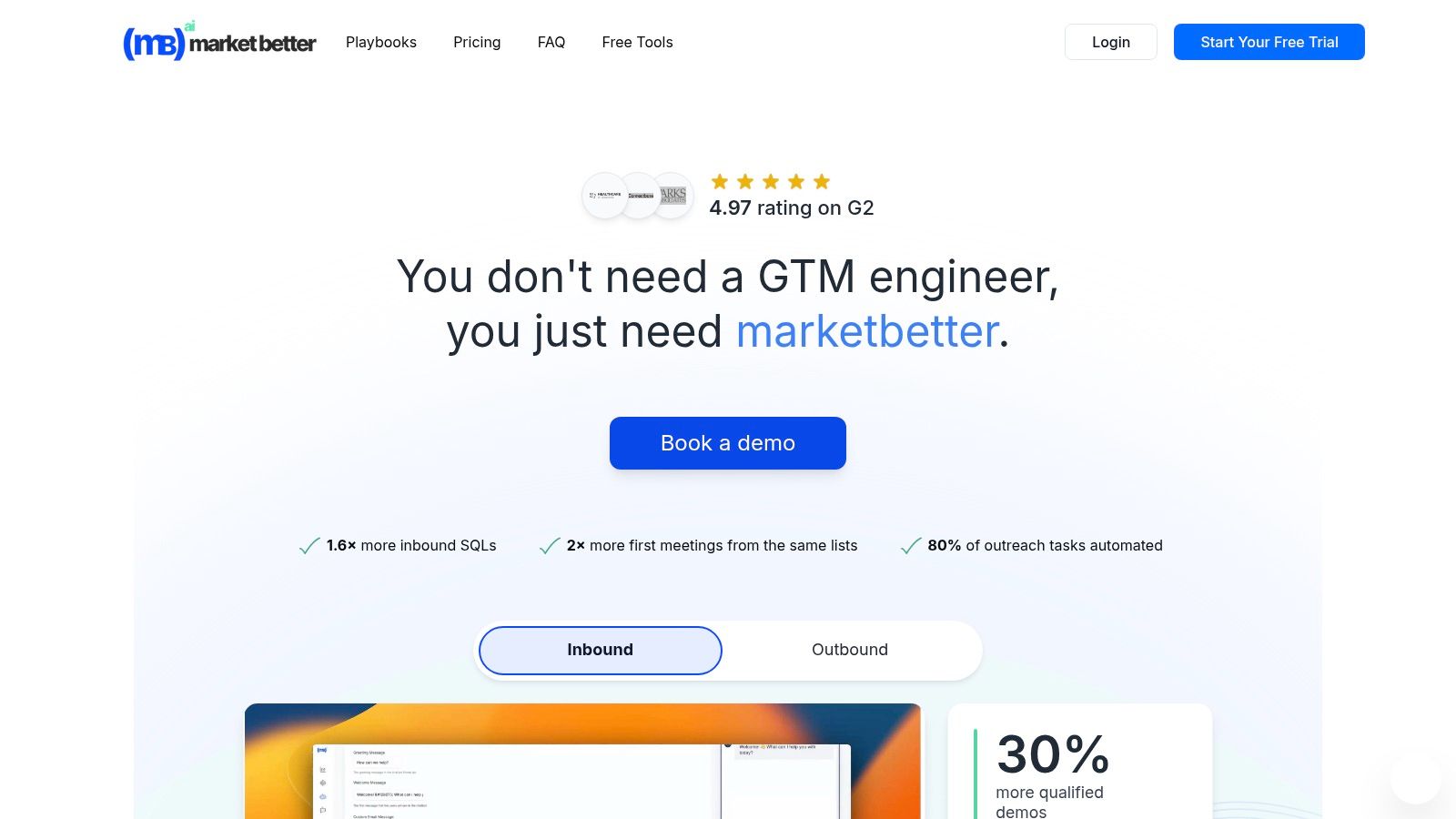
This unified approach provides a powerful advantage for mid-market and enterprise B2B teams. Where a typical marketing operations team might use separate tools for prospecting, content creation, email sequencing, and analytics, marketbetter.ai consolidates these functions. Its dashboards are not just passive reports; they are actionable command centers that connect AI-driven insights directly to automated execution.

Strategic Analysis: Beyond Visualization to Execution

The core strength of marketbetter.ai lies in its ability to close the loop between insight and action. The platform is engineered to detect GTM signals like page-level intent and firmographic data, automatically enrich and score accounts, and trigger personalized multi-channel outreach without manual intervention.

Key Strategic Takeaway: The platform’s true value is its operational efficiency. By replacing multiple point solutions, it eliminates data silos and automates the top-of-funnel workflow, allowing teams to move from intent detection to a first meeting faster and with less overhead. Customer-reported metrics like a 2x increase in first meetings and a 24% faster follow-up time directly reflect this integrated power.

Unlike traditional analytics tools that require marketers to interpret data and then manually build campaigns in other systems, marketbetter.ai uses its dashboard insights to fuel its own AI engine. For instance, if the dashboard shows a specific segment is responding well to a campaign, the platform can automatically reallocate budget or adjust messaging in real-time.

Standout Features and Actionable Insights

Let's break down the key capabilities that make its dashboards so effective:

  • Unified Revenue Attribution: The dashboards directly link marketing activities (blog posts, ads, emails) to pipeline and revenue by writing every interaction back to Salesforce, HubSpot, or Dynamics. This provides clear, defensible ROI metrics that CMOs can present to the board.
  • Predictive Campaign Optimization: The platform doesn't just show you A/B test results. It uses AI to run tests automatically, identify winning variations, and dynamically adjust segmentation and budget allocation to maximize performance.
  • AI-Powered Content Intelligence: Dashboards are connected to an AI content generator that creates on-brand blogs, ads, and social posts. This allows teams to rapidly act on performance data by creating and deploying new assets informed by what’s already working.

Practical Implementation and Use Cases

For a Demand Generation Manager, this means launching a new product campaign becomes a streamlined process. Using marketbetter.ai, they can:

  1. Identify Intent: The platform detects a cluster of target accounts visiting specific product pages.
  2. Generate Assets: The AI creates tailored ad copy, emails, and social posts for this high-intent segment.
  3. Automate Outreach: The system triggers a multi-channel sequence across email and LinkedIn Ads.
  4. Measure and Attribute: The dashboard tracks every touchpoint, attributing new meetings and pipeline directly to the campaign.

The setup is designed for rapid deployment. With turnkey CRM integrations and a simple tracking code installation, the vendor claims teams can be operational in minutes. This speed, combined with dedicated implementation support, makes it an attractive option for organizations undergoing digital transformation or needing to hit aggressive growth targets.

Pros and Cons of marketbetter.ai

ProsCons
Unified AI-Native Platform: Replaces multiple point tools (prospecting, automation, enrichment), simplifying the martech stack and reducing data silos.No Public Pricing: Requires a demo or quote, which may be a barrier for smaller teams or those with rigid budget approval processes.
Proven Impact Metrics: Strong customer-reported results (e.g., 3x campaign ROI, 30% more qualified demos) backed by a 4.97 G2 rating.Potential Compliance Complexity: Automated IP-based identification may require careful configuration to align with privacy regulations like GDPR or CCPA.
Full-Funnel Automation: Connects intent detection directly to multi-channel outreach and CRM write-back for end-to-end attribution.Learning Curve: While powerful, an all-in-one platform may require more initial team training compared to a single-function point solution.
Fast Time-to-Value: Turnkey integrations with major CRMs and a straightforward setup process are supported by dedicated implementation teams.
Enterprise-Grade Security: Features encryption, audit logs, and configurable data policies to meet enterprise security and compliance standards.

Website: https://www.marketbetter.ai
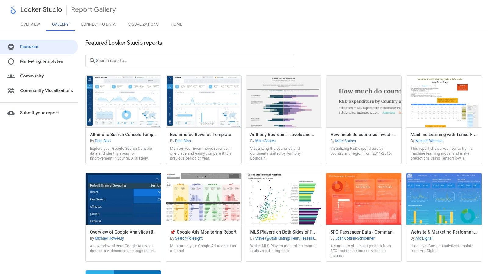
The Google Looker Studio Report Gallery is an invaluable resource for marketers seeking ready-to-use, professional-grade dashboard templates. As Google's official repository, it provides a curated collection of reports designed for a wide range of marketing use cases, from Google Ads campaign analysis to GA4 traffic deep dives. Its primary strength lies in its seamless integration with the Google ecosystem, making it a go-to starting point for teams heavily invested in Google's marketing and analytics platforms.

Google Looker Studio Report Gallery (official)

Unlike many platforms that require extensive setup, Looker Studio's gallery allows marketers to find a relevant template, click "Use template," and connect their own data sources in minutes. This dramatically reduces the time to value. Compared to a tool like Tableau which requires a paid license and more technical setup, Looker Studio's free and intuitive interface makes it highly accessible for teams of any size.

Strategic Analysis and Tactical Insights

The gallery is more than just a collection of templates; it's a strategic playbook. By browsing the marketing section, you can see how Google and top marketing practitioners visualize data to answer critical business questions. This is one of the best free resources for finding proven marketing dashboard examples that are ready for immediate deployment.

Key Strategic Insight: Looker Studio templates are designed around specific data connectors (e.g., GA4, Google Ads, YouTube Analytics). This forces you to think about data integration from the start. A dashboard that combines Google Ads cost data with GA4 conversion data provides a much clearer picture of your Return on Ad Spend (ROAS) than looking at each platform in isolation.

Actionable Takeaway: Don't just copy a template. Analyze its structure. Action this by asking yourself why certain metrics are grouped together. For instance, a lead generation dashboard might pair impressions and clicks with form submissions and cost-per-acquisition. This structure helps you follow the customer journey from initial awareness to conversion. To get more ideas on what to track, explore these essential lead generation key performance indicators.

Access and Implementation

Looker Studio's core product is completely free, making it accessible to individuals, startups, and large enterprises alike.

  • Access: Simply visit the Looker Studio Report Gallery with a Google account.
  • Pricing: The gallery and core dashboarding tools are free. An optional upgrade to Looker Studio Pro is available for enterprises needing advanced team management, governance, and SLA support.
  • Data Connectors: While native Google connectors are free, connecting to non-Google platforms like HubSpot, Facebook Ads, or Salesforce often requires third-party connectors (e.g., from Supermetrics or Power My Analytics), which come with their own subscription costs.

3. Tableau Exchange – Accelerators (official)

For marketing teams operating within the Tableau or Salesforce ecosystem, the Tableau Exchange Accelerators are a powerful, enterprise-grade resource. These are not just templates; they are fully-formed, free-to-use dashboards built by certified partners. They are designed to plug directly into your data sources and provide immediate analytical value, covering specialized areas like Paid Media Performance, Social Media Analytics, and Google Ads campaign tracking.

Tableau Exchange – Accelerators (official)

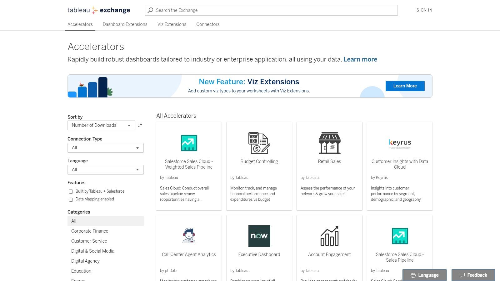
Unlike more generalized galleries, Tableau Accelerators are pre-configured to answer specific, complex business questions right out of the box. This drastically reduces the development time typically associated with building sophisticated dashboards in a powerful BI tool like Tableau. The user experience is tailored for analysts and data-savvy marketers who need to move beyond basic reporting and into deeper data exploration.

Strategic Analysis and Tactical Insights

The true power of Tableau Accelerators is their focus on complex marketing analysis. They provide a solid foundation for building sophisticated visualizations that can uncover nuanced performance trends. Many of these pre-built dashboards serve as excellent marketing dashboard examples for teams aiming for a higher level of data maturity.

Key Strategic Insight: Accelerators often incorporate advanced analytical concepts from the start. For example, a Paid Media Performance accelerator might include blended data from multiple ad platforms (Google, Meta, LinkedIn) and tie it back to CRM data (like Salesforce). This encourages a holistic view of campaign effectiveness and ROI that isolated platform dashboards cannot provide.

Actionable Takeaway: Download an accelerator that aligns with your key channels, like the "Paid Media Performance" one. Instead of just connecting your data, dissect its logic. Pay attention to how it calculates metrics like blended Cost Per Lead (CPL) or visualizes customer journey paths. Use this as a blueprint to create a unified data model for your own reports, ensuring consistent calculations across all channels. For deeper insights, you can explore various multi-touch attribution models to see how each channel contributes to conversions.

Access and Implementation

While the accelerators themselves are free, they require a Tableau license to function, positioning them as a value-add for existing users rather than a standalone free tool.

  • Access: Available directly from the Tableau Exchange by searching for relevant marketing keywords.
  • Pricing: The accelerators are free to download and use. However, a paid license for Tableau Desktop, Tableau Creator, or Tableau Cloud is required to open, edit, and connect them to your data.
  • Data Connectors: Accelerators are built for common data sources (e.g., Google Ads, Salesforce, Snowflake). Each listing includes detailed instructions and notes on the required data schema, which you must match for the dashboard to populate correctly.

4. Microsoft AppSource – Power BI marketing templates

For organizations embedded within the Microsoft ecosystem, AppSource is the go-to marketplace for discovering pre-built Power BI template apps. These turnkey solutions are designed to dramatically accelerate the deployment of sophisticated marketing analytics. Instead of building reports from a blank canvas, AppSource provides complete, installable dashboards for specific use cases like Meta Ads performance, multichannel attribution, and lead funnel analysis, making it an excellent source for robust marketing dashboard examples.

Microsoft AppSource – Power BI marketing templates

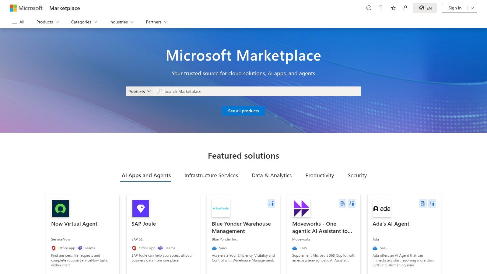
Unlike Google's Looker Studio gallery, which primarily focuses on Google-centric data, AppSource offers a broader range of third-party templates from various publishers. The key comparison here is ecosystem alignment: Power BI templates are ideal for companies using Microsoft Dynamics 365 and Azure, whereas Looker Studio is the default for those centered on Google Analytics and Google Ads.

Strategic Analysis and Tactical Insights

The true value of AppSource templates lies in their enterprise-ready structure. They often include not just the dashboard but also the underlying data model and Power Query transformations. This provides a complete blueprint for how to structure marketing data for scalable analysis, a significant step up from basic template galleries.

Key Strategic Insight: Power BI templates on AppSource are built for integration and governance. They are designed to fit into a corporate BI strategy where data from marketing (e.g., Facebook Ads) needs to be securely blended with data from other departments (e.g., sales data from Dynamics 365). This encourages a holistic view of business performance, connecting marketing spend directly to revenue outcomes.

Actionable Takeaway: When evaluating an AppSource template, look beyond the visuals. Investigate the data model included with the template. How does it handle date tables? What relationships are pre-defined between campaign data and conversion data? Your action is to replicate these logical structures in your own BI environment—this is often more valuable than copying the charts themselves. To see these principles in action, you can explore various inspiring Power BI dashboard examples that demonstrate effective marketing performance visualization.

Access and Implementation

While the Power BI platform has a free tier, many of the advanced marketing templates on AppSource have associated costs, either for the template itself or for required data connectors.

  • Access: Browse marketing templates on the Microsoft AppSource website. A Microsoft work or school account is typically required to install apps into a Power BI workspace.
  • Pricing: Varies by publisher. Some templates are free, while others require a one-time purchase or an ongoing subscription.
  • Data Connectors: The biggest caveat is that many templates rely on third-party data pipelines or ETL services to pull data from platforms like Meta, LinkedIn, or HubSpot. These services carry their own subscription fees, so be sure to review the template's "Requirements" section before installation.

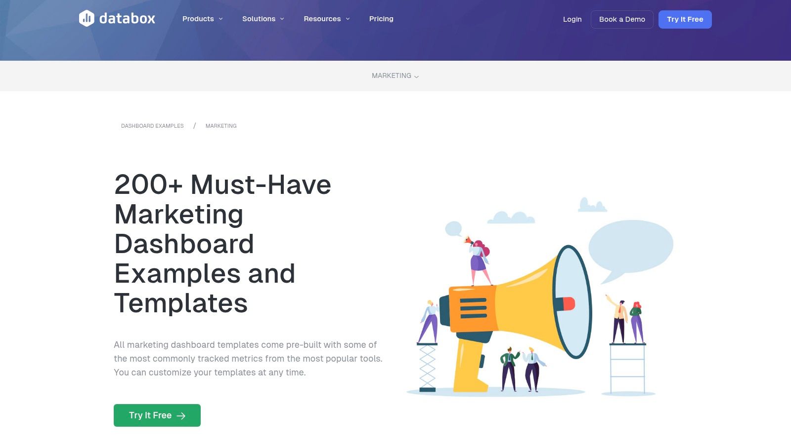
5. Databox – Marketing dashboard templates

Databox offers one of the most extensive and actively maintained libraries of marketing dashboard templates available. With over 200 pre-built options covering everything from GA4 and HubSpot to social media and paid advertising, it serves as a powerful no-code solution for teams that need to deploy comprehensive reports quickly. Its key differentiator is the one-click setup, which leverages over 130 native integrations to pull data and populate a dashboard in minutes, not hours.

Databox – Marketing dashboard templates

Compared to platforms like Looker Studio, which may require third-party connectors for non-Google data, Databox's value lies in its all-in-one, integrated environment. The user experience is designed for speed and simplicity, enabling marketers to select a template, connect their accounts, and immediately see their data visualized. This makes it an ideal choice for agencies managing multiple clients or in-house teams seeking standardized reporting across departments.

Strategic Analysis and Tactical Insights

The sheer volume of Databox's gallery provides a strategic advantage by offering specialized views for nearly every marketing function. You can find highly specific marketing dashboard examples, such as a "HubSpot Blog Performance" report or a "Google Ads Call & Lead Details" dashboard. This specialization allows teams to move beyond generic overviews and monitor the precise KPIs that drive their specific goals.

Key Strategic Insight: Databox excels at creating multi-source dashboards out of the box. For example, a "Paid Ads Overview" template can pull data from Google Ads, Facebook Ads, and LinkedIn Ads into a single, unified view. This immediately highlights cross-channel performance, enabling you to see which platform delivers the best cost-per-lead or ROAS without building complex data blends manually.

Actionable Takeaway: Use Databox templates to establish a performance baseline, then customize them to answer deeper questions. For instance, start with the "GA4 Website Traffic" template. After reviewing it, your action is to add a calculated metric that tracks the conversion rate of blog traffic versus paid traffic. This turns a standard report into a strategic tool for budget allocation. Understanding these metrics is crucial; for more detail, learn how to calculate marketing ROI effectively.

Access and Implementation

Databox is a subscription-based service with various tiers tailored to different business needs, from small teams to large agencies.

  • Access: Sign up for a free trial directly on the Databox website to explore the template gallery and connect your data sources.
  • Pricing: Databox operates on a paid subscription model after the initial trial period. Plans are typically based on the number of data connections and dashboards required. The platform's free plan was sunset, so a paid subscription is necessary for continued use.
  • Data Connectors: The platform boasts over 130 native one-click integrations, including HubSpot, Google Analytics 4, SEMrush, Salesforce, and all major social media and ad platforms. This extensive list is a core part of its value proposition.

6. Geckoboard – Marketing dashboard examples and templates

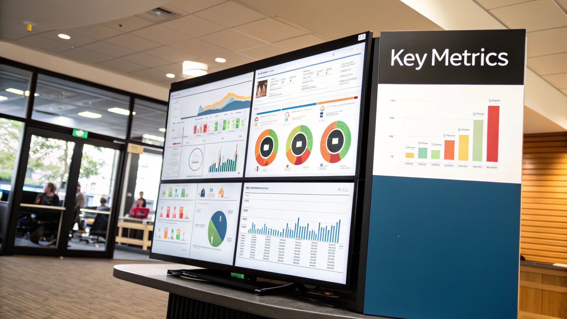
Geckoboard specializes in creating simple, high-impact dashboards designed for real-time team visibility and stakeholder communication. Its strength is not in complex data exploration but in distilling key marketing metrics into easily digestible visuals, perfect for displaying on office TVs or sharing with non-technical executives. With over 90 pre-built integrations, it allows marketers to quickly connect their tools and create focused dashboards for specific functions like lead generation, social media performance, or high-level CMO overviews.

Geckoboard – Marketing dashboard examples and templates

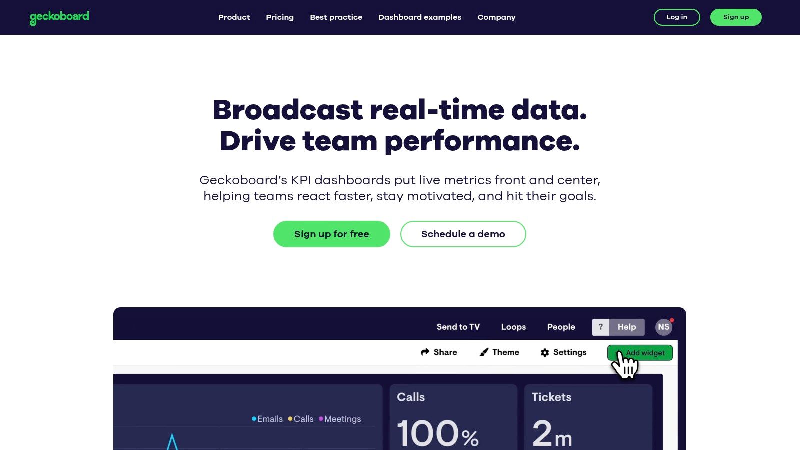
Unlike more analyst-focused tools like Tableau, which are built for deep dives, Geckoboard prioritizes speed-to-value and "glanceability". The user experience is exceptionally straightforward; marketers can select a pre-built template, connect data sources like Google Analytics or HubSpot with a few clicks, and have a live dashboard running in minutes. This makes it an ideal solution for teams that need to foster a data-aware culture without a steep learning curve.

Strategic Analysis and Tactical Insights

Geckoboard’s approach is centered on communication. The templates and examples provided on their site are excellent marketing dashboard examples that demonstrate how to communicate performance without overwhelming the audience. The focus is on clarity and real-time updates, making it a powerful tool for operational alignment.

Key Strategic Insight: Geckoboard’s design philosophy forces you to prioritize what truly matters. By limiting the number of widgets on a screen and focusing on clear, numerical KPIs, it encourages a "one primary metric per widget" approach. A dashboard built for a TV screen can't afford clutter, which pushes you to select metrics that drive immediate action, like "New MQLs Today" or "Live Website Visitors."

Actionable Takeaway: Use Geckoboard's simplicity as a strategic filter for your KPIs. To make this actionable, ask: "If my team could only see five metrics to know if we are winning today, what would they be?" Start with high-level outcomes (e.g., Leads Generated) and pair them with leading indicators (e.g., Ad Spend or Organic Sessions). This focus helps teams connect daily activities directly to business goals, turning the dashboard from a reporting tool into a motivational one.

Access and Implementation

Geckoboard is a premium SaaS product with a free plan for single users and one dashboard, making it accessible to try before committing to a paid tier for team use.

  • Access: Sign up for an account on the Geckoboard website. A 14-day free trial of paid features is available.
  • Pricing: Plans start with a free tier. Paid plans are based on the number of users and dashboards, starting at $49/month for the "Team" plan, which includes 3 dashboards and unlimited users. Higher tiers add features like Slack sharing and custom CSS.
  • Data Connectors: Geckoboard offers over 90 pre-built integrations with popular marketing platforms like Google Analytics, HubSpot, Salesforce, Mailchimp, and social media channels. These native connectors are included in the subscription cost.
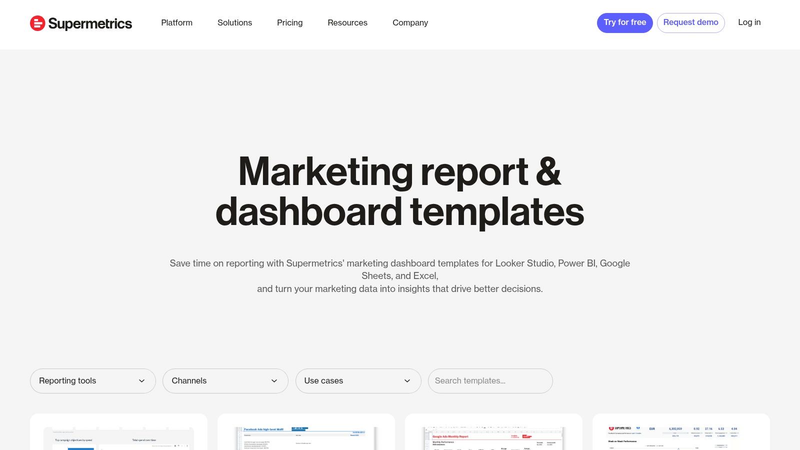
The Supermetrics Template Gallery is a powerful hub for marketers looking to build sophisticated, multi-channel reports without starting from scratch. While Google's gallery excels within its own ecosystem, Supermetrics specializes in bridging the gap between dozens of non-Google platforms like Meta Ads, LinkedIn, TikTok, and HubSpot. It offers a vast collection of free and paid templates designed to work seamlessly with its data connectors across various BI tools, including Looker Studio, Power BI, Excel, and Google Sheets.

Supermetrics Template Gallery (for Looker Studio, Power BI, Sheets, Excel)

This platform's core advantage is saving immense time on data integration. Instead of manually exporting CSVs or wrestling with APIs, marketers can use a Supermetrics template, connect their ad accounts via the Supermetrics connector, and have a comprehensive dashboard populated in minutes. The templates are built by marketing data experts, ensuring the visualizations and KPI groupings are logical and designed for performance analysis.

Strategic Analysis and Tactical Insights

The Supermetrics gallery provides a clear blueprint for unified marketing reporting. Its templates are particularly strong for paid media, social media, and SEO, offering some of the most practical marketing dashboard examples for performance marketers who need to blend data from multiple sources. A single dashboard can compare Meta Ads CPA against Google Ads CPA, or track organic search rankings alongside paid search clicks, providing a holistic view of performance.

Key Strategic Insight: Supermetrics templates are designed to solve the data blending problem. A "Paid Channel Mix" dashboard, for instance, forces you to standardize metrics (like cost, impressions, and conversions) across platforms that report them differently. This enables a true apples-to-apples comparison of channel efficiency and helps you allocate budget more effectively.

Actionable Takeaway: When you select a Supermetrics template, pay close attention to the data sources it pulls from. Use the "Paid Channel Mix" report to not only monitor performance but to identify cross-channel trends. For example, if you see a spike in branded search traffic (from a GA4 dashboard) a week after launching a high-reach TikTok campaign, you can start to attribute indirect value and justify your social media spend. This is your action: connect insights from one channel to performance in another.

Access and Implementation

While the templates themselves are often free, they require a paid Supermetrics subscription to function, as they rely on Supermetrics' data connectors.

  • Access: Browse the full collection at the Supermetrics Template Gallery. Each template comes with detailed setup instructions.
  • Pricing: The templates are free to use, but you must have a corresponding paid Supermetrics subscription for the specific data connectors needed (e.g., a connector for Meta Ads, another for LinkedIn Ads). Pricing is tiered based on the number of data sources, users, and accounts.
  • Data Connectors: Supermetrics is the connector. Its primary business is providing reliable data pipelines from marketing platforms into BI tools and spreadsheets. The templates are a value-add that accelerates the time-to-insight for their customers.

Top 7 Marketing Dashboard Examples Comparison

SolutionImplementation complexity 🔄Resource requirements 💡Expected outcomes 📊Ideal use casesKey advantages ⭐⚡
marketbetter.ai🔄 Moderate — turnkey tracking + CRM connectors; enterprise config for compliance💡 Mid–high: CRM, implementation support, likely custom pricing📊 High-impact claims: 1.6x inbound SQLs, 2x meetings, 3x campaign ROI; improved attributionMid-market & enterprise B2B demand‑gen, consolidate martech, intent-driven outreach⭐ Integrated AI-native stack with CRM write‑back; ⚡ fast time‑to‑value; measurable ROI
Google Looker Studio Report Gallery (official)🔄 Low — copy templates and swap data; some connectors add steps💡 Low: free core product; Pro for governance; third‑party connectors may cost📊 Quick KPI dashboards and shareable reports; limited built-in attributionIndividuals/teams in Google ecosystem needing fast, low‑cost reporting⭐ Free templates, deep Google integration, strong community content
Tableau Exchange – Accelerators (official)🔄 Low–moderate — download + data mapping; requires Tableau environment💡 Mid: Tableau Desktop/Cloud license; possible partner setup📊 Enterprise‑grade, vetted dashboards that shorten time‑to‑valueTableau/Salesforce customers needing certified marketing dashboards⭐ High-quality partner-built accelerators with data mapping guidance
Microsoft AppSource – Power BI templates🔄 Low — one‑click install but may require data prep/mapping💡 Mid: Power BI license; some templates need ETL/subscriptions📊 Turnkey reports and standardized views within Microsoft stackOrganizations standardizing on Power BI for marketing reporting⚡ One‑click installs and guided setup; enterprise governance
Databox – Marketing dashboard templates🔄 Very low — one‑click setup from many integrations💡 Low–mid: paid plan after trial; no‑code platform📊 Fast deployment of multi‑source dashboards and goal trackingAgencies and in‑house teams needing rapid, consistent reporting⚡ Large template catalog (200+); 130+ integrations for quick setup
Geckoboard – Marketing dashboard examples🔄 Very low — ready‑to‑use KPI dashboards and TV mode💡 Low–mid: paid tiers scale with dashboards/editors📊 Real‑time visibility and stakeholder alignment; simple KPI focusNon‑technical teams wanting live TV dashboards and executive views⚡ Easy rollout; excellent real‑time displays and simple sharing
Supermetrics Template Gallery🔄 Low–moderate — templates for multiple platforms; connector setup required💡 Mid: Supermetrics subscription often required; connector costs📊 Consolidated multichannel paid‑media and blended reportsTeams reporting across Looker Studio, Power BI, Sheets, Excel for ads/SEO⭐ Strong multichannel support and detailed setup guides; good for paid media integration

Your Next Step: From Insight to Actionable Intelligence

We've explored a comprehensive gallery of marketing dashboard examples, moving from the granular details of SEO and campaign performance to the high-level strategic overview required in an executive summary. The journey through platforms like Looker Studio, Tableau, and Power BI reveals a crucial truth: a dashboard is not merely a collection of charts and numbers. It's a strategic command center designed to answer your most pressing business questions.

The most effective dashboards, as we've seen, share common traits. They are tailored to a specific audience, focused on a handful of critical KPIs, and designed to tell a clear, unambiguous story. They transform raw data from disparate sources into a cohesive narrative that links marketing activities directly to business outcomes like revenue, customer lifetime value, and market share.

Distilling Action from Analysis

The core takeaway from these examples is the shift from passive data monitoring to active, intelligent decision-making. A well-crafted dashboard doesn't just show you what happened; it illuminates why it happened and guides you on what to do next.

  • Focus on Causation, Not Just Correlation: Instead of just noting that website traffic and sales both increased, a strong dashboard helps you connect the dots. Did a specific PPC campaign (with its own detailed report) drive the high-converting traffic? Did a surge in organic rankings for bottom-of-funnel keywords lead to more demo requests?
  • Embrace Iteration: Your first dashboard won't be your last. As your marketing strategy evolves, so should your metrics. The acquisition dashboard you build today might need to incorporate product-led growth metrics next quarter. Treat your dashboards as living documents that adapt to your business goals.
  • Automate Where Possible: The time spent manually pulling data and compiling reports is time you could be spending on strategy and execution. Tools like Supermetrics and Databox excel at automating data integration, freeing up your team to focus on analysis rather than assembly.

Choosing Your Starting Point and Tools

Your ideal tool depends entirely on your team's technical skill, budget, and specific needs. The marketing dashboard examples we've reviewed offer a clear roadmap for selecting the right platform.

  • For Maximum Customization and Integration (High Technical Skill): Tableau and Microsoft Power BI are enterprise-grade solutions. They offer unparalleled power for data modeling and visualization but come with a steeper learning curve. They are best suited for organizations with dedicated data analysts or BI teams.
  • For Accessibility and Ease of Use (Low to Medium Technical Skill): Looker Studio, Databox, and Geckoboard provide a more user-friendly entry point. Their template galleries allow you to get up and running quickly, connecting to common marketing data sources with minimal friction. If you're focused on paid media, streamlining your reporting process is essential. To streamline your reporting process and ensure strategic clarity, consider leveraging top PPC reporting templates for Google Ads which can be easily adapted for these platforms.
  • For Automated Action and Optimization (All Skill Levels): This is where a platform like marketbetter.ai creates a new category. While traditional BI tools show you the data, marketbetter.ai closes the loop by using that data to automate and optimize marketing actions. It moves beyond visualization to execution, turning insights into tangible performance gains without manual intervention.

Ultimately, the goal is to create a data-driven culture. This begins by providing every stakeholder, from the demand generation manager to the CMO, with a clear, relevant, and actionable view of performance. Use these examples not as rigid blueprints, but as a source of inspiration to build the marketing intelligence engine your business needs to thrive.


Ready to move beyond static reports and turn your data into automated growth? marketbetter.ai connects to your data sources, analyzes performance, and automatically adjusts your campaigns to maximize ROI. Stop just viewing your data and start acting on it by visiting marketbetter.ai to see how our AI-powered platform can build and optimize your marketing engine for you.

Your Guide to Actionable Lead Generation KPIs

· 21 min read

Lead generation KPIs (Key Performance Indicators) are the specific, measurable numbers that tell you if your marketing and sales efforts are actually working. They go way beyond simple counts. Instead of just tracking activity, they focus on the outcomes that directly grow your business—things like lead quality and how many of those leads turn into actual customers.

Why Lead Generation KPIs Are Your Growth Compass

Trying to run a marketing campaign without tracking KPIs is like driving cross-country without a map. Sure, you're moving, but you have no idea if you're getting any closer to your destination.

It’s easy to get caught up in vanity metrics like just collecting contacts, but the real goal is to generate qualified opportunities that drive revenue. Measuring the right things is what turns marketing from a cost center into a predictable growth engine.

This is more important than ever. The global lead generation industry is on track to hit $295 billion by 2027, growing at a blistering pace of 17% each year. That kind of growth means data-driven strategies are no longer optional—they're essential for staying in the game.

This infographic paints a clear picture of how KPIs form the critical bridge between your day-to-day marketing activities and the revenue you’re trying to generate.

Infographic about lead generation kpis

As you can see, great marketing isn't just about making noise. It’s about using the right KPIs to translate that effort into results you can take to the bank.

Moving Beyond Metrics to Meaningful Action

It’s crucial to understand the difference between a simple metric and a true KPI. For instance, website traffic is a metric. The traffic-to-lead conversion rate? That's a KPI. The first one tells you how many people showed up; the second tells you how effective your site is at getting them to raise their hand. Making this distinction is the cornerstone of any solid demand generation strategy.

Actionable Tip: A metric counts activity, but a KPI measures effectiveness. To make a metric actionable, compare it to a business goal. Don't just report "10,000 website visits." Instead, analyze "Our website converted 2% of its 10,000 visitors into leads, hitting our 2% goal."

To really use KPIs as a compass for growth, you need to connect them to proven lead generation best practices. This alignment makes sure your measurement framework is built on strategies that are already known to work.

When you focus on the right indicators, you can:

  • Pinpoint Inefficiencies: Immediately see which channels or campaigns are wasting your time and money.
  • Optimize Spending: Confidently shift your budget to the activities that deliver the highest impact.
  • Improve Sales Alignment: Hand over higher-quality, conversion-ready leads that your sales team will actually love.

Measuring Awareness with Top-of-Funnel KPIs

Your lead generation engine starts at the top of the funnel (ToFu). This is where you cast your net, trying to attract a broad but still relevant audience. Think of these top-of-funnel KPIs as your sonar—they tell you if you're fishing in the right spots and if your bait is actually interesting.

Getting this stage wrong causes huge problems later. If you attract the wrong crowd here, you'll be dealing with unqualified leads all the way down the pipeline. Let's dig into the core metrics that show you how well your initial outreach is working.

Click-Through Rate (CTR)

Click-Through Rate is the first real test of your messaging. It tells you what percentage of people who saw your ad, social post, or email subject line actually bothered to click it. It’s a direct gut-check on how compelling your creative and copy are.

Formula: (Total Clicks / Total Impressions) x 100 = CTR (%)

A high CTR means your message is hitting the mark. A low one means you've got a disconnect. For example, a CTR of 2% is often considered good for search ads, while a 0.5% CTR on a social media ad might signal poor targeting or uninspired creative.

Actionable Tip: If your CTR is low, don't just scrap the campaign. Test different headlines or images. A simple A/B test comparing "Save 20% Today" vs. "Stop Wasting Time on Admin Tasks" can quickly reveal which message resonates with your audience and double your CTR.

Cost Per Lead (CPL)

This one is simple but powerful: Cost Per Lead is the final price tag for acquiring one new contact. It’s the metric that keeps your budget honest, tying your marketing spend directly to a tangible result.

Formula: Total Campaign Cost / Total New Leads = CPL

Actionable Tip: Don't just track your overall CPL. Segment it by channel to find your most efficient sources. If LinkedIn ads generate leads at a CPL of $75 but your organic blog generates them for $20, you have a clear directive: invest more in content creation and SEO to scale your most profitable channel.

The real magic happens when you compare CPL across channels. Let's say your LinkedIn ads bring in leads for $75 a pop, but your organic blog content generates them for just $20. That tells you exactly where to double down. Mastering your CPL is the foundation of a healthy inbound marketing lead generation strategy.

Traffic-to-Lead Ratio

While CTR shows initial interest, the Traffic-to-Lead Ratio tells you what happens after the click. Of all the people who landed on your page, how many actually filled out the form and became a lead? This metric puts your landing page experience under the microscope.

Formula: (Total New Leads / Total Website Visitors) x 100 = Traffic-to-Lead Ratio (%)

Here's where looking at these KPIs together paints the full picture.

  • Scenario A (High CTR, Low Conversion): You have a killer CTR (5%) but a terrible Traffic-to-Lead Ratio (1%). Your ad is fantastic at getting people to click, but your landing page is dropping the ball. The problem isn't the ad; it's what happens next. Action: A/B test your landing page headline, form length, or call-to-action button.
  • Scenario B (Low CTR, High Conversion): Your CTR is dismal (0.5%), but your Traffic-to-Lead Ratio is amazing (10%). Your ad is clearly missing the mark. But the few people who do click are so motivated they convert instantly. Your landing page is great, but your ad targeting or copy is broken. Action: Refine your ad audience or rewrite your ad copy to better match your high-converting landing page.

By analyzing these metrics together, you stop guessing and start diagnosing. You can see exactly where the leaks are in your funnel and plug them, making sure a steady stream of good prospects keeps flowing in.

Gauging Interest with Middle-of-Funnel KPIs

So you’ve grabbed a lead's attention. Great. Now the real work begins. The middle of the funnel (MoFu) is where that initial curiosity has to become real intent. The KPIs at this stage are your heat map, showing you exactly who’s warming up and who’s going cold.

This is the make-or-break handoff between marketing and sales. Nail it, and your sales team gets a steady stream of promising conversations. Get it wrong, and they’ll burn hours chasing dead ends, leading to wasted money and a seriously frustrated team.

A person at a desk analyzing charts and graphs on multiple screens, representing the tracking of middle-of-funnel KPIs.

Differentiating MQLs from SQLs

First things first: you need to draw a clear line between a Marketing Qualified Lead (MQL) and a Sales Qualified Lead (SQL). This isn't just fluffy jargon—it's the fundamental agreement that gets your marketing and sales teams rowing in the same direction.

  • MQL (Marketing Qualified Lead): This is someone who's definitely interested but not quite ready to talk to a salesperson. They’ve downloaded your ebook, joined a webinar, or maybe they keep coming back to your pricing page. They fit your ideal customer profile and are engaging with your content.

  • SQL (Sales Qualified Lead): This lead is the real deal. They've been vetted, either by automation or a sales development rep, and they check the important boxes: a clear need, a budget, and the authority to pull the trigger. They've taken a high-intent action, like requesting a demo or a quote.

Think of it like fishing. An MQL is a fish that’s nibbling at your bait. An SQL is the one you've hooked and are ready to reel in. The whole point of MoFu KPIs is to figure out which nibblers are about to bite down hard.

The Power of Lead Scoring

How do you tell the difference between a window shopper and a serious buyer automatically? The answer is Lead Scoring. It's a system that assigns points to leads based on who they are (demographics, company size) and what they do (website visits, email opens, content downloads).

A VP of Marketing at a 500-person tech firm? They’ll get more points than an intern from a tiny agency. Someone who requests a demo gets a massive score bump compared to someone who just reads a blog post.

This isn’t just a nice-to-have; it's a powerful lever for growth. Companies that implement Lead Score Tracking can see conversion rates jump by up to 28%. It’s a data-driven way to automatically surface your hottest prospects, so your sales team always knows who to call first.

Actionable Lead Scoring Model Comparison

You don't need a data science degree to build a lead scoring model. It’s really about comparing different signals of intent and assigning a logical value to each one.

Action Taken by LeadPoint ValueRationale
Visited Pricing Page+15Shows strong buying intent and consideration.
Attended a Webinar+10Demonstrates a commitment of time and interest in a solution.
Downloaded Ebook+5Indicates interest in a topic but is lower-intent.
Opened an Email+1A basic engagement signal, shows the lead is still active.

Actionable Tip: Set a threshold—let's say 50 points. Once a lead hits that number, automate two actions: flag them as an MQL in your CRM and immediately send a notification to the assigned sales rep. This simple automation bridges the gap between marketing interest and timely sales follow-up, ensuring hot leads never go cold.

Connecting Marketing to Revenue with Bottom-of-Funnel KPIs

This is where the rubber meets the road. If top-of-funnel metrics are about starting conversations, bottom-of-funnel (BoFu) KPIs are about cashing the checks.

These are the numbers your CFO and CEO actually care about. Why? Because they draw a straight line from your marketing campaigns to the company's bank account, proving your work isn't just a cost center—it's a revenue engine. We're moving past clicks and downloads to focus purely on efficiency and profit.

Getting this right lets you confidently answer the most important question: "Which of our marketing activities are making us the most money?"

A person pointing at a financial chart on a large screen, symbolizing the direct connection between marketing efforts and revenue.

Customer Acquisition Cost (CAC)

While Cost Per Lead (CPL) tells you what you paid for a handshake, Customer Acquisition Cost (CAC) tells you the total cost of winning a paying customer. It's the real deal.

CAC rolls up all your sales and marketing expenses—salaries, ad spend, software licenses, the whole shebang—and divides it by the number of new customers you closed in a set period.

Formula: Total Sales & Marketing Costs / Number of New Customers = CAC

Think of CAC as the ultimate stress test for your go-to-market strategy. A high CAC can bleed your company dry, even if you’re closing deals left and right. The goal isn't just to lower it, but to lower it without sacrificing the quality of the customers you bring in.

Comparing CAC Across Different Channels

To make CAC truly useful, you have to slice it up by channel. An overall CAC is a good health metric, but channel-specific CAC is where the strategic magic happens.

Imagine your paid search campaigns have a CAC of $1,500, but the customers coming from your organic blog content cost only $400 to acquire. That data isn't just a report card; it's a roadmap. It tells you exactly where to pour your next dollar for the biggest impact.

Actionable Tip: Create a simple table comparing the CAC of each marketing channel against the average deal size from that channel. If Channel A has a $500 CAC but brings in $5,000 deals, while Channel B has a $250 CAC but only brings in $1,000 deals, you can make a strategic decision to invest more in Channel A for higher ROI, despite its higher initial cost.

SQL-to-Customer Conversion Rate

This KPI is all about the handoff between marketing and sales. It measures how many of the leads your sales team accepted as qualified (SQLs) actually signed on the dotted line and became customers.

Formula: (New Customers / Total SQLs) x 100 = SQL-to-Customer Rate (%)

A low number here screams that there's a disconnect. Either marketing is sending over-hyped leads that aren't truly ready to buy, or the sales process has a leak that needs plugging. A common benchmark for B2B is around 20-30%. If yours is at 5%, it’s time for a joint meeting between marketing and sales to review lead qualification criteria.

Customer Lifetime Value (CLV)

Finally, we have Customer Lifetime Value (CLV). This isn't about the first sale; it's about the entire relationship. CLV predicts the total amount of revenue you can expect from a single customer over the entire time they do business with you. It’s the long game.

Formula: (Average Purchase Value x Average Purchase Frequency) x Average Customer Lifespan = CLV

Comparing your CLV to your CAC is the moment of truth for your business model. A healthy, scalable business needs its CLV to be much higher than its CAC. The classic benchmark is a 3:1 ratio.

Actionable Tip: If your CLV:CAC ratio is a dangerous 1:1, you have two levers to pull. You can work to decrease CAC by optimizing your marketing channels, or you can work to increase CLV by launching customer retention programs, upsell campaigns, or loyalty initiatives. Analyzing this ratio tells you whether to focus on acquisition efficiency or customer satisfaction.

Tying all these numbers together requires a solid grasp of where the revenue is actually coming from. To get a clearer picture, it’s worth exploring different multi-touch attribution models to see which touchpoints are doing the heavy lifting. This kind of analysis is what allows you to invest with confidence, knowing every decision is backed by hard financial data.

Building Your Lead Generation KPI Dashboard

Knowing your lead generation KPIs is one thing. Actually tracking them is how you win. A good dashboard turns a mountain of raw data into a handful of smart decisions, giving you a live look at the health of your marketing engine. It gets you out of the spreadsheet weeds and helps you see the story the numbers are telling.

The right tool really just depends on your scale. If you're a startup, a well-organized spreadsheet can be a surprisingly powerful (and free) command center. But once you're scaling, automated platforms like HubSpot or Marketo become non-negotiable for taming the complexity and seeing the entire funnel in one place.

Choosing Your Dashboard Tools

When you're comparing tools, the big differentiators are automation and integration. A simple spreadsheet means someone has to manually punch in the numbers. That's fine for a weekly review, but it’s not going to cut it for daily monitoring.

A dedicated marketing platform, on the other hand, does the heavy lifting for you. It pulls data automatically from all your sources—your website, your CRM, your ad accounts—and gives you a single source of truth.

  • Spreadsheets (Google Sheets, Excel): You get total flexibility at zero cost. Best for: Early-stage companies focusing on a few core metrics like CPL and conversion rate. Actionable Use: Create a weekly scorecard where you manually input leads, cost, and customers by channel.
  • Marketing Platforms (HubSpot, Marketo): These give you automated, real-time dashboards that connect the dots from first touch to final sale. Best for: Scaling businesses that need to track the full customer journey and complex attribution. Actionable Use: Build a "Funnel Health" dashboard showing MQLs generated this month, SQL-to-Customer rate, and channel-specific CAC.

The screenshot below from a HubSpot dashboard is a perfect example of this. It turns performance data into something you can actually understand at a glance.

This visual approach makes it dead simple to spot trends, like which channels are bringing in the best leads, without having to become a spreadsheet wizard.

Making KPI Reviews Actionable

A dashboard is just a pretty picture if you don't act on what it's showing you. You need a rhythm for reviewing it. I recommend weekly check-ins for small tactical tweaks and monthly meetings for bigger strategic shifts.

During these reviews, don't just read the numbers off the screen. Ask why. Why did CPL suddenly spike? Was it that new ad campaign we launched? Did that blog post go viral and flood the top of our funnel?

This focus on turning insights into action has never been more critical. In 2025, lead generation is still the top priority for 34% of companies. Yet a mind-boggling 80% of those leads never become sales. That’s a huge disconnect. As you can find in these lead generation statistics on DesignRush.com, it highlights a massive need to focus on lead quality, not just quantity—a shift you can only make with consistent KPI analysis.

Your dashboard's job is to flag problems and opportunities. Treat it like a diagnostic tool for your growth engine. It helps you find the bottlenecks, celebrate the wins, and constantly refine your game plan.

Common KPI Mistakes and How to Avoid Them

Tracking your lead generation KPIs is non-negotiable, but let’s be honest—tracking the wrong things is even worse than tracking nothing at all. It’s like sending your team on a wild goose chase for ghosts while real, paying customers walk right out the door.

The biggest trap? Vanity metrics. We all know them. Social media likes, page views, email open rates. They feel good, they look great in a report, but they don't pay the bills. A blog post with 10,000 likes that brings in zero leads is a distraction. The targeted article with only 100 views that lands two high-quality MQLs? That's the real winner.

A signpost with confusing arrows pointing in different directions, representing common KPI mistakes.

Mistake 1: Ignoring Context and Segmentation

Another classic pitfall is staring at numbers in a vacuum. Let’s say your overall Cost Per Lead (CPL) is a tidy $50. Sounds great, right? But what happens when you start slicing up that data?

You might find your LinkedIn ads are actually costing you $200 per lead, while your organic search CPL is a lean $15. Without digging into the segments, you'd keep pouring money down the drain, completely clueless that one channel is bleeding you dry while another is a goldmine.

Your top-level numbers tell you what happened. Segmented data tells you why. Always slice your KPIs by channel, campaign, and audience to get the real story behind the numbers.

This tunnel vision often leads to another problem: celebrating top-of-funnel wins without looking at the whole picture. A huge spike in new leads is great, but if none of them ever become Sales-Qualified Leads (SQLs), you've just created a lot of noise. You have to connect the dots from the first click all the way to the final sale.

Actionable Solutions to Common Pitfalls

Building a smart measurement system isn't complicated—it just requires discipline. Here’s how you can steer clear of these common traps:

  • Tie Everything to Revenue: For every single KPI you track, ask yourself: "How does this number get us closer to a sale?" If you can't draw a straight line, it’s probably a vanity metric. Action: Replace a "Page Views" goal with a "Traffic-to-Lead Ratio" goal.
  • Compare Apples to Apples: Don't just look at your overall CPL. Track the CPL for your Google Ads campaign versus your content marketing efforts. Compare the SQL-to-Customer rate from webinar leads against ebook downloads. Action: Create a monthly "Channel Performance" report that ranks your channels by CPL and CAC to force a data-driven budget conversation.
  • Build a Full-Funnel View: Your dashboard should tell a story. Put your Traffic-to-Lead Ratio right next to your MQL-to-SQL Rate and your Customer Acquisition Cost (CAC). Action: Structure your marketing meetings around the funnel stages (ToFu, MoFu, BoFu) to ensure no single stage is analyzed in isolation.

A Few Final Questions About Lead Generation KPIs

You've got the list, the formulas, and the strategy. But a few common questions always pop up when teams start getting serious about measurement. Let's tackle them head-on.

What’s the Real Difference Between a Metric and a KPI?

Think of it like driving. A metric is your speedometer—it tells you how fast you're going right now. It's just a number, a piece of data. Your website traffic is a metric. It just tells you how many people showed up.

A KPI, on the other hand, is your GPS. It tells you if you're actually getting closer to your destination. Your traffic-to-lead ratio is a KPI because it measures how good your website is at turning those visitors into actual leads, directly tying your speed (traffic) to your goal (more business).

The difference is all about focus. Chasing metrics like social media likes can keep you busy but not productive. Focusing on KPIs like SQL-to-customer conversion rate ensures every move you make is aimed squarely at driving revenue.

How Often Should I Actually Look at These Numbers?

This isn't a one-size-fits-all answer. Your review schedule should match the speed of the channel you're managing. A clear comparison helps:

  • Fast-Paced Channels (e.g., Paid Ads): Review these weekly. Bids, creative, and CPC can fluctuate rapidly. A weekly check-in lets you shift budget from an underperforming ad set to a winning one before you waste money.
  • Long-Term Channels (e.g., SEO, Content): Review these monthly. It takes time for content to rank and for organic trends to become clear. A monthly review helps you spot overarching trends, like which content clusters are driving the most organic leads, without overreacting to daily traffic dips.

Actionable Tip: Schedule two recurring meetings: a 30-minute "Weekly Tactical Huddle" to review ad performance and a 60-minute "Monthly Strategic Review" to analyze full-funnel trends and make bigger decisions on budget and channel focus.

We’re a B2B SaaS Company. Which KPIs Matter Most?

For B2B SaaS, the game is all about long-term value, not just a quick win. While top-of-funnel KPIs are important, the ones that truly define success are at the bottom of the funnel. Here's a comparison of what to prioritize:

  • Good to Track: Cost Per Lead (CPL) and number of MQLs. These are early health indicators.
  • Critical to Track: Customer Acquisition Cost (CAC), Customer Lifetime Value (CLV), and the CAC to CLV Ratio. These are the bottom-line truths of your business model.

A healthy, sustainable SaaS business should be aiming for a CLV that's at least 3x its CAC. Anything less, and you're likely spending too much to acquire customers who don't stick around long enough to pay you back. If your ratio is 1:1, you have a financial emergency. If it's 5:1, you are likely underinvesting in growth and should spend more aggressively.


Ready to turn your data into decisions? marketbetter.ai uses AI to optimize your campaigns and prove your marketing impact. Stop guessing and start growing by exploring our AI-powered marketing platform.

Mastering Marketing Performance Metrics

· 26 min read

Marketing performance metrics are the numbers you track to see if your campaigns are actually working. They’re the hard data that tells you what’s a hit, what’s a miss, and where to put your budget next to get the best results.

Think of it this way: running a marketing campaign without metrics is like sailing a ship without a compass. You’re definitely moving, but you have no clue if you’re heading toward your destination or just drifting out to sea. Marketing performance metrics are your navigation system, giving you the critical feedback needed to steer your strategy with confidence.

Image

In a world where every dollar needs to be justified, these metrics are what turn marketing from a perceived cost center into a predictable revenue driver. They give you the proof you need to defend your budget, show your value, and fix small problems before they become massive headaches.

Turning Data Into Decisions

The real power of metrics is how they turn vague goals into something you can actually measure and improve. Instead of just "increasing brand awareness," you can now track specific numbers like social media reach, website traffic, and share of voice. It’s this shift from guesswork to guided action that separates the top-performing teams from everyone else.

We're all swimming in data these days. Projections show that by 2025, marketers will be using 230% more data than they were back in 2020. But here’s the catch: even with all this information, a shocking 56% of marketers feel they don’t have enough time to actually analyze it.

This is exactly why having a focused set of clear, actionable metrics is non-negotiable. They help you cut through the noise and zero in on the numbers that truly move the needle for your business.

“At the simplest level, you need to measure what you set out to achieve with your marketing objectives.”

To help you get started, it's useful to group metrics into a few key categories. Each one tells a different part of your marketing story.

Key Metric Categories at a Glance

This table gives you a quick rundown of the main types of marketing metrics and what they're designed to measure. Think of it as a cheat sheet for understanding the landscape.

Metric CategoryWhat It MeasuresExample MetricActionable Insight
Traffic & EngagementHow many people are finding your content and how they're interacting with it.Website SessionsCompare session sources (e.g., Organic vs. Social) to see which channel brings more traffic.
Conversion MetricsThe effectiveness of your marketing in prompting desired actions (e.g., sign-ups).Lead Conversion RateA/B test your landing page headline to see if you can increase the conversion rate by 5%.
Revenue & ROI MetricsThe direct financial impact and profitability of your marketing efforts.Customer Acquisition Cost (CAC)If CAC is rising, analyze your ad spend to cut underperforming campaigns.
Brand MetricsThe perception and awareness of your brand in the market over time.Share of Voice (SOV)Track SOV against competitors to gauge your market presence.
Customer MetricsThe health and value of your existing customer relationships.Customer Lifetime Value (CLV)Compare CLV of customers from different channels to find your most valuable audiences.

With these categories in mind, you can start building a dashboard that gives you a complete picture of your performance, not just isolated data points.

From Vanity to Value

One of the most common traps marketers fall into is obsessing over "vanity metrics" instead of "actionable metrics." The difference is critical.

  • Vanity Metrics: These are the numbers that look great in a report but don’t really connect to your business goals. Think of things like total page views or social media likes. They might feel good, but they don't tell you if you're making money.
  • Actionable Metrics: These numbers are directly tied to your bottom line. We're talking about things like Customer Acquisition Cost (CAC), Conversion Rate, and Return on Ad Spend (ROAS). These are the metrics that give you clear insights you can actually do something with.

Actionable Comparison: Imagine your page views went up 50% (vanity), but your conversion rate dropped 20% (actionable). The actionable metric tells you the new traffic is low quality, prompting you to review your targeting. The goal is to build a measurement framework that prioritizes real value over fluff. To get a deeper look at what truly matters, check out this excellent guide on how to measure advertising effectiveness.

Drowning in marketing data? I get it. The sheer number of metrics can feel overwhelming. The trick isn't to track everything, but to organize the numbers into a story that actually makes sense—one that follows your customer from their very first click to the final sale.

Let's cut through the noise. We can sort pretty much all marketing data into three simple tiers: Acquisition, Engagement, and Conversion. Think of it as a diagnostic tool. Each tier answers a critical question about your performance, helping you pinpoint exactly what's working and what’s falling flat.

Tier 1: Acquisition Metrics That Attract Customers

Acquisition is all about your first handshake. How well are you pulling new people into your world? These metrics live at the very top of your funnel, measuring your ability to grab attention and draw in potential customers before you've even had a real conversation.

This tier answers one fundamental question: "Are we reaching the right people, and what's it costing us?"

Here are the big three to watch:

  • Customer Acquisition Cost (CAC): This is the bottom line of your growth efforts. Simply put, it’s the total you spend on marketing and sales divided by the number of new customers you actually land. A high CAC can be a red flag for inefficient ad spend, while a low CAC is a sign you're growing profitably.
  • Cost Per Lead (CPL): A more granular look, CPL tells you how much you're shelling out for a single new lead. Comparing your CPL from Google Ads versus LinkedIn, for instance, shows you where your budget is working hardest.
  • Click-Through Rate (CTR): This is the percentage of people who see your ad and are compelled enough to click it. If your CTR is in the gutter, it’s a strong signal that your creative or ad copy just isn't hitting the mark.

A pro tip? Always compare your CAC to your Customer Lifetime Value (CLV). A healthy business model usually has a CLV that's at least three times higher than its CAC. If that ratio is off, it’s time to rethink your targeting or tighten up your messaging.

To really get a handle on performance, you need to see how all your channels work together. This is where owned, paid, and earned media come into play, feeding into your overall strategy.

Image

As you can see, a strong marketing foundation doesn't lean on just one pillar. It's a balanced mix of your own assets (like your website), paid campaigns, and the social proof that builds trust.

Tier 2: Engagement Metrics That Build Relationships

Okay, so you've got their attention. Now what? The next step is holding it. Engagement metrics tell you how people are interacting with your brand once they're in the door. This is where you separate the casual window shoppers from a genuinely interested audience.

This tier answers the question: "Is our content actually connecting with people?"

Think of a high bounce rate like someone walking into your store, taking one look around, and immediately leaving. It screams "This isn't what I expected!" By comparing the bounce rate of two different landing pages, you can quickly see which one is doing a better job of delivering on its promise.

Tools like Google Analytics are your best friend here, giving you a clear dashboard view of what’s happening.

Image

Dashboards like this make it easy to see which channels are bringing in the most engaged visitors, so you know exactly where to double down.

Keep an eye on metrics like Time on Page, Bounce Rate, and Social Media Interactions (likes, shares, comments). These are the numbers that tell you if your content is truly hitting home or just creating noise.

Tier 3: Conversion Metrics That Drive Revenue

This is it. The moment of truth. Conversion is where all your hard work turns into tangible business results. These are the "money metrics" that track actions directly tied to revenue—making a purchase, booking a demo, or downloading an ebook. They prove your marketing ROI.

They answer the most important question of all: "Are we actually making money from all this?"

While there are many conversion metrics, two reign supreme:

  1. Conversion Rate: The percentage of visitors who take the specific action you want them to. A dead-simple way to improve this? A/B test your calls-to-action (CTAs). I've seen a simple text change from "Learn More" to "Get Your Free Trial" literally double a page's conversion rate overnight.
  2. Return on Ad Spend (ROAS): This measures the raw revenue you generate for every single dollar you put into advertising. A 4:1 ROAS means you're making $4 for every $1 spent. Comparing ROAS across your different campaigns is the fastest way to find your most profitable channels and cut the fat.

Comparing Metrics Across Your Marketing Channels

Image

Treating all your marketing performance metrics the same is like using a hammer for every job in your toolbox—it’s clumsy, inefficient, and you'll probably break something. A metric that signals a huge win in one channel might be a total distraction in another. The real key is learning to speak the unique language of each platform.

A high Click-Through Rate (CTR) is a clear victory for a PPC ad, proving your copy and creative were sharp enough to grab immediate attention. But for an email campaign? The hero metric is often the Open Rate. That tells you if your subject line even earned a glance in a crowded inbox. Understanding these differences is what turns a generic marketing plan into a smart, channel-specific strategy.

SEO Success Metrics That Build Long-Term Value

Search Engine Optimization (SEO) is a marathon, not a sprint. The goal here isn't a quick burst of attention; it's about attracting high-quality, organic traffic by earning real estate on search engine results pages. Success isn’t measured in flashy, short-term spikes. It's all about steady, sustainable growth.

The SEO metrics that truly matter are the ones that build over time:

  • Organic Traffic: This is your bread and butter—the total number of visitors who find your site from a search engine. A steady upward trend means your content is hitting the mark with both search algorithms and actual humans.
  • Keyword Rankings: Tracking your position for target keywords tells you how visible you are for the exact terms your customers are using. Moving from page two to page one isn't just a small jump; it can exponentially increase your traffic.
  • Backlink Profile: Think of each high-quality backlink as a vote of confidence from another credible site. The quantity and quality of these "votes" are a massive signal to search engines that you're an authority worth listening to.

A powerful way to move the needle is to focus on topic clusters instead of isolated keywords. Build a central "pillar" page on a core topic and link out to related sub-topic articles. This strategy shows search engines you have deep expertise, improving rankings across a whole range of terms and driving more organic traffic over the long haul.

PPC Metrics That Drive Immediate Action

Pay-Per-Click (PPC) advertising is all about speed and precision. You’re paying for every interaction, so efficiency is the name of the game. The goal is to get immediate, measurable results by placing ads directly in front of a highly targeted audience.

For PPC, your dashboard should be focused on these core numbers:

  • Return on Ad Spend (ROAS): This is the ultimate bottom-line metric. It cuts through the noise and tells you exactly how much revenue you’re generating for every single dollar you put into your ads.
  • Cost Per Click (CPC): This shows you what you're paying for a single click. Keeping a close eye on CPC helps you spot cost-effective keyword opportunities and avoid getting dragged into expensive bidding wars.
  • Conversion Rate: A high CTR is great, but it doesn't pay the bills. This metric tracks the percentage of users who actually take the desired action—like making a purchase—after clicking your ad. If your conversion rate is low, it's a sign your landing page isn't delivering on the ad's promise.

To sharpen your PPC performance, you have to be constantly testing. A/B test your ad copy, your headlines, your calls-to-action, and your landing pages. Even a tiny tweak can have a massive impact on your ROAS.

Comparing channels reveals their unique strengths. SEO builds a foundational asset that generates traffic over the long term, while PPC acts as a faucet you can turn on for immediate, targeted leads. A strong strategy uses both in tandem.

Social Media Metrics That Foster Community

Social media marketing plays a different game. While it can absolutely drive sales, its primary strength lies in building brand awareness, fostering a community, and actually engaging with your audience. The metrics here are less about hard conversions and more about audience sentiment and interaction.

On social, you need to be tracking:

  • Engagement Rate: This is the sum of all interactions—likes, comments, shares, and saves. It’s a direct measure of how compelling your content is and whether your audience is leaning in to be part of the conversation.
  • Reach and Impressions: Reach is the number of unique people who see your content, while impressions are the total number of times it was displayed. Tracking both helps you understand just how far your brand's voice is carrying.

For marketers looking to get a much sharper picture of their audience, new tracking technologies are making a huge difference. You can learn more about how person-level identification is changing the game in our detailed guide.

Email Marketing Metrics That Nurture Leads

Email marketing is the workhorse of lead nurturing. It’s one of the most personal and effective channels for moving subscribers down the funnel by delivering valuable content straight to their inbox. It's where you build lasting customer relationships.

Success in email marketing comes down to these key indicators:

  • Open Rate: The percentage of recipients who opened your email. This is your first and most important hurdle, heavily influenced by your subject line and sender reputation.
  • Click-Through Rate (CTR): The percentage of people who clicked on a link inside your email. A solid CTR tells you that your message and call-to-action were compelling enough to spark action.
  • Unsubscribe Rate: The percentage of subscribers who opt out. A high rate is a massive red flag that your content is missing the mark or you're sending too frequently.

Recent data shows just how powerful this channel remains for tech companies. Email marketing continues to show its strength with an average open rate of 28%, proving it’s still a vital tool for engagement. This sits alongside other key benchmarks like a 3.2% CTR for LinkedIn Ads and an average Customer Acquisition Cost of $95, which are setting new standards for performance.

Channel-Specific Metric Comparison

To bring it all together, it's helpful to see these metrics side-by-side. Each channel has a different job to do, and therefore, a different scorecard.

Marketing ChannelPrimary GoalKey Metrics to TrackIndustry Benchmark Example
SEOBuild organic visibility, attract qualified trafficOrganic Traffic, Keyword Rankings, Backlinks5-10% monthly growth in organic traffic
PPCDrive immediate conversions and targeted leadsROAS, CPC, Conversion Rate4:1 ROAS (varies widely by industry)
Social MediaBuild community, increase brand awarenessEngagement Rate, Reach, Follower Growth1-5% average engagement rate on posts
Email MarketingNurture leads, drive repeat businessOpen Rate, CTR, Unsubscribe Rate28% average open rate (tech industry)

This table isn't about declaring a "winner"—it's about clarity. By focusing on the right metrics for the right channel, you stop comparing apples to oranges and start making smarter decisions that drive real growth across your entire marketing ecosystem.

Turning Numbers Into Results: A Framework That Actually Works

Knowing your marketing performance metrics is one thing. Actually improving them is the entire game. The difference between the two is having a repeatable process—a framework that takes you from staring at a dashboard to actively shaping the numbers on it.

This isn't complicated. It’s a simple, four-stage loop: Define, Measure, Analyze, and Optimize. Think of it as a flywheel. Each time you complete the cycle, your marketing gets a little sharper, a little smarter, and a lot more effective.

Step 1: Define Your Objective

Before you can fix anything, you have to know exactly what you’re trying to achieve. "Increase traffic" isn't an objective; it's a wish. A real objective is specific, measurable, and tied directly to a business outcome.

For example, don't just say, "get more leads." Instead, get specific: "Reduce Customer Acquisition Cost (CAC) by 15% in Q3 by improving lead quality from our paid search campaigns." See the difference? Now you have a clear target and a specific area to focus your energy on.

A well-defined objective is your North Star. It stops you from chasing shiny objects and keeps the entire team focused on what actually drives growth.

Step 2: Measure the Right Things

With a clear objective locked in, the next step is picking the right metrics to track your progress. This is where so many marketers get lost, drowning in dozens of numbers that don't actually matter for their specific goal.

If your objective is to slash CAC, you shouldn’t be obsessing over social media likes. Instead, you’d zero in on a few key performance indicators (KPIs) that are directly wired to that outcome.

  • Cost Per Click (CPC): How efficient is your ad spend at the very top of the funnel?
  • Cost Per Lead (CPL): How much are you actually paying to get a potential customer to raise their hand?
  • Lead-to-Customer Conversion Rate: This one’s crucial. It tells you if the leads you’re generating are actually any good.

Just comparing CPL across different campaigns can be a powerful diagnostic tool. If Campaign A has a CPL of $50 and Campaign B is running at $150, you immediately know where to start digging. A solid CRM is non-negotiable for tracking these numbers from the first click to the final sale.

Step 3: Analyze Your Performance

Now for the fun part: connecting the dots. Analysis is all about digging into the data to understand the "why" behind the numbers. Why is one ad campaign crushing it while another is a dud? Where's the bottleneck in your funnel?

You might discover your CPC is nice and low, but your Lead-to-Customer Rate is terrible. That’s a huge insight. It suggests your ad is great at getting clicks but it’s attracting the wrong crowd, or maybe your landing page isn’t delivering on the promise you made in the ad. This is the moment data becomes intelligence.

Here’s a snapshot of a Google Ads dashboard, a primary tool for measuring and analyzing paid campaign performance.

This gives you a high-level view of critical metrics like clicks, impressions, and cost, letting you quickly check the health of your campaigns. By drilling down into these numbers, you can start to figure out which ads and keywords are driving the most valuable actions.

Step 4: Optimize for Better Results

This is where you turn your analysis into action. Based on your insights, you’ll form a hypothesis and run a test to see if you can move the needle. Optimization isn't a one-and-done task; it's an ongoing process of experimenting, learning, and iterating. You make small, calculated bets to produce better outcomes.

Here are a few common scenarios and the optimization plays that follow:

  • If your CAC is too high: Your targeting is probably too broad. Try refining it to reach a more specific audience. A great first step is to test negative keywords to filter out all the irrelevant search traffic that's eating your budget. You can see how one of our partners did just that by reading about how LevelBlue optimized their ad spend in our case study.

  • If your conversion rate is low: Your landing page is the likely culprit. A/B test your headlines, your call-to-action (CTA) buttons, and the overall page layout. Sometimes a simple change from "Submit" to "Get My Free Guide" can make a world of difference.

  • If your ROAS is weak: Time to reallocate your budget. Be ruthless. Shift spending from the campaigns that are underperforming to your proven winners. Compare the ROAS of your social media ads to your search ads to find your most profitable channel, and then double down on it.

By running through this Define, Measure, Analyze, Optimize cycle again and again, you build a powerful engine for growth. You stop guessing what works and start building a marketing strategy based on hard evidence and real results.

The Future of Measurement: AI and Analytics are Changing the Game

For years, marketing performance metrics have been a rearview mirror. They show you where you’ve been—what worked last quarter, which campaign drove clicks last month. It’s useful, sure, but it’s always historical. You're constantly reacting.

The arrival of AI and predictive analytics is flipping that script entirely. It's turning measurement from a history report into a weather forecast, giving you a real shot at seeing what’s coming before it happens. This isn't just about getting reports faster; it’s about making smarter, proactive decisions instead of constantly playing catch-up.

This isn't some far-off trend, either. The AI marketing space was already worth around $20 billion in 2022 and is on track to hit $40 billion by the end of 2025. That’s not slow adoption—that’s a full-on sprint as businesses race to get an edge. If you're curious about the numbers, Cubeo.ai has a great breakdown of AI's marketing impact.

From Reactive to Predictive Measurement

So what's the real difference here? It’s all about the questions you can ask. A traditional dashboard tells you your Customer Acquisition Cost (CAC) last quarter. An AI model can forecast your CAC for the next quarter based on your planned ad spend and expected market shifts. See the leap? It’s the difference between reaction and prediction.

This is possible because AI can chew through massive datasets and spot subtle patterns a human analyst would almost certainly miss. It connects the dots between thousands of customer behaviors, market signals, and campaign results to make some remarkably accurate guesses about the future.

AI lets us move beyond asking, "What happened?" to asking, "What’s likely to happen next, and what should we do about it?" It turns your data from a record of the past into a roadmap for the future.

How AI is Actually Used in Marketing Analytics

This all sounds great in theory, but what does it look like on the ground? We’re talking about real tools that are already changing how marketing teams work and measure success.

Here are a few game-changing applications you can use today:

  • Predictive Lead Scoring: Forget manually assigning points for email opens. AI digs into thousands of data points—from website clicks to social media engagement—to figure out which leads are genuinely hot. This lets sales teams stop chasing ghosts and focus their energy where it’ll actually count. We have a full playbook on implementing AI-powered lead scoring if you want to go deeper.

  • AI-Driven Budget Allocation: Trying to manually spread a big ad budget across dozens of campaigns is a nightmare of spreadsheets and guesswork. AI algorithms can watch performance in real-time and automatically shift money to the channels and ads that are actually working, squeezing every last drop of value from your Return on Ad Spend (ROAS).

  • Customer Churn Prediction: AI is fantastic at spotting the quiet signals that a customer is about to bail. By analyzing past behavior, it can flag at-risk accounts, giving you a critical window to step in with a retention offer or some extra support before they’re gone for good.

The Old Way vs. The New Way

When you put them side-by-side, the difference is stark. One approach is static and historical; the other is dynamic and forward-looking. This table breaks down that fundamental shift.

CapabilityTraditional AnalyticsAI-Powered Analytics
FocusHistorical performance ("What happened?")Predictive outcomes ("What will happen?")
OptimizationManual A/B testing and tweaksAutomated, real-time optimization
AudienceBroad, demographic-based segmentsHyper-personalized, behavior-based micro-segments
InsightsShows you correlations in dataUncovers causal relationships—the "why"
SpeedWeekly or monthly reportsReal-time analysis and instant alerts

This isn't just about keeping up with the latest tech. By embracing these tools, you're building a system that can anticipate and adapt. You’re setting up your marketing to be a step ahead, no matter what changes come next.

Common Questions About Marketing Metrics

Image

Alright, we've covered the what and the why. But let's be real—the day-to-day work of wrangling marketing data always sparks a few questions. This is where the rubber meets the road.

Here are the practical hurdles and strategic puzzles I see marketers run into all the time, along with some straight-up, actionable answers to help you get unstuck.

How Often Should I Review My Marketing Metrics?

There’s no one-size-fits-all answer here. The right cadence depends entirely on what you're measuring. Think of it like this: some metrics are speedboats, and others are oil tankers. You don't pilot them the same way.

A simple way to break it down is by speed and impact:

  • Daily or Weekly Checks: These are your fast-moving, tactical numbers. Think PPC ad spend, website traffic, social media engagement, and conversion rates on a new campaign. These metrics can change on a dime and often need quick adjustments to stop a budget leak or double down on something that's working.
  • Monthly or Quarterly Reviews: This is for your big-picture, strategic metrics. We're talking Customer Lifetime Value (CLV), Customer Acquisition Cost (CAC) trends, and overall market share. Peeking at these every day is like trying to watch a plant grow—you won't see meaningful change, and you'll drive yourself crazy.

The key is matching your review cycle to the metric's nature. Checking CLV daily is pointless. Checking a failing ad campaign monthly is a recipe for wasted cash.

What's the Difference Between a KPI and a Metric?

This is a classic point of confusion, but the distinction is simple—and powerful.

Picture your car's dashboard. All the readings are metrics: engine temperature, tire pressure, RPMs. But the ones you actually rely on to get to your destination are your Key Performance Indicators (KPIs)—your speedometer and your fuel gauge.

A metric is just a number you can track (like website visitors or email opens). A KPI is a specific metric you’ve hand-picked because it directly measures progress toward a critical business goal (like new qualified leads per month).

So, all KPIs are metrics, but not all metrics are KPIs. Your social media follower count is a metric. The number of sales-qualified leads you generate from social media? That’s a KPI, because it's directly tied to the goal of driving revenue.

How Do I Choose the Right Metrics for My Business?

Stop guessing. The most effective way to choose the right marketing metrics is to work backward from what the business actually wants to achieve. Don't start with the data you have; start with the outcome you need.

Here’s a simple, three-step framework:

  1. Define Your Primary Business Objective: Get specific. Is it to grow overall revenue by 20% this year? Or maybe to break into a new market segment within six months? Write it down.
  2. Identify the Supporting Marketing Outcomes: What has to happen in marketing for that objective to become a reality? To hit that 20% revenue goal, you might need to "generate 500 new sales-qualified leads" or "increase customer retention by 10%."
  3. Select the Metrics That Measure Those Outcomes: Now, and only now, you pick your tools. To measure those 500 leads, you'll track Cost Per Lead (CPL) and Lead Conversion Rate. For retention, you'll watch Churn Rate and Repeat Purchase Rate.

This top-down approach forces every metric on your dashboard to justify its existence. No passengers allowed.

What Are Vanity Metrics and Should I Ignore Them?

Vanity metrics are the numbers that make you feel good but don't actually tell you much about the health of the business. Think social media likes, total page views, or your raw number of email subscribers. They look great in a presentation but often have a weak-to-nonexistent link to revenue.

But should you ignore them completely? Not necessarily.

While they should never be your main measure of success, they can act as useful early warning signals or indicators of top-of-funnel health. A sudden explosion in social media likes could be a sign of growing brand awareness—the very first step in your customer journey.

The trick is to know what they're good for and what they aren't.

Metric TypePurposeExampleWhat It Really Means
Vanity MetricSignals top-of-funnel activity or brand reach.10,000 new followers."More people are aware of our brand."
Actionable MetricMeasures progress toward a business goal.15% lift in conversion rate from social traffic."Our social strategy is now generating leads."

Use vanity metrics as a canary in the coal mine, but always connect them to the actionable metrics that prove you're making a real impact.


Ready to stop reacting and start predicting? marketbetter.ai uses an integrated AI approach to turn your marketing data into a powerful roadmap for the future. Our platform helps you automate budget allocation, predict which leads will convert, and generate high-performing content at scale. Discover how marketbetter.ai can elevate your marketing strategy today.