What Is a Cohort Analysis A Guide to Unlocking User Behavior
Let’s start with a simple truth: looking at your overall metrics is like trying to read a blurry photograph. Sure, you can see the general shape of things—maybe user numbers are up, maybe revenue is steady—but all the important details are lost in the noise. You get the big picture, but you miss the story.
This is where your top-line numbers can trick you. A big spike in sign-ups from a new ad campaign might look great, but if those users churn out in a week, your "growth" is just a mirage. The average hides the reality. This is the core problem that cohort analysis solves: it moves you from seeing what happened to understanding why it happened.
Going Beyond Averages: What Is a Cohort Analysis?

Cohort analysis is how you bring that blurry picture into focus. Instead of lumping every single user into one giant, anonymous bucket, you group them into smaller, related teams—or cohorts.
Think of it this way: aggregate data is the final score of a basketball game. It tells you who won, but not how they won. Did the starting lineup dominate the first quarter? Did the bench players seal the deal in the fourth? Cohort analysis is the play-by-play, showing you how different groups performed over time.
A cohort is simply a group of users who share a common characteristic. Most often, it’s an acquisition cohort, meaning everyone who signed up in the same week or month. By tracking each cohort as a distinct group, you can finally see how their behavior evolves. You stop looking at averages and start understanding actual user journeys.
Why Aggregate Data Fails Marketers
Relying on big, top-level numbers creates a false sense of security while your business might be slowly leaking its best customers. That sudden rush of low-quality users from a new campaign can easily mask the fact that your loyal, long-term users are quietly slipping away.
Cohort analysis gives you the context that aggregate data completely misses. It tells you who is sticking around, who is leaving, and—most importantly—why. It lets you plug the leaks instead of just celebrating the inflow.
To see the difference in action, let's compare the two views side-by-side.
Aggregate Data vs. Cohort Analysis: A Quick Comparison
This table breaks down how each approach answers (or fails to answer) critical marketing questions. The difference isn't just in the data; it's in the actionability of the insight.
| Metric Focus | Aggregate Data View (The Blurry Picture) | Cohort Analysis View (The Clear Story & Actionable Step) |
|---|---|---|
| User Retention | "Our overall retention rate is 30%." | "The January cohort retained at 45%, but the February cohort only retained at 20% after we changed the onboarding flow. Action: We need to investigate and potentially roll back the February onboarding changes." |
| User Value | "The average LTV per user is $150." | "Users from our organic search campaign have an LTV of $250, while users from social ads have an LTV of only $75. Action: Shift ad budget from social to SEO and content marketing to acquire more valuable users." |
| Campaign ROI | "Our latest campaign brought in 5,000 new users." | "The 5,000 users from our spring campaign are churning twice as fast as the users we acquired in the winter. Action: Analyze the spring campaign's messaging and targeting to understand why it's attracting less-committed users." |
See the difference? The cohort view doesn't just give you a number; it gives you a narrative with actionable insights.
This method really took off in the early 2010s, especially with SaaS and mobile app companies that needed a much deeper understanding of user loyalty. For instance, Dropbox used acquisition cohort analysis to prove their new referral program was working. They discovered the January 2012 cohort—users acquired via referrals—had a 40% retention rate after 30 days. That blew past the 25% rate from earlier cohorts, directly connecting their strategy to a 60% jump in active users. You can dig deeper into how cohort analysis drives growth strategies on Julius.ai.
How Cohort Analysis Delivers Actionable Insights
By breaking down your user base, you can finally get clear answers to the questions that keep you up at night:
- Campaign Impact: Did the users we got from that big spring campaign stick around longer than the ones from our winter sale?
- Onboarding Effectiveness: Are users who actually complete our new tutorial more engaged a month later than those who skip it?
- Product Changes: After we launched that new feature, did the engagement of new users improve compared to the cohorts who signed up before the change?
Understanding the behavior of these distinct groups is the first, most critical step toward making smarter marketing decisions that actually move the needle.
Why Cohort Analysis Is Your Marketing Superpower
Aggregate data gives you the final score, but cohort analysis gives you the game-winning play. It’s the difference between knowing your user count went up and knowing which specific groups are driving that growth—and which are quietly walking out the back door.
This is what transforms marketing from a guessing game into a precise, strategic operation. It reveals the “why” behind your numbers.
Imagine you launch a flashy new onboarding flow. Your big-picture metrics show a huge spike in signups. Looks like a clear win, right? But a quick cohort analysis tells a different story: these new users are churning 40% faster after their first week than the users you acquired last month.
That single insight is the difference between celebrating a vanity metric and fixing a leaky bucket before it sinks your business. This is how you turn data into a superpower. You stop making broad assumptions and start asking the questions that actually move the needle.
Moving Beyond Vanity Metrics
One of the biggest traps in marketing is chasing numbers that look good on a chart but don’t translate to real value. A mountain of signups means nothing if those users never come back. Cohort analysis forces you to look past these surface-level wins.
It helps you compare the long-term behavior of different user groups, side-by-side. You can finally prove whether the expensive leads from that big trade show are actually more valuable over six months than the cheaper ones you got from a social media campaign.
Cohort analysis is your defense against misleading data. It ensures you're optimizing for sustainable growth and genuine user loyalty, not just temporary spikes in activity.
This focus on long-term value ties directly into one of the most important metrics for any business: customer lifetime value (LTV).
Calculating a More Accurate LTV to CAC Ratio
One of the most powerful things you can do with cohort analysis is refine your understanding of customer lifetime value. Instead of using a single, blended LTV for all your customers, you can calculate it for specific groups. This is where the magic happens.
Suddenly, you can see which user segments are your most profitable.
- Channel-Based LTV: Discover that users from organic search have a 2x higher LTV than those from paid ads. The Actionable Step: Reallocate a portion of your paid ad budget to content marketing and SEO to attract more high-value customers.
- Campaign-Based LTV: See if customers acquired during your Black Friday sale have a lower long-term value than those acquired through a content marketing push. The Actionable Step: Adjust your Black Friday messaging to attract customers who will stick around, not just bargain hunters.
- Feature-Based LTV: Find out if users who adopt a specific feature within their first week stick around longer and spend more. The Actionable Step: Make that feature a centerpiece of your onboarding experience to drive adoption.
Armed with this level of detail, your LTV-to-CAC ratio becomes a much sharper tool. You can make smarter calls about where to invest your marketing dollars, zeroing in on the channels and campaigns that bring in the customers who will provide the most value over time. For a deeper dive, check out our guide on improving customer lifetime value.
Pinpointing Your "Aha!" Moments
Every product has an "aha!" moment—that point where a user truly gets its value and becomes likely to stick around for the long haul. Cohort analysis is the perfect tool for finding it.
By tracking behavioral cohorts, you can isolate the specific actions that correlate with high retention.
You might discover that users who invite three teammates in their first week have a 90% retention rate after one month, while those who don't are almost guaranteed to churn. That’s not just an interesting stat; it’s a roadmap for your entire onboarding strategy. Your new goal is crystal clear: get every new user to invite three teammates, fast. This is the definition of an actionable insight.
This ability to connect early user actions to long-term loyalty is what makes cohort analysis so indispensable. It helps you stop guessing what makes your product sticky and start building an experience that systematically creates loyal advocates. For marketers looking to quantify this, calculating customer lifetime value by cohort can connect these "aha" moments directly to revenue. When you know the drivers, you know where to focus.
Understanding the Building Blocks of Cohort Analysis
To get real value out of cohort analysis, you first need to know what you're looking at. Think of it like a recipe. You have your ingredients and you have your cooking instructions. Get them right, and you’ve got a masterpiece. Get them wrong, and you’ve just got a mess.
At its core, every cohort analysis boils down to answering two simple questions:
- How are we going to group these users together?
- What specific actions or outcomes are we going to track over time?
The answers define the cohorts you’ll build and the metrics you’ll watch. Let’s break that down.
Acquisition vs. Behavioral Cohorts
Your first big decision is how you'll group your users. This single choice shapes the entire story your data will tell. The two most common ways to slice it are by when a user joined or what a user did. Comparing these two approaches helps you decide which one answers your business question best.
| Cohort Type | Definition | Best for Answering... | Actionable Example |
|---|---|---|---|
| Acquisition Cohorts | Grouping users by when they signed up (e.g., January 2024 cohort). | "Is our overall product stickiness improving over time?" | Compare the 3-month retention of the Q1 cohort vs. the Q2 cohort to see if recent product changes had a positive effect on loyalty. |
| Behavioral Cohorts | Grouping users by a specific action they took (e.g., used a coupon code, invited a teammate). | "Which early actions lead to long-term retention?" | Compare the LTV of users who did invite a teammate in week one vs. those who didn't. If it's higher, build incentives around that action. |
One of the most famous (and slightly creepy) examples of this was Target's 2012 pregnancy prediction model. They grouped shoppers into a behavioral cohort based on their purchase history—things like unscented lotion and supplements. This let them predict life events with 87% accuracy and send incredibly timely coupons, reportedly boosting baby product sales by 20-30% for those cohorts. You can read more about how big data shapes retail on Datamation.com. While these groupings are fundamental, you can get even more granular with other powerful customer segmentation strategies.
Key Metrics to Track
Once you have your groups, you need to decide what to measure. "Activity" is way too vague. You need to focus on specific numbers that tie directly to your business goals.
For most marketing teams, it comes down to three essentials:
- Retention Rate: This is the big one. It’s the percentage of users in a cohort who are still active after a certain period. High retention means people are finding real, ongoing value in what you offer.
- Churn Rate: This is the flip side of retention. It tracks the percentage of users from a cohort who stop using your product. If you see churn spike at the same point for multiple cohorts, you’ve likely found a critical friction point in your user experience.
- Customer Lifetime Value (LTV): This tracks the total revenue a cohort brings in over time. Comparing the LTV of different cohorts is one of the clearest ways to see the true ROI of your marketing campaigns and product changes.
When you combine a cohort type with a key metric, you create a powerful, focused question. For example: "What is the 90-day retention rate (metric) of users acquired during our Q4 campaign (acquisition cohort)?" This is the kind of focus that turns data into action.
How to Build Your First Cohort Analysis Step-by-Step
Alright, let's move from theory to action. This is where the real insights are hiding. Building your first cohort analysis might sound like a job for a data scientist, but it’s a process any marketer can—and should—master. It all boils down to asking the right questions and then lining up your data to find the answers.
This guide breaks it down into five clear, manageable steps. Follow them, and you'll turn raw user data into a powerful story that reveals trends, flags problems, and surfaces opportunities you didn't know you had.
Step 1: Define Your Core Question
Before you even think about opening a spreadsheet, you need to know what you're trying to learn. A vague goal like "I want to see user behavior" is a recipe for a confusing, useless chart. Instead, start with a specific, measurable question that ties directly to a business outcome.
A great question is your compass for the entire analysis. Here are a few examples to get your wheels turning:
- Campaign Performance: "Do users we got from our latest TikTok campaign have a higher 30-day retention rate than users from our Google Ads?"
- Onboarding Impact: "Did the new onboarding flow we launched in March improve Week 1 retention for new users compared to the February cohort?"
- Feature Adoption: "Are users who tried our new 'Project Template' feature in their first week more likely to stick around after 60 days?"
Your question dictates which users to group, what actions to track, and how to define success. Without a clear one, you're just wandering in the dark.
Step 2: Identify and Gather Essential Data
With your question locked in, it's time to gather the raw materials. You don't need every scrap of data on every user. You just need the essentials to form your cohorts and watch what they do over time.
For a standard retention analysis, you typically need just two key pieces of information for each user:
- The Cohort Date: This is the date the user joined. For an acquisition cohort, this is simply their sign-up date.
- Activity Dates: This is a running list of every date the user was active—when they logged in, opened the app, or made a purchase.
This data usually lives in your product analytics tool, your CRM, or even raw database logs. The goal is to get it into a simple format, like a spreadsheet, where each row represents a user's activity.
Step 3: Group Users into Cohorts
Now, let's get organized. This is where you officially group individual users into their respective cohorts. If you're looking at monthly sign-ups, you'll create a cohort for January, one for February, and so on.
Imagine your raw data looks like a simple table:
| User ID | Sign-up Date | Last Seen |
|---|---|---|
| User A | 2024-01-15 | 2024-03-20 |
| User B | 2024-01-22 | 2024-01-25 |
| User C | 2024-02-05 | 2024-04-10 |
Here, you'd group User A and User B into the "January 2024" cohort and User C into the "February 2024" cohort. Simple as that. This step transforms a messy list of individuals into a handful of tidy groups, setting the stage for the real analysis.
Step 4: Calculate Retention Rates Over Time
This is the math part, but don't worry, it's straightforward. For each cohort, you'll calculate the percentage of users who came back during specific time intervals after they joined. Think Day 1, Day 7, Day 30, or Month 1, Month 2, etc.
The formula is dead simple:
Retention Rate (Month N) = (Number of users from the cohort active in Month N) / (Total number of users in the cohort)
You just repeat this calculation for each cohort across each time period. So, for the January cohort, you’d calculate how many of them came back in February (Month 1), then March (Month 2), and so on. This process is what builds the grid of percentages that will bring your chart to life.
As you get comfortable with this, you'll see how it plugs into bigger metrics. Understanding how to calculate Customer Lifetime Value, including cohort-based methods is a great next step.
Step 5: Visualize and Interpret Your Findings
Finally, the payoff. You’ll visualize your grid of numbers in a cohort chart, which is almost always a heatmap. This is where your spreadsheet transforms into an intuitive, visual story.
This flowchart lays out the entire process from start to finish.
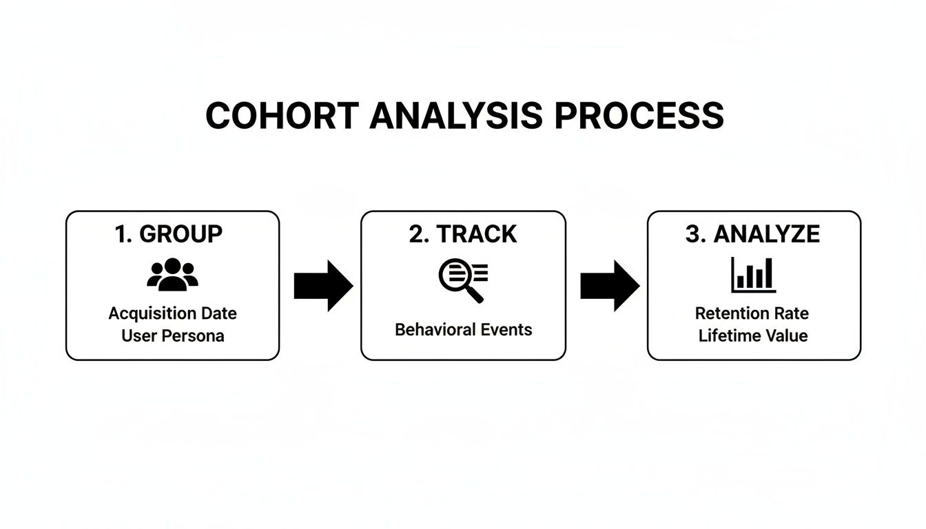
You group users, track their behavior, and analyze the patterns that emerge. It's a clean workflow.
Once you have the chart, interpreting it is all about looking for patterns:
- Read the Rows (Horizontally): How does a single cohort's retention fade over time? A steep drop-off screams early churn.
- Scan the Columns (Vertically): How does Month 1 retention compare across different cohorts? If that column gets darker over time, your onboarding or initial user experience is improving.
- Look for Diagonals: Do you see weird diagonal stripes of poor retention? That could point to a problem that affected all active users at a specific point in time, like a widespread bug or a bad product update.
By methodically following these steps, you create a clear, data-backed picture of user behavior. You’re no longer guessing—you’re making genuinely informed marketing decisions.
Putting Cohort Analysis into Action with Real-World Examples

Theory is great, but seeing cohort analysis solve real problems is where it all clicks. This isn’t just about making colorful charts. It’s about turning squiggly lines on a graph into specific, strategic moves that actually grow the business.
Let's walk through a few mini-stories of marketers using cohort analysis to win. Each one starts with a common marketing headache, shows the critical insight a cohort chart revealed, and breaks down the exact change they made. Think of this as your playbook for putting what you’ve learned into practice.
Use Case 1: Fixing a Leaky Onboarding Funnel
The Problem: A B2B software company was stuck. They were getting a steady stream of new sign-ups every month, but their overall user retention numbers just wouldn't budge. The top-level metrics looked fine, but something was clearly broken.
The Cohort Finding: After building a daily acquisition cohort chart, a glaring pattern jumped out. For every single new cohort, retention would drop off a cliff right after Day 3. While Day 1 retention was a healthy 50%, by Day 4, it consistently plummeted below 15%. That told the team the issue wasn’t the product itself—it was something happening in the very first few days.
The Actionable Solution: The team quickly zeroed in on their three-part welcome email sequence. It was front-loaded with generic feature tours and failed to guide users toward that critical "aha!" moment.
Armed with this insight, they took immediate action:
- Reworked Emails: They rewrote the Day 2 and Day 3 emails to focus on one high-value action: creating their first project.
- Added In-App Prompts: They also implemented simple in-app tooltips that appeared on Day 2, nudging users who hadn't started a project yet.
The result? The very next cohort showed a 35% retention rate on Day 4. They more than doubled the previous average and effectively plugged the leak in their onboarding funnel. This is a perfect example of how focusing on early interactions can dramatically improve your customer retention marketing strategies.
Use Case 2: Finding the Most Profitable Ad Channels
The Problem: A direct-to-consumer brand was spending money across multiple channels—organic search, TikTok ads, and influencer collaborations. On paper, TikTok was the hero. It was driving the highest volume of clicks and had the lowest cost-per-acquisition (CPA). Seemed like a no-brainer.
The Cohort Finding: The marketing manager decided to dig deeper and compare the customer lifetime value (LTV) of cohorts acquired from each channel. The analysis told a completely different story.
| Acquisition Channel | Average 90-Day LTV |
|---|---|
| Organic Search | $125 |
| Influencer Collabs | $95 |
| TikTok Ads | $40 |
While TikTok brought in tons of cheap clicks, those users almost never made a second purchase. Meanwhile, the cohort from organic search, though smaller, had a 3x higher LTV after just three months. They weren't just one-and-done buyers; they were sticking around.
The Actionable Solution: This single chart led to a major budget shift. The team pulled back on their top-of-funnel TikTok ad spend and reinvested that money into SEO and content marketing. They stopped chasing cheap acquisitions and started investing in profitable, long-term customer relationships.
Use Case 3: Validating a New Product Feature
The Problem: A project management app had just invested a ton of resources into building a new "Team Dashboard" feature. After launch, the aggregate engagement metrics showed a small uptick, but the leadership team wanted definitive proof: was this new feature actually making users stick around longer?
The Cohort Finding: A product marketer set up a simple comparison. They looked at the "Pre-Dashboard" cohort (users who signed up the month before launch) versus the "Post-Dashboard" cohort (users who signed up the month after). The results were crystal clear. The Post-Dashboard cohort had a 15% higher 3-month retention rate.
This isn't just a hypothetical. Many real SaaS companies saw this in the 2020s. For example, after Slack integrated new collaboration features, their 2021 cohorts saw a huge retention lift. The March 2021 cohort—the first group exposed to new canvas features—maintained 62% Day 30 retention, a massive jump from the 48% seen in prior cohorts, directly impacting their revenue per user. You can learn more about Slack's cohort-driven growth at Statsig.com.
The Actionable Solution: This cohort analysis was the proof they needed. The company could now confidently double down on promoting the new dashboard in onboarding flows and marketing campaigns, knowing it was a key driver of user loyalty.
Choosing Your Tools and Sidestepping Common Traps
Alright, you've got the theory down. Now, let's get our hands dirty. A great cohort analysis isn't just about following the steps—it's about picking the right tool for the job and knowing which rookie mistakes to dodge. Get this part wrong, and you'll either waste a ton of time or, even worse, walk away with the wrong conclusions.
Your choice of tool really boils down to your team's size, budget, and how comfortable you are with technical deep dives. Most marketers land in one of three camps.
Choosing the Right Tool for Your Cohort Analysis
Picking a platform is your first real step. Do you just need a quick-and-dirty analysis for a one-off project, or are you building a system for ongoing, automated insights? This table should help clear things up.
| Tool Type | Best For | Pros | Cons |
|---|---|---|---|
| Spreadsheets (Google Sheets, Excel) | Beginners, small datasets, and one-time analyses where budget is a primary concern. | No cost and incredibly flexible. You can build completely custom calculations and charts without any limitations. | Manual and error-prone. Gets painfully slow and clunky as your dataset grows. Not built for ongoing analysis. |
| Product Analytics (Mixpanel, Amplitude) | Marketing and product teams needing automated, real-time insights without deep technical skills. | Fast and automated with built-in cohort charts. It’s dead simple to track user behavior and retention day-to-day. | Can get expensive, and you’re pretty much stuck with the data and chart types the platform offers out of the box. |
| BI Tools (Tableau, Looker) | Data teams and large organizations with complex, custom data from multiple sources. | Extremely powerful and customizable. You can blend data from just about anywhere to get a super deep understanding. | High cost and a steep learning curve. You'll almost certainly need a dedicated data analyst to build and manage these. |
Ultimately, the best tool is the one that gets you the insights you need without creating a massive headache. Start simple and scale up as your needs become more complex.
Common Mistakes to Sidestep
Even with the perfect tool in hand, a few common traps can completely derail your analysis. Knowing what they are is the best way to make sure your work actually drives the business forward, instead of just producing a pretty chart.
The absolute biggest mistake? Doing nothing with the insights. A cohort chart that doesn't inspire a change in strategy—a new campaign, a product tweak, a different onboarding flow—is just a vanity report.
Here are a few other slip-ups I see all the time:
-
Mistake 1: Analyzing Cohorts That Are Too Small A cohort with just a handful of users is a recipe for disaster. It isn’t statistically significant, meaning the random behavior of one or two people can throw off the entire trend and send you chasing ghosts. How to fix it: If your user volume is low, zoom out. Group your cohorts by month or even by quarter instead of by day or week. A good rule of thumb is to aim for at least 100 users in each cohort before you start drawing any big conclusions.
-
Mistake 2: Focusing on Vanity Metrics Sure, "time on page" is a metric you can track, but does it actually have anything to do with whether a customer sticks around or spends more money? Chasing metrics that don't tie back to real business goals is just creating noise. How to fix it: Keep your eyes on the prize. Prioritize truly actionable metrics like retention rate, churn rate, and customer lifetime value (LTV) for each cohort. These numbers tell you the real story about the health of your business.
Try our Lookalike Company Finder — find companies similar to your best customers in seconds. No signup required.
Still Have Questions? Let’s Clear Things Up
Even after you’ve got the basics down, a few practical questions always seem to pop up the first few times you run a cohort analysis. Let’s tackle the most common ones head-on so you can move forward with confidence.
Wait, Isn't This Just Segmentation?
Not quite, though they're definitely related. Think of it this way:
Segmentation is like taking a snapshot of all your users right now and grouping them by static traits. Who are my customers in California? Who are my enterprise users? It's a picture of the present.
Cohort analysis, on the other hand, is like a time-lapse video. You group users by a shared starting point—like everyone who signed up in January—and then watch how that specific group behaves over the next few weeks, months, or years. All cohorts are a type of segment, but not all segments are cohorts. It’s all about tracking change over time.
How Big Does a Cohort Need to Be?
There’s no single magic number, but you need enough people to see a real pattern, not just random noise. A good rule of thumb is to aim for at least 100 users in any cohort you plan to analyze.
If your groups are too small, the behavior of just one or two power users (or inactive ones) can completely skew your results and send you chasing ghosts. If you're not getting enough volume, just broaden your timeframe. Instead of looking at weekly sign-ups, group them by month or even by quarter. This will give you larger, more reliable groups to work with.
How Often Should I Be Doing This?
The honest answer? It depends entirely on the rhythm of your business.
- Weekly or even Daily: This is perfect for high-volume B2C apps, e-commerce stores, or mobile games. When you're running constant promotions and A/B tests, you need that fast feedback loop to see what’s working right now.
- Monthly or Quarterly: This cadence makes more sense for most B2B SaaS companies. With longer sales cycles and user onboarding periods, behaviors change more slowly. A monthly or quarterly check-in gives trends enough time to actually emerge.
The key is to sync your analysis with your marketing and product sprints. When you do that, it stops being a backward-looking report and becomes a tool that shows you the direct impact of your decisions.
Ready to turn these insights into action without getting stuck in spreadsheets? marketbetter.ai doesn’t just help you understand your cohorts; it gives you the AI-powered content and campaign tools to engage them effectively. See how our platform can automate your growth at https://www.marketbetter.ai.