
2 posts tagged with "sdr performance"

View All Tags

Beyond the Inbox: An Actionable Guide to Email Open Rates for Sales Leaders

· 18 min read

I'm going to be blunt: your email open rate report is probably lying to you. While it might feel good to see high numbers, the reality is that many of those "opens" are triggered by machines, not actual prospects. This creates a dangerous gap between the data you see and the real engagement you're getting.

Why Your Email Open Rates Are Lying to You

It’s an uncomfortable truth, but one every sales leader needs to confront. As we head through 2026, the open rates in your dashboard have become increasingly disconnected from genuine human interest, mostly thanks to new privacy-focused tech.

The main driver behind this is Apple's Mail Privacy Protection (MPP). It works by automatically pre-loading email content on its own servers, which instantly triggers the tracking pixel that counts as an "open." This happens whether the recipient ever lays eyes on your message or not.

The Motion Sensor Analogy

I like to explain it this way: imagine your open rate is a motion sensor at the front of a store. Its only job is to count people walking through the door. But what if it's placed poorly and also counts every car that drives by on the street?

At the end of the day, your report would show incredible foot traffic, but your sales would be flat. The sensor is technically working, but it’s counting the wrong thing. This is exactly what's happening with your open rates email metrics; they're counting server pings, not just human attention.

This generates an army of "ghost opens"—open events logged by automated systems, not curious prospects. If you're relying on that inflated number to judge a subject line's effectiveness or a campaign's success, you're essentially navigating with a broken compass.

A New Role for an Old Metric

So, if open rates are no longer a reliable measure of interest, should you just ignore them? Not exactly. The metric isn't useless; its job has just changed. Think of it less as a performance indicator and more as a technical diagnostic tool.

Your open rate is now the canary in the coal mine for your email deliverability. Its real value is in spotting big-picture technical issues before they derail your outreach.

Here’s an actionable comparison:

  • A sudden, sharp drop in opens is a huge red flag. It’s a strong signal that your emails are landing in spam, meaning prospects aren't even getting a chance to see them. This is your cue to immediately investigate your sender reputation and list health.
  • A steady, high rate, even if it seems inflated, is actually good news. In contrast, this suggests your emails are successfully making it to the primary inbox. Your subject lines are passing the first filter and at least have an opportunity to be read.

By shifting how you look at it, this flawed metric becomes useful again. The goal is no longer about celebrating a 70% open rate. It's about using the data to confirm your technical foundation is solid, which frees you up to focus on the metrics that truly matter: clicks and replies.

How Email Open Rates Are Actually Measured

Ever wondered what really happens when you get that ‘email opened’ notification? To understand why your open rate data can be so misleading, you have to look under the hood at the technology that powers it.

The whole system relies on a tiny, invisible image called a 1x1 tracking pixel. It’s a single, transparent pixel hidden in the code of your email. When your prospect’s email client (like Outlook or Gmail) loads the images in your message, it has to fetch that tiny pixel from your email provider’s server. That request is the signal that logs an “open.”

It's a clever trick, but it's an old one. This method was never built to handle the privacy-first world we live in today, where automated systems can easily trip the wire and give you a false signal.

This map shows the difference between a real open—from a person—and a “ghost open” triggered by a machine.

Concept map illustrating email open rates, differentiating real and ghost opens influenced by privacy features.

As you can see, the journey to a logged open isn't always what it seems. For any sales leader, knowing this difference is absolutely essential.

Where the Measurement Breaks Down

So, why isn't the tracking pixel reliable? A few common issues can completely throw off your data, making open rates a shaky indicator of who's actually reading your emails.

Here are the main culprits:

  • Image Blocking: Plenty of people have their email clients set to block images by default. If a prospect reads your entire message but never clicks "display images," the pixel never loads. You get zero credit for an open, even though they were engaged.
  • Text-Only Previews: The preview panes in many email clients only show the plain text version of an email. Just like with image blocking, the pixel doesn’t fire, and the open goes unrecorded.
  • Automated Server Actions: This is the big one. Privacy features, most notably Apple's Mail Privacy Protection (MPP), now pre-fetch and download all email content through their own servers. This automatically triggers the tracking pixel and logs an open, even if the user never laid eyes on your message.

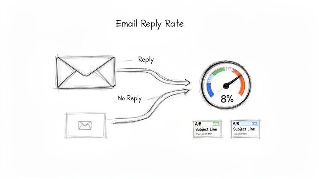
This difference between a 'real open' (a prospect reading your message) and a 'proxy open' (an Apple server fetching the content) is critical. A 95% open rate paired with a 0.2% click rate isn't a success story; it's a clear signal of a measurement problem.

This data inflation is everywhere. For instance, recent industry reports showed the global average email open rate climbed to 42.35% in 2025. While that sounds great, a huge part of that increase comes from automated opens triggered by services like MPP, not from more human engagement.

Ultimately, these technical blind spots mean that while you can confirm your emails are landing, you can't always trust the open rate to tell you who is truly interested. Getting your emails delivered is just the first step. To get the full story, it helps to understand all the factors that impact whether your emails arrive in the first place, which you can find in our comprehensive B2B email deliverability guide.

Setting Realistic B2B Email Benchmarks

Everyone wants to know: what’s a “good” email open rate? The honest answer is, it depends. Chasing some universal number is a losing game because what’s considered great for one team might be a total flop for another.

The key is to stop looking for a magic number and start setting benchmarks that actually make sense for your specific industry, region, and campaign goals.

Just look at how much geography can influence performance. Different markets have different digital habits and levels of inbox saturation. For example, recent data showed the Americas having a standout year, with an average open rate of 58.8%—a full 3.4% higher than the global average. The region’s unique open rate of 40.8% also beat the worldwide figure of 37.7%.

That kind of performance, including a 7.1% year-over-year jump, shows just how much regional factors matter. It's a useful piece of context, but it's not the full story.

Compare Your Campaigns, Not Your Company

Even within your own team, not all emails are created equal. The most common mistake SDRs and managers make is comparing the open rates of completely different types of campaigns.

A hyper-personalized, one-to-one email sent to a Tier 1 executive shouldn't be judged against a broad, automated sequence sent to a list of 200 prospects. They have entirely different objectives, levels of effort, and expected outcomes.

It’s like comparing a sniper rifle to a shotgun. You use one for a single, high-value target that requires extreme precision. You use the other for wider coverage. You’d never measure their success by the same standard.

To make your reporting meaningful, you have to start tracking performance based on the type of campaign you’re running.

Here’s a look at how benchmarks can differ dramatically by campaign type. These are solid starting points for most outbound B2B teams.

B2B Email Open Rate Benchmarks Comparison

CategoryBenchmark Open RateActionable Tip for SDRs
Tier 1 Account Outreach70-85%Action: If rates are below this, audit your personalization. Is it truly unique to the prospect, or just a mail-merged first name?
Automated Prospecting Cadence40-55%Action: A/B test your subject lines constantly in these campaigns. A small improvement here scales across the entire list.
Re-Engagement Campaign30-45%Action: Try a pattern-interrupt subject line like "Still interested?" or "Closing your file". A direct question can often spark a response.

As you can see, the definition of a "good" open rate changes depending on the mission. Context is everything.

Build Your Own Benchmark

Ultimately, the only benchmark that truly matters is your own. Your team's historical data is the most reliable source of truth for what’s possible. Stop looking for an external magic number and start looking at your own past performance.

Here’s a simple, four-step process to create a baseline that works for you:

  1. Analyze Past Performance: Pull the data from all your outbound sequences over the last quarter.
  2. Segment by Campaign: Group the results by campaign type (e.g., Tier 1, automated prospecting, event follow-up).
  3. Establish a Baseline: Calculate the average open rate for each of those categories. That’s your new starting line.
  4. Set an Actionable Goal: Forget about doubling your numbers overnight. Aim to improve each category’s baseline by a realistic 5-10% over the next quarter.

By following this approach, your open rate transforms from a simple vanity metric into a powerful diagnostic tool. It tells you exactly what’s working—and what isn’t—for your team, your prospects, and your strategy.

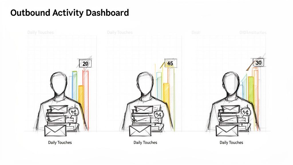
Actionable Steps to Improve Real Email Engagement

Forget about just getting your open rate number to go up. Since we know those metrics can be misleading, let’s talk about what actually gets a real person to stop scrolling and read your email. It's less about gaming the system and more about earning that click.

Sketched icons representing sender reputation, subject lines, preview text, and timing for email optimization.

When you boil it all down, there are four key things that convince a busy prospect to give you their time: your reputation, your subject line, that little snippet of preview text, and when you show up in their inbox.

If you get these four elements right, you’re optimizing for genuine human interest, not just a tracking pixel.

Protect Your Sender Reputation

Think of your sender reputation as your passport to the inbox. A bad one gets you a one-way ticket to the spam folder, and everything else you do is for nothing. It’s basically a credit score for your email domain—the higher it is, the more mailbox providers like Google and Microsoft trust you.

Here are two non-negotiable actions:

  • Warm Up Your Domain: Never blast out a ton of emails from a brand-new domain. You have to build trust. Start by sending a few emails to people you know will open them, then slowly ramp up your volume over a few weeks. This shows the filters you’re a legitimate sender, not a spammer.
  • Keep Your Lists Clean: Routinely clear out bad email addresses and contacts who haven't engaged in months. A high bounce rate is a huge red flag for email providers and will tank your reputation faster than almost anything else.

Craft Unforgettable Subject Lines

Your subject line is your first impression, and you’ve got about three seconds to make it count. It needs to be interesting enough to stop someone in their tracks and make them curious about what's inside. The secret is to mix genuine personalization with a hint of value.

Action: Run a subject line A/B test. Send half your list a question-based subject line (e.g., "Idea for [Company Name]?") and the other half a benefit-driven one (e.g., "Cutting your team's ramp time"). Compare the click-through rates (not just opens!) to see which resonates more with your audience.

Personalized subject lines can lead to 50% higher open rates, and when you realize that 42-60% of people open emails on their phones, a short, punchy subject line is absolutely critical to stand out on that small screen.

If you need some fresh ideas, our guide to subject lines for sales emails is packed with examples that work.

Maximize Your Preview Text

That little line of text next to the subject line? That’s your preview text, and it’s your second chance to grab their attention. Too many reps waste this prime real estate with junk like, "Having trouble viewing this email?"

Actionable Comparison: Bad: "Hi [First Name], My name is..." (Wastes space) Good: "A quick question about your Q3 hiring goals..." (Adds context and curiosity) Use the preview text to build on your subject line. Ask a thought-provoking question, hint at the solution you're offering, or add a detail that makes opening the email irresistible.

Perfect Your Timing

Finally, when your email lands can be just as important as what it says. Hitting a prospect’s inbox at the exact moment they’re most likely to be engaged dramatically increases your odds of getting noticed. For a deeper dive, there's great info on understanding the best time to send an email.

Action: Don't just send all your emails at 9 AM on a Tuesday. Use engagement tracking to identify when your key accounts are most active. Then, schedule your most important emails to land 10-15 minutes before those peak activity windows. Platforms like marketbetter.ai automate this, prioritizing tasks to align with buyer activity.

Measuring What Truly Matters for Your Pipeline

Since we know email open rates can be misleading, it’s time to stop obsessing over them. Chasing ghost opens is a waste of energy. Instead, the best sales teams I’ve worked with focus on the numbers that actually predict and drive real pipeline.

These are the metrics that show you what’s really happening when your emails land in a prospect’s inbox.

An illustration showing email marketing metrics: Opens, CTR, COTOR, Replies, leading to Pipeline.

Think of these as the true signals of engagement. They move past vanity numbers and give you a clear, honest picture of your messaging, your offer, and your overall outbound strategy.

How to Read the Real Engagement Signals

Each of these metrics tells you something different. A high open rate might feel great, but if no one clicks or replies, it's just noise. The real skill is learning how these numbers work together to tell a story about your campaign's performance.

Let's break down how to read the tea leaves.

  • Click-Through Rate (CTR): This is the gold standard of engagement. It’s the percentage of people who actually clicked a link in your email. A click is a definitive action; it shows your message was compelling enough for someone to do something. For context, the average email click rate across industries is about 2.09%.

  • Click-to-Open Rate (CTOR): This metric digs a layer deeper. It compares the number of unique clicks to the number of unique opens, which helps you judge the quality of your email’s content and call-to-action, even if your open rate is artificially high.

  • Reply Rate: For most outbound sales, this is the holy grail. A reply—even a "not interested" one—means a human read your email and felt compelled to respond. It’s your ticket to starting a real conversation.

When you look at these metrics together, you can diagnose exactly where your outreach is falling short.

Actionable Diagnosis: Scenario A: High Open Rate, Low CTR

  • Comparison: Your subject line is effective, but your email body is not.
  • Action: Rewrite the body copy. Is the call-to-action clear? Is the value proposition compelling? Scenario B: Good CTR, Zero Replies
  • Comparison: Your content is interesting, but your ask is wrong.
  • Action: Re-evaluate your call-to-action. Is it too high-commitment (e.g., "Book a demo")? Try a softer ask (e.g., "Is this a priority for you?").

This kind of analysis turns a simple data report into a powerful coaching tool for your entire team. For a deeper dive, check out our guide on how to segment email lists to improve message relevance.

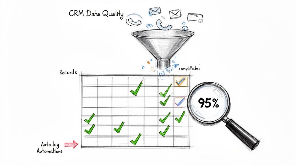
Tying Your Data Back to Your CRM

The biggest hurdle to tracking these metrics effectively? Messy, disconnected data. When reps are jumping between their inbox, a sales engagement platform, and the CRM, activities get lost in the shuffle. It becomes almost impossible to get a clear picture of what's actually working.

This is where having a tool that lives inside your CRM makes all the difference.

Platforms like marketbetter.ai that are built to work directly within your CRM solve this problem by automatically logging every call, email, click, and reply. This simple change ensures your data is always clean, complete, and tied directly to the right contact and account record.

With all your data in one place, sales leaders can finally build dashboards that track what truly moves the needle. You can see which reps are getting the most replies, which email templates are driving the highest CTR, and which sequences are actually creating pipeline. This is how you get your team to stop chasing vanity metrics and start focusing on the activities that generate revenue.

Frequently Asked Questions About Email Open Rates

Even after you've got a handle on the basics, a few nagging questions about open rates can still cause confusion. Let's clear the air and tackle the most common ones I hear from sales leaders, so you can stop worrying and start focusing on what actually works.

How Often Should I Check My Email Open Rates?

This one's easy: stop checking them daily. Obsessing over day-to-day blips will drive you crazy and lead to bad decisions based on statistical noise. Instead, make it a weekly habit.

Think of it like checking your car's tire pressure. You don't do it every single time you get in the car, but a regular check-up keeps you from getting a flat. A weekly review gives you enough real data to spot meaningful trends and catch a big drop that might signal a deliverability problem, without getting lost in the weeds.

What's More Important: Open Rate or Click-Through Rate?

It’s not even a fair fight. Your click-through rate (CTR) is vastly more important. An open might mean someone saw your email, but a click is hard proof of genuine interest. It’s a deliberate action that tells you your message connected with the prospect.

A high open rate with a low CTR is a classic warning sign. It screams that your subject line did its job, but the email body completely missed the mark. In comparison, a decent open rate with a great CTR shows you’re hitting the right people with a message that resonates. Clicks and replies are the currency of outbound; opens are just loose change.

Should I Remove Subscribers Who Don't Open My Emails?

Yes, but you need a smart approach. Don't just go on a purge based on opens alone, especially since we know the tracking is shaky. A much better way is to identify contacts who haven't opened or clicked anything in the last 90-120 days.

Action Plan:

  1. Segment: Create a list of contacts with no opens or clicks in 90 days.
  2. Re-engage: Send them a final, direct campaign with a subject line like, "Is this goodbye?" or "Still interested in [Topic]?"
  3. Purge: If they still don't engage, remove them. A clean, engaged list is your best friend for improving sender reputation and overall campaign performance.

Is a Low Open Rate Always a Bad Sign?

Not always. While a low open rate is often the first sign of a deliverability issue or a weak subject line, context is everything.

Compare these two scenarios:

  • Cold List Re-engagement: An open rate of 30-45% could actually be a huge win here. It shows you're successfully reviving a stale audience.
  • Tier 1 Personalized Outreach: Here, anything below 70-85% is a five-alarm fire. It means your high-value messaging or deliverability is failing.

The "good" or "bad" of an open rate depends entirely on the campaign's context—who you're emailing and what you're trying to achieve.


Stop guessing what to do next. marketbetter.ai turns buyer signals into a prioritized task list for your SDRs, complete with AI-generated emails and a CRM-native dialer to ensure reps execute flawlessly. Transform your outbound motion and see how much pipeline your team can really build at https://www.marketbetter.ai.

10 Actionable Marketing Key Performance Indicators Examples for 2026

· 29 min read

In the high-stakes world of B2B marketing and sales development, activity without measurement is just noise. The critical difference between a high-growth team and a stagnant one often lies in tracking the right metrics, not just the most obvious ones. Simply monitoring website traffic or social media likes isn't enough; you need to connect marketing efforts directly to sales outcomes and revenue generation. This guide moves beyond vague theory to provide a comprehensive list of actionable marketing key performance indicators examples.

We will provide a detailed breakdown of the KPIs that truly matter for modern demand generation and sales development teams. You won't just get definitions. For each metric, we'll provide the specific formulas for calculation, realistic benchmarks to aim for, and common pitfalls to avoid. More importantly, we'll give you actionable strategies and quick implementation tips to start using these KPIs immediately. This isn't about collecting data for its own sake; it's about transforming that data into your most powerful strategic asset.

This article is designed for sales and marketing leaders who need to prove their impact, drive efficiency, and make data-driven decisions. You will learn precisely how to measure everything from top-of-funnel activity rates and email engagement to sales cycle velocity and the true cost per opportunity. We will explore how to compare different channels, assess rep performance, and optimize your entire go-to-market motion. Let's dive into the essential KPIs that will help you stop guessing, start measuring, and build a predictable revenue engine.

1. Outbound Activity Rate (Calls & Emails Per Rep Per Day)

The Outbound Activity Rate measures the raw volume of outreach a sales development representative (SDR) or business development representative (BDR) completes daily. This foundational KPI tracks meaningful touches, such as calls and personalized emails, which serve as the top-of-the-funnel fuel for pipeline generation. While simple, it's a critical indicator of a team's effort and capacity.

Dashboard visualizing outbound activity with daily touches and performance metrics for three individuals.

This metric helps sales leaders quickly diagnose issues. Low activity could signal a need for better tools, process improvements, or coaching on efficiency. For instance, compare two reps: Rep A averages 15 daily touches while Rep B hits 45. The discrepancy isn't about effort but efficiency. A deeper look might show Rep B uses a tool to automate prep work and logging, while Rep A is bogged down by manual tasks. This comparison makes the case for investing in automation actionable.

Strategic Application & Analysis

Tracking this KPI reveals powerful insights when segmented. An outbound-focused SaaS company, for example, might track calls and emails separately. By comparing the two channels, they could discover that calls convert to meetings at a 3x higher rate than emails. This data provides an actionable insight: shift the team's strategy toward a call-first engagement model for higher-value accounts.

Key Insight: Activity without quality is just noise. The goal isn't simply to maximize touches but to maximize meaningful touches. High activity rates paired with low conversion rates indicate a problem with messaging, targeting, or rep skill.

Actionable Tips for Implementation

  • Automate Non-Selling Tasks: Use tools that auto-log activities in your CRM. This keeps reps focused on outreach, not administrative work, and ensures data accuracy.
  • Set Realistic Targets: Base daily activity goals on historical performance and team capacity, not arbitrary industry benchmarks. A realistic target for a team with complex, research-heavy sales will differ from one with a high-volume, transactional model.
  • Prioritize Smartly: Implement a system, like a prioritized task inbox, to ensure reps always work on the highest-fit accounts first. This aligns effort with potential revenue.
  • Coach with Data: In weekly one-on-ones, review activity dashboards to identify bottlenecks. Is a rep spending too much time researching? Are they struggling with call scripts? Use the data to guide coaching conversations. For a deeper dive, explore these strategies for effective outbound lead generation.

2. Reply Rate (Email Open & Response %)

The Reply Rate is the percentage of cold outreach emails that receive a human response, excluding automated replies. This KPI is a direct measure of message effectiveness, moving beyond simple open rates to gauge genuine prospect engagement. It serves as a crucial leading indicator for outbound success, as a strong reply rate signals that your targeting, subject lines, and messaging are resonating with your audience.

Diagram illustrating email reply rate, showing emails leading to replies or no replies, with an 8% success.

This metric allows managers to pinpoint weak links in the outreach sequence. A low reply rate despite a high open rate, for instance, suggests the subject line works but the email body fails to connect. Compare two reps: one using generic templates sees a 2% reply rate, while another using context-specific emails achieves an 8% rate by referencing recent account intent signals. This clear comparison demonstrates the ROI of personalization and provides a playbook for the underperforming rep.

Strategic Application & Analysis

Segmenting reply rates by persona, industry, or campaign type is essential for optimization. A B2B tech company might compare subject lines: "Quick question" outperforms "Partnership opportunity" by a 2:1 margin when targeting VPs of Engineering, but the opposite is true for C-level executives. This insight allows for the immediate, actionable tailoring of messaging to different buyer personas.

Key Insight: A reply, even a negative one, is valuable data. A "not interested" response provides a learning opportunity to refine targeting or messaging, whereas silence offers no feedback. The goal is to start conversations, not just send emails.

Actionable Tips for Implementation

  • Segment and Test Systematically: Track reply rates by campaign, persona, and industry to identify what messaging works best for specific audiences. A/B test email variants to isolate winning elements.
  • Keep Emails Short and Relevant: Ditch long, generic templates. Test concise 2-to-4-line emails that reference a specific, recent trigger event like new hiring initiatives or company funding.
  • Monitor and Optimize Weekly: Review reply rate trends every week. If a campaign falls below a set threshold (e.g., 3%), immediately flag it for optimization and analysis.
  • Use Account Context: Leverage tools like MarketBetter to automatically find and insert relevant account context, such as recent site visits or tech stack changes, to make your outreach feel personal and timely. For more strategies, check out these tips on how to improve email open rates.

3. Call Connect Rate (Calls Answered / Calls Made %)

The Call Connect Rate measures the percentage of dialed calls that result in a live conversation with the intended prospect, distinguishing it from calls that go to voicemail or are not answered. This is one of the most vital marketing key performance indicators examples for sales development teams, as it directly impacts the ability to qualify leads and book meetings. A low connect rate renders even the highest call volume ineffective.

This metric provides immediate feedback on the effectiveness of a team's dialing strategy and timing. For instance, a sales manager can compare performance based on process: reps using a dedicated call-prep workflow connect at a 20% rate, while unprepared reps on the same team only average 11%. This data provides a clear, actionable business case for adopting standardized preparation processes to improve efficiency and pipeline generation.

Strategic Application & Analysis

Analyzing connect rates by different segments reveals critical patterns that inform strategy. An enterprise sales team, for example, could compare connect rates by Ideal Customer Profile (ICP) segment. They might discover that executives connect at an 18% rate, while IT buyers only answer 8% of the time. This insight leads to an actionable strategy: reallocate resources, shifting the IT buyer outreach to a different channel and focusing call efforts on the more accessible executive personas.

Key Insight: A high connect rate is a direct reflection of strategic timing, accurate data, and compelling outreach. It's not just about when you call, but also who you call and how prepared your reps are for the conversation.

Actionable Tips for Implementation

  • Time Dials Strategically: Experiment with calling during peak windows, typically 9–11 AM and 1–3 PM local time. Track your own data to find the optimal times for your specific industry and personas.
  • Arm Reps Before Dialing: Use call-prep features or checklists to provide reps with key talking points, recent company news, and prospect background information before they ever pick up the phone.
  • Segment Performance: Monitor connect rates by persona, title, and industry. A low rate for a key segment may signal an issue with your data accuracy or value proposition for that audience.
  • Coach the Opening: Listen to call recordings for reps with below-average connect rates (e.g., under 12%). Often, the first 5-10 seconds of the opening statement make the difference between a conversation and a hang-up. Use this data to refine their talk tracks.

4. Conversation-to-Opportunity Rate (Meeting Booked % or SQL Rate)

The Conversation-to-Opportunity Rate, often called the SQL Rate or Meeting Booked Percentage, measures the effectiveness of an SDR's outreach. It calculates the percentage of meaningful conversations (connected calls or positive email replies) that successfully convert into a qualified meeting or a Sales Qualified Lead (SQL). This is one of the most vital marketing key performance indicators examples for bridging top-of-funnel activity with tangible pipeline growth, shifting focus from quantity to quality.

This KPI directly reflects the quality of targeting, messaging, and a rep's qualification skills. A low rate signals a disconnect; perhaps reps are engaging the wrong personas or the value proposition isn't resonating. For instance, compare two outreach approaches: a rep’s SQL rate might jump from 8% with generic outreach to 14% after using a tool to prioritize accounts showing clear buying signals. This comparison proves the power of context-driven engagement and provides an actionable directive to prioritize intent-based leads.

Strategic Application & Analysis

Analyzing this KPI by channel and segment reveals powerful strategic levers. A revenue operations manager could compare the SQL rate by different outreach triggers and discover that tasks generated from "hiring spike" alerts convert at a rate three times higher than standard cold prospecting. This data provides a clear, actionable mandate to reallocate resources and prioritize campaigns targeting companies that are actively expanding their teams.

Key Insight: Not all meetings are created equal. The ultimate goal is to generate qualified pipeline, not just fill calendars. A high meeting-booked rate with a low SQL-accepted rate indicates a qualification gap between the SDR and sales teams.

Actionable Tips for Implementation

  • Define "Qualified" Collaboratively: Work with the sales team to establish firm, mutually agreed-upon criteria for what constitutes a true SQL. This alignment prevents pipeline friction and wasted effort.
  • Track End-to-End Conversion: Monitor the entire sequence from initial task creation to conversation, booking, and final SQL acceptance. This full-funnel view helps pinpoint exactly where prospects are dropping off.
  • Segment for Precision: Analyze your SQL rate by account fit (ICP vs. non-ICP), industry, and persona. Focus your team's energy and resources on the segments that demonstrate the highest conversion potential.
  • Coach on Qualification: Train reps to qualify prospects during the conversation, not just book a meeting with anyone who shows interest. Equip them with questions to uncover pain points, budget authority, and timing.

5. Average Sales Cycle Length & Deal Velocity

The Average Sales Cycle Length measures the time from the first outbound touch, like a call or email, to a key conversion point such as a closed deal. Deal Velocity tracks how quickly deals progress through pipeline stages. These complementary KPIs show how effectively outbound efforts are not just generating leads, but accelerating them toward revenue. A shorter cycle means faster cash flow and quicker feedback loops for campaign optimization.

This metric is essential for connecting top-of-funnel activity to bottom-line results. For instance, a RevOps manager might compare lead sources and discover that Sales Qualified Leads (SQLs) generated from high-intent outbound tasks progress through the pipeline 40% faster than leads from other sources. This insight provides an actionable justification for reallocating budget toward more targeted cold outreach efforts that produce higher-velocity deals.

Strategic Application & Analysis

Analyzing sales cycle length by segment reveals which outreach strategies are most efficient. A B2B SaaS company might track this KPI by outreach channel and compare call-sourced vs. email-sourced deals. If they discover call-sourced deals close in 28 days on average, while email-sourced deals take 35 days, they have a strong, data-backed case for prioritizing a call-first engagement model for high-value target accounts to shorten the time to revenue.

Key Insight: Speed is a competitive advantage. A faster sales cycle doesn't just improve cash flow; it reduces the risk of deals stalling or being lost to competitors. The goal is to identify and eliminate friction points at every stage of the buyer's journey.

Actionable Tips for Implementation

  • Establish a Baseline: Before making any changes, measure your current average sales cycle length to create a benchmark for future optimizations.
  • Segment the Cycle: Break the sales cycle into distinct phases (e.g., first touch to meeting, meeting to SQL, SQL to close) to pinpoint exactly where deals are slowing down.
  • Prioritize High-Intent Leads: Use tools that create outreach tasks based on intent signals rather than random prospecting. Warm leads naturally move through the pipeline faster, compressing your sales cycle.
  • Monitor Velocity Weekly: Track the number of deals created, their current stage, and their age. A weekly review helps you spot bottlenecks before they derail your forecast.
  • Align with Sales: Collaborate with the sales team to understand why SQLs get stuck. Common roadblocks include internal approvals, forecasting issues, or a lack of sales readiness materials.

6. Cost Per Sales Qualified Lead (CPSL) or Cost Per Opportunity

Cost Per Sales Qualified Lead (CPSL) measures the total expense required to generate one opportunity for the sales pipeline through outbound efforts. This efficiency metric connects the investment in your sales development team (salaries, tools, overhead) directly to pipeline value. It answers a critical question for sales leaders: How much does it cost us to create a qualified chance to win business?

This KPI is essential for budgeting, justifying headcount, and evaluating technology investments. Compare your team's efficiency before and after a change. For example, a baseline CPSL might be $400 per opportunity, driven by manual research. After implementing an automation tool, activity rises by 40% with the same team, lowering the CPSL to $280. This comparison demonstrates clear ROI and provides an actionable business case for further investment in sales efficiency.

Strategic Application & Analysis

Analyzing CPSL reveals the true cost-effectiveness of different outreach strategies. For instance, a sales leader can compare CPSL by channel. They might discover that their cold email campaigns produce SQLs at a CPSL of $350, while a call-first sequence results in a CPSL of just $310. This data provides a clear, actionable directive to reallocate rep time and training resources toward more phone-based engagement to optimize the budget.

Key Insight: A declining CPSL is a direct indicator of improving operational efficiency. It proves that your team, processes, and tools are becoming more effective at turning investment into a tangible sales pipeline.

Actionable Tips for Implementation

  • Calculate True Costs: Include all associated expenses in your CPSL calculation: fully-loaded salaries (including benefits and taxes), software licenses, management overhead, and training costs for a complete picture.
  • Segment for Deeper Insights: Don't just track a single, blended CPSL. Break it down by individual rep, team, target industry, or outreach campaign to identify top performers and effective strategies that can be replicated.
  • Set Improvement Targets: Use your baseline CPSL to set quarterly or annual goals. A common objective is to reduce CPSL by a specific percentage, such as 15% year-over-year, driving continuous process improvement.
  • Evaluate Tool ROI: When assessing new sales technology, frame the decision around its potential impact on CPSL. If a tool costs $5,000 per month but reduces CPSL by $100 per lead across 500 monthly SQLs, it generates a net savings of $45,000, making the investment easy to justify.

7. Email Deliverability & Bounce Rate

Email Deliverability measures the percentage of emails that successfully land in a recipient's primary inbox, while Bounce Rate tracks the percentage that fails to be delivered. These interconnected marketing key performance indicators examples are foundational; if your messages don't reach their destination, every other email metric like open and reply rates becomes irrelevant. High bounce rates are a direct threat to your sender reputation, which can get your domain blacklisted by providers.

This KPI is a critical health check for your entire outbound engine. A high bounce rate (over 3-5%) or low deliverability immediately signals a problem with your data quality, sending infrastructure, or content. For instance, compare a stale list to a clean list: a team using a stale list might see an 8% bounce rate and only 60% deliverability. After cleaning the list and implementing an email warm-up protocol, bounces could drop to under 1% and deliverability climb to over 97%, an actionable process that effectively revives a failing campaign.

Strategic Application & Analysis

Analyzing these metrics by campaign or domain provides immediate diagnostic power. Imagine a marketing team comparing two domains in a multi-domain outreach campaign. They notice one domain's performance is lagging significantly. A reputation audit reveals that specific domain has been flagged for spam. The actionable solution is to pause activity on the flagged domain and shift volume to a fresh, properly warmed-up one, restoring overall campaign deliverability from a concerning 70% to a healthy 94%.

Key Insight: Deliverability isn't a "set it and forget it" metric. It's a dynamic score influenced by recipient engagement, list hygiene, and technical setup. Consistently low inbox placement, even without high bounces, indicates that your emails are being filtered to spam, silently killing your ROI.

Actionable Tips for Implementation

  • Validate Lists Relentlessly: Before every single campaign, use an email validation service to scrub your list of invalid, inactive, or risky addresses.
  • Authenticate Your Domain: Properly configure your technical records (SPF, DKIM, and DMARC). These act as your domain's digital passport, proving to email providers that you are a legitimate sender.
  • Implement an Email Warm-Up: Never send high-volume campaigns from a new domain or email address. Start by sending 5-10 emails on day one, then increase the volume by about 10% daily over several weeks to build a positive sender reputation.
  • Monitor Bounce Rates Daily: During any active campaign, watch your bounce rate. If it exceeds 3%, pause the campaign immediately to diagnose the issue, whether it's a bad data segment or a technical block.

8. Rep Ramp Time (Time to Productivity for New SDRs)

Rep Ramp Time measures how long it takes a newly hired sales development representative (SDR) to reach full productivity. This crucial KPI quantifies the efficiency of your onboarding and training processes, directly impacting the return on investment for new hires. A shorter ramp time means a faster contribution to pipeline and revenue, making it a key focus for scaling sales teams.

This metric provides a clear lens into the effectiveness of your sales enablement. For instance, an enterprise sales operations team can compare ramp time by hiring cohort. A pre-implementation cohort could average 85 days to full productivity, while a cohort equipped with an automation tool from day one might reach the same level in just 52 days—a 39% improvement. This comparison provides a clear, actionable case for investing in better onboarding technology.

Strategic Application & Analysis

Analyzing this KPI by cohort or team reveals the impact of training programs, tools, and management styles. A sales manager might compare the progress of reps using different tools. New hires without a structured enablement platform might hit 40% of their activity target by day 30. In contrast, new reps using a platform with an automated task inbox and AI-generated emails might hit 70% in the same timeframe. This demonstrates a clear, actionable link between tooling and performance.

Key Insight: Rep Ramp Time is not just a training metric; it's a financial one. Every day shaved off the ramp period is a day a new hire is generating pipeline and revenue, directly accelerating team-wide goal attainment.

Actionable Tips for Implementation

  • Define 'Full Productivity': Establish a clear, quantifiable benchmark. This could be hitting 80% of a tenured rep's qualified meeting target, a specific activity level, or a target reply rate for three consecutive weeks.
  • Track Cohort Performance: Measure ramp time for groups of hires, not just individuals. This smooths out personal variations and provides a more accurate view of your onboarding process's effectiveness.
  • Automate the Onboarding Playbook: Use tools to build a standardized ramp playbook. A new rep should log in on day one to a prioritized task list, proven outreach sequences, and templated messaging, eliminating guesswork.
  • Implement a Buddy System: Pair each new hire with a top-performing veteran for the first few weeks. This provides a direct line for tactical questions and helps them learn the qualitative aspects of the role faster.

9. CRM Data Quality & Activity Logging Completeness

CRM Data Quality measures the accuracy and completeness of logged sales activities, such as calls and emails, within a CRM like Salesforce or HubSpot. This critical KPI evaluates whether reps are consistently recording interactions with the correct disposition, timing, and context. Poor data quality renders reporting useless, hampers effective coaching, and breaks revenue attribution models.

A diagram illustrating CRM data quality, automation processing communication data into records, achieving 95% completeness.

This metric exposes foundational operational gaps. For example, compare a rep's claimed activity to their logged activity. A rep might claim 50 calls per day, but their CRM only shows 15 logged tasks. Without accurate data, a manager can't distinguish between low effort and poor logging discipline. Implementing an automated tool that reveals the rep's true performance makes the problem visible and coachable. For effective tracking and analysis of your sales performance, accurate and complete CRM data is non-negotiable; exploring options like a dedicated CRM Specialist Virtual Assistant can greatly enhance data quality.

Strategic Application & Analysis

Tracking logging completeness helps RevOps and sales leaders trust their pipeline forecasts. Compare two teams: one without auto-logging might have only 35% of calls logged, leading to inaccurate forecasts. A team with an automation tool could see 94% of calls auto-logged with summaries and dispositions. This comparison highlights the direct impact of automation on forecast accuracy, providing an actionable insight for operational improvement.

Key Insight: Incomplete CRM data is not just a reporting inconvenience; it's a strategic liability. It hides top performer behaviors, masks coaching opportunities, and leads to flawed decisions about which marketing key performance indicators examples are truly driving revenue.

Actionable Tips for Implementation

  • Automate Everything Possible: Use tools with native dialers and email integration to eliminate manual data entry. This removes friction for reps and ensures every touchpoint is captured.
  • Standardize Dispositions: Create a simple, clear taxonomy for call and email outcomes (e.g., Connected, Voicemail, Meeting Set, Follow-Up). This standardizes data for easier analysis.
  • Conduct Weekly Spot-Checks: During one-on-ones, pull a few random contact records and review them for logging completeness. This reinforces accountability and identifies issues early.
  • Show the "Why": Create a dashboard that connects logging compliance to tangible business outcomes. Show the team, "When we log over 90% of activities, our forecast accuracy improves by 15%."

10. Manager Coaching Leverage & Rep Enablement Scalability

Manager Coaching Leverage is a qualitative KPI that measures how effectively sales leaders can scale coaching and replicate top-performer behaviors across their entire team. It assesses the ability to move beyond one-off feedback by systematically identifying winning patterns, codifying them into playbooks, and course-correcting underperformers with data-backed insights. Without visibility into rep outreach, coaching is often based on guesswork; this KPI tracks the shift from anecdotal to analytical enablement.

This metric helps leadership turn individual successes into scalable team-wide strategies. A manager can compare the tactics of a top performer to a struggling rep. One rep has an 11% reply rate while another is at 3%. By reviewing their activities in a centralized tool, the manager can pinpoint exact differences in subject lines or call scripts. This allows them to coach the struggling rep with specific, proven examples—a highly actionable alternative to generic advice.

Strategic Application & Analysis

Analyzing this KPI involves moving from individual performance metrics to team-wide behavioral patterns. A sales leader can compare the call recordings of top reps vs. average reps. They might discover top performers consistently use a specific opener, like, "I noticed you recently hired a new VP of Sales." This observation is then transformed into an actionable playbook for the entire team. After rollout, they can track the team's average meeting booking rate. If it jumps from 4% to 6%, the coaching leverage is tangibly proven.

Key Insight: Scalable enablement isn't about cloning your best rep; it's about isolating and distributing their most effective behaviors. The goal is to create a system where winning tactics are quickly identified, shared, and adopted by everyone.

Actionable Tips for Implementation

  • Schedule Weekly Coaching Reviews: Dedicate time to review 2-3 call recordings and recent email threads for a handful of reps each week. Focus on identifying one winning tactic and one area for improvement.
  • Create Living Playbooks: Use a centralized document or tool to codify what works. Include best-in-class subject lines, opening call scripts, objection-handling phrases, and optimal follow-up sequences.
  • Run Data-Driven Team Huddles: Start weekly meetings by sharing a "winning message of the week." Showcase a specific email or call opener from a top performer and explain why it worked, using data on reply or connection rates.
  • Build an Internal Training Library: Use call recordings and email examples to create an onboarding goldmine for new hires. This allows them to learn from your team's best, real-world examples from day one. To take this further, explore these sales enablement best practices.

Top 10 Marketing KPI Comparison

Metric🔄 Implementation Complexity⚡ Resource Requirements⭐ Expected Outcomes💡 Ideal Use Cases📊 Key Advantages
Outbound Activity Rate (Calls & Emails Per Rep Per Day)Low — simple workflows & auto-loggingModerate — reps + CRM integrationIncreases outbound volume; needs quality controlsHigh-volume SDR/BDR teams focused on pipeline creationClear visibility and easy measurement; motivates execution
Reply Rate (Email Open & Response %)Medium — personalization, A/B testing requiredModerate — copy, intent signals, testing toolsImproves message-market fit and conversion per emailTargeted cold email / account-based outreachDirectly tied to relevance; efficient to optimize via tests
Call Connect Rate (Calls Answered / Calls Made %)Medium — dialer setup & call-prep workflowsHigh — dialing volume, trained reps, schedule blocksDrives live conversations and opportunity creationCall-first outreach and executive prospectingTime-of-day optimization; measurable by disposition
Conversation-to-Opportunity Rate (Meeting Booked % / SQL Rate)Medium–High — needs SQL criteria & end-to-end trackingModerate — coaching, CRM hygiene, qualification processStrong indicator of SDR quality and pipeline contributionTeams prioritizing qualified meetings and revenue attributionAligns SDRs to revenue; surfaces repeatable playbooks
Average Sales Cycle Length & Deal VelocityHigh — cross-team tracking and stage disciplineHigh — analytics, sales ops, coordinationShorter cycles improve cash flow and forecasting accuracyForecasting, enterprise deals, process improvement initiativesReveals bottlenecks; informs resource allocation and pacing
Cost Per Sales Qualified Lead (CPSL)Medium — cost allocation and attribution modelingModerate — finance inputs, tooling, campaign dataQuantifies outbound ROI; supports budget/headcount decisionsTool procurement, hiring justification, channel comparisonClear financial metric to evaluate tool ROI and efficiency
Email Deliverability & Bounce RateHigh — DNS auth, warm-up, ongoing list hygieneModerate — IT support, list-cleaning tools, warm-up timeEnables campaign reach; prevents wasted sends and reputation lossAny email-heavy outreach or large-scale cold campaignsProtects sender reputation; directly impacts campaign ROI
Rep Ramp Time (Time to Productivity for New SDRs)Medium — onboarding playbooks + toolingHigh — training, mentorship, enablement toolsFaster productivity and quicker hiring ROIRapid scaling and frequent new-hire onboardingReduces hiring cost/time; standardizes successful behaviors
CRM Data Quality & Activity Logging CompletenessMedium — integrations, taxonomy and governanceModerate — integration tooling and ops monitoringAccurate reporting, reliable forecasting, better coachingTeams relying on data-driven forecasting and attributionEnables coaching, forecasting and removes manual admin burden
Manager Coaching Leverage & Rep Enablement ScalabilityMedium — analytics, recordings, review workflowsModerate — manager time + platform accessScales coaching impact; speeds adoption of best practicesGrowing teams and formal enablement programsData-driven coaching; codifies top-performer playbooks and metrics

From Metrics to Momentum: Turning KPIs into Your Growth Engine

Navigating the landscape of modern sales and marketing can feel like steering a ship in a storm without a compass. The comprehensive list of marketing key performance indicators examples we've detailed in this article serves as that essential navigation system. Moving beyond mere data collection, the real power lies in transforming these metrics from passive dashboard decorations into an active, intelligent growth engine that drives predictable revenue and empowers your entire team. The journey isn't about tracking every possible number; it's about selecting the vital few that illuminate the path from initial outreach to a closed deal.

The KPIs discussed, from Outbound Activity Rate to CRM Data Quality, are not isolated figures. They represent an interconnected ecosystem where performance in one area directly influences outcomes in another. Think of it as a domino effect: improving your Email Deliverability and Reply Rates (KPIs #7 and #2) directly increases the number of conversations your team has, which in turn boosts your Conversation-to-Opportunity Rate (KPI #4). Similarly, a focus on reducing Rep Ramp Time (KPI #8) ensures that your team scales efficiently, preventing a drop in overall activity and effectiveness as you grow. The most successful demand generation and sales development teams don't just track these metrics; they understand and actively manage these intricate relationships.

Turning Insights into Actionable Strategy

The core challenge for any sales leader, demand generation manager, or VP of Sales is translating raw data into strategic action. It’s the difference between knowing your Call Connect Rate is 5% and understanding why it’s 5% and what levers to pull to improve it. Let’s compare two approaches:

  • The Passive Tracker: This manager sees a low Conversation-to-Opportunity Rate and simply tells the team to "book more meetings." The KPI is a grade, not a guide. This leads to frustration, burnout, and stagnant results.
  • The Active Optimizer: This manager sees the same low rate but digs deeper. They analyze call recordings, review email copy, and use CRM data to see if the issue is lead quality, messaging, or a need for more coaching. They treat the KPI as a diagnostic tool, leading to targeted, effective interventions.

This is where the strategic value of mastering these marketing key performance indicators examples truly shines. They provide the empirical evidence needed to justify strategic shifts, allocate resources effectively, and build a compelling business case for new tools or headcount. When you can clearly demonstrate how a 2% increase in Reply Rate translates directly into a 15% increase in Sales Qualified Leads, you're no longer just managing a team; you're architecting a revenue machine.

Your Roadmap for Implementation and Growth

Embarking on this data-driven journey can feel daunting, but the key is to start small and build momentum. Don't try to overhaul your entire reporting structure overnight. Instead, adopt a phased approach:

  1. Select Your "North Star" KPIs: Choose 2-3 primary indicators from our list that align directly with your most pressing business goal for this quarter. Is it pipeline generation? Then focus on Conversation-to-Opportunity Rate and Cost Per Sales Qualified Lead. Is it team scalability? Prioritize Rep Ramp Time and Manager Coaching Leverage.
  2. Establish a Baseline: Track these selected KPIs for 2-4 weeks without making major changes. This gives you a clear, honest baseline from which to measure future improvements.
  3. Implement and Iterate: Introduce one strategic change at a time. This could be a new email sequence, a refined call script, or a dedicated coaching session. Measure the impact on your North Star KPIs.
  4. Create a Rhythm of Review: Institute a weekly or bi-weekly meeting where the team reviews these key metrics. The focus should not be on judgment but on collaborative problem-solving and celebrating wins.

To truly accelerate this process, integrating technology is crucial. For instance, implementing effective sales and marketing automation strategies can streamline many of the manual tasks associated with tracking and follow-up, freeing your team to focus on high-value conversations. This is how you embed data into your team's DNA, transforming KPIs from a management chore into a shared tool for collective success. Ultimately, mastering these metrics empowers your team with clarity, purpose, and a direct line of sight between their daily efforts and the company's growth.


Ready to move from tracking KPIs to actively improving them? marketbetter.ai is the platform designed to turn your sales development data into your biggest competitive advantage. It automates the tedious parts of tracking and analysis, surfacing the critical insights you need to coach your team and build a predictable pipeline. Stop guessing and start growing by visiting marketbetter.ai to see how you can transform your metrics into momentum.