
3 posts tagged with "landing page optimization"

View All Tags

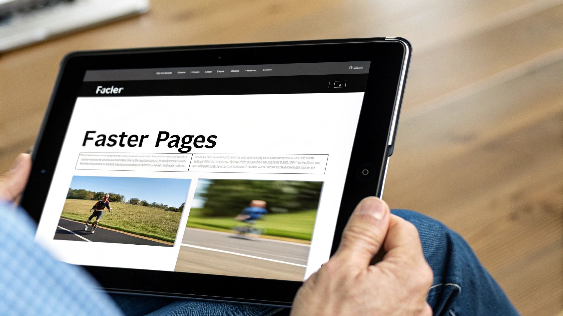
The Top 10 Best Practices for Landing Page Design in 2026

· 26 min read

In B2B marketing, a landing page isn't just a webpage; it's your digital sales pitch, working 24/7 to turn clicks into qualified pipeline. With buyer attention spans shrinking and competition intensifying, a generic design no longer drives meaningful results. The critical difference between a page that converts prospects and one that merely consumes ad spend lies in the deliberate, strategic application of proven design principles. A high-performing page anticipates user intent and guides them seamlessly to a single conversion goal, while a weak one creates friction, confusion, and ultimately, a bounce.

This guide moves beyond generic advice to provide a prioritized, actionable roundup of the 10 best practices for landing page design, specifically tailored for demanding mid-market and enterprise sales funnels. We will break down what works versus what falls flat, comparing high-impact elements like problem-centric hero sections against vague value propositions. You won't just learn what to do; you'll learn how to implement it.

Inside, you'll find A/B testing recipes, performance benchmarks, and clear implementation tips to help you build landing pages that don't just look good but consistently drive results. Whether you're a Head of SDR, a demand generation manager, or a VP of Sales, these principles will equip you to transform your landing pages from simple information hubs into powerful conversion machines. We will explore everything from structuring your value proposition and leveraging social proof to optimizing form fields and handling objections before they even arise.

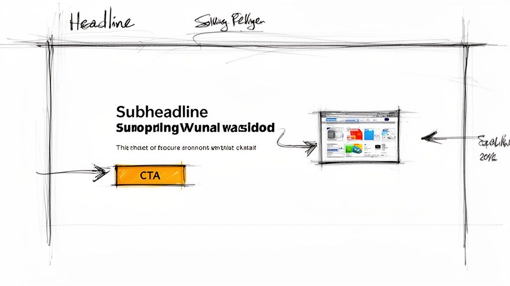
1. Clear Value Proposition Above the Fold

A visitor should understand what you offer, who it's for, and why they should care within five seconds of landing on your page. This immediate clarity is achieved with a strong value proposition placed "above the fold," meaning it's fully visible without any scrolling. This isn't just a best practice for landing page design; it's the foundation upon which all other conversion elements are built. A visitor who is confused about your core offer will never reach your call-to-action.

A hand-drawn wireframe sketch illustrating a landing page design with headline, subheadline, CTA, and content area.

Why It's Crucial

Your headline and subheadline are your one chance to make a first impression. They must immediately resonate with the visitor's pain point and promise a clear, desirable outcome.

  • Ineffective Comparison: A headline like "AI-Powered Sales Tool" is weak because it describes a feature. It forces the user to figure out the benefit.
  • Effective Comparison: A much stronger, outcome-focused headline is: "Turn Buyer Signals into Qualified Pipeline, Instantly." This version sells a result that every VP of Sales wants. This single element is often the highest-impact variable you can test to improve performance.

Actionable Implementation Steps

To craft a compelling value proposition, focus on your target audience's specific needs.

  • Action: Audit your current headline. Does it describe a feature or a benefit? Rewrite it to focus on the outcome your ideal customer profile (ICP) desires. For an SDR Manager, use phrases like "eliminate manual research" and "ensure CRM hygiene."
  • Action: Anchor your solution to a concrete workflow. Instead of a vague promise like "Improve Sales," be specific: "Prioritize SDR Tasks Inside Salesforce." This makes your solution tangible.
  • Action: Set up an A/B test today. Pit your new benefit-driven headline against a pain-point-focused one (e.g., "Stop Wasting Time on Bad Leads"). Allocate at least 20% of your paid traffic to the test to get statistically significant results quickly.

Crafting the perfect headline is a critical step in your conversion strategy. For a deeper dive into methodical testing and optimization, check out our comprehensive conversion rate optimization checklist.

2. Problem-Centric Hero Section (Before/After or Pain Validation)

Instead of leading with your solution, a problem-centric hero section immediately validates the visitor's primary business pain. It demonstrates a deep understanding of their challenges, building trust and credibility before you ever mention a feature. This approach shifts the conversation from "what our product does" to "we understand your world," which is a far more powerful opening for complex B2B sales cycles and a cornerstone of effective landing page design.

Before: chaotic desk with monitors, sticky notes. After: organized digital task management showing efficiency.

Why It's Crucial

Your value proposition resonates more strongly when it's framed as the direct answer to a well-articulated problem.

  • Ineffective Comparison: A landing page that simply states "AI-Powered Sales Dialer" is forgettable and competes on features alone.
  • Effective Comparison: A hero section leading with a stat like "SDRs spend 3+ hours daily on research and admin, not selling" immediately grabs the attention of any Sales VP. This pain validation technique, popularized by frameworks like StoryBrand, makes your solution feel less like a product and more like a necessary resolution.

Actionable Implementation Steps

To build a compelling problem-centric hero, immerse yourself in your customer's daily workflow.

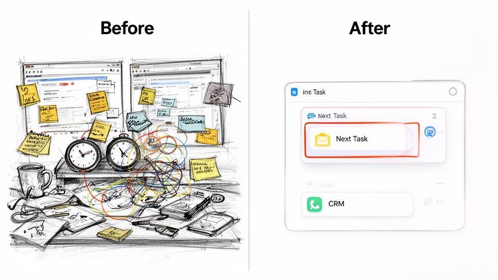
  • Action: Create a "Before/After" visual. Show a graphic of an SDR juggling multiple tabs (LinkedIn, CRM, dialer) next to a clean interface of your tool. This makes the pain tangible and the solution clear.
  • Action: Add a quantified pain point to your hero copy. Use an industry stat or internal data like "67% of SDRs say poor dialer integration kills adoption" to add authority and validate the problem.
  • Action: A/B test different pain points. Run one hero section focused on wasted research time against another focused on low CRM adoption. This will reveal which problem is the most powerful motivator for your audience.

By first proving you understand the problem better than anyone else, you earn the right to present your solution. For more on creating narratives that drive action, explore Donald Miller's insights on the StoryBrand marketing framework.

3. Social Proof and Trust Signals (Logos, Reviews, Case Studies)

For B2B buyers, especially in the mid-market to enterprise space, skepticism is the default setting. A landing page must quickly overcome the "another tool that won't stick" objection. Social proof and trust signals serve as the most effective antidote, providing third-party validation that your solution is credible, adopted by peers, and delivers real-world results. This isn't just about adding a few logos; it's a strategic element of landing page design that directly addresses perceived risk.

Why It's Crucial

Your claims about turning "buyer signals into qualified pipeline" are just that: claims. They gain credibility only when backed by evidence from existing customers. For a sales leader evaluating a tool like MarketBetter, seeing logos of well-known, sales-driven organizations or a testimonial from a VP of Sales at a similar company instantly builds a bridge of trust.

  • Ineffective Comparison: A page with no trust signals feels like an empty restaurant; it creates doubt.
  • Effective Comparison: A page with strong, relevant proof feels like the most in-demand spot in town. It shifts the conversation from "Does this work?" to "This works for them, so it could work for us."

Actionable Implementation Steps

Strategically deploy social proof to build momentum as a visitor scrolls down the page.

  • Action: Replace vague testimonials ("We love the tool") with quantified outcomes. Reach out to a happy customer and ask for a specific metric: "MarketBetter reduced our SDRs' prep time by 2 hours a day."
  • Action: Segment your logo bar. If your landing page targets B2B SaaS companies, create a dedicated section showing only logos from that vertical. This demonstrates industry expertise.
  • Action: Prominently display your G2 or Capterra rating. Add a badge with your star rating (e.g., "4.7/5 stars on G2") near your CTA to act as an unbiased stamp of approval.
  • Action: A/B test social proof formats. Test a static logo bar against a rotating carousel of detailed, quote-based testimonials to see which format drives more conversions for your specific audience.

Building this layer of trust is a fundamental component of effective landing page design, transforming a simple marketing page into a compelling business case. For more insights on building a narrative with customer evidence, explore our guide on crafting high-impact case studies.

4. Feature-to-Benefit Translation (Show the Workflow, Not Just the Tech)

Prospective buyers don't purchase features; they invest in solutions that solve specific, often painful, problems within their daily workflow. Simply listing what your product does, such as "Salesforce Dialer" or "AI-written emails," forces the visitor to connect the dots themselves. Effective landing pages close this gap by translating technical features into tangible business outcomes and workflow improvements. This approach shifts the focus from "what it is" to "what it does for me."

Why It's Crucial

Your landing page must function as a bridge between your product's capabilities and the visitor's desired future state. A sales development representative (SDR) doesn't just want a dialer; they want to stop switching between browser tabs, log calls automatically, and make more dials per hour.

  • Ineffective Comparison: A weak feature description like "AI Cold Email" is a tool.
  • Effective Comparison: A stronger, workflow-focused benefit is: "Generate on-brand, context-specific cold emails that earn higher reply rates, eliminating hours of manual research and subject-line testing." This is a direct solution to a major productivity bottleneck.

Actionable Implementation Steps

To implement this principle, map your core features directly to the "job to be done" for your target audience.

  • Action: Restructure your features section around 3-5 core workflows. Instead of a feature grid, create sections like "Automate Task Prioritization," "Streamline Outreach," and "Improve CRM Hygiene."
  • Action: Use "Before/After" copy. For each workflow, describe the old, inefficient way ("Manually searching for prospect data") and contrast it with the new, streamlined process your tool enables ("Get AI-surfaced insights in one click").
  • Action: Convert a feature into an outcome. Take a feature like "Call Recording" and rewrite its description to focus on the benefit for a manager: "Allow sales coaches to QA rep calls asynchronously, providing targeted feedback without having to sit in on every single conversation."

By focusing on the workflow, you embed your product into the visitor's reality, making the value proposition both undeniable and immediately understandable. This is a key best practice for landing page design that directly addresses the user's core needs.

5. Friction Reduction: Single CTA, Clear Next Step, Minimal Form Fields

Every decision you ask a visitor to make introduces friction, a form of cognitive load that can stop a conversion dead in its tracks. Effective landing page design is a masterclass in reducing this friction. The goal is to create a seamless, intuitive path from visitor to lead by presenting one primary call-to-action (CTA), clarifying what happens next, and asking for the absolute minimum amount of information required. A visitor who feels the process is simple and transparent is far more likely to convert.

Why It's Crucial

Decision paralysis is real. Offering a visitor too many choices, like "Schedule a Demo," "Start a Trial," "Download Whitepaper," and "Watch a Video" on the same page, creates confusion. The visitor doesn't know which path is right for them and often chooses none.

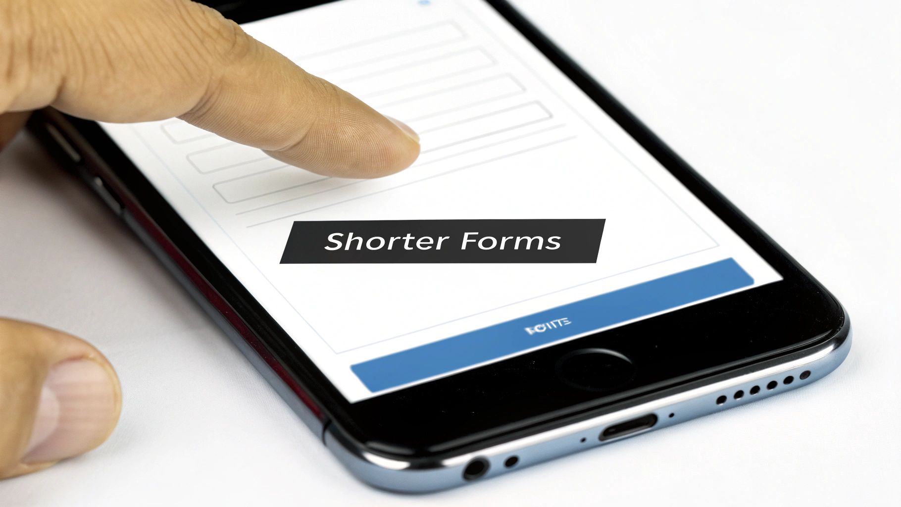
  • High-Friction Comparison: A form with ten fields feels like a major commitment and an invasion of privacy. It screams "we're going to spam you."
  • Low-Friction Comparison: A form with just three fields feels easy and low-risk. Simplifying from eight fields to four can directly increase lead volume.

Actionable Implementation Steps

To minimize friction, streamline every element of the conversion process. Focus on making the desired action feel effortless.

  • Action: Unify your CTA. Choose the single most valuable action (e.g., "Schedule a Demo") and make it your primary CTA. If you must offer a secondary option ("Watch a 3-Minute Walkthrough"), make it a text link instead of a button to reduce its visual weight.
  • Action: Shrink your form today. Audit your form fields and remove at least one. Do you really need their phone number right now? Start with Name, Work Email, and Company. Use data enrichment tools later.
  • Action: Add expectation-setting microcopy. Below your form, add a simple sentence: "You'll receive a calendar link within 15 minutes. No sales call required to book." This builds trust and clarifies the next step.

Reducing friction is one of the most powerful levers you can pull to improve performance. For a step-by-step guide on applying these principles, you can learn more about how to create a high-converting landing page.

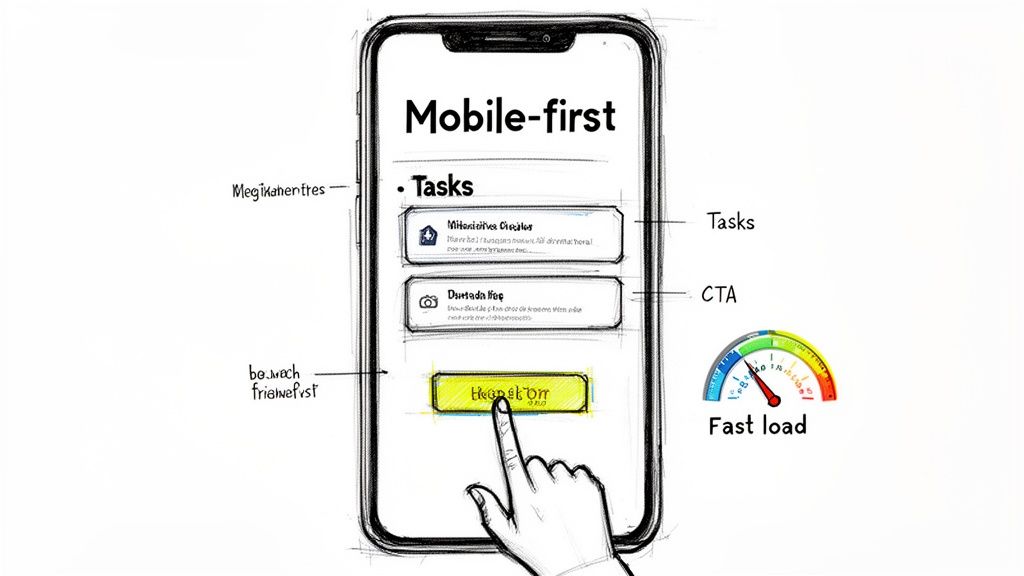
6. Mobile-First Responsive Design (Not an Afterthought)

In today's B2B landscape, treating the mobile experience as a secondary concern is a critical mistake. A mobile-first approach means you design the landing page for the smallest screen first, then adapt it for larger screens like desktops. This isn't just a technical detail; it's a strategic imperative. Many of your target buyers, from VPs of Sales checking emails between meetings to SDRs browsing on the go, will first encounter your brand on their phone. A clunky, slow, or broken mobile page immediately signals a lack of attention to detail and can kill a potential lead instantly.

A mobile-first design sketch of a smartphone with tasks, a call to action, and fast load indications.

Why It's Crucial

Google's mobile-first indexing means your mobile page performance directly impacts your search ranking. Beyond SEO, however, is the user experience.

  • Ineffective Comparison: A desktop design shrunk down to mobile, requiring pinching and zooming to fill out a form, will be abandoned immediately.
  • Effective Comparison: Companies like Slack and HubSpot excel here; their mobile landing pages are clean, fast, and feature a single-column layout with a prominent, "thumb-friendly" CTA, ensuring the experience is seamless. This focus is a core part of effective landing page design.

Actionable Implementation Steps

Shifting to a mobile-first mindset requires practical changes to your design and development workflow.

  • Action: Test your mobile speed now. Use Google's PageSpeed Insights and aim for a score of 90+. Compress all images using a tool like TinyPNG and remove any non-essential scripts.
  • Action: Redesign UI for touch. Stack elements like CTAs vertically on mobile instead of placing them side-by-side. Ensure buttons are at least 44x44 pixels to create ample tap targets and avoid user frustration.
  • Action: Test on a real device. Open your landing page on your own phone. Try to fill out the form. If it's frustrating for you, it's a conversion killer for your prospects.
  • Action: Optimize media for mobile. Replace auto-playing videos with a static image thumbnail and a play button. This saves bandwidth, improves load times, and gives the user control.

A robust mobile experience is no longer optional. For guidance on optimizing every aspect of your funnel, explore our detailed lead generation strategy guide for advanced techniques.

7. Customer Testimonial and Case Study Depth (Specific Metrics and Quotes)

Generic testimonials like "Great product!" are easily ignored and do little to build trust. One of the most effective best practices for landing page design in a B2B context is to showcase social proof with verifiable depth. This means featuring testimonials and case study summaries that are packed with specific, quantifiable results, company context, and quotes from identifiable professionals. It transforms vague praise into a compelling, evidence-backed narrative that allows prospects to see a clear path to their own success.

Why It's Crucial

A vague testimonial is forgettable, but a specific, metric-driven outcome is persuasive. When a VP of Sales sees that a peer at a similar company increased their pipeline by 35% using your tool, it builds instant credibility and relevance.

  • Ineffective Comparison: A generic quote like "MarketBetter helped our sales team." is a platitude with zero impact.
  • Effective Comparison: A powerful, specific alternative is: "MarketBetter’s Salesforce integration helped our SDRs increase daily outreach by 40% while cutting prep time in half." The second is a business case that directly addresses a prospect's KPIs.

Actionable Implementation Steps

To leverage deep social proof, focus on weaving specific, persona-aligned results into your landing page.

  • Action: Add quantifiable outcomes to every testimonial. Go beyond percentages and include metrics like "generated $250k in new pipeline," "saved 10 hours per rep per week," or "improved data quality by 60%."
  • Action: Provide context and credibility. Add the person's name, title, a professional headshot, and their company logo to every quote. This is non-negotiable for building trust.
  • Action: Align case studies with page personas. If the page targets VPs of Sales, feature a case study summary focused on pipeline creation. If it targets SDR Managers, feature one focused on activity metrics and efficiency gains.

For a comprehensive guide on building a repository of customer stories that fuel your marketing efforts, explore our detailed resource on creating a customer evidence program.

8. Visual Hierarchy and Scannable Content (Not Dense Paragraphs)

B2B buyers are busy and goal-oriented; they don't read landing pages, they scan them. A wall of dense text is an immediate conversion killer. Implementing a strong visual hierarchy guides the visitor’s eye to the most critical information, making your page instantly digestible. This isn't just about aesthetics; it's a fundamental principle of user experience design that directly impacts whether a visitor understands your offer or bounces in confusion.

Why It's Crucial

A scannable layout allows prospects to quickly find the sections most relevant to their specific role or pain point.

  • Ineffective Comparison: A single, dense block of text forces all visitors—from a Sales Leader to a RevOps Manager—to parse the same information, much of which may be irrelevant to them.
  • Effective Comparison: Pages from SaaS leaders like Stripe and HubSpot use minimal copy, strong headings, and clear section breaks to direct attention. This respects the user's time and makes the solution feel more accessible.

Actionable Implementation Steps

To transform a text-heavy page into a scannable, high-converting asset, focus on structure and visual cues.

  • Action: Break up your content. Go through your page and ensure every section has a clear H2 or H3 heading. For MarketBetter, change a long paragraph about features into an H2 like 'How MarketBetter Works' with three distinct H3s: Prioritize Tasks, Automate Emails, and Log Calls.
  • Action: Convert prose to lists. Find any sentence that lists three or more items and convert it into a bulleted list. This simple format change can dramatically improve readability.
  • Action: Increase whitespace. Add 20-30% more vertical padding between sections. This reduces cognitive load and helps your calls-to-action stand out more effectively.

Testing different layouts, such as comparing a paragraph-based section to a bulleted one, is essential. For more insights on structuring these experiments, explore our guide on how to conduct A/B testing.

9. FAQ/Objection Handling Section (Preempt Buyer Doubts)

Even the most persuasive landing page can leave a high-intent prospect with lingering questions or doubts. A dedicated FAQ section strategically addresses these common objections head-on, reducing friction and preventing visitors from abandoning the page to seek answers elsewhere. This isn't just a list of questions; it's a critical conversion tool that builds trust and preemptively handles the "but what about..." thoughts that can derail a decision. A visitor who finds answers to their specific concerns is far more likely to convert.

Why It's Crucial

Your prospects are silently running through a checklist of potential deal-breakers: cost, implementation effort, compatibility with existing tools, and security. Failing to address these directly creates uncertainty.

  • Ineffective Comparison: Ignoring a key objection like “We already have Outreach/Salesloft. Why do we need this?” lets the prospect disqualify you on their own.
  • Effective Comparison: Addressing it head-on with an answer like, "MarketBetter isn't a replacement; it’s the decision engine that lives inside Salesforce, turning buyer signals into prioritized tasks that your existing sales engagement platform can then execute," re-frames your product from a competitor to a complementary, value-add layer.

Actionable Implementation Steps

To build an effective objection-handling section, source questions directly from your sales and customer success teams.

  • Action: Survey your sales reps for the top 5 questions they get on discovery calls. Common ones include: “Will our SDRs actually use this?” and “What if our Salesforce instance is messy?” Build your FAQ around these.
  • Action: Use a collapsible accordion format. This keeps the page clean and allows visitors to find the specific information they need without being overwhelmed by text. Place this section right before the final CTA to resolve last-minute doubts.
  • Action: Turn objections into benefits in your answers. For "How long does implementation take?", provide a phased timeline: "Start with core task management in under 2 weeks, then layer in our AI coaching module." This transforms a potential negative into a positive (fast time-to-value).

By proactively answering questions, you control the narrative and build the confidence a prospect needs to take the next step. For more on crafting persuasive copy that overcomes objections, explore our detailed guide on writing high-converting landing page copy.

10. Video or Animated Demo (Not Just Screenshots)

A static screenshot can show a feature, but a dynamic video or animated demo tells a story and demonstrates value. For complex products, showing the actual workflow in action is far more compelling than simply describing it with text and images. This approach builds trust by showcasing the real product, reduces the user's perceived complexity, and significantly boosts engagement by making your solution tangible and easy to understand.

Why It's Crucial

Words can be misinterpreted, but a well-executed video demo provides undeniable proof of your product's capabilities.

  • Ineffective Comparison: A static screenshot shows a single screen, forcing the user to imagine the workflow.
  • Effective Comparison: A short video shows exactly how an SDR transitions from receiving a prioritized signal to logging an AI-summarized call in Salesforce. This visual evidence of efficiency answers key questions before they're asked. Companies like Loom and Calendly master this by turning abstract benefits into concrete results.

Actionable Implementation Steps

To create an effective demo, focus on showcasing a high-value workflow rather than a generic product tour.

  • Action: Script a problem-solution story. Instead of clicking through menus, script a 90-second video that shows a user's complete workflow: starting with the problem (a messy task list) and ending with the solution (an AI-prioritized task executed and logged).
  • Action: Add on-screen captions. A significant portion of viewers watch with the sound off. Use clear text overlays or subtitles to ensure your message lands even without audio.
  • Action: Run an A/B test. Create two versions of your landing page—one with the video and one with a static hero image. Track form fill conversion rates to measure the video's direct impact on your pipeline. Ensure the video is user-initiated with a play button, as autoplay can be disruptive.

For more on this topic, explore these strategies for creating compelling product videos that convert.

10-Point Landing Page Design Comparison

Item🔄 Implementation Complexity⚡ Resource Requirements📊 Expected Outcomes💡 Ideal Use Cases⭐ Key Advantages
Clear Value Proposition Above the FoldLow–Medium — copy + design and iterative A/B testsSmall team: copywriter, designer, analyticsFaster visitor qualification; lower bounceTop-of-funnel pages, paid ads, first-touch trafficImmediate clarity; reduced cognitive load
Problem-Centric Hero Section (Before/After or Pain Validation)Medium — needs research-driven copy and visualsDesigner, copywriter, customer insight/researchHigher engagement and empathy; stronger relevance signalsPages targeting known pain points or persona-specific campaignsBuilds trust by validating buyer pain
Social Proof and Trust Signals (Logos, Reviews, Case Studies)Low–Medium — asset collection and placementCustomer success, legal approvals, designIncreased credibility; better enterprise conversionMid-market/enterprise targeting and late-stage buyersReduces perceived adoption risk with real proof
Feature-to-Benefit Translation (Show the Workflow)Medium — mapping features to workflows and visualsProduct, PM, copy, designer, UXBetter comprehension across personas; clearer ROI linksComplex products, multi-stakeholder buying processesShows how features drive real outcomes
Friction Reduction: Single CTA, Minimal FormsLow — design/form changes and copy tweaksCRO specialist, dev, analyticsHigher conversion rates; lower form abandonmentDemo/trial signups and high-intent landing pagesSimplifies path to conversion; faster user action
Mobile-First Responsive Design (Not an Afterthought)Medium–High — responsive build and performance workFront-end dev, QA, performance toolsHigher mobile conversions; SEO and load-time improvementsMobile-heavy audiences (SDRs on-the-go)Better UX on mobile; signals product maturity
Customer Testimonial and Case Study DepthMedium–High — interviews, write-up, designCustomer interviews, content team, design, approvalsStronger trust and faster sales decisions; proven ROIRevOps, VP Sales, procurement evaluationsSpecific metrics and contextual credibility
Visual Hierarchy and Scannable ContentLow–Medium — content restructuring and layoutCopywriter, designer, UX reviewerIncreased time-on-page and comprehension; easier scanningAny landing page where visitors skim contentReduces cognitive load; improves information discovery
FAQ/Objection Handling SectionLow — collating common objections into concise answersSales input, copy, UX, links to resourcesFewer pre-sale objections; faster qualificationConsideration-stage traffic and technical buyersPreempts concerns and reduces friction
Video or Animated Demo (Not Just Screenshots)Medium — production and periodic updatesVideo producer, product demo lead, hosting, captionsHigher engagement; lowers perceived complexityDemonstrating workflows to SDRs, RevOps, and execsShows product in action; reusable marketing asset
Free Tool

Try our Marketing Plan Generator — generate a complete AI-powered marketing plan in minutes. No signup required.

Putting It All Together: Your Blueprint for a Conversion-Focused Landing Page

We’ve journeyed through the ten pillars of high-performance landing page design, moving from the crucial first impression above the fold to the final, reassuring details in your FAQ section. But these are not just items on a checklist; they are interconnected components of a single, conversion-focused machine. The true power of these best practices for landing page design is unlocked when they are integrated into a cohesive and persuasive user journey.

Think of your landing page as your best digital salesperson. A top-performing sales development representative (SDR) doesn't just list product features; they listen to a prospect's pain points, validate their challenges, and then frame the solution in terms of tangible outcomes. Your landing page must do the same. A problem-centric hero section (Principle #2) hooks the visitor by acknowledging their specific struggle, while feature-to-benefit translation (Principle #4) shows them, step-by-step, how your solution resolves that pain.

From Good to Great: The Synthesis of Strategy

The difference between a landing page that gets a few leads and one that consistently fuels your pipeline lies in the synthesis of these principles. For example, robust social proof (Principle #3) and in-depth testimonials (Principle #7) are not just decorative elements. They are strategic tools that directly support your value proposition (Principle #1) and preemptively handle objections (Principle #9).

Let’s compare two approaches:

  • The "Good Enough" Page: This page has a clear CTA and lists features. It might get some conversions from high-intent visitors, but it fails to persuade those on the fence. It often relies on a single screenshot and generic testimonials like "Great product!" which lack credibility.
  • The High-Conversion Page: This page tells a story. It uses a video demo (Principle #10) to illustrate a workflow, not just a static interface. It features a testimonial with specific metrics like, "Reduced our manual data entry by 15 hours per week," providing concrete proof. This page is built with a mobile-first mindset (Principle #6), ensuring the experience is seamless for the 50%+ of users on mobile devices, and uses a scannable layout (Principle #8) to guide the reader’s eye.

By embracing this more holistic approach, you move beyond merely presenting information to actively persuading and guiding your audience.

Your Actionable Next Steps

Mastering the art and science of landing page optimization is an ongoing process, not a one-time project. Don’t get overwhelmed by trying to implement all ten practices at once. Instead, adopt an iterative, data-driven methodology:

  1. Audit Your Current Page: Score your primary landing page against the ten principles discussed. Where are the biggest gaps? Is your CTA singular and clear? Are your form fields minimal (Principle #5)?
  2. Prioritize and Hypothesize: Select two or three high-impact areas for improvement. A good starting point is often strengthening your value proposition and adding metric-driven social proof. Formulate a clear hypothesis, such as: "By replacing our generic hero image with a short video demo showing the 'before and after' workflow, we believe we can increase form submissions by 15%."
  3. Test and Measure: Run an A/B test on your changes. Let the data tell you what resonates with your audience. Track not just conversion rates, but also metrics like scroll depth and time on page to understand user behavior more deeply.

By continually testing and refining, you transform your landing page from a static digital brochure into a dynamic, intelligent conversion engine. For a deeper, step-by-step walkthrough that puts these ideas into practice, this guide on how to build landing pages that convert provides an excellent technical framework. Ultimately, a well-optimized landing page doesn't just generate leads; it delivers highly qualified prospects to your sales team, shortening sales cycles and accelerating revenue growth.


Ready to turn those hard-earned landing page conversions into qualified pipeline? marketbetter.ai automates the tedious SDR tasks that follow a form submission, so your team can focus on selling. See how our AI-powered engine can help you engage, qualify, and book meetings with leads instantly by visiting marketbetter.ai.

How to Create a Landing Page That Converts at 8%+ (Not the Usual 2.3%)

· 24 min read

For a Sales Development Representative, a dedicated landing page isn't just a marketing asset; it's a closing tool. It’s what you use to turn a warm conversation into a booked demo, cutting through the noise and friction of a generic company homepage. This isn't just theory—it's a tactical advantage that top-performing SDRs use to crush their quotas by making the prospect's decision to meet a no-brainer.

Why Your SDRs Need a Dedicated Landing Page

The standard SDR playbook is packed with email cadences and call scripts. But what happens after you nail the call or send that perfect, witty email? You send them a link. All too often, that link points to your company's homepage, and that's a momentum-killer.

Sending a prospect to your homepage after a great conversation is like giving them a map of the entire city when all they need is the address of one building. They're suddenly forced to navigate menus, case studies, and blog posts that have nothing to do with the specific problem you just discussed.

It’s a jarring experience. The journey goes from a personalized, one-on-one discussion straight into a one-size-fits-all digital maze. More often than not, this leads to confusion, drop-off, and a lost opportunity. The prospect who was moments away from booking a demo is now gone, and all that hard work just evaporated.

The Homepage vs. Landing Page Showdown for SDRs

A homepage is built for exploration. It has to serve everyone—potential investors, job seekers, existing customers, you name it. A landing page, on the other hand, is built for one specific action. For an SDR, that action is almost always booking a meeting. The difference in results is stark.

FeatureHomepageSDR Landing PageSDR Benefit
GoalExploration & brand awarenessA single action (book demo)Higher conversion, less friction
AudienceEveryoneOne specific prospect/accountHyper-relevant, personal message
NavigationMany links (menu, footer, etc.)Zero links, one buttonKeeps prospect focused, no distractions
OutcomeBrand education, potential confusionBooked meeting, clear next stepMore qualified meetings in the pipeline

Let’s walk through the two paths a prospect can take:

  • The Homepage Detour: An SDR sends a follow-up email linking to the company homepage. The prospect clicks, gets overwhelmed by navigation options, and tries to find info relevant to their pain point. They get distracted by a blog post, their phone buzzes, and they leave without booking a meeting. The conversation dies right there.
  • The Landing Page Expressway: An SDR sends an email linking to a custom landing page. The page’s headline mirrors the exact pain point they discussed. The content speaks directly to their industry, a relevant testimonial builds trust, and a single, unmissable "Book a Demo" button is the only path forward. The prospect feels understood. They book the meeting.

This direct approach isn't just about making things easy; it’s a crucial part of modern sales enablement. By creating a frictionless path, you respect the prospect's time and keep control of the narrative. If you're looking to sharpen your team's process, understanding broader sales enablement best practices can show you how to weave this tactic into your larger strategy.

Real-World Scenarios Where SDR Landing Pages Win

This isn't a one-trick pony. A dedicated landing page is a versatile tool that can be deployed at different stages of the sales cycle to make an SDR dramatically more effective and help them crush their quota.

Think about these common situations:

  • Account-Based Marketing (ABM): For a high-value target account, an SDR can spin up a landing page personalized with the company's name, logo, and colors. The copy can reference specific industry challenges or even mention the prospect's role, showing you’ve done your homework.
  • Post-Demo Follow-Up: After a great discovery call, the landing page can summarize the key discussion points and give the prospect a direct link to book the next meeting with the Account Executive. No more email tag to get something on the calendar.
  • Event or Webinar Follow-Up: Instead of a generic "thanks for attending" email, send attendees to a page with the event recording, key takeaways, and a clear CTA to discuss how those ideas apply directly to their business.

By creating a hyper-relevant, frictionless experience, a dedicated landing page transforms from a simple marketing tool into a strategic sales asset. It’s the difference between saying "go find what you need" and "here is exactly what we discussed."

The Blueprint for a High-Converting SDR Landing Page

Before you even think about copy or design, you need a blueprint. For an SDR, that blueprint has one job and one job only: book a demo. Anything that doesn't directly serve that goal is just noise—and noise kills conversion rates. Your prospects are busy. They don't have time to solve a puzzle. They need a straight line from their problem to your solution.

This isn't about throwing information on a page; it's about building a rock-solid argument that convinces a prospect a meeting is worth their time, and doing it in under a minute.

This flowchart shows exactly why that direct path matters. Sending a prospect to your homepage from a targeted email is a recipe for a dead end. A dedicated landing page, on the other hand, creates a frictionless journey straight to a booked demo.

Flowchart showing two prospect journey flows: email to homepage, and email to landing page then demo.

Without this focused structure, you’re just hoping for the best. With it, you're engineering a specific outcome.

The Five Pillars of an SDR Landing Page

Think of your landing page as a short, sharp conversation. You need to grab their attention, show them the value, earn their trust, make it ridiculously easy to say yes, and then ask for the meeting. Each of these five pillars handles one part of that conversation.

  • The Problem-Centric Headline: This is your hook. It has to hit home instantly. Stop talking about your product and start talking about their pain. "The Future of Sales Software" is generic and gets skipped. But "Tired of Reps Wasting Hours on Admin Work?" That speaks directly to a Sales VP's daily headache.

  • The Solution-Oriented Value Proposition: Right below the headline, you need to answer the silent question: "What's in it for me?" This isn't a feature list. It’s a promise of results. Instead of saying, "We have an AI dialer," say, "Help your team make 2x more calls without ever leaving Salesforce." See the difference?

A great landing page answers a prospect's unasked questions before they even think of them. It anticipates their needs and guides them to the logical conclusion that a demo is the next best step.

  • Targeted Social Proof: Prospects are naturally skeptical. You have to build credibility, and you have to do it fast. The key is relevance. If you're targeting a tech company, a testimonial from a manufacturing firm won't land with the same impact. Use logos of companies they recognize, a quote from someone in their role, or a hard-hitting stat like, "Trusted by 500+ sales teams."

  • The Frictionless Form: This is where so many landing pages fall apart. Your goal is to book a meeting, not to pre-qualify the entire lead. Every single field you add is another reason for them to leave. The best "form" isn't a form at all—it's an embedded calendar from Calendly or Chili Piper. If you absolutely must use a form, ask for their work email. That's it. You already know who they are.

  • A Singular, Compelling Call-to-Action (CTA): Your page has one goal, so it gets one CTA. Period. Strip out everything else. No navigation menu, no links to your blog, no "About Us" page. Nothing. The button text needs to be clear and action-oriented. "Submit" is weak. "Book Your 15-Minute Demo" is strong, direct, and sets clear expectations.

To help tie this all together, here’s a quick cheat sheet for the core components every SDR page needs.

Core Components of a High-Conversion SDR Landing Page

ComponentSDR-Specific PurposeConversion Goal
Problem HeadlineInstantly mirror the prospect's biggest pain point.Grab attention and establish relevance.
Value PropositionClearly state the specific outcome or benefit.Answer "What's in it for me?" quickly.
Relevant Social ProofBuild immediate trust with logos or testimonials.Overcome skepticism and add credibility.
Frictionless Form/SchedulerRemove every possible barrier to booking a meeting.Maximize form completions/booked demos.
Single, Clear CTAFocus the prospect's attention on the one desired action.Drive a click to the scheduler or form.

Getting these five elements right is the foundation. They work together to guide the prospect’s eye and their decision-making process straight toward that final, all-important click.

For a deeper dive into the fundamental principles, it's worth reviewing a complete guide on how to create high-converting landing pages that boost sales. Mastering these basics is what separates SDRs who consistently hit their numbers from those who don't.

Writing Compelling Copy That Books More Meetings

Your landing page is your best sales pitch, working 24/7. But for an SDR, it's more than that—it's a direct continuation of a real conversation. Generic marketing fluff just won't cut it. The copy has to feel personal, solve the exact problem you just discussed, and drive one specific action: booking that next meeting.

The difference between copy that gets ignored and copy that converts often boils down to empathy. Does your headline mirror the pain point they mentioned on your call? Or does it sound like a generic brochure? Prospects are tired of being treated like a number. Your landing page is your chance to prove you were actually listening.

Two handwritten notes comparing bad and good landing page copy with a weak versus a strong call to action.

From Generic to Specific: A Framework for SDRs

Stop talking about features and start talking about your prospect's reality. A simple but powerful way to structure your landing page message is the 'You, We, Proof' model. It creates a conversational flow that builds a rock-solid case for taking the next step.

  • You: Start with them. Hit their specific challenge or goal right out of the gate. This proves you get their world.
  • We: Position your solution as the bridge from their current problem to their desired outcome. This is where you connect their pain to your value.
  • Proof: Back it up. Slap a relevant customer logo, a targeted testimonial, or a hard-hitting statistic on the page to build instant credibility.

This structure forces you to write from the customer's perspective, which is the whole game. It's a subtle shift that makes your copy feel helpful, not pushy.

Writing Headlines That Hit Home

The headline is 80% of the battle. If it doesn't grab them, nothing else you've written matters. As an SDR, you have a massive advantage here: you've already spoken to the prospect. Use that intel.

Let's say you're talking to a prospect whose team is buried in manual CRM data entry.

  • Weak Headline: "The #1 CRM Automation Platform" (This is all about you.)
  • Strong Headline: "Cut Your Team's Salesforce Admin Time in Half" (This speaks directly to their problem and offers a tangible outcome.)

The second headline isn't just better; it’s a direct echo of a real conversation. That personal touch immediately signals that this page is for them, not for everyone.

Your best headlines are probably sitting in your call notes right now. Pull direct quotes or summarized pain points from your conversations to create headlines that are impossible to ignore.

Crafting a Call to Action That Creates Urgency

Your call-to-action (CTA) is the final shove. It needs to be clear, compelling, and feel immediate. Vague, lazy buttons like "Submit" or "Learn More" are absolute conversion killers because they offer zero value and create uncertainty.

A great CTA tells the user exactly what happens next and reinforces the benefit they're about to receive. Think of it as a value exchange, not just a command.

Weak CTAStrong CTAWhy It Works Better
SubmitBook Your 15-Min DemoIt sets clear expectations for time and action. No surprises.
DownloadGet My Free Sales Playbook"My" feels personal, and "Playbook" is more valuable than a generic "download."
Contact UsSee How Much You Can SaveIt focuses on the outcome (saving money), not the task (contacting you).

Notice how the strong examples are all benefit-driven? They answer the "what's in it for me?" question one last time before the click. This is especially crucial for SDRs who need to keep the momentum going. Digging into the motivations behind why prospects act can make your copy even sharper. For a deeper dive, check out these powerful customer segmentation strategies that can help you tailor your message.

Ultimately, great landing page copy isn't about clever wordplay. It's about clarity, relevance, and a genuine understanding of the person on the other side of the screen. By using insights from your sales calls and structuring your message around the prospect's world, you can turn a simple webpage into your most effective tool for booking more meetings.

Designing for Trust, Action, and Credibility

Great design isn’t about flashy animations or artistic flair; it’s about psychology. For a Sales Development Representative (SDR), your landing page has one job: build instant trust and guide your prospect’s eye straight to the "Book a Demo" button. Think of it as a silent partner in your sales pitch, reinforcing the credibility you’ve already started building.

Many SDRs think design is a marketer’s job, but you don't need to be a designer to understand the basics. A cluttered, confusing page screams disorganization and makes a prospect second-guess your professionalism. In contrast, a clean, focused design communicates competence and respect for their time.

This isn't just about looking good; it's about making it ridiculously easy for the prospect to say yes. Smart design choices directly impact meeting booking rates by removing friction and building confidence with every scroll.

Two hand-drawn web page layouts illustrating a generic long-form versus a concise, to-the-point form.

Guiding the Prospect's Eye with Visual Hierarchy

Visual hierarchy is just a fancy way of saying you’re arranging elements to show their order of importance. It’s what tells the visitor what to look at first, second, and third. For an SDR’s page, the hierarchy should be dead simple: headline, value prop, social proof, and finally, the call-to-action (CTA).

You create this hierarchy with a few simple tools:

  • Size: Your headline should be the biggest text on the page. Your CTA button should be large and impossible to miss.
  • Color: Use a bold, contrasting color for your CTA button so it pops. If your brand color is blue, an orange button will naturally draw the eye.
  • Whitespace: Don’t cram everything together. Whitespace (or negative space) is the empty area around your text and images. It kills clutter and makes your most important elements stand out.

A cluttered page is like a loud, crowded room where you can’t hear what one person is saying. A clean page with plenty of whitespace is like a quiet, one-on-one conversation—clear, focused, and persuasive.

Choosing Images That Build Credibility

Generic stock photos of smiling business people in a boardroom are a credibility killer. Your prospects have seen them a thousand times, and they instantly signal "corporate brochure." To build genuine trust, your images have to feel authentic.

Ditch the stock photos and use visuals that actually support your message.

  • Product Screenshots: Show, don't just tell. A clean screenshot of your platform in action is way more convincing than a paragraph of text.
  • Team Photos: A simple, professional photo of your team (or even just you) adds a human touch. It reminds the prospect there are real people behind the software.
  • Customer Logos: This is powerful visual social proof. A row of recognizable logos builds immediate trust before they’ve read a single word.

The rule is simple: if the image doesn't add value or build credibility, get rid of it. Every single element on the page should serve your one goal of booking that meeting.

Optimizing the Lead Form for SDRs

This is where the rubber meets the road. The goal is to make saying "yes" as frictionless as possible. Every single field you add increases the odds of abandonment. A prospect might be willing to give you their email, but asking for their phone number, company size, and annual revenue will make them hit the back button faster than you can blink.

Look at the difference between these two approaches:

Ineffective Form (High Friction)SDR-Optimized Form (Low Friction)
First NameName
Last NameWork Email
Work Email(That's it. Seriously.)
Phone Number
Company Name
Company Size
Job Title

Remember, your landing page isn't for qualifying the lead; it's for securing the meeting. You can gather all that extra information on the discovery call. The only data you need right now is what's required to book the demo.

For a deeper dive into visual guidance, these 10 Landing Page Design Best Practices are a great resource for making sure your page is both appealing and effective.

How to Measure and Optimize Your Landing Page Performance

Launching your landing page isn’t the finish line. Honestly, it’s just the starting block. For a Sales Development Representative (SDR), the real magic happens next: turning that live page into a repeatable, predictable source of booked demos. This is where you shift from building to optimizing, using data to systematically improve your results.

Without tracking, you’re just guessing. You might think a headline is brilliant, but if prospects aren't clicking, it's not doing its job. Measuring performance lets you move beyond opinions and make data-driven decisions that directly impact your quota.

This process transforms your landing page from a static brochure into a dynamic sales asset that gets smarter over time. You don't need a dedicated marketing team to do it, either. You just need to know what to look for and how to test your assumptions.

Key Metrics Every SDR Should Track

You don't need to get lost in a sea of analytics. For an SDR, only a handful of metrics truly matter. They tell you exactly what's working and where prospects are dropping off.

  • Conversion Rate: This is your North Star. It’s the percentage of visitors who actually book a demo. A low conversion rate is a blaring alarm that something in your message or design isn't connecting.
  • Bounce Rate: This one tracks the percentage of visitors who land on your page and leave without doing anything. A high bounce rate usually means your headline and initial value prop aren't strong enough to hold their attention for more than a few seconds.
  • Time on Page: This shows how long visitors are sticking around. If your conversion rate is low but the time on page is high, it could mean your copy is engaging but your call-to-action (CTA) isn't strong enough to close the deal.

Getting a handle on these numbers is non-negotiable; they're the vital signs of your landing page's health. For a deeper dive, check out our guide on essential lead generation key performance indicators.

The Power of A/B Testing for SDRs

A/B testing is your secret weapon for continuous improvement. The concept is simple: you create two versions of your page (Version A and Version B), change just one single element, and see which one performs better. By isolating one variable at a time, you can scientifically figure out what resonates most with your prospects.

The core principle of A/B testing is simple: Don't guess. Test. A small change, like rephrasing a CTA button from "Book a Demo" to "Get a 15-Min Demo," can have a surprisingly large impact on your booking rate.

This approach is incredibly effective. Landing pages have become powerful tools, with the average conversion rate across all industries sitting around 6.6%. They outperform other signup methods by a staggering 160%. What's more, companies that use between 31 and 40 landing pages generate seven times more leads than those with just a handful. You can discover more about these landing page statistics and how to apply them.

What Should You Test on Your Landing Page

To keep from getting overwhelmed, focus your A/B tests on the elements that have the biggest impact on a prospect's decision to act.

Elements to A/B Test for Higher Conversion

Element to TestWhy It Matters for SDRsExample Test (A vs. B)
HeadlineIt's the first thing a prospect reads. It determines if they stay or leave.A: "The Future of Sales Automation" vs. B: "Cut Your Team's Admin Work by 5 Hours a Week"
Call-to-Action (CTA)The button's text, color, and placement directly influence clicks.A: "Submit" (button color: blue) vs. B: "Book My Demo" (button color: orange)
Hero Image/VideoA visual can build trust or cause confusion. It needs to be relevant and credible.A: Generic stock photo of an office vs. B: A short video of you explaining the value proposition.
Social ProofThe type of proof you use—testimonials, logos, case studies—can make or break your credibility.A: Testimonials from SMBs vs. B: Logos of enterprise customers.

The key is to run each test long enough to get a statistically significant result—usually a few hundred visitors, depending on your traffic. Once you have a clear winner, you implement that change and move on to testing the next element. This iterative process is how you build a landing page that doesn't just look good, but consistently books more meetings and helps you crush your sales goals.

Free Tool

Try our Marketing Plan Generator — generate a complete AI-powered marketing plan in minutes. No signup required.

Your Top SDR Landing Page Questions, Answered

Even with a solid game plan, you're going to hit a few snags building your first landing page. That's just part of the process. As an SDR, your time is your most valuable asset, and getting bogged down by a technical hiccup or a design debate is a total momentum killer.

This section is your quick-reference guide for those moments. I’ve compiled the most common questions sales reps ask and provided straight, actionable answers to get you unstuck and back to booking meetings.

What’s the Easiest Way to Build a Landing Page Without Knowing How to Code?

Good news: you absolutely don't need to be a developer. The market is packed with user-friendly builders made for people who care more about the message than the code behind it.

The single most important thing to look for is a tool that plays nice with your CRM or sales software. You need lead data and booked meetings to flow right into your workflow, no manual copy-pasting required.

Here are a few popular choices I’ve seen teams use successfully:

  • Unbounce & Instapage: These are the industry heavyweights. They come with powerful templates, serious A/B testing features, and deep integrations. They're perfect for teams that want total control and are obsessed with optimization.
  • Leadpages: Known for being incredibly easy to use and more affordable. Leadpages is a fantastic starting point if you just need to get a solid page live fast without a massive learning curve.
  • Carrd: If you need a dead-simple, one-page site, Carrd is brilliant. It's the go-to for a super-focused page with a single call-to-action, maybe for a specific account or a niche campaign.

How Do I Actually Personalize a Page for One Specific Account?

This is your secret weapon. Personalization is the biggest advantage you have over generic, one-size-fits-all marketing pages. It instantly shows the prospect you’ve done your homework and makes them feel like you get them. This is the heart of any real account-based marketing (ABM) play.

Start with the simple stuff:

  • Slap their company name right in the headline. Something like "A Better Workflow for [Company Name]" works every time.
  • Drop their logo next to yours. It creates an immediate visual cue of a potential partnership.

For a high-value account, you need to go deeper. Reference a specific challenge you uncovered during your research. Use images that reflect their industry—don't show a picture of a software dashboard to a manufacturing plant manager. Tailor your entire value prop to solve a problem you know they have.

For an SDR, a personalized landing page is the digital equivalent of a firm handshake and direct eye contact. It proves you're not just another automated email—you're a focused problem-solver.

Seriously, How Many Form Fields Should I Use?

The answer is brutally simple: as few as humanly possible.

Your goal is to book a meeting, not pre-qualify their entire business. Every single field you add is another reason for them to click away. Think of each box as a little bit of friction.

For most SDR pages, you only need a Name and Work Email. And honestly, you probably already have their name from your outreach, so you might get away with just asking for an email confirmation.

The best-case scenario? No form at all. Embed a scheduler like Calendly or Chili Piper directly on the page. This completely removes the barrier and lets a prospect book a time in just a couple of clicks. Fight the urge to ask for their phone number, company size, or job title. Save that for the discovery call.

Where Can I Get Social Proof That Actually Works?

Social proof is what makes your pitch believable. Without it, you're just making claims. Your first stop should always be your marketing team—they usually have a goldmine of approved customer logos, quotes, and case studies ready to go.

Here are the types of social proof that hit hardest on an SDR's landing page:

  • Customer Logos: Don't just throw any logo up there. Use logos from companies in your prospect's industry. Seeing a familiar competitor or partner builds instant trust.
  • Short Testimonials: A quote from someone with the same job title as your prospect is incredibly effective. It's someone they can relate to.
  • Hard Data: Concrete numbers are persuasive. Something like "Trusted by 5,000+ sales teams" shows scale and proves you're not a risky bet.
  • Third-Party Badges: If your company has great reviews on sites like G2 or Capterra, use their badges. It's unbiased validation you can't fake.

At marketbetter.ai, we turn this entire process into a seamless workflow. Our platform helps you identify the right accounts, generates the tasks, and provides the AI-powered tools to create compelling outreach—all inside your CRM. See how you can build a consistent outbound motion without the busywork at https://www.marketbetter.ai.

Conversion Rate Optimization Checklist: 7 Quick Wins (We Went From 1.2% to 4.7%) [2026]

· 21 min read

In a competitive market, attracting traffic is only half the battle. The real challenge lies in efficiently converting those hard-won visitors into leads and customers. Too often, teams rely on guesswork, launching redesigns or copy changes without a clear strategy. This is like renovating a house without a blueprint, leading to wasted resources and stagnant results. A website that merely exists compared to one that actively drives revenue is defined by its systematic approach to improvement. This is where a comprehensive conversion rate optimization checklist becomes an indispensable tool, transforming your digital presence from a passive brochure into an active, high-performing sales engine.

This guide provides a structured, actionable framework to systematically enhance your website's performance. Forget vague advice; we will break down the 10 most impactful areas for testing and refinement, from headline copy and form fields to mobile experience and page speed. You'll get specific, actionable comparisons and practical steps to implement immediately. For a deeper dive into the fundamental principles behind these strategies, read this guide on What Is Conversion Rate Optimization. This checklist is your blueprint for building a high-converting machine that drives measurable growth and maximizes the ROI of every single visitor. Let's begin.

1. Headline and Copy Testing

Your headline and body copy are your digital first impression. They are the primary tools you use to communicate value, and even a minor change can dramatically impact whether a user clicks, converts, or bounces. Headline and copy testing involves systematically creating and comparing different versions of your text to discover which messaging resonates most powerfully with your target audience. This is a foundational step in any conversion rate optimization checklist because it directly influences user engagement from the very first glance.

Why It Works & How to Implement It

Testing allows you to move from guesswork to data-driven decisions. For example, a feature-focused headline like "Our Software Has 10 Integrations" is far less compelling than a benefit-focused alternative: "Connect All Your Tools in 5 Minutes." The first is about you, the second is about them. Basecamp famously saw a 40% conversion lift by making a similar switch from features to benefits.

Actionable Steps for Implementation:

  • Isolate Variables: Don't test a new headline, new image, and new CTA all at once. Compare Headline A vs. Headline B while keeping everything else constant. This tells you exactly what caused the change.
  • Run for Significance: Let tests run long enough to achieve statistical significance, typically at least 1-2 weeks. A test stopped too early might show a "winner" based on random chance, not true user preference.
  • Segment Your Audience: Analyze results based on traffic source or user segment. A headline that works for organic traffic might not perform as well for paid ads, where user intent is different.

This same testing principle is crucial for email marketing; you can see how to apply it by learning more about improving email subject lines.

2. Form Field Optimization

Your web forms are the final hurdle between a user and a conversion. Every additional field you ask a user to fill out introduces friction, which can significantly decrease completion rates. Form field optimization is the process of streamlining these forms to make them as easy and intuitive as possible. This is a critical component of any conversion rate optimization checklist because it directly tackles one of the biggest drop-off points in the customer journey.

Form Field Optimization

Why It Works & How to Implement It

Optimizing forms works by reducing cognitive load and perceived effort. Compare a daunting 12-field form that asks for everything at once to a simplified 5-field version. The latter feels much more approachable. Marketo famously saw a 50% increase in conversions by cutting their form from 12 fields down to 7. The principle is simple: the less you ask for, the more you get.

Actionable Steps for Implementation:

  • Reduce Fields: Scrutinize every field. Is "Phone Number" absolutely essential for an ebook download? If not, remove it. A 3-5 field form is ideal for initial lead capture compared to longer forms which should be reserved for high-intent, bottom-of-funnel actions.
  • Implement Smart Logic: Use progressive profiling or conditional logic. Tools like HubSpot can show different fields to returning visitors, while Typeform only displays questions relevant to a user's previous answers. This is more efficient than showing every possible field to every user.
  • Improve Usability: Use clear, concise labels and inline validation to provide immediate feedback on errors. A single-column layout is better for mobile viewing than a multi-column layout, and placing easy fields like "Email" before more complex ones can build momentum.

3. Call-to-Action (CTA) Button Testing

Your Call-to-Action (CTA) button is the final gateway between a visitor and a conversion. It’s the single most important click on a page, and its design, text, and placement can make or break your conversion goals. CTA testing involves experimenting with different button elements like color, wording, size, and location to determine what prompts the most users to take action. This element is a non-negotiable part of any conversion rate optimization checklist because it directly impacts the final decision-making moment.

Why It Works & How to Implement It

Testing your CTA moves you beyond design assumptions and into data-backed optimization. For instance, Performable (now HubSpot) famously increased conversions by 21% simply by changing their CTA button color from green to red. This wasn't because red is a "better" color, but because it created a stronger visual contrast on their specific page. A button that blends in is worse than a button with a non-brand color that stands out.

Actionable Steps for Implementation:

  • Test One Variable: Isolate changes to see what truly moves the needle. Test button text "Book Now" vs. "Reserve Your Spot" but keep the color and placement the same. This is more insightful than changing three things at once.
  • Prioritize High-Impact Pages: Start testing on pages with the highest traffic and conversion potential, like your homepage or pricing page. A 5% lift on a high-traffic page is more valuable than a 20% lift on a low-traffic one.
  • Use Action-Oriented Language: Compare passive words like "Submit" against more compelling, benefit-driven phrases like "Get Your Free Quote" or "Start My Trial." The former is generic; the latter sets a clear expectation of value.

By systematically refining your CTAs, you guide users more effectively toward the desired action, turning passive interest into measurable conversions.

4. Landing Page Layout & Design Testing

The visual structure of your landing page is the road map that guides visitors toward your conversion goal. Layout and design testing involves experimenting with different arrangements of page elements, from content hierarchy to visual balance, to discover the most intuitive and persuasive path for users. This process is a critical component of any conversion rate optimization checklist because it directly impacts user flow and how easily a visitor can find and act on your call-to-action.

Why It Works & How to Implement It

An optimized layout reduces friction and cognitive load, making it easier for users to convert. For instance, compare a simple, single-column layout to a busy multi-column design. The single-column version often wins because it presents a clear, linear path to conversion. ConvertKit simplified its landing page to a single column, which focused user attention on a clear value proposition and led to improved sign-ups.

Actionable Steps for Implementation:

  • Analyze User Behavior: Use heat mapping tools like CrazyEgg to see where users click and how far they scroll. If users aren't scrolling to your CTA, that's a layout problem to fix immediately.
  • Test Major Layout Variations: Don't just tweak padding. Test fundamentally different structures. Pit a single-column layout against a two-column one, or test a version with the hero image on the left versus the right.
  • Prioritize "Above the Fold": Test the placement of your most critical elements, such as your primary headline and CTA button. Ensure they are immediately visible without scrolling. A CTA below the fold might as well not exist for many users.
  • Ensure Mobile Responsiveness: A layout that works perfectly on a desktop can be a disaster on a smaller screen. Always A/B test layout variations on mobile devices to ensure a positive experience for all users.

5. Value Proposition & Benefit Communication

Your value proposition is the promise you make to a customer. It’s a clear, concise statement explaining the tangible benefits they will receive by choosing your product or service. This goes beyond a list of features to articulate the transformation or outcome a user can expect. Effectively communicating this value is a cornerstone of any conversion rate optimization checklist because it directly answers the user’s most critical question: "What's in it for me?"

Why It Works & How to Implement It

A strong value proposition resonates with a user’s specific pain points, making your solution feel like the obvious choice. Compare Slack's old messaging, "Messaging and search for teams," to its current "Where work happens." The first is descriptive (a feature list), while the second is transformative (an outcome). This shift communicates a broader, more impactful benefit, aligning better with user needs and boosting conversions.

Actionable Steps for Implementation:

  • Focus on Outcomes vs. Features: Instead of saying "We offer a 10-megapixel camera," try "Capture crystal-clear memories that last a lifetime." The first describes a feature; the second sells an experience. Always frame your copy around the user's end goal.
  • Use Customer Language: Conduct interviews or surveys to understand how your customers describe the problem you solve. A value proposition using your internal jargon will fail compared to one using the customer's exact terminology.
  • A/B Test Your Statements: Systematically test different value propositions on your key pages. Pit a security-focused message against a convenience-focused one to see which angle drives more action for a specific audience segment.

By grounding your messaging in real customer insights, you ensure it is both compelling and believable. You can discover powerful examples by exploring the concept of voice of customer analysis.

6. Trust Signal & Social Proof Optimization

Trust is the currency of the internet. Before a user will share their email, let alone their credit card information, they need to feel confident in your business. Trust signal and social proof optimization involves strategically placing elements like testimonials, security badges, and user counts to alleviate purchase anxiety and build credibility. This is a non-negotiable part of any conversion rate optimization checklist because it directly addresses the user's subconscious question: "Can I trust this company?"

Why It Works & How to Implement It

This strategy works by leveraging psychological principles like social proof. Compare a generic statement like "Customers love our product" to a specific testimonial with a name, company, and a quantified result like, "We increased our lead quality by 45% using this tool." The first is a claim; the second is proof. The specific, verifiable statement is exponentially more powerful.

Actionable Steps for Implementation:

  • Be Specific and Authentic: Use real customer photos and include their full name, title, and company. Quantified results in testimonials ("Saved 10 hours per week") are far more persuasive than vague praise ("It's a great product!").
  • Show, Don't Just Tell: Display logos of well-known clients near your primary call-to-action. A row of recognizable logos (like Slack does with Uber and Target) provides instant credibility compared to a blank space.
  • Secure the Transaction: Place security badges (like SSL certificates) and payment provider logos (Stripe, PayPal) prominently on checkout pages. This directly counters purchase anxiety and is a simple way to reduce cart abandonment.

7. Checkout & Payment Process Optimization

The checkout process is the final and most critical step in a customer's journey. A confusing, lengthy, or untrustworthy checkout is the primary cause of cart abandonment, a major conversion killer for any e-commerce business. Optimizing this flow involves streamlining every action from cart to confirmation, reducing friction, and building trust to ensure users complete their purchase. This element is essential in any conversion rate optimization checklist because it directly recovers revenue that would otherwise be lost.

Why It Works & How to Implement It

A streamlined checkout removes barriers to purchase. Compare forcing a user to create an account before purchase versus offering a prominent "Guest Checkout" option. The latter consistently results in higher completion rates because it removes a significant point of friction. Similarly, Unbounce saw its conversion rate increase by 35% by reducing its checkout from three steps to one.

Actionable Steps for Implementation:

  • Reduce Form Fields: Only ask for essential information. Use tools like address auto-fill to speed up the process. A 5-field checkout is better than a 10-field one.
  • Offer Guest Checkout: Forcing account creation is a major conversion killer. Make guest checkout the most prominent option. You can always ask them to create an account on the confirmation page.
  • Show Progress Indicators: In a multi-step checkout, a visual progress bar lets users know where they are in the process. This reduces anxiety compared to a process with no clear endpoint.
  • Display Trust Signals: Prominently feature security badges (SSL, McAfee) and accepted payment logos (Visa, PayPal) to reassure customers their data is safe, especially near the credit card input fields.

Implementing automated abandoned cart email sequences is another powerful tactic to recover lost sales. You can explore how to set these up by reading more about e-commerce marketing automation.

8. Page Speed & Performance Optimization

In a world of instant gratification, your website's load time is a critical, non-negotiable factor in user experience. Page speed optimization involves a set of techniques used to reduce the time it takes for a web page to fully display its content. A 3-second load time is significantly better than a 5-second one, as every one-second delay can lead to a 7% reduction in conversions. This is an essential but often overlooked item on any conversion rate optimization checklist.

Page Speed & Performance Optimization

Why It Works & How to Implement It

A faster website feels more professional and reliable, keeping users engaged and encouraging them to complete their goals. Compare two identical e-commerce sites: one loads in 2 seconds, the other in 6. Users will trust and convert on the faster site. Amazon calculated that every 100ms of latency cost them 1% in sales, while Walmart saw a 2% conversion increase for every one-second improvement in load time.

Actionable Steps for Implementation:

  • Establish a Baseline: Use tools like Google PageSpeed Insights and GTmetrix to measure your current performance. You can't improve what you don't measure.
  • Optimize Your Media: Compress images before uploading them and use modern formats like WebP. An unoptimized 2MB image is a conversion killer compared to a compressed 150KB version that looks nearly identical.
  • Streamline Your Code: Minify your CSS, JavaScript, and HTML files to remove unnecessary characters and reduce file sizes. This is a simple, technical win.
  • Leverage Caching and CDNs: Implement browser caching so repeat visitors load the site faster. Use a Content Delivery Network (CDN) to serve assets from servers closer to your users, reducing latency.
  • Monitor Core Web Vitals: Pay close attention to Google's key performance metrics (LCP, FID, CLS) as they are crucial for both SEO and user experience.

9. Mobile Experience Optimization

With more than half of all web traffic coming from mobile devices, a clunky mobile experience is no longer a minor inconvenience; it's a major conversion killer. Mobile experience optimization ensures your site is not just accessible but fully functional and enjoyable on smaller screens. Compare a desktop site shrunk to fit a phone (requiring pinching and zooming) to a truly responsive design with large, touch-friendly buttons. The latter will always convert better. Making this a priority in your conversion rate optimization checklist is essential.

Why It Works & How to Implement It

A mobile-optimized site meets users where they are, often on-the-go and looking for quick, simple interactions. Etsy recognized this early, optimizing its mobile experience to the point where mobile transactions grew to over 70% of their total sales. The key is reducing friction. A desktop-first design ported to mobile creates friction; a mobile-first design anticipates user needs and creates a seamless journey.

Actionable Steps for Implementation:

  • Adopt a Mobile-First Design: Build your user experience for the smallest screen first, then scale up. This forces you to prioritize essential content and functionality.
  • Test on Real Devices: Emulators are helpful, but nothing beats testing on actual iPhones and Android devices. This is the only way to truly understand touch responsiveness and real-world performance.
  • Focus on Touch-Friendliness: Ensure all buttons and interactive elements are large enough for fingers, with a minimum recommended size of 44x44 pixels. Tiny links are a primary source of mobile frustration. For developers, using a rem converter for responsive design can be an invaluable tool for consistent scaling.
  • Simplify Navigation and Forms: Use collapsible menus (hamburgers) and break long forms into smaller, manageable steps. A multi-page mobile form is far less intimidating than a single, long-scrolling page of fields.

10. Personalization & Segmentation Testing

A one-size-fits-all approach no longer works in a competitive digital landscape. Personalization and segmentation testing involves tailoring the user experience for different audience groups. Instead of showing everyone the same generic message, you present content that feels uniquely relevant to their situation. Compare a landing page showing the same offer to all visitors versus one that dynamically changes the headline based on the user's location or the ad they clicked. The personalized version will feel more relevant and convert higher.

Why It Works & How to Implement It

Personalization boosts conversions by increasing relevance. For example, a visitor arriving from a social media ad about "starting a blog" should see a different landing page than a visitor from a Google search for "advanced email marketing software." The former needs beginner-friendly language, while the latter is ready for feature-deep content. Companies like Amazon and Netflix have built their empires on this principle.

Actionable Steps for Implementation:

  • Segment by Source: Create distinct landing page experiences for key traffic channels like paid search, organic, social, and email. Your message to a cold prospect from a Facebook ad should be different from your message to a warm lead from an email newsletter.
  • Use Dynamic Content: Implement tools that can dynamically change images, text blocks, or calls-to-action based on user data (e.g., showing different testimonials based on industry).
  • Test Against a Control: Always A/B test your personalized experience against the generic version. This is the only way to validate that your personalization efforts are actually improving conversion rates and not just adding complexity.

This data-driven segmentation allows you to speak directly to individual user needs, turning a broad marketing message into a personal conversation.

10-Point Conversion Rate Optimization Checklist Comparison

Technique🔄 Implementation Complexity⚡ Resource & Dev Requirements⭐ Expected Outcomes📊 Typical Impact💡 Ideal Use Cases / Key Advantage
Headline and Copy TestingLow — simple A/B tests on textLow — copywriter + A/B toolImproves messaging clarity and CTR20–50% lift reported in examplesBest for early-stage messaging tweaks; test one variable at a time
Form Field OptimizationLow–Medium — UX changes, validationLow–Medium — front-end dev + analyticsIncreases completion rates and data qualityUp to ~50% form conversion gainsIdeal for lead-gen and signup flows; reduce fields, use inline validation
CTA Button TestingLow — visual/text variantsLow — design + simple experimentsQuick wins on click-through and conversions20–90% swings possible per testUse contrasting colors and action verbs; ensure accessibility
Landing Page Layout & Design TestingMedium–High — structural changesMedium–High — design, dev, sufficient trafficImproves overall UX and funnel flow10–15% typical lifts; varies with trafficBest for major conversion pages; use heatmaps and test hierarchy
Value Proposition & Benefit CommunicationMedium — research + copy iterationsMedium — customer research + skilled copywritingAligns audience expectations and boosts intentVariable; can be material to conversion and retentionUse customer language; focus on outcomes not features
Trust Signal & Social Proof OptimizationLow — content placement & assetsLow — content gathering + designReduces purchase anxiety and builds credibility15–50% improvements in some casesEffective for B2B/high-value purchases; use specific, recent proof
Checkout & Payment Process OptimizationMedium–High — flows and integrationsMedium–High — payment gateways, security, devDirectly reduces cart abandonment and friction20–40% conversion increases typicalCritical for e-commerce; enable guest checkout and clear pricing
Page Speed & Performance OptimizationMedium–High — technical optimizationsHigh — dev, infra, CDN, monitoringImproves conversions, SEO, and engagement1s improvement -> measurable % gains (platform-dependent)Prioritize images, caching, and Core Web Vitals monitoring
Mobile Experience OptimizationMedium — responsive & touch UXMedium — device testing, responsive devImproves mobile conversions and retentionSignificant for mobile-first audiences (50%+ traffic)Mobile-first design; test on real devices and optimize touch targets
Personalization & Segmentation TestingHigh — data, tooling, segmentationHigh — analytics, personalization engine, privacy complianceIncreases relevance and long-term engagement20–50%+ lifts when well-executedStart simple (source/device); respect privacy and test vs. control
Free Tool

Try our Marketing Plan Generator — generate a complete AI-powered marketing plan in minutes. No signup required.

From Checklist to Conversion Engine: Putting Your Plan into Action

The journey through this extensive conversion rate optimization checklist has provided a comprehensive blueprint for transforming your digital assets. We've moved beyond surface-level advice, dissecting everything from the magnetic pull of a well-crafted headline to the frictionless flow of a mobile-optimized checkout process. You now have a strategic framework covering critical touchpoints: compelling copy, intuitive forms, high-impact CTAs, and the trust-building power of social proof.

The true takeaway, however, is not just the list itself, but the mindset it represents. Conversion rate optimization is not a project with a finish line; it is a continuous, iterative process. A static website is a depreciating asset. In contrast, a website that embraces constant testing and refinement becomes an appreciating asset, a true conversion engine that consistently drives revenue and growth for your business.

From Static List to Dynamic Strategy

Treating this guide as a one-time "fix-it" list is a common mistake. Instead, view it as a recurring cycle of improvement. Where a novice might simply change a CTA button color and hope for the best, a seasoned professional understands the interconnectedness of these elements. The optimization of your form fields, for instance, directly impacts the effectiveness of your CTA, and both are influenced by the clarity of your value proposition.

Your first step should be to prioritize. Don't try to tackle all ten areas at once. Use your analytics to identify the biggest "leaks" in your conversion funnel.

  • High Bounce Rate on Landing Pages? Start with Headline Testing, Value Proposition Communication, and Page Speed Optimization.
  • High Cart Abandonment? Focus intensely on Checkout Process Optimization and bolstering Trust Signals.
  • Low Form Submissions? Immediately dive into Form Field Optimization and CTA Button Testing.

This diagnostic approach ensures your efforts are concentrated where they will yield the highest return, creating momentum and securing early wins.

The Compounding Power of Incremental Gains

Mastering CRO is about embracing the power of compounding. A 5% improvement in your landing page conversion, followed by a 3% reduction in form abandonment, and a 4% lift from a new CTA doesn't just add up; it multiplies. These seemingly small, incremental gains stack on top of each other, leading to significant, bottom-line impact over time.

This is the fundamental difference between tactical tweaks and a strategic optimization program. It requires a commitment to a data-driven culture where every hypothesis is tested, every result is analyzed, and every learning is reapplied. By consistently applying the principles from this conversion rate optimization checklist, you're not just improving a metric; you are building a more customer-centric experience, fostering a deeper understanding of your audience, and creating a formidable competitive advantage. You are now equipped to stop guessing and start engineering growth.


Ready to move from manual testing to an automated conversion engine? The principles in this checklist are powerful, but implementing them at scale can be complex. marketbetter.ai uses AI to automate A/B testing, personalize user journeys based on real-time behavior, and deliver predictive insights, helping you execute your CRO strategy faster and more effectively. See how you can accelerate your results by visiting marketbetter.ai today.