How K-12 Education Technology Companies Can 3x Their Demo Pipeline With Territory-Based Signal Selling

Selling to K-12 school districts is unlike any other B2B sales motion on the planet.
Your buyers operate on budget cycles dictated by federal and state funding windows, not quarterly revenue targets. Your decision-makers — superintendents, CTOs, curriculum directors, and procurement officers — are drowning in vendor pitches from every edtech company that's ever raised a seed round. And your sales cycle can stretch from first contact to purchase order across two fiscal years if you time it wrong.
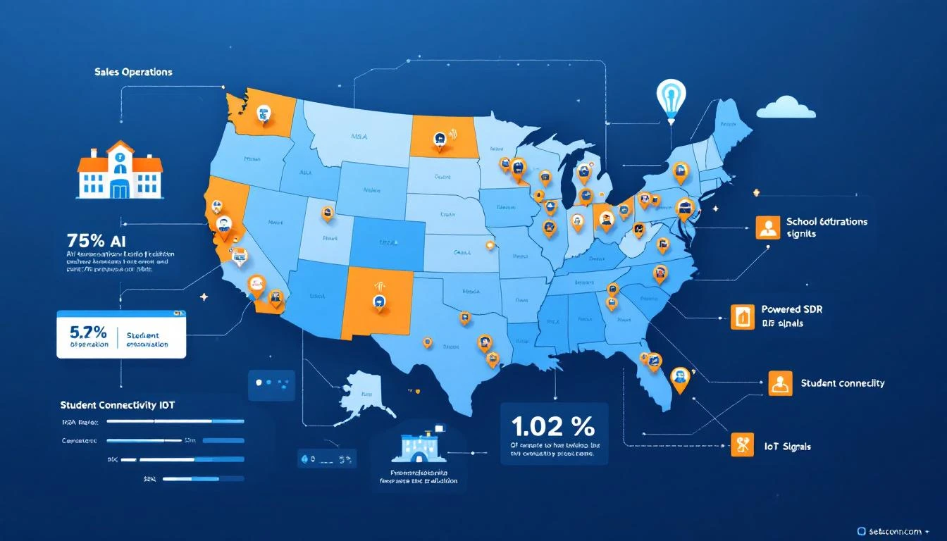
Now layer on the geographic complexity. School districts are inherently local. A district in rural West Texas has different infrastructure needs, different budgets, different political dynamics than a suburban district outside Chicago. Your SDRs don't just need to know the product — they need to know their territory. The superintendent's name. Whether the district passed their last bond measure. Which schools already have 1:1 device programs.
This is the story of how one K-12 education IoT connectivity company — serving over 1,400 school district customers nationwide — rebuilt their SDR operation from geographic cold outreach to territory-based signal selling. Three SDRs. Three territories. One platform. And a pipeline that finally matched the size of their addressable market.
The K-12 Sales Problem: Why Outbound Alone Can't Scale
Let's be honest about what K-12 edtech sales looks like at most companies:
1. The budget calendar runs everything. Districts finalize budgets between March and June (varying by state). E-Rate applications have their own deadlines. Title I and ESSER funding come in waves. If your SDR reaches a district in September, they're 6 months early — or 3 months late. Timing isn't just important; it's the entire game.
2. Cold outreach gets filtered aggressively. Superintendents and district IT directors get hundreds of vendor emails per week. Most districts have procurement policies that funnel everything through formal RFP processes anyway. Your beautifully crafted cold email to the superintendent? It went to a shared inbox that a procurement coordinator checks on Thursdays.
3. Territory knowledge is the moat — but it doesn't scale manually. The best K-12 reps know their districts inside and out. They know which ones just passed a technology bond. They know which superintendent is retiring. They know which districts piloted a competitor's solution and hated it. But this knowledge lives in the rep's head — and when they leave, it leaves with them.
4. Geographic territories create natural coverage gaps. With only 3 SDRs covering the entire United States, there are inevitably districts that don't get touched for months. The Southeast rep is busy with a cluster of Florida districts while Georgia and Tennessee go dark. Opportunities slip through — not because they don't exist, but because nobody was watching.
This was exactly the situation at a K-12 IoT connectivity company with a national footprint and a small, territory-based sales team.
Before: The Manual Territory Grind
Here's what their SDR operation looked like before the shift:
The team: 3 SDRs, each owning a geographic region (roughly West, Central, and East), managed through Salesforce.
The process:
- Each SDR maintained a target account list of ~500 districts in their territory
- Prospecting was manual: LinkedIn research, checking district websites for bond measures and tech initiatives, reading local education news
- Outbound sequences were semi-personalized (district name, state-specific funding references) but fundamentally cold
- Activity metrics drove behavior: 60 emails/day, 20 calls/day, 5 LinkedIn touches/day
- Demo bookings averaged 8-12 per SDR per month — respectable, but plateauing
The problems:
- Timing was random. SDRs had no way to know when a district was actively evaluating solutions. They'd sequence a district for 3 weeks, get no response, move on — only to learn later that the district bought a competitor the following month.
- Signal blindness. The company's website had strong organic traffic from district IT directors searching for connectivity solutions, device management platforms, and IoT infrastructure for schools. But that traffic was 100% anonymous. An IT director in Fairfax County could spend 20 minutes on the product page and the Virginia SDR would never know.
- Salesforce was a graveyard. The CRM had thousands of district contacts, many outdated. The CTOs moved to new districts. The procurement contacts retired. Nobody was systematically tracking which contacts were still at which districts — a critical gap when K-12 personnel turnover runs at 15-20% annually.
- Territory coverage was uneven. Whichever region had an SDR in "flow" got all the attention. The others coasted on autopilot sequences that nobody was monitoring.
The ceiling was clear: this team was working harder, not smarter. They needed leverage.
The Shift: Territory-Based Signal Selling
The transformation happened in three stages — and it didn't require adding headcount.
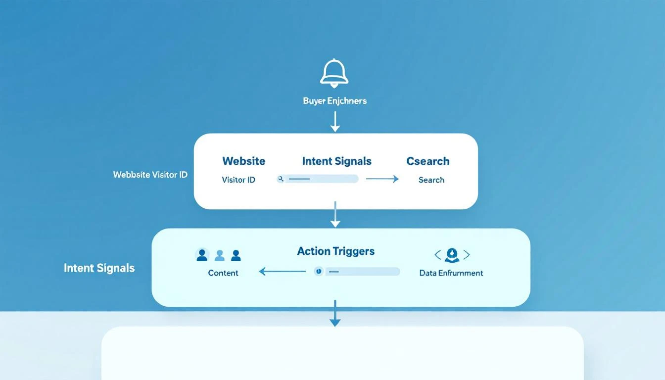
Stage 1: Visitor Identification Meets Territory Routing
The first move was activating website visitor identification and connecting it directly to Salesforce territory assignments.
When a school district visited the website, the system would:
- Identify the district (or the managed service provider acting on their behalf)
- Match it to the correct territory in Salesforce based on state/region
- Route an alert to the assigned SDR within minutes — not hours, not days
- Include context: which pages they viewed, how long they spent, whether they'd visited before
The impact was immediate. Within the first week, the Central territory SDR received an alert: a large Texas ISD (independent school district) with 47 schools had visited the 1:1 device connectivity page three times in five days. Nobody in the CRM had logged a single interaction with this district in 18 months.
The SDR sent a personalized email within 2 hours. They booked a demo the next day. The district was actively evaluating vendors for a $200K connectivity deployment — and MarketBetter's visitor identification had caught the signal before any competitor even knew the opportunity existed.
Stage 2: Champion Tracking Across District Transitions
Here's something unique to K-12: people move between districts constantly. A CTO who implemented your solution at one district gets hired as the superintendent at a neighboring district. A curriculum director who championed your pilot moves to a state education agency.
These transitions are pure gold for K-12 sales — but only if you can track them.
The company implemented champion tracking signals that monitored job changes across their existing contact database:
- Former champion moves to new district: High-priority alert → SDR reaches out referencing their previous experience
- IT director leaves a customer district: Account management alert → check if the replacement is a detractor or neutral
- Procurement officer joins a target district from another customer: Warm introduction opportunity — they already know the product
One champion transition alone generated a $150K opportunity: a former IT director who had deployed the company's IoT connectivity solution across 23 schools moved to a larger district in a neighboring state. The SDR in that territory got an alert, reached out, and the former champion pulled the company into an active RFP they hadn't known about.
Without the signal, that opportunity would have gone to whatever vendor the new district's existing contacts already knew.
Stage 3: Funding-Aware Sequencing
K-12 sales lives and dies by funding cycles. The team built signal-aware sequences that adjusted messaging based on known timing:
E-Rate filing season (January–March): Sequences emphasized total cost of ownership, managed services, and E-Rate eligible product configurations. Messaging shifted from "here's what we do" to "here's how to include this in your E-Rate Category 2 application."
Budget planning season (March–June): Visitor identification signals during this window received the highest priority. A district visiting the pricing page during budget season wasn't casually browsing — they were comparing vendors for a line-item decision. SDRs escalated these immediately.
Back-to-school (August–September): Messaging focused on rapid deployment and support. Districts that waited too long to procure during budget season would panic-buy in August. Signals during this window triggered urgency-focused sequences.
Bond measure tracking: The team started tracking which districts had upcoming bond measures for technology infrastructure. When a district with a pending bond measure showed up on the website, the SDR knew to reference the specific bond allocation and timeline.
This wasn't just personalization — it was synchronization. The SDRs' outreach rhythm matched the districts' buying rhythm for the first time.
The Results: Same Team, Completely Different Output
Demo bookings per SDR went from 8-12/month to 22-28/month. Not by working more hours — by working the right accounts at the right time.
Signal-sourced pipeline represented 55% of new opportunities within 90 days. More than half of all new pipeline came from accounts that were identified through website signals, champion tracking, or funding-cycle triggers — not cold outbound.
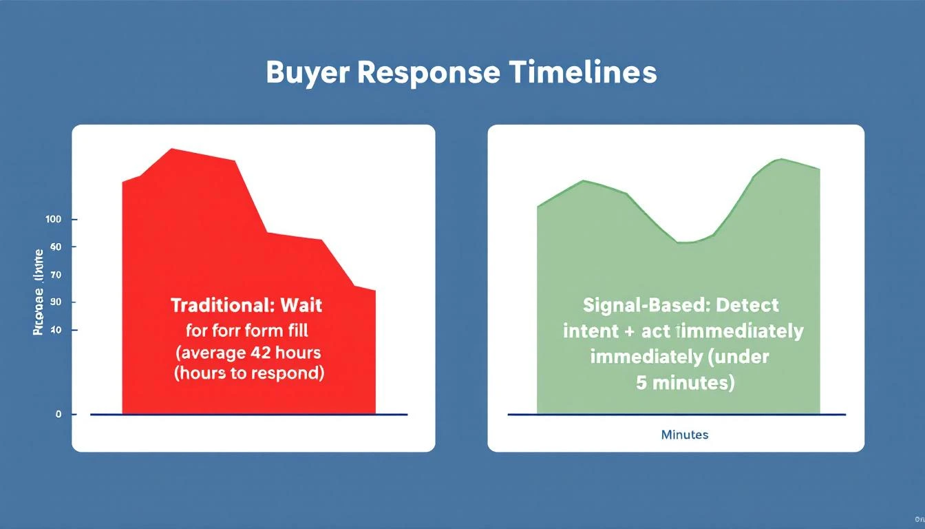
Average response rate on signal-triggered outreach: 34%. Compare that to 3-4% on their previous cold sequences. When you email a district CTO the same week they visited your product page three times, they respond — because you're relevant.
Territory coverage gaps disappeared. Even when an SDR was deep in a deal cycle with a cluster of districts, signals from other districts in their territory still surfaced. Nothing fell through the cracks because the system was watching all 500+ districts per territory simultaneously — something no human SDR can do manually.
Salesforce became alive. Instead of a database of stale contacts, the CRM now reflected real-time buyer behavior. Deals moved stages based on actual engagement, not optimistic SDR forecasts.
The K-12 EdTech Playbook: Lessons for Every Education Technology Company
Whether you sell connectivity, curriculum software, assessment tools, school safety systems, or any other K-12 solution, these principles apply:
1. Your Website Traffic Contains Your Best Leads
K-12 buyers research online before engaging vendors — often for weeks. If you're not running visitor identification, your best prospects are browsing your site and leaving without a trace. Fix that first.
2. Route Signals to Territory Owners Instantly
Speed matters enormously in K-12. Districts evaluate on compressed timelines dictated by budget cycles. A signal that reaches an SDR 48 hours after a district visited your site might as well be a week late. Build real-time routing from identification to territory owner.
3. Track Champions, Not Just Accounts
K-12 personnel turnover is one of your biggest pipeline risks and opportunities. When a champion moves to a new district, that's a warm introduction waiting to happen. When a detractor replaces a champion at a customer district, that's a churn risk you need to catch early.
4. Synchronize Outreach With Funding Cycles
Don't blast the same sequences year-round. Align your messaging to E-Rate filing windows, budget planning seasons, and bond measure timelines. A district that hears from you at the right moment in their procurement cycle is 10x more likely to engage than one you cold-email in November.
5. Let Signals Equalize Territory Coverage
Three SDRs can't manually monitor 1,500 districts. But a signal engine can. When website visits, champion moves, and funding events surface automatically, every district in every territory gets watched — regardless of which deals your SDRs are currently focused on.
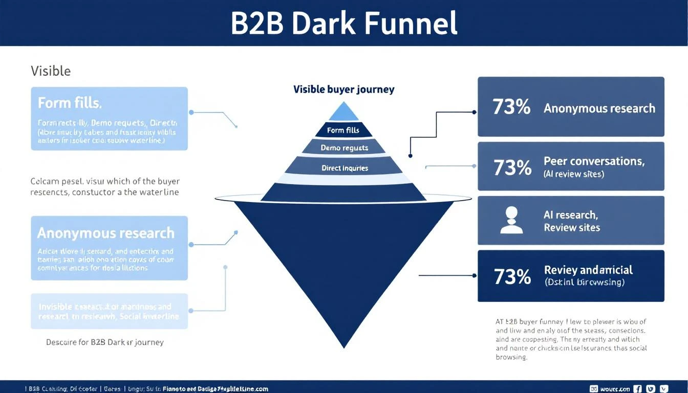
6. Capture the Dark Funnel in Education
The B2B dark funnel is particularly deep in education. Buying committees do extensive research internally before ever reaching out to vendors. Committee members share links in email threads you'll never see. Visitor identification is the only way to know they're looking.
Why This Matters Now: The K-12 Market Opportunity
Over $190 billion in federal education technology funding has been allocated since 2020. E-Rate modernization continues to expand eligible technology categories. Districts are investing in IoT infrastructure, 1:1 connectivity, smart building systems, and digital learning platforms at unprecedented rates.
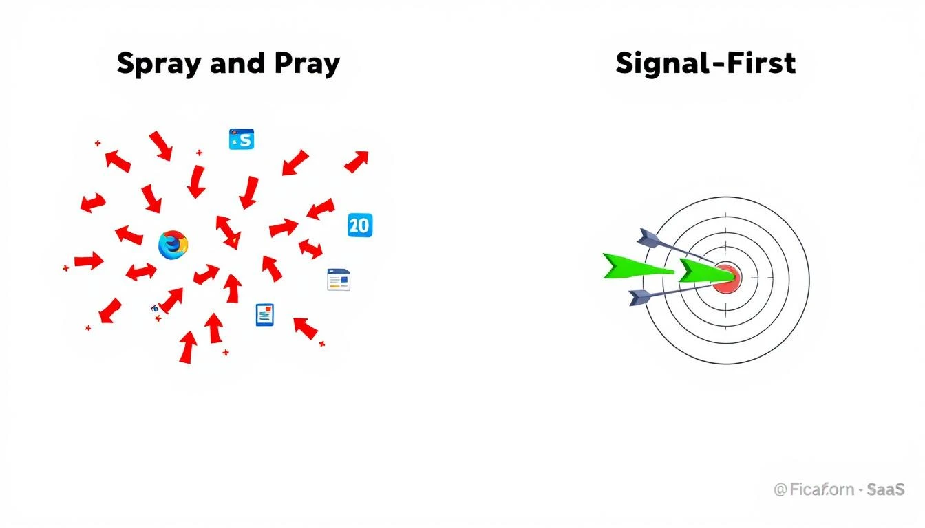
But the K-12 edtech market is also getting crowded. Dozens of vendors compete for every district's attention. The companies that win won't be the ones who send the most emails — they'll be the ones who reach the right district, at the right moment, with the right message.
For a lean SDR team with geographic territories, signal-based selling isn't a luxury. It's the only way to compete at scale without scaling headcount.
Three SDRs. Three territories. Over 1,400 customers. And a pipeline that finally reflects the real size of the opportunity.
Want to see which school districts are researching solutions on your website right now? Start identifying your anonymous education traffic →